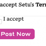
Tell us what you are trying to do? I am trying to style a checkbox do that the text is aligned with the checkbox rather then skewed up.
Is there any documentation that you are following? I can't find anything on the Toolset site
Is there a similar example that we can see?
What is the link to your site?
hidden link
Hello,
I have tried the URL you mentioned above, but I see different from your screenshot, see screenshot checkbox.JPG
Is this problem resolved? Please let me know if you need more assistance for it. thanks
Hi, what browser are you in? In Safari and Chrome they are misaligned, like my first screenshot. Here is the link again: hidden link
In browsers, we want the checkbox on the left, and then text on the right, they should be aligned on a grid (so they have the same typographic baseline). Right now the text is too high.
Alignment should be something like this.
I am using Chrome browser, I have test again the URL you mentioned above, but get the same result as the screenshot as I mentioned above.
I have tested it in my localhost, it is possible to style the checkbox field as your screenshot, for example:
input[data-wpt-name="wpcf-privacy-policy"]{
position: absolute;
    left: 0px;
    top: -12px;
    width: 10px;
}
See screenshhot checkbox1.JPG
Thank you, I was able to work with that code, but it definitely does not render the same way as it does on your screen. I tested different devices and colleagues are testing on various devices as well. It's frustrating that I can't replicate your view.
Since it is a custom CSS codes problem, if you need more assistance for it, please provide a test site with the same problem, I can setup a demo for you, thanks


