Skip Navigation

[Resolved] Cells Display vertically instead of Horizontally

This thread is resolved. Here is a description of the problem and solution.

Problem:

I would like to Keep the same horizontal order to the cells in a small screen as when viewing it from a Laptop.

Solution:

1) With Bootstrap grid system:

you can add CSS class name " col-xs-*" to each layout cell

https://getbootstrap.com/docs/3.3/examples/grid/

2) Without Bootstrap grid system:

you can use HTML table to format your data:

https://www.w3schools.com/html/html_tables.asp

Relevant Documentation:

https://toolset.com/documentation/user-guides/adding-custom-styling-to-a-layout/#cell

This support ticket is created 6 years, 9 months ago. There's a good chance that you are reading advice that it now obsolete.

This is the technical support forum for Toolset - a suite of plugins for developing WordPress sites without writing PHP.

Everyone can read this forum, but only Toolset clients can post in it. Toolset support works 6 days per week, 19 hours per day.

Sun Mon Tue Wed Thu Fri Sat
- 9:00 – 13:00 9:00 – 13:00 9:00 – 13:00 9:00 – 13:00 9:00 – 13:00 -
- 14:00 – 18:00 14:00 – 18:00 14:00 – 18:00 14:00 – 18:00 14:00 – 18:00 -

Supporter timezone: Asia/Hong_Kong (GMT+08:00)

This topic contains 7 replies, has 2 voices.

Last updated by Luo Yang 6 years, 9 months ago.

Assisted by: Luo Yang.
Author
Posts
#682779
LAYOUT.png
WIDE.png
SMALL.png

Hello again ToolSet

Tell us what you are trying to do?
I would like to Keep the same horizontal order to the cells in a small screen as when viewing it from a Laptop.
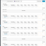
Please see the attached screenshots...

In the "wide.png" all the cells are correctly organized as in the "layout.png"
but in the "small.png" the cells look quite bad.

Could you please let me know what am I doing wrong?

I really like the scrolling feature of the the sample URL bellow.
It keeps the horizontal order but since it's too small anyway, it lets users scroll across to see all the content.
Is it posible to achieve the same with the Layouts extension?
I think it would be an awesome setting.

Is there any documentation that you are following?
None that I found..

Is there a similar example that we can see?
Yes:
hidden link

What is the link to your site?
hidden link

#682956
extra-small.JPG

Hello,

Yes, it is possible to setup columns style for extra small screens, for example you can add CSS class name " col-xs-*" to each visual editor cell, see screenshot: extra-small.JPG

More help:
hidden link
Bootstrap grid examples

https://toolset.com/documentation/user-guides/adding-custom-styling-to-a-layout/#cell
Styling individual cells

#682960

Thank you very much for your quick response Luo.

From the sample screenshot that you provided,
I can see that using your suggested method,
the horizontal order will be kept ..

Is it posible to also add the Scrolling feature for small screens?

That way the words would still be legible.

#683000

No, there isn't such a feature within Layouts, I suggest you use HTML table to format your data:
hidden link

#686206

Oh, thanks a lot!
I followed the tutorial you provided and it looks better on both big and smaller screens..

The "Row Hover" Style is not functioning anymore thought...

Could you please help me get that back?

See result here:
hidden link

#689854

For example:

tr:hover {
    background-color: #f1f1f1;
}

I assume the original question of this thread is resolved, you can create new thread for the new question, that will help other users to find the answers.

#695427

Thank you for your help Luo

#695521

You are welcome