Tell us what you are trying to do?
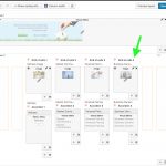
I built a layout, the second rows has 4 grids of 1 column by 2 rows each,
Top row is an image cell
Second row is an accordion.
Everything is perfect only that when viewing from the front end, they appear slimly un-aligned...
Please see attached.
Is there any documentation that you are following?
None.
Is there a similar example that we can see?
Please see images attached.
What is the link to your site?
hidden link
Hello,
I assume you are going to display the "accordion" in a same row.
If it is, I suggest you try this:
1) Insert a grid cell with two rows and 4 column,
2) in the first row, each cell displays a image
2) in the second row, each cell displays a accordion cell.
Then all accordion cells will display in the same row.
More help:
https://toolset.com/documentation/user-guides/learn-creating-using-grids/
Grid of Cells
Thank you for the simply fix Luo,
Yes, indeed the alignment issue is solved, now there is another problem..
On a small screen, the order of the cells is wrong..
BEFORE IS WAS:
1- Image A
2- Accordion A
3- Image B
4- Accordion B
5- Image C
6- Accordion C
7- Image D
8- Accordion D
which was GOOD..
NOW IT IS:
1- Image A
2- Image B
3- Image C
4- Image D
5- Accordion A
6- Accordion B
7- Accordion C
8- Accordion D
which is BAD..
Can this be corrected?
OK, you can switch back to your original solution:
https://toolset.com/forums/topic/aligning-images-on-cells/#post-688515
And setup the image cell with same fix height, it should be able to avoid the problem you mentioned above.
More help:
hidden link
Ok, I reverted to the previous layout and the order is now correct...
What "fix height" would you recommend for the cells?
The challenge is to make it look good on both big screens and Mobile Devices.
Please have a look at the document I mentioned above:
hidden link
You can setup a fix height for HTML element with CSS codes, like this:
div.thumbnail{
height: 300px;
}

