Hi there,
I have a search using a list of bullets, this in 1 column and works great.
However for iPad would like this to be in 3 columns and mobile phone back to 1 column. Is this possible?
For the past hour I have tried many variations using info from the Bootstrap Grid info however everything I try breaks.
This is the page: hidden link
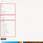
On mobile view an accordion appears at the top of the grid.
The code below is what I have the in the sidebar for PC, wondering if this can be modified rather than creating new?
<div class="form-group">
<label class="main-label">[wpml-string context="wpv-views"]Pets[/wpml-string]</label>
[wpv-control-post-taxonomy taxonomy="pet" type="radios" url_param="wpv-pet" output="legacy" class="special-radio-class" label_class="special-label-class"]
</div>
<div style = "height:15px;"></div>
<div class="form-group">
<label class="main-label">[wpml-string context="wpv-views"]Area[/wpml-string]</label>
[wpv-control-post-taxonomy taxonomy="area" type="radios" url_param="wpv-area" output="legacy" class="special-radio-class" label_class="special-label-class"]
</div>
<div style = "height:15px;"></div>
<div class="form-group">
<label class="main-label">[wpml-string context="wpv-views"]Guests[/wpml-string]</label>
[wpv-control-post-taxonomy taxonomy="guests" type="radios" url_param="wpv-guests" output="legacy" class="special-radio-class" label_class="special-label-class"]
</div>
<div style = "height:15px;"></div>
<div class="form-group">
<label class="main-label">[wpml-string context="wpv-views"]Collections[/wpml-string]</label>
[wpv-control-post-taxonomy taxonomy="collection" type="radios" url_param="wpv-collection" output="legacy" class="special-radio-class" label_class="special-label-class"]
</div>
[wpv-filter-reset output="bootstrap"]
Hi Pete,
Thanks for asking! I'd be happy to help.
Based on the instructions from the Bootstrap's official documentation on its grid structure ( hidden link ), the HTML structure for such columns would look like this:
<div class="row">

  <div class="col-md-12 col-sm-4 col-xs-12">
    Column 1
  </div>

  <div class="col-md-12 col-sm-4 col-xs-12">
    Column 2
  </div>

  <div class="col-md-12 col-sm-4 col-xs-12">
    Column 3
  </div>

</div>
This will show the content in a single column on large and medium screens (laptops & desktops), in 3 columns on smaller screens (tablets) and again in a single column on extra small screens (mobiles).
Next, you can move your HTML for the filtering fields in that new grid structure, accordingly.
( screenshot: hidden link )
I hope this helps.
regards,
Waqar
Hi there Waqar,
Goodness, how you make sense of Bootstrap and to achieve the result you have is a mystery to me 🙂
Media quires using CSS is so easy in comparison 🙂
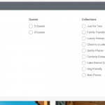
Ok your code works well in the first instance...thank you. See pic attached.
It's a shame on a screen 1024 x 768 (tablet landscape) it's back to a single column rather than maintaining 3 columns.
Can I ask, what would be the code to make it 3 columns on large and medium screens (laptops & desktops) and smaller screens (tablets) ...and a single column on extra small screens (mobiles)?
I may use this elsewhere and would like to keep both variations of this on file so I don;t have to bother you again, possibly later today 🙂
The result is better than I hoped so intend to use elsewhere.
Thanks again. P
Hi Pete,
Glad that you liked the results.
The Bootstrap library also uses CSS media quires, but it provides an easy to use and a pre-built collection of styles for most common usage scenarios. This allows a rapid and standardized development, where everything doesn't need to be written from scratch.
For any specific changes as per the project's requirement, we can always introduce custom CSS styles to override those default styles.
> Can I ask, what would be the code to make it 3 columns on large and medium screens (laptops & desktops) and smaller screens (tablets) ...and a single column on extra small screens (mobiles)?
- For this specific case, you can change the grid classes to:
<div class="row">

  <div class="col-sm-4 col-xs-12">
    Column 1
  </div>

  <div class="col-sm-4 col-xs-12">
    Column 2
  </div>

  <div class="col-sm-4 col-xs-12">
    Column 3
  </div>

</div>
Note: This means that for large to small screens use 4 columns (1/3), and only for extra small screens, switch to full width or all columns.
regards,
Waqar
Hi Waqar,
I have had a look at Bootstrap media queries and it's not easy to understand. One day, after I have a better understanding of Toolset, I may spend some time trying out different things with Bootstrap. At the moment I have too many other things to think about.
Ok I have changed...
<div class="col-md-12 col-sm-4 col-xs-12">
to
<div class="col-sm-4 col-xs-12">
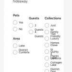
Now in the filter accordion (this will be hidden on desktop and only for mobile view) It looks and works much better.
However the sidebar is now using the same 3 column layout. Is there a way of assigning the new column code just to the accordion dropdown?
hidden link
Thank you. P
Hi Pete,
For this, you'll need to add some custom code, that only targets those grid wrappers, inside the sidebar:
Example:
.elementor-widget-toolset-view .wpv-filter-form div.col-sm-4 {
  width: 100%;
}
Tip: To view the page's HTML elements for CSS styling, you can use Google Chrome's inspect element tool, as explained in this guide:
hidden link
regards,
Waqar
My issue is resolved now. Thank you!


