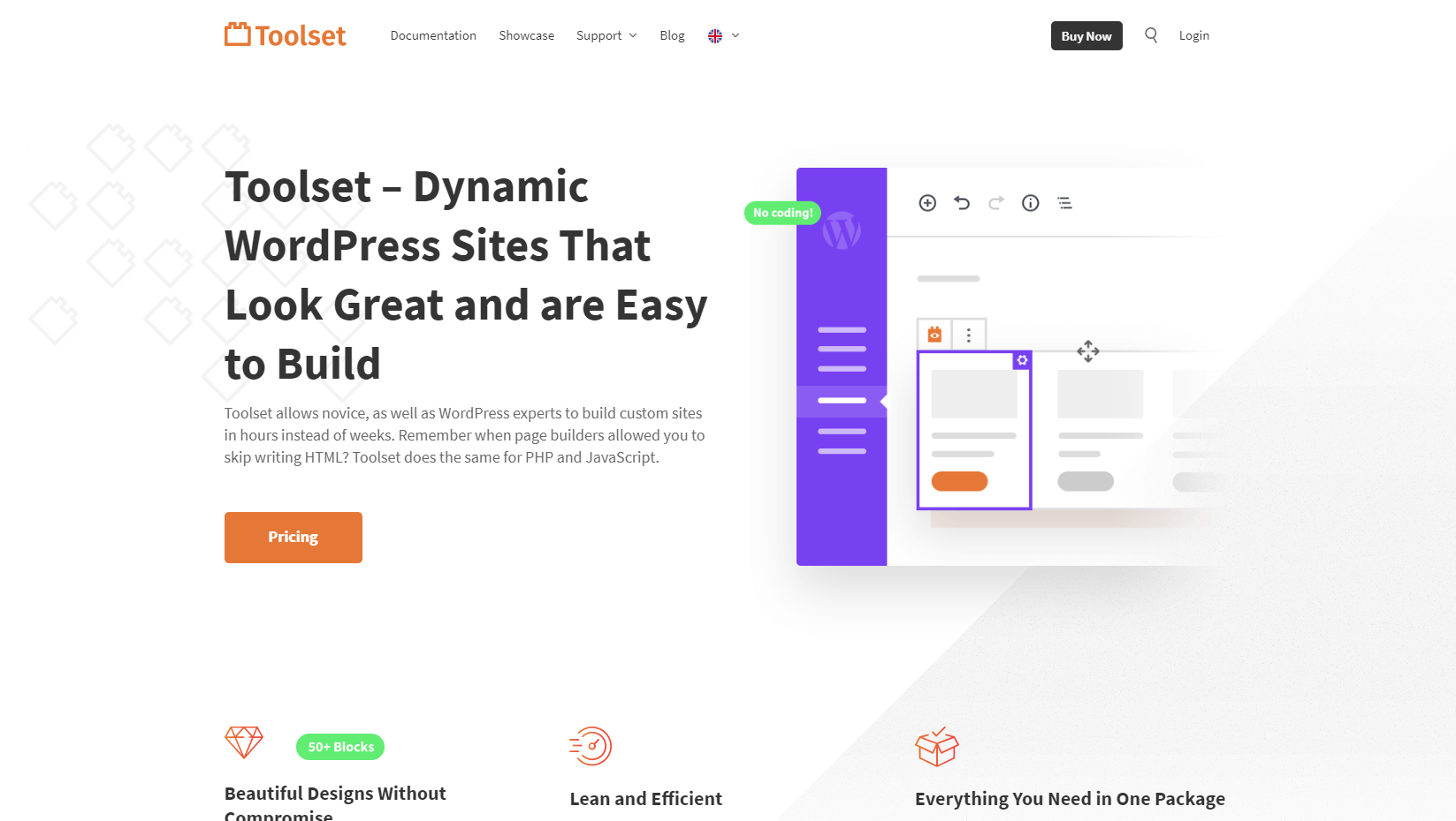
We’re happy to announce Toolset Blocks 1.1.1. This release gives you everything you need to build beautiful and fully responsive designs with Toolset and the WordPress Block Editor.
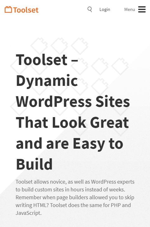
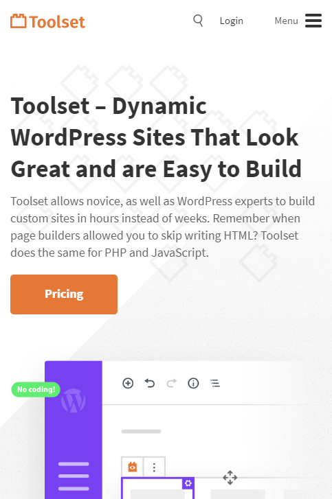
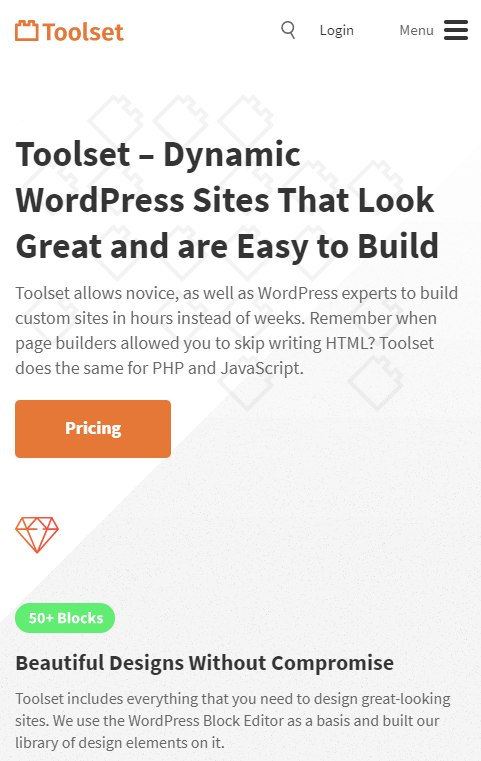
It’s easiest to explain “responsive design” using an example. Look at our own homepage and how it’s improved with Toolset Blocks 1.1.1.
Control the appearance of any element for different screen sizes
See how the “phone screen” design for our homepage improved with Toolset Blocks 1.1.1:
Desktop design
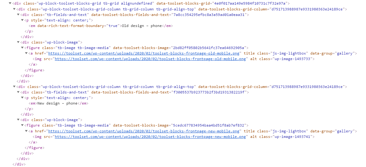
Old design – phone
New design – phone
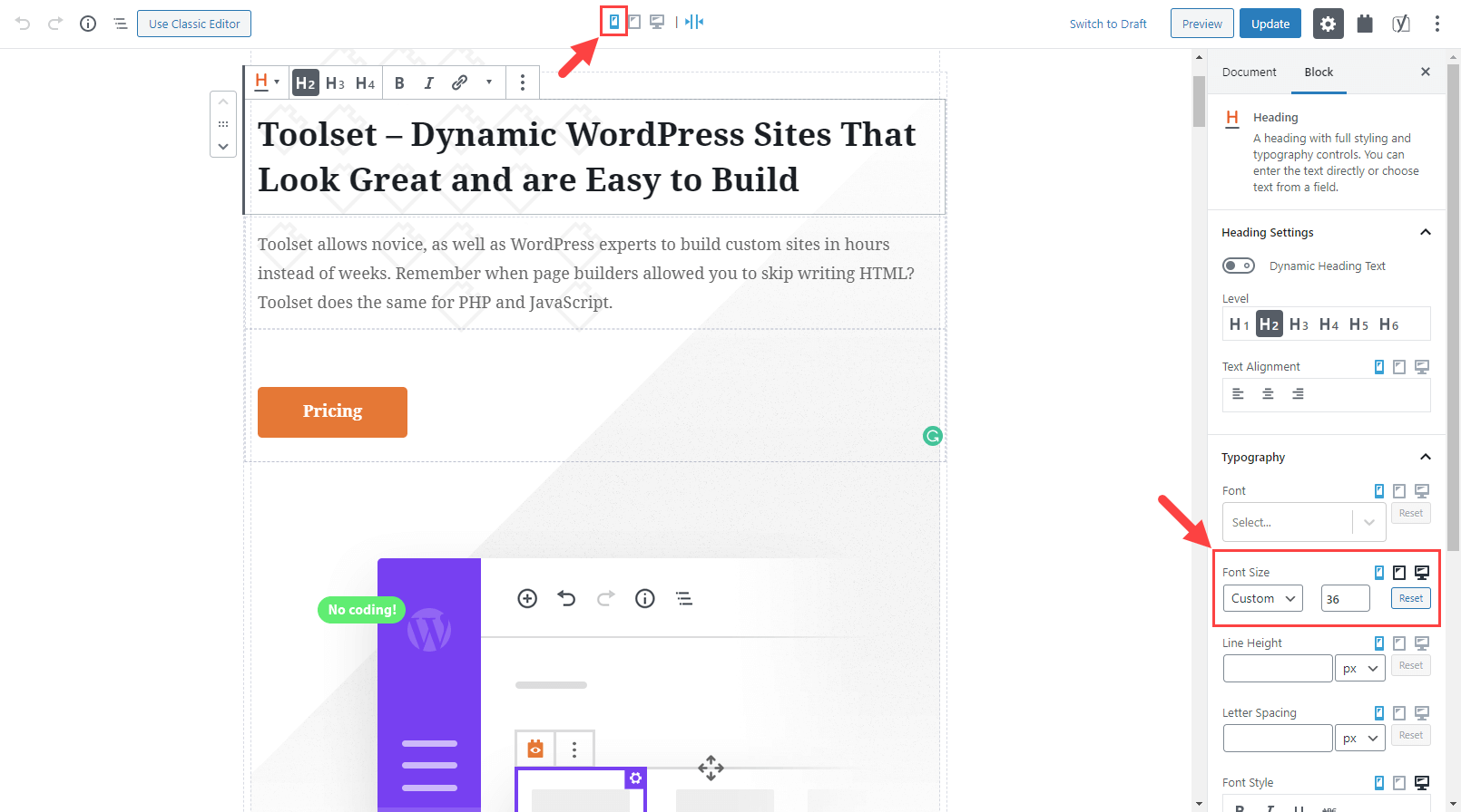
The old design used the same font size for the header on both desktop and phone screens. You can see that while the header looks fine on desktop, it looked too large on a phone screen. The new design uses a smaller font size for tablets and even smaller for phones.
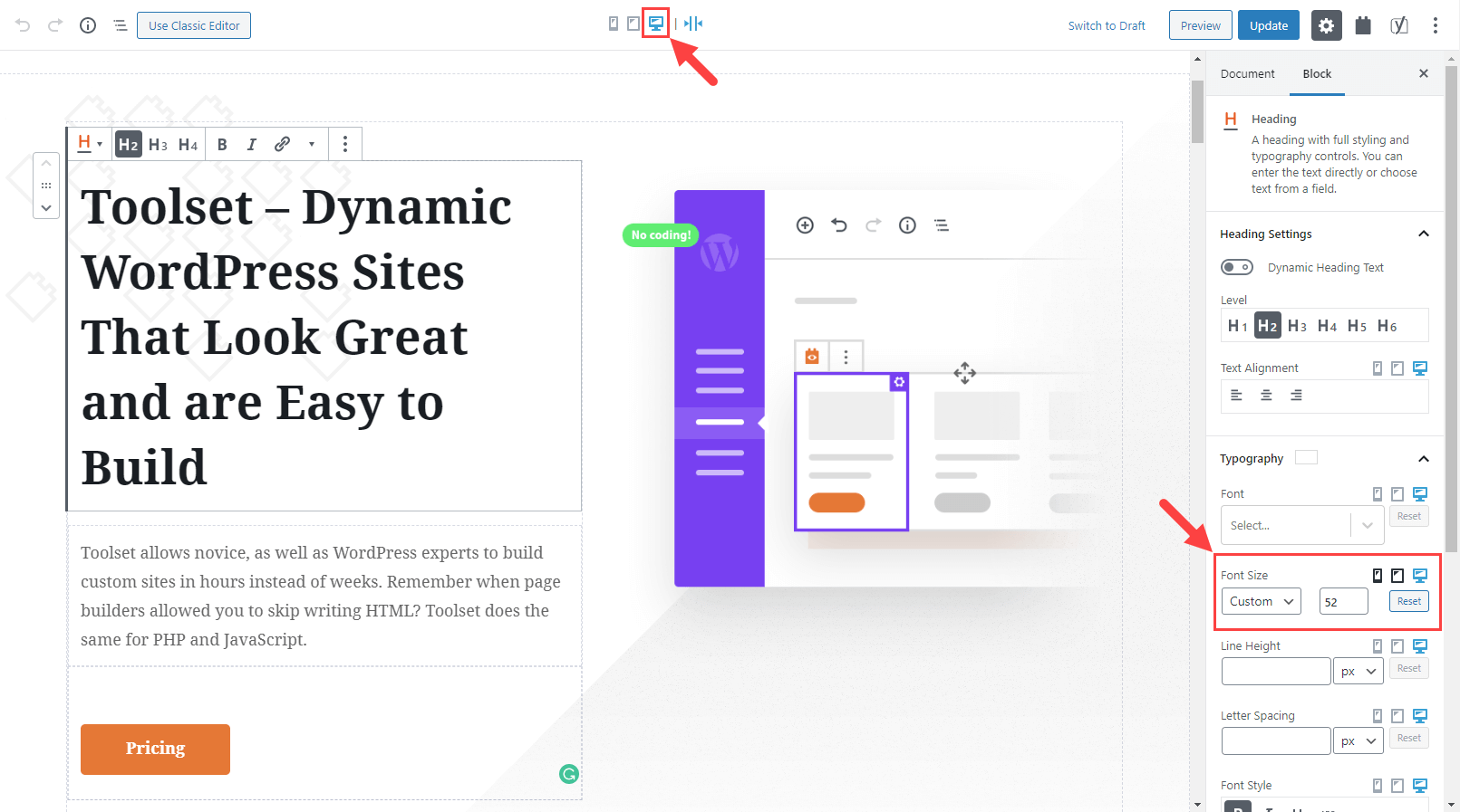
The heading block with settings for desktop screens
The heading block with settings for phone screens
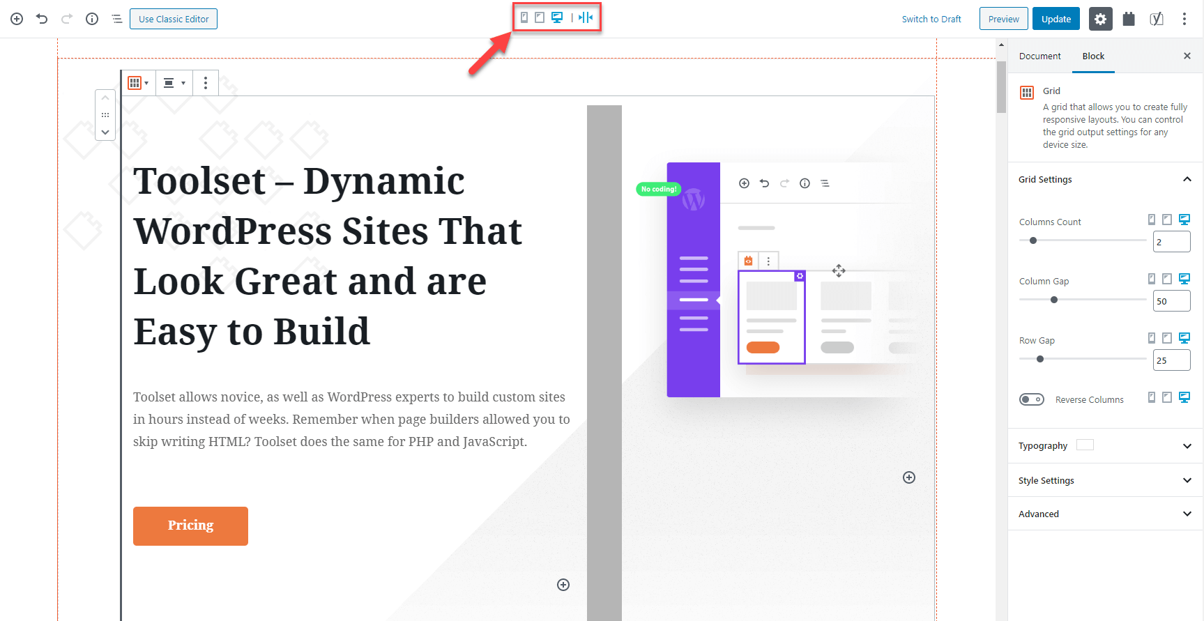
You will see the screen size selector when you edit any block coming from Toolset. Now, you can fully control the appearance of any block for different screen sizes.
Create responsive columns and grids
Columns are a big challenge on narrow screens. While several columns fit nicely on a desktop screen, on phone screens, typically only one column will fit. And since almost every design needs columns, it’s a big deal for responsive design.
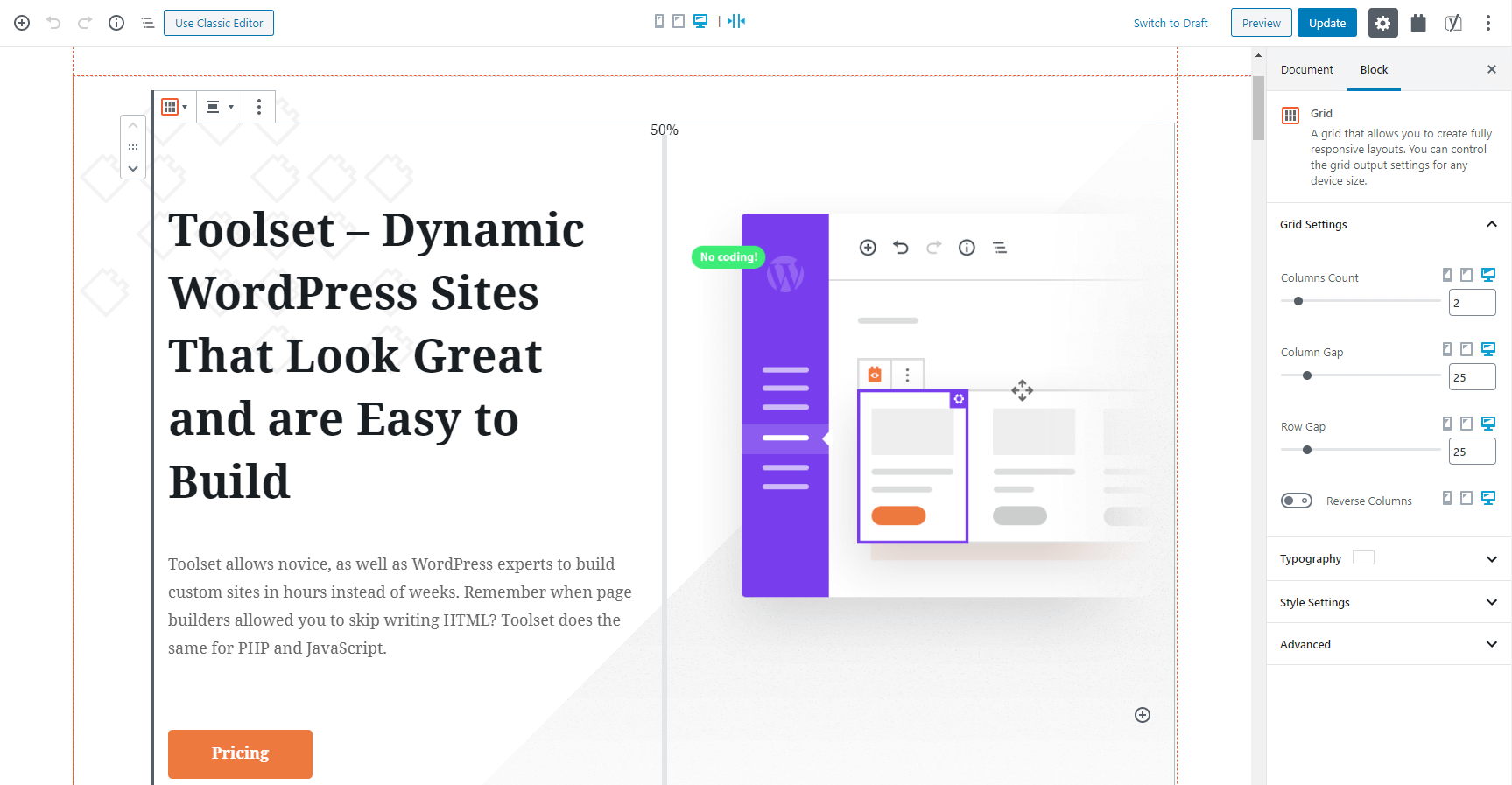
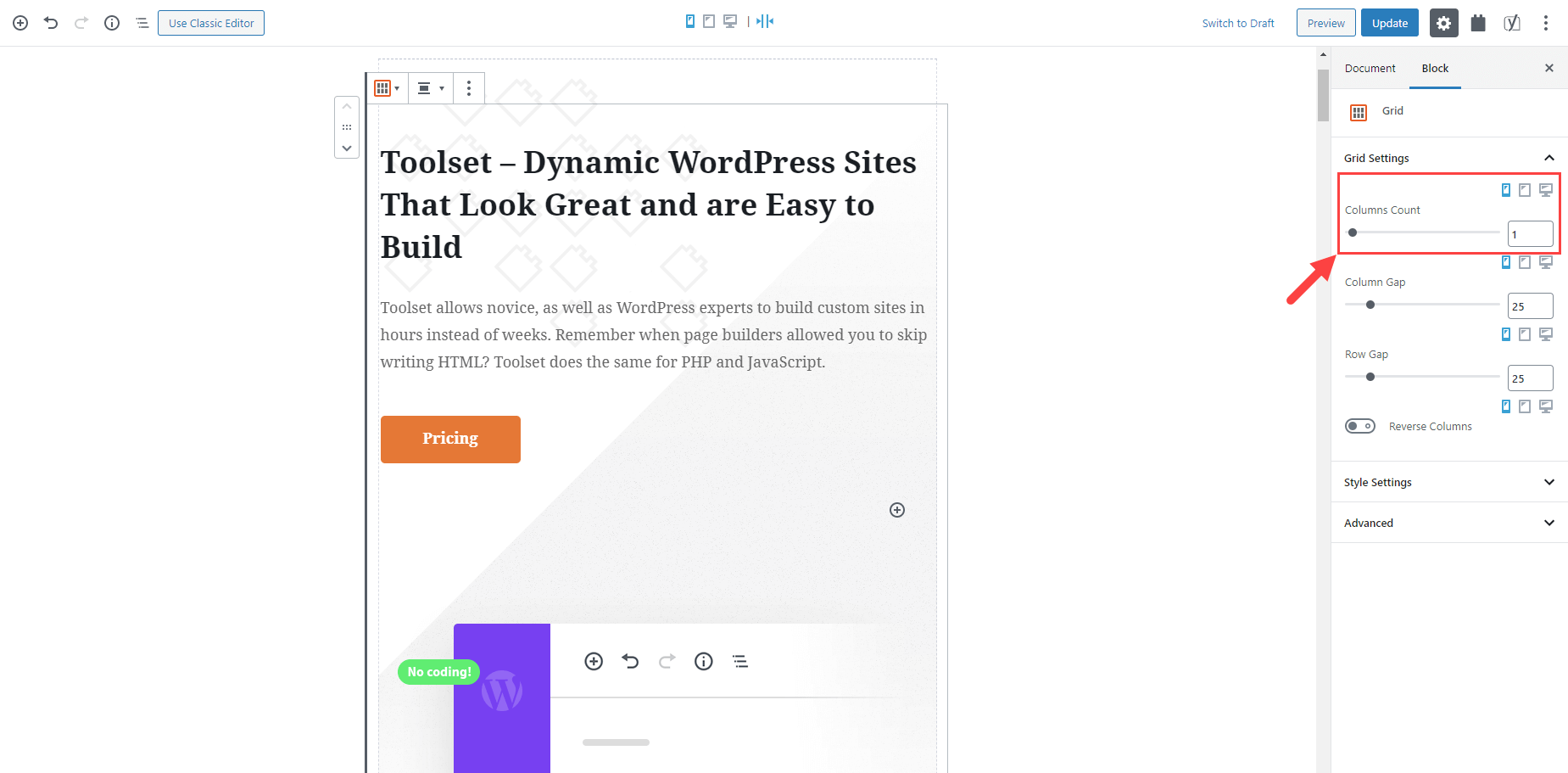
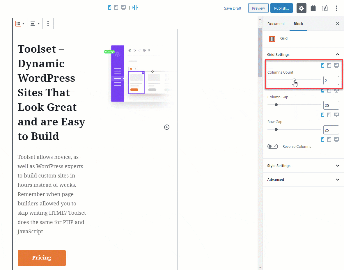
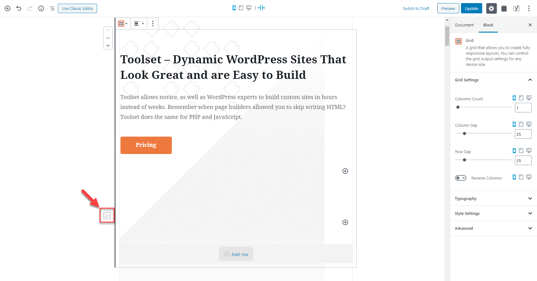
Toolset Blocks 1.1.1 offers its own Grid block. You can use it for simple columns and for complex grids.
Grid Block settings
What makes Toolset’s Grid block so great?
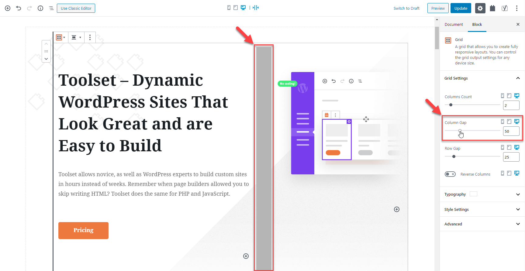
1) Convenient controls over columns width Click between any two columns to resize them. Set different column sizes for different screen widths.
2) Accurate setting for column and row gaps You have full control over the gap (space) between columns and rows.
3) Different column per screen size On wide screens, place several columns. On tablets fewer and usually, one column is great for phone screens.
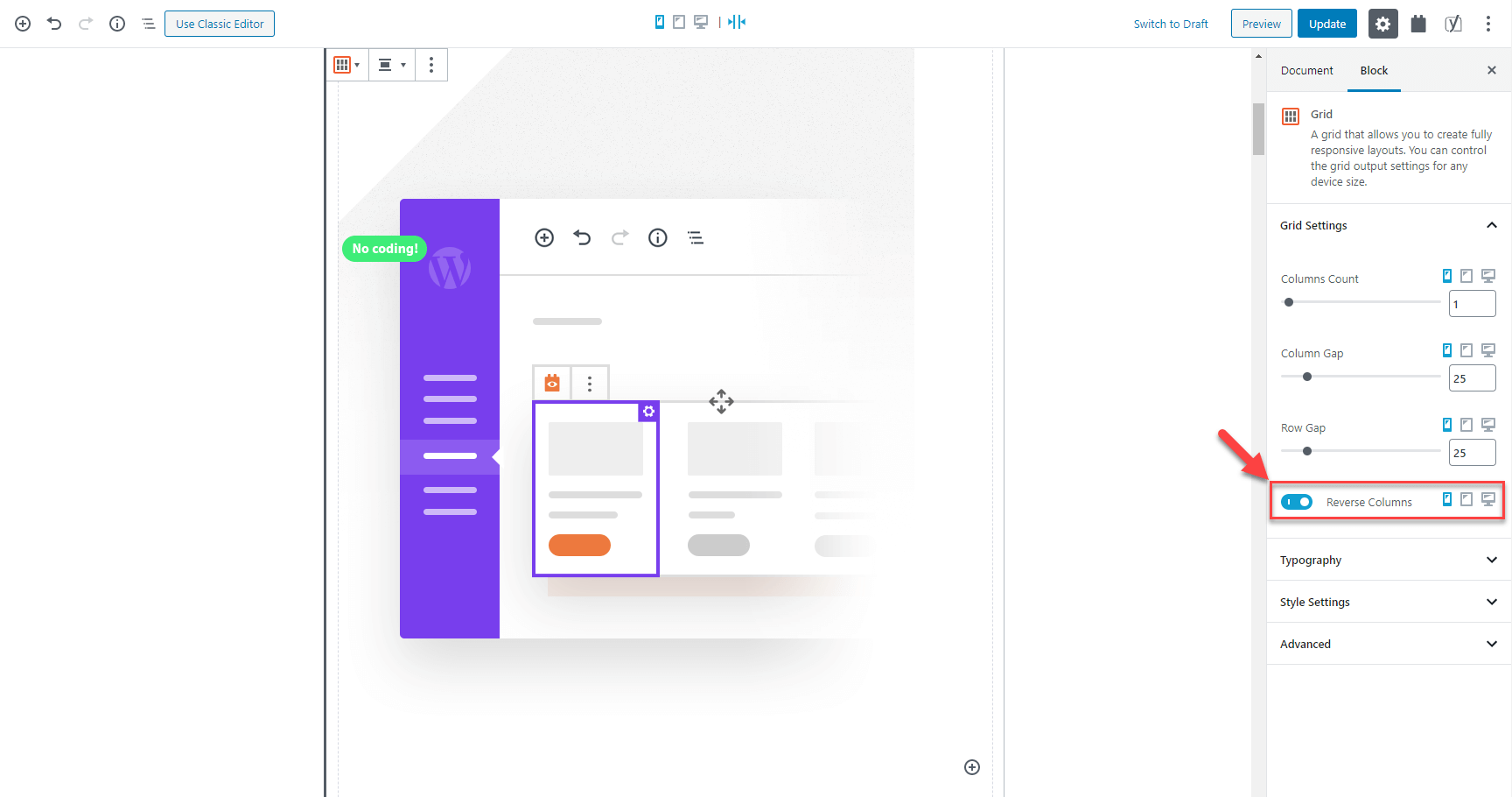
4) “Reverse column order” for sensible image positions This feature allows you to control when “floating” images appear on phones. Reverse the column order for right-floating images to come before the text on phones.
5) Use the Grid block in pages and in Views The goodies of the Toolset Grid block are also available when you create Views. The new grid layout makes your Views look great on narrow screens.
6) Protects you from losing content when reducing the column count When you reduce the number of columns, your content automatically shifts.
7) Clean and conflict-free CSS The Grid block generates dynamic CSS based on your settings. This results in tiny CSS that works perfectly with any theme and other plugins.
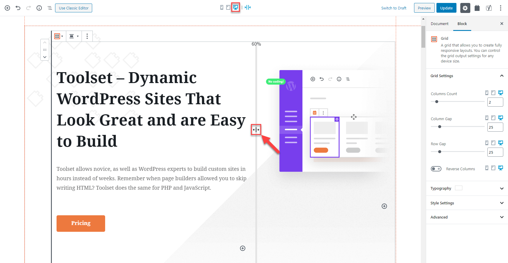
8) Auto-adjusts to screen width Use the screen-width control at the top of the editor to view your design on different screen sizes. The grid shifts automatically as the screen size changes.
You guessed right. The grid above is created with Toolset’s Grid block. View this post on your phone and see how it looks 🙂
Hide elements when they don’t make sense
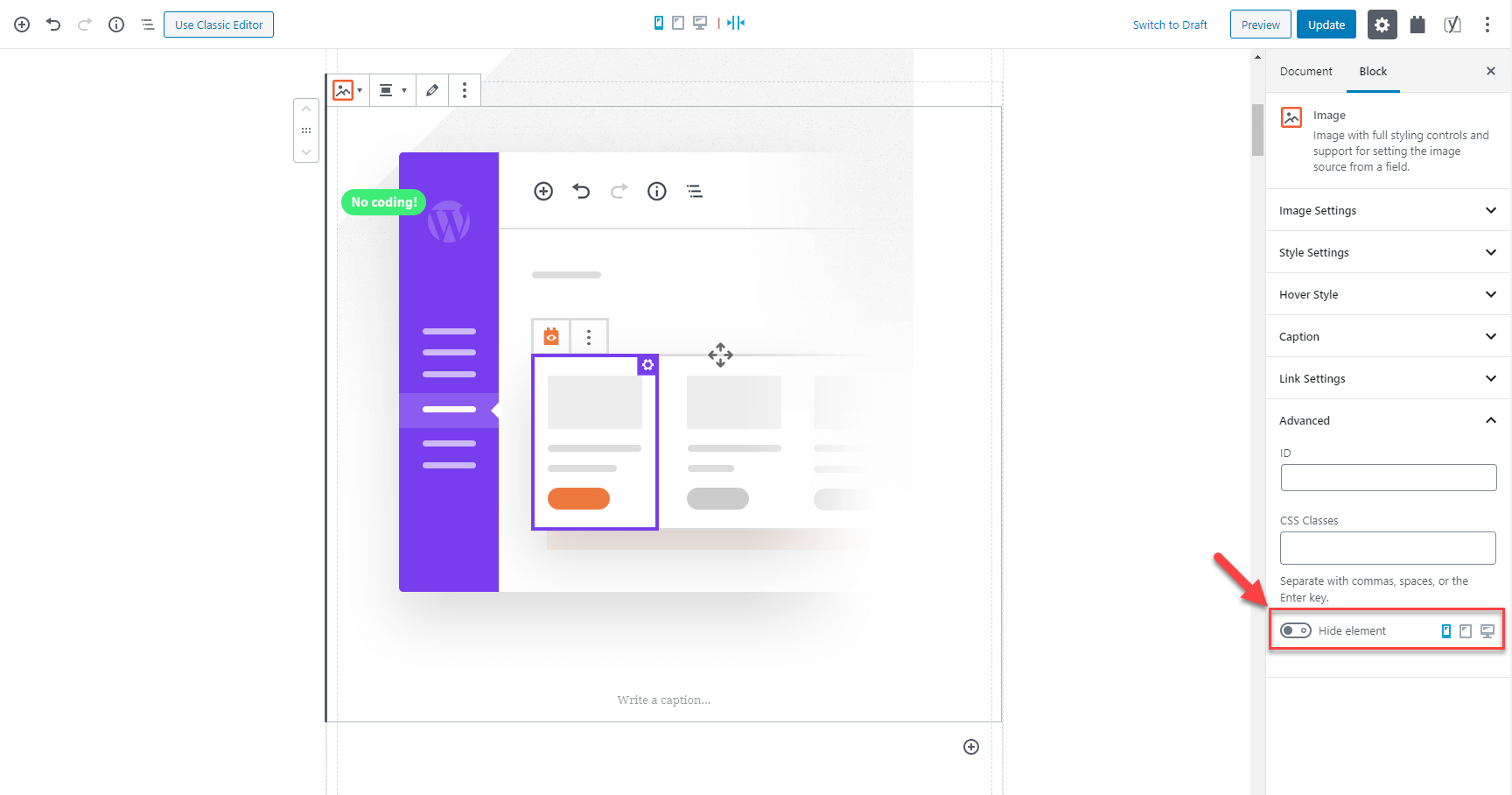
Many designs use fancy (and pretty large) images. These images often look great on a desktop but don’t contribute much on phones. Toolset Blocks 1.1.1 allows you to hide any element on different screen sizes.
All elements showing
No image on phone screen
You can see that the big image that we’re hiding on the phone is really not needed. The design works better without it (less scroll to get to the point).
To achieve this, you’ll find a “Display” control when editing any element.
The option to hide a Toolset block on screen sizes of your choice
Switch to the target screen size on which you don’t want to show an element and hide it.
But wait. There’s more!
Once you’ve hidden an element, Toolset helps you remember that it’s there, just hidden.
Reminder icon for hidden element
Click on the reminder icon to edit the element’s settings. There, you can quickly unhide it.
Download and Update
We push out Toolset releases gradually. If your sites haven’t received this update yet, give it some time and you’ll see the update in a few days.
To skip the queue and get the update right away, to the Plugins –> Add New page, click the Commercial tab and then click the Check for updates button.
You can also download the plugins manually by going to your Toolset account and clicking Downloads.
Don’t forget to backup your site before updating.
Feedback? Questions? Suggestions?
Are you already using Toolset Blocks to build websites? What do you think about the new responsive features in this release?
Please leave comments with your questions, ideas, and suggestions and we’ll get back to you.
We’re happy to announce Toolset Blocks 1.1.1. This release gives you everything you need to build beautiful and fully responsive designs with Toolset and the WordPress Block Editor. It’s easiest to explain “responsive design” using an example. Look at our own homepage and how it’s improved with Toolset Blocks 1.1.1. Control the appearance of any…
Cool, it was about time. Now I can rely on less gutenberg extensions to handle this part.
Thanks! I’m heading to a test right away!
Great, please, let us know how it goes! Thanks!
Okay, here is my first feedback on this.
I like the new way of visually building views, however I see a general flaw here, since if I go the Blocks extension way the Toolset back-end will not allow me to separately edit my views anymore, as with the Views extension.
This is because the back-end sub-menu where we can see and edit our views is gone with the Blocks extension.
I find it odd having to create my views in a sandbox page where I will play with a view until I like it, and then implement on a live page.
Also since the Views submenu is gone, there is practically no way I can delete a View from the database. I will be doomed to have my list of all my test views with me until the end of my project.
So please return us the Views submenu (Toolset>Views) where we can see a list of all our existing views. Where we can also edit and create those views. Or at least give us a way to delate the odd ones.
I realise this will require having a dummy sandbox page with Gutemberg editor for creating and managing views. But hey that isn’t that bad. You can call it the Views Editor page.
Hi Diyan,
There is a solution, and Dario or other support can correct me if I am wrong. Disable Toolset Blocks and Install the latest version of Views. Basically it is Views as we know with all the block goodness tacked on.
Hi, Diyan and Stephen!
First, please don’t do what Stephen suggested, there is really no need to uninstall Toolset Blocks and install Toolset Views. 🙂
On a site where you have Toolset Blocks installed, to see all “legacy” Toolset admin pages, simply go to the Toolset → Settings page and scroll to the “Editing experience” section. There, select the option to “Show both the legacy and Blocks interface option…”.
You will now be able to go to the Toolset → Views page and see a list of all the Views in your site. You can delete any of the Views there and you can click to edit them, but in this case, you are taken to the page where you originally created them and can edit them there.
Thanks Dario,
That solves it. Thanks!
Ok, there is that option so yes scrap my suggestion.
It’s cool, there are always multiple ways of achieving the same thing but I needed to share the best one with you! 🙂 Thank you both!
Hi Dario, What happens if the page where the block was created its deleted? I cannot edit never more?
What about blocks that suddenly appears with a message: “This block contains unexpected or invalid content” Resolve or convert to html buttons appears. Both of them converts the tootlset code to a wrong one and i have to recreate the column? And what about big images sizes appearing when blocks is installed? Are these things corrected in these 1.1 update? thanks
Thank goodness… responsive design has been my struggle with blocks as of late. I will try this right away.
Thanks, Jonathon! As always, your feedback is important to us so please feel free to let us know how it goes!
Are the breakpoints for mobile, tablet, desktop fixed or can they be changed by some mechanism? Is there inheritance of rules (e.g. mobile first)?
It appears you can change the 2 breakpoints between mobile/tablet/desktop by going to… Toolset > Settings > General … then scroll to bottom of page. Would be nice if there was 1 or 2 extra breakpoints.
Exactly as Peter suggested, the breakpoint options are available on the Toolset Settings page. Peter, I will mention your suggestion to the team. Thanks!
I’ll second the need for more breakpoints (phone, tablet portrait ~768-1024px, tablet landscape ~1024-1240px, desktop ~1240-1440px, desktop XL.
The ideal perhaps would be to just have a repeating set of two columns with label and an arbitrary media query.
Ditto. Why do most other WP Blocks plugins neglect the tablet-landscape breakpoint?
Looks good. I haven’t had time to test yet but I trust the block editor width shrinks down automatically as you use the tablet and mobile viewports.
What is the fourth icon after the desktop icon in the top tool bar? What does it do?
One viewport which is my ch needed for responsive design is one for tablet in landscape. I would even push it as far to suggest one for small/medium laptop viewports. Too many time I have to roll some extra css for these in the theme or child theme style sheet.
Hi, Stephen! Yes, the editor width changes according to the screen size you select.
The fourth icon is to select whether you want the editor width to shrink as you select smaller screen sizes or not. For example, you might want to edit the design for the phones, but you prefer the editor width to stay full. In this case, click this fourth icon to disable it. As you do that, all design tweaks for the phones will still be visible (changes to fonts, margins, column numbers, etc.) but the editor will stay in the full width.
Try it out and I’m sure you’ll immediately see what I mean.
I will share your suggestion about the landscape tablet viewport, but as with every other feature requests, it will depend on how requested this is.
Thanks a lot for your comments!
Hi Dario,
Just doing a bit of testing and one edge case is where in Divi, if you have customised the the styling to accommodate sections to span the full width of the browser window, the grid will automatically go wide 100%. In Kadence rows which I have used in previous testing, under Structure Settings you can set a content width so that the inner content sticks to a main content width intended.
I suppose applying a class to the grids and then setting widths for each breakpoint is a workaround.
Hi, Stephen! Could you please clarify, when you say “the grid will automatically go wide 100%” do you mean that:
1. You are talking about the new Toolset Grid block?
2. You don’t want the Grid block to automatically go 100% wide?
If this is the case, can’t you simply insert the Toolset Grid block into a Toolset Container block and then for the Container block, expand the “Inner Content” section and set the “Max-Width” option to whatever width you want your Grid to have?
Aha! That’s the way to do it. There are so many new elements in the form of blocks to play with that it is hard to keep track of them all at this early stage. And tis is better than the Kadence row which doesn’t seem to cover responsiveness in all areas.
One thing I do notice, and I see this as a block editor issue in general, is dragging elements into others in a nested manner. It is impossible in many instances. So dragging my grid into the container, it either ends above or below the container. I find I often have to start over with my nested elements in the layout.
Great, I am glad it helped! 🙂 Yes, I believe that’s related to the Block Editor. From what I remember they are aware of these dragging/nesting issues and I’m sure we’ll see a fix for them, hopefully soon.
Hey Stephen and Dario. I too noticed that it’s difficult or impossible to drag blocks into an empty TS Container. However, if you first create any new block inside the Container, such as an empty text block, you’ll then be able to drag whatever you want into the container. Afterwards simply delete the empty block. No need to start over/recreate any elements.
Speaking of dragging and nesting, I really want to be able to drag and nest blocks via the block selector drop-down at the top of the screen. I assume Toolset can’t control that. So Dario, could Toolset get a feature similar in style to the block selector, but where we could drag and nest blocks up and down anywhere in the block tree structure? This would be very helpful when layouts get complicated or very long.
Hi Dario… I figured out this would be the way to do it – so I inserted my grid inside a Container Block and set the Inner Content ‘Max Width’ value – but it seems to have no effect. The grid still resizes to the full screen width. Any ideas? I will explore further…
My bad… set to % and not px! Ignore my last comment!
😁
Just spotted. You used a screenshot image of a site (pottery) I built in one of the article images.
Nice one 😎✌️
Hehehe, good eye there! Thanks Stephen! 🙂
Great! Just when I need it.
Critical error installing the plugin through commercial section or through downloading and uploading through 🙁 been waiting for a long time for this update
Sounds good. Does this make the grid/responsive layouts aspect of using Bootstrap 4.0 redundant?
I am in the planning stages of upgrading from Bootstrap 3.0/Layouts/Views to Bootstrap 4.0/Blocks. Now it seems it may just be Blocks without the need for Bootstrap?
Hi, Gavin! Well, for new sites, yes, it does make Bootstrap redundant because you can build and layout everything using the new Toolset Grid block and the Grid options for your Views.
However, on existing sites, the already-built Views do not get automatically converted to the new grids. So if you have such Bootstrap-based elements on existing sites, you need to keep Bootstrap, or convert them all to the new grid system.
Thanks Dario… I am converting my site! And have to say, the new Grid system is awesome! I love it! 🙂
Got a critical error while uploading on a fresh WordPress website. Please look into the issue.
Thanks for the update and much-needed features though.
Thanks for reporting it. Do you use the WooCommerce Views plugin?
Yes, WooCommerce Views is currently installed on the website.
Thank you. I’ve just sent you an email with the link to the new zip and steps to follow. The official patch will be released tomorrow.
This update looks pretty great!
Couple issues I’ve found while testing…
1) On a couple of test pages where I had built grid views with blocks using the previous version of TS Blocks, I received an error when first editing those pages after updating TS Blocks to 1.1. The error was in a block and read “This block contains unexpected or invalid content. [ Resolve ] [ Convert to HTML ]”. This error had an option similar to “Attempt to recover this block” which worked. Just wanted to mention this in case anyone else is reporting this.
2) Right now I was trying to add a box shadow to a TS Container while in the tablet responsive mode. I enabled the box shadow option by clicking the toggle, but when attempting to change any of its settings the box shadow properties box would close and the toggle would revert to disabled. I was eventually able to make changes by first changing the responsive option from tablet to desktop. Once I was able to make changes, I set the horizontal shadow position to 0 but right afterwards I attempted to change the shadow opacity by sliding the opacity slider to the left but whenever I do this the horizontal shadow position changes itself to -4. When I attempt to fix the horizontal position by changing it back to 0, the shadow opacity resets itself darker!
There are definitely some glitches with the box shadow UI.
Hi, Peter! Thanks a lot for reporting this. For the first issue, are you still able to replicate this on your site? If so, I would kindly ask you to report this in our support forum, so our supporters can take a look and debug it and then forward the info to our developers. These errors usually happen in certain rare scenarios and are usually hard to replicate. However, access to a site where this can be replicated usually results in finding the root cause.
Regarding the second issue. I will report this first thing in the morning and we will test it, thanks for the detailed description. Yes, it could be a bug in the Box Shadow UI but our testers need to test, replicate, and confirm.
Thank you!
Hi Dario. Unfortunately I’ve already deleted the pages that produced errors. Luckily they were only test pages as I was waiting for this grid update before doing any real work with Toolset on new projects.
As for number 2, I no longer experienced the problems when building on a new/clean page. Previously I was building on a page that also contained a grid-view built with the previous version of TS Blocks so maybe there was some sort of conflict between the two versions being on the same page. To test Divi’s new Gutenberg block feature, I had also inserted a Divi module via blocks on the same page, so maybe it caused a problem too. So at the moment maybe don’t waste your time looking into the problems mentioned. If they occur again when building new pages/posts, I’ll be sure to let yas know.
Thanks for the quick follow-up, Peter! OK, that additional information helps a lot. I’ll do a quick test just to make sure it doesn’t happen with the usual workflow. 🙂
Error Details
=============
An error of type E_ERROR was caused in line 101 of the file
…..plugins/toolset-blocks/vendor/toolset/common-es/php/bootstrap.php. Error message: Uncaught Error: Call to undefined method ToolsetCommonEs\Rest\API::apply_script_data() in /….toolset-blocks/vendor/toolset/common-es/php/bootstrap.php:101
Stack trace:
#0 ….wp-includes/class-wp-hook.php(288): {closure}(”)
#1 ….wp-includes/class-wp-hook.php(312): WP_Hook->apply_filters(NULL, Array)
#2 ….wp-includes/plugin.php(478): WP_Hook->do_action(Array)
#3 ….wp-settings.php(523): do_action(‘init’)
#4 ….wp-config.php(110): require_once(‘/nas/content/li…’)
#5 ….wp-load.php(37): require_once(‘/nas/content/li…’)
#6 ….admin.php(34): require_once(‘/nas/content/li…’)
#7 ….plugins.php(10): require_once(‘/nas/content/li…’)
#8 {main}
thrown
Hello Suzan, thanks for reporting it. It has to do with the Toolset WooCommerce Views plugin. The patch is on the way. Will keep you posted.
Hi Agnes
Thank you for your quick rely!
Yes I use WooCommerce view. I would love to receive the patch
Best regards,
Thank you Suzan. A few minute ago I just sent you an email with the link to the new zip. The official patch will be released tomorrow. If you don’t want to wait, please use the one I sent.
The hotfix solved conflict with WooCommerce Views. Thank you for the quick response!
Nice. Will try this soon.
Problems holding the different values for Desktop, Tablet and Phone. I tried a Toolset Heading block and tried to do H2 for Desktop, H3 for Tablet and H4 for phone. It just kept changing the values I had entered in the different scenarios. Nice idea but it doesn’t stick? I tried a few other blocks too but same issue. (New Classic view and then Edit loop in Block editor).
Hi, I am not sure what’s happening and in order to take a better look, we’ll need to access or duplicate your site probably. Please report that in our support forum so we can help you fox.
Ok, now I see that you can’t change the H2 tags etc for device, but you can change the typography settings. That works! However, I notice that (on Single Field Block):
1. for Style (B, I, U) that if I set Desktop to U-underline, I can’t turn it off for Tablet or Mobile (if it is activated on Desktop).
2. can’t enter values for Font Weight?
3. Font Size allows changes by device but the Size eg. Small doesn’t change just the pixel size is changed (so it works but just doesn’t update the Textual size descriptor between devices)
Hi, Martin!
Actually, we put that limitation there on purpose. You see, for SEO purposes it would be a bad thing to have different HTML markups for different screen sizes. Trust me, you don’t want to do that. 🙂
When it scans sites, Google pays a lot of attention to the markup and sites should actually have the same HTML markup for all screen sizes. On the other hand, it’s perfectly fine and expected that dimensions and spacing of elements change for different screens.
So, it’s not a bug but something we didn’t allow because it would be bad for your sites.
Sounds great! Thanks. (still minor issues with the some of the typography settings as I mentioned but otherwise fantastic)
Dario –
In this case, I assume by “markup” you are referring to B|I|U only, and not to font size/weight? It wasn’t crystal clear to me.
Hi, Jeff! Actually, I meant the HTML markup. For example, if you have an H2 heading on a desktop and you want it to be smaller on mobile phones, it wouldn’t be a good idea to change it to an H3 heading. Instead, you leave it as H2 but use the Typography options to change its font size.
In other words, changes to font sizes, spacing, padding, colors, etc. are all perfectly fine as long as the HTML element stays the same.
How about the header and footer. Formerly Layout allowed us to create headers and footers so easily. Can we do that with Blocks?
Hi, Mike! Sorry for missing your comment. For the time being, you can design the content part of your websites using Toolset Blocks and the WordPress Block Editor. Everything else comes from the theme.
However, this is coming to WordPress and the core team is already working on this feature for the Block Editor. They call it “full site editing”, so if you google that, you will find many articles.
When this gets into core, you will be able to use blocks, including Toolset Blocks, to design every single part of your site.
Nice work Toolset team! I’m testing it right now.
One question: how do I set background position on the image block? I’d like to set it fixed.
Thanks, Roberto! I am not sure if I understood your question, you mean how to choose the alignment (floating) of the image when using the Toolset Image block? If so, please take a look at the following screenshot and it shows you where this setting is:
– https://www.screencast.com/t/CIMEjDApgMn5
Is this what you meant?
Hi Dario. In fact I meant the background-position css property. For example, what if I want to set the background to fixed?
No, no. I meant the background-position css property. I’d like to set the image to fixed.
Hi Roberto, this is Amit here, from the Toolset Support team, we’d be happy to help you with this CSS issue, but the best way to be able to do that is by reporting that in our support forum. Can you please do that?
Hi Amit,
It won’t be necessary anymore. I’ve found my way using the container block with an image background. Thanks
Perfect! The best approach is to use already built-in solutions inside Tooslet., and it seems like this is exactly what you have done. If you need anything else please let us know.
I have been using Toolset (“Types/Views”) for several sites for nearly five years. I now need to start a simple site project immediately and want to use Toolset Blocks for it. This new responsive Blocks release sounds great. But, I don’t understand if I need to download Blocks separately or download the latest Views. The Views version I currently have (3.0.2) does support Toolset Blocks.
So, it seems I do not need to worry about downloading Toolset Blocks – correct?
What Views version supports this latest Blocks 1.1.1 with responsive support?
Thanks,
Jeff
–––––––
You’re correct. Views and Blocks are basically the same plugin. They only expose different GUI by default, which you can change in Toolset->Settings. We created the Blocks version so that people who are building new sites or are new to Toolset don’t need to decide between two workflows and don’t see a complex user interface.
Ah, thanks Amir.
That makes great sense.
Blocks looks fantastic so far! Nice job. I will be starting a new project tonight using Blocks and I am intrigued and excited.
I built two sites last year, one with Elementor, and one with Brizy. I much preferred Brizy, but I was missing my Types & Views! And Toolset Forms is soooo much quicker to build a form with all the extras than either of those two others.
Really looking forward to Toolset Blocks.
Jeff Safire
–––––––––
I am starting a new very simple no-frills directory/membership site, and plan to use Toolset Blocks for the first time. My client doesn’t want any fancy stuff at all, for now. So, I am not sure what to use for a “light” theme. I was thinking of using the Toolset Starter Theme, but I see it is now gone. Should I just use the basic WP 2019/2020 theme and modify away, or is there something better (but simple) to start with?
They all work great with Toolset and allow you to control every part of every page.
All of the sites I’m designing at the moment don’t use the new Gutenberg blocks editor. I install the Classic Editor and haven’t made the switch yet. Am I better to continue using Views for these websites? I’m guessing that Blocks only works with the new editor running? PS – We will be updating our workflow to use Gutenberg blocks eventually so I’m very excited about your new Block plug-in.
Yes, if you’re using TinyMCE you can stay with Views and shortcodes. Give it a try. We were hesitant at first and now we’re super happy with the results.
For example, today we noticed that on a phone, we should remove the main image on the homepage. This way, the new videos that we added (today) will be move visible. With Toolset Blocks (and Gutenberg) this change took 30 seconds. Would have taken 1/2 day if we had to edit the site’s CSS file, QA and upload it manually.
Thanks Amir.
Hi, Joshua! Yes, Toolset Blocks works only inside the new WordPress Block Editor. On the sites where you are still using the Classic Editor it makes sense to stay with Views.
I suggest creating a test site and trying to build something nice using Toolset Blocks. I am sure you will be pleasantly surprised. And if you need any help, our supporters will be there for you! 🙂
Thanks for replying and confirming so quickly, Amir and Dario. Toolset Blocks sounds great so I’ll certainly be giving it a go on a test site. 🙂
I ‘m using this for a project and so far it’s working well. Just a suggestion. Please add conditions for a block to be displayed based on user role, user status, as well as mobile devices etc.
There is already a plugin that does this but I can’t keep on buying more and more plugins just to add a little extra feature like this: https://conditionalblocks.com/
Please consider adding these features in so we can conditionally display blocks.
Thanks!
Hello Farrel, this is Agnes from the Toolset team. Can you please elaborate on your use cases? We are open to add those features but there is a good chance that there are some other ways to achieve what you need using Toolset Access controls features, the hide on mobile feature etc.
So please, provide us 1-2 examples for each case:
1. user role
2. user status
3. mobile devices
Thank you.
Hi Agnes, thanks for responding. I want to be able to customize a page and show a specific block based on whether a user is logged in or not, or is in a certain role, or is using a mobile device.
I was hoping that some kind of integration was made with Toolset Access, but instead of the access being restricted by page it’s restricted by block.
Is this enough info? I don’t know all the use cases yet, but it’s basically being able to control content within a page.
Also, Please put back the normally editing of a View back into Blocks. It’s a HORRENDOUS experience trying to create/edit a View inside of a block on a page.
I created a View on one page and then there was errors. I then deleted that block. I then created a new page, assigned that View and tried to edit it and my block came back as having errors.
Inserting an already created View with Blocks is fine. But creating a View inside of a block on a page is a terrible experience and is unworkable.
If I have one view that I need to edit I now have to go into the page that contains it and I don’t want to have to do that. I want to be able to create a View like I used to be able to in a separate screen and do the editing from there.
It may make sense in theory to do it your way but it’s not practical.
I’m now literally unable to edit the View since all I get whenever I add the View to a block and try to edit it is this message:
This block has encountered an error and cannot be previewed.
That’s what I mean when I say it’s unworkable.
Hello – I’m Beda. I’m jumping into this conversation to help you best with the different points you mentioned.
We can discuss some parts of these requests first in a Support Ticket if you would like because as Agnes points out, some of the mentioned things are eventually already possible!
However, since the Blog comments here are too narrow to elaborate on these features, I suggest reaching out in the forum to our supporters so we can narrow down what is possible already and help you implement it.
Then, for the missing parts, a request should be submitted.
PS You can link back to this comment, in your Support Ticket(s), so you do not have to re-explain everything again to the Support Personnel.
2. Related to https://toolset.com/2020/02/toolset-blocks-1-1-beautiful-responsive-design-made-easy/#comment-503165, I am not sure to understand and would also like to check this with you in a (separate) ticket, if possible.
I understand you liked the legacy View Editors better than the Blocks version. In this case, you could either switch the editors used in Toolset > Settings > General or, you can simply not use Blocks.
However, in a ticket, we could check precisely what you have installed, what the settings are, and what the options are to use classic versus block edit experience.
I see you also refer to some unexpected behavior of the editing experience in this comment. Hence I suggest mentioning this in the ticket so that we can resolve it.
The error itself generally can be resolved by pulling the 3-dot menu on the right hand of the block and choosing “Attempt block recovery”.
If that fails, we need to eventually have a copy of the install so to let our Developers have a closer look and debug the problem as well.
I apologise I could not be of more direct help here in the blog comments, let’s proceed in the Techincal support forum!
Hi Beda,
Thanks for the info. I didn’t realize that I could switch back to the legacy Views editor when using Blocks. That’s exactly what I had asked for and I’m glad to know that I can. I have just switched it to use the legacy editor. Please don’t ever remove this option.
With regards to my View with errors. There was no option on the 3 dot menu to choose “Attempt block recovery”.
I have seen that option before on another site that didn’t use Views, but on my block it’s not there.
That being said, I don’t require any tech support as I’m just going to delete that View and start from scratch with the legacy editor.
I will post my feature suggestions as you had recommended I do.
Thanks again for replying.
Farrel
Great job as always. Even more reason to use Gutenberg now

Cool, it was about time. Now I can rely on less gutenberg extensions to handle this part.
Thanks! I’m heading to a test right away!
Great, please, let us know how it goes! Thanks!
Okay, here is my first feedback on this.
I like the new way of visually building views, however I see a general flaw here, since if I go the Blocks extension way the Toolset back-end will not allow me to separately edit my views anymore, as with the Views extension.
This is because the back-end sub-menu where we can see and edit our views is gone with the Blocks extension.
I find it odd having to create my views in a sandbox page where I will play with a view until I like it, and then implement on a live page.
Also since the Views submenu is gone, there is practically no way I can delete a View from the database. I will be doomed to have my list of all my test views with me until the end of my project.
So please return us the Views submenu (Toolset>Views) where we can see a list of all our existing views. Where we can also edit and create those views. Or at least give us a way to delate the odd ones.
I realise this will require having a dummy sandbox page with Gutemberg editor for creating and managing views. But hey that isn’t that bad. You can call it the Views Editor page.
Hi Diyan,
There is a solution, and Dario or other support can correct me if I am wrong. Disable Toolset Blocks and Install the latest version of Views. Basically it is Views as we know with all the block goodness tacked on.
Hi, Diyan and Stephen!
First, please don’t do what Stephen suggested, there is really no need to uninstall Toolset Blocks and install Toolset Views. 🙂
On a site where you have Toolset Blocks installed, to see all “legacy” Toolset admin pages, simply go to the Toolset → Settings page and scroll to the “Editing experience” section. There, select the option to “Show both the legacy and Blocks interface option…”.
You will now be able to go to the Toolset → Views page and see a list of all the Views in your site. You can delete any of the Views there and you can click to edit them, but in this case, you are taken to the page where you originally created them and can edit them there.
Thanks Dario,
That solves it. Thanks!
Ok, there is that option so yes scrap my suggestion.
It’s cool, there are always multiple ways of achieving the same thing but I needed to share the best one with you! 🙂 Thank you both!
Hi Dario, What happens if the page where the block was created its deleted? I cannot edit never more?
What about blocks that suddenly appears with a message: “This block contains unexpected or invalid content” Resolve or convert to html buttons appears. Both of them converts the tootlset code to a wrong one and i have to recreate the column? And what about big images sizes appearing when blocks is installed? Are these things corrected in these 1.1 update? thanks
Thank goodness… responsive design has been my struggle with blocks as of late. I will try this right away.
Thanks, Jonathon! As always, your feedback is important to us so please feel free to let us know how it goes!
Are the breakpoints for mobile, tablet, desktop fixed or can they be changed by some mechanism? Is there inheritance of rules (e.g. mobile first)?
It appears you can change the 2 breakpoints between mobile/tablet/desktop by going to… Toolset > Settings > General … then scroll to bottom of page. Would be nice if there was 1 or 2 extra breakpoints.
Exactly as Peter suggested, the breakpoint options are available on the Toolset Settings page. Peter, I will mention your suggestion to the team. Thanks!
I’ll second the need for more breakpoints (phone, tablet portrait ~768-1024px, tablet landscape ~1024-1240px, desktop ~1240-1440px, desktop XL.
The ideal perhaps would be to just have a repeating set of two columns with label and an arbitrary media query.
Ditto. Why do most other WP Blocks plugins neglect the tablet-landscape breakpoint?
Looks good. I haven’t had time to test yet but I trust the block editor width shrinks down automatically as you use the tablet and mobile viewports.
What is the fourth icon after the desktop icon in the top tool bar? What does it do?
One viewport which is my ch needed for responsive design is one for tablet in landscape. I would even push it as far to suggest one for small/medium laptop viewports. Too many time I have to roll some extra css for these in the theme or child theme style sheet.
Hi, Stephen! Yes, the editor width changes according to the screen size you select.
The fourth icon is to select whether you want the editor width to shrink as you select smaller screen sizes or not. For example, you might want to edit the design for the phones, but you prefer the editor width to stay full. In this case, click this fourth icon to disable it. As you do that, all design tweaks for the phones will still be visible (changes to fonts, margins, column numbers, etc.) but the editor will stay in the full width.
Try it out and I’m sure you’ll immediately see what I mean.
I will share your suggestion about the landscape tablet viewport, but as with every other feature requests, it will depend on how requested this is.
Thanks a lot for your comments!
Hi Dario,
Just doing a bit of testing and one edge case is where in Divi, if you have customised the the styling to accommodate sections to span the full width of the browser window, the grid will automatically go wide 100%. In Kadence rows which I have used in previous testing, under Structure Settings you can set a content width so that the inner content sticks to a main content width intended.
I suppose applying a class to the grids and then setting widths for each breakpoint is a workaround.
Hi, Stephen! Could you please clarify, when you say “the grid will automatically go wide 100%” do you mean that:
1. You are talking about the new Toolset Grid block?
2. You don’t want the Grid block to automatically go 100% wide?
If this is the case, can’t you simply insert the Toolset Grid block into a Toolset Container block and then for the Container block, expand the “Inner Content” section and set the “Max-Width” option to whatever width you want your Grid to have?
Aha! That’s the way to do it. There are so many new elements in the form of blocks to play with that it is hard to keep track of them all at this early stage. And tis is better than the Kadence row which doesn’t seem to cover responsiveness in all areas.
One thing I do notice, and I see this as a block editor issue in general, is dragging elements into others in a nested manner. It is impossible in many instances. So dragging my grid into the container, it either ends above or below the container. I find I often have to start over with my nested elements in the layout.
Great, I am glad it helped! 🙂 Yes, I believe that’s related to the Block Editor. From what I remember they are aware of these dragging/nesting issues and I’m sure we’ll see a fix for them, hopefully soon.
Hey Stephen and Dario. I too noticed that it’s difficult or impossible to drag blocks into an empty TS Container. However, if you first create any new block inside the Container, such as an empty text block, you’ll then be able to drag whatever you want into the container. Afterwards simply delete the empty block. No need to start over/recreate any elements.
Speaking of dragging and nesting, I really want to be able to drag and nest blocks via the block selector drop-down at the top of the screen. I assume Toolset can’t control that. So Dario, could Toolset get a feature similar in style to the block selector, but where we could drag and nest blocks up and down anywhere in the block tree structure? This would be very helpful when layouts get complicated or very long.
Hi Dario… I figured out this would be the way to do it – so I inserted my grid inside a Container Block and set the Inner Content ‘Max Width’ value – but it seems to have no effect. The grid still resizes to the full screen width. Any ideas? I will explore further…
My bad… set to % and not px! Ignore my last comment!
😁
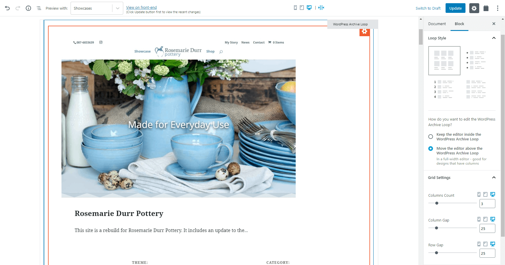
Just spotted. You used a screenshot image of a site (pottery) I built in one of the article images.
Nice one 😎✌️
Hehehe, good eye there! Thanks Stephen! 🙂
Great! Just when I need it.
Critical error installing the plugin through commercial section or through downloading and uploading through 🙁 been waiting for a long time for this update
Sounds good. Does this make the grid/responsive layouts aspect of using Bootstrap 4.0 redundant?
I am in the planning stages of upgrading from Bootstrap 3.0/Layouts/Views to Bootstrap 4.0/Blocks. Now it seems it may just be Blocks without the need for Bootstrap?
Hi, Gavin! Well, for new sites, yes, it does make Bootstrap redundant because you can build and layout everything using the new Toolset Grid block and the Grid options for your Views.
However, on existing sites, the already-built Views do not get automatically converted to the new grids. So if you have such Bootstrap-based elements on existing sites, you need to keep Bootstrap, or convert them all to the new grid system.
Thanks Dario… I am converting my site! And have to say, the new Grid system is awesome! I love it! 🙂
Got a critical error while uploading on a fresh WordPress website. Please look into the issue.
Thanks for the update and much-needed features though.
Thanks for reporting it. Do you use the WooCommerce Views plugin?
Yes, WooCommerce Views is currently installed on the website.
Thank you. I’ve just sent you an email with the link to the new zip and steps to follow. The official patch will be released tomorrow.
This update looks pretty great!
Couple issues I’ve found while testing…
1) On a couple of test pages where I had built grid views with blocks using the previous version of TS Blocks, I received an error when first editing those pages after updating TS Blocks to 1.1. The error was in a block and read “This block contains unexpected or invalid content. [ Resolve ] [ Convert to HTML ]”. This error had an option similar to “Attempt to recover this block” which worked. Just wanted to mention this in case anyone else is reporting this.
2) Right now I was trying to add a box shadow to a TS Container while in the tablet responsive mode. I enabled the box shadow option by clicking the toggle, but when attempting to change any of its settings the box shadow properties box would close and the toggle would revert to disabled. I was eventually able to make changes by first changing the responsive option from tablet to desktop. Once I was able to make changes, I set the horizontal shadow position to 0 but right afterwards I attempted to change the shadow opacity by sliding the opacity slider to the left but whenever I do this the horizontal shadow position changes itself to -4. When I attempt to fix the horizontal position by changing it back to 0, the shadow opacity resets itself darker!
There are definitely some glitches with the box shadow UI.
Hi, Peter! Thanks a lot for reporting this. For the first issue, are you still able to replicate this on your site? If so, I would kindly ask you to report this in our support forum, so our supporters can take a look and debug it and then forward the info to our developers. These errors usually happen in certain rare scenarios and are usually hard to replicate. However, access to a site where this can be replicated usually results in finding the root cause.
Regarding the second issue. I will report this first thing in the morning and we will test it, thanks for the detailed description. Yes, it could be a bug in the Box Shadow UI but our testers need to test, replicate, and confirm.
Thank you!
Hi Dario. Unfortunately I’ve already deleted the pages that produced errors. Luckily they were only test pages as I was waiting for this grid update before doing any real work with Toolset on new projects.
As for number 2, I no longer experienced the problems when building on a new/clean page. Previously I was building on a page that also contained a grid-view built with the previous version of TS Blocks so maybe there was some sort of conflict between the two versions being on the same page. To test Divi’s new Gutenberg block feature, I had also inserted a Divi module via blocks on the same page, so maybe it caused a problem too. So at the moment maybe don’t waste your time looking into the problems mentioned. If they occur again when building new pages/posts, I’ll be sure to let yas know.
Thanks for the quick follow-up, Peter! OK, that additional information helps a lot. I’ll do a quick test just to make sure it doesn’t happen with the usual workflow. 🙂
Error Details
=============
An error of type E_ERROR was caused in line 101 of the file
…..plugins/toolset-blocks/vendor/toolset/common-es/php/bootstrap.php. Error message: Uncaught Error: Call to undefined method ToolsetCommonEs\Rest\API::apply_script_data() in /….toolset-blocks/vendor/toolset/common-es/php/bootstrap.php:101
Stack trace:
#0 ….wp-includes/class-wp-hook.php(288): {closure}(”)
#1 ….wp-includes/class-wp-hook.php(312): WP_Hook->apply_filters(NULL, Array)
#2 ….wp-includes/plugin.php(478): WP_Hook->do_action(Array)
#3 ….wp-settings.php(523): do_action(‘init’)
#4 ….wp-config.php(110): require_once(‘/nas/content/li…’)
#5 ….wp-load.php(37): require_once(‘/nas/content/li…’)
#6 ….admin.php(34): require_once(‘/nas/content/li…’)
#7 ….plugins.php(10): require_once(‘/nas/content/li…’)
#8 {main}
thrown
Hello Suzan, thanks for reporting it. It has to do with the Toolset WooCommerce Views plugin. The patch is on the way. Will keep you posted.
Hi Agnes
Thank you for your quick rely!
Yes I use WooCommerce view. I would love to receive the patch
Best regards,
Thank you Suzan. A few minute ago I just sent you an email with the link to the new zip. The official patch will be released tomorrow. If you don’t want to wait, please use the one I sent.
The hotfix solved conflict with WooCommerce Views. Thank you for the quick response!
Nice. Will try this soon.
Problems holding the different values for Desktop, Tablet and Phone. I tried a Toolset Heading block and tried to do H2 for Desktop, H3 for Tablet and H4 for phone. It just kept changing the values I had entered in the different scenarios. Nice idea but it doesn’t stick? I tried a few other blocks too but same issue. (New Classic view and then Edit loop in Block editor).
Hi, I am not sure what’s happening and in order to take a better look, we’ll need to access or duplicate your site probably. Please report that in our support forum so we can help you fox.
Ok, now I see that you can’t change the H2 tags etc for device, but you can change the typography settings. That works! However, I notice that (on Single Field Block):
1. for Style (B, I, U) that if I set Desktop to U-underline, I can’t turn it off for Tablet or Mobile (if it is activated on Desktop).
2. can’t enter values for Font Weight?
3. Font Size allows changes by device but the Size eg. Small doesn’t change just the pixel size is changed (so it works but just doesn’t update the Textual size descriptor between devices)
Hi, Martin!
Actually, we put that limitation there on purpose. You see, for SEO purposes it would be a bad thing to have different HTML markups for different screen sizes. Trust me, you don’t want to do that. 🙂
When it scans sites, Google pays a lot of attention to the markup and sites should actually have the same HTML markup for all screen sizes. On the other hand, it’s perfectly fine and expected that dimensions and spacing of elements change for different screens.
So, it’s not a bug but something we didn’t allow because it would be bad for your sites.
Sounds great! Thanks. (still minor issues with the some of the typography settings as I mentioned but otherwise fantastic)
Dario –
In this case, I assume by “markup” you are referring to B|I|U only, and not to font size/weight? It wasn’t crystal clear to me.
Hi, Jeff! Actually, I meant the HTML markup. For example, if you have an H2 heading on a desktop and you want it to be smaller on mobile phones, it wouldn’t be a good idea to change it to an H3 heading. Instead, you leave it as H2 but use the Typography options to change its font size.
In other words, changes to font sizes, spacing, padding, colors, etc. are all perfectly fine as long as the HTML element stays the same.
How about the header and footer. Formerly Layout allowed us to create headers and footers so easily. Can we do that with Blocks?
Hi, Mike! Sorry for missing your comment. For the time being, you can design the content part of your websites using Toolset Blocks and the WordPress Block Editor. Everything else comes from the theme.
However, this is coming to WordPress and the core team is already working on this feature for the Block Editor. They call it “full site editing”, so if you google that, you will find many articles.
When this gets into core, you will be able to use blocks, including Toolset Blocks, to design every single part of your site.
Nice work Toolset team! I’m testing it right now.
One question: how do I set background position on the image block? I’d like to set it fixed.
Thanks, Roberto! I am not sure if I understood your question, you mean how to choose the alignment (floating) of the image when using the Toolset Image block? If so, please take a look at the following screenshot and it shows you where this setting is:
– https://www.screencast.com/t/CIMEjDApgMn5
Is this what you meant?
Hi Dario. In fact I meant the background-position css property. For example, what if I want to set the background to fixed?
No, no. I meant the background-position css property. I’d like to set the image to fixed.
Hi Roberto, this is Amit here, from the Toolset Support team, we’d be happy to help you with this CSS issue, but the best way to be able to do that is by reporting that in our support forum. Can you please do that?
Hi Amit,
It won’t be necessary anymore. I’ve found my way using the container block with an image background. Thanks
Perfect! The best approach is to use already built-in solutions inside Tooslet., and it seems like this is exactly what you have done. If you need anything else please let us know.
I have been using Toolset (“Types/Views”) for several sites for nearly five years. I now need to start a simple site project immediately and want to use Toolset Blocks for it. This new responsive Blocks release sounds great. But, I don’t understand if I need to download Blocks separately or download the latest Views. The Views version I currently have (3.0.2) does support Toolset Blocks.
So, it seems I do not need to worry about downloading Toolset Blocks – correct?
What Views version supports this latest Blocks 1.1.1 with responsive support?
Thanks,
Jeff
–––––––
You’re correct. Views and Blocks are basically the same plugin. They only expose different GUI by default, which you can change in Toolset->Settings. We created the Blocks version so that people who are building new sites or are new to Toolset don’t need to decide between two workflows and don’t see a complex user interface.
Ah, thanks Amir.
That makes great sense.
Blocks looks fantastic so far! Nice job. I will be starting a new project tonight using Blocks and I am intrigued and excited.
I built two sites last year, one with Elementor, and one with Brizy. I much preferred Brizy, but I was missing my Types & Views! And Toolset Forms is soooo much quicker to build a form with all the extras than either of those two others.
Really looking forward to Toolset Blocks.
Jeff Safire
–––––––––
I am starting a new very simple no-frills directory/membership site, and plan to use Toolset Blocks for the first time. My client doesn’t want any fancy stuff at all, for now. So, I am not sure what to use for a “light” theme. I was thinking of using the Toolset Starter Theme, but I see it is now gone. Should I just use the basic WP 2019/2020 theme and modify away, or is there something better (but simple) to start with?
Thanks,
Jeff
———————
We use GeneratePress, OceanWP and Astra for our reference sites:
https://toolset.com/documentation/recommended-themes/
They all work great with Toolset and allow you to control every part of every page.
All of the sites I’m designing at the moment don’t use the new Gutenberg blocks editor. I install the Classic Editor and haven’t made the switch yet. Am I better to continue using Views for these websites? I’m guessing that Blocks only works with the new editor running? PS – We will be updating our workflow to use Gutenberg blocks eventually so I’m very excited about your new Block plug-in.
Yes, if you’re using TinyMCE you can stay with Views and shortcodes. Give it a try. We were hesitant at first and now we’re super happy with the results.
For example, today we noticed that on a phone, we should remove the main image on the homepage. This way, the new videos that we added (today) will be move visible. With Toolset Blocks (and Gutenberg) this change took 30 seconds. Would have taken 1/2 day if we had to edit the site’s CSS file, QA and upload it manually.
Thanks Amir.
Hi, Joshua! Yes, Toolset Blocks works only inside the new WordPress Block Editor. On the sites where you are still using the Classic Editor it makes sense to stay with Views.
I suggest creating a test site and trying to build something nice using Toolset Blocks. I am sure you will be pleasantly surprised. And if you need any help, our supporters will be there for you! 🙂
Thanks for replying and confirming so quickly, Amir and Dario. Toolset Blocks sounds great so I’ll certainly be giving it a go on a test site. 🙂
I ‘m using this for a project and so far it’s working well. Just a suggestion. Please add conditions for a block to be displayed based on user role, user status, as well as mobile devices etc.
There is already a plugin that does this but I can’t keep on buying more and more plugins just to add a little extra feature like this: https://conditionalblocks.com/
Please consider adding these features in so we can conditionally display blocks.
Thanks!
Hello Farrel, this is Agnes from the Toolset team. Can you please elaborate on your use cases? We are open to add those features but there is a good chance that there are some other ways to achieve what you need using Toolset Access controls features, the hide on mobile feature etc.
So please, provide us 1-2 examples for each case:
1. user role
2. user status
3. mobile devices
Thank you.
Hi Agnes, thanks for responding. I want to be able to customize a page and show a specific block based on whether a user is logged in or not, or is in a certain role, or is using a mobile device.
I was hoping that some kind of integration was made with Toolset Access, but instead of the access being restricted by page it’s restricted by block.
Is this enough info? I don’t know all the use cases yet, but it’s basically being able to control content within a page.
Also, Please put back the normally editing of a View back into Blocks. It’s a HORRENDOUS experience trying to create/edit a View inside of a block on a page.
I created a View on one page and then there was errors. I then deleted that block. I then created a new page, assigned that View and tried to edit it and my block came back as having errors.
Inserting an already created View with Blocks is fine. But creating a View inside of a block on a page is a terrible experience and is unworkable.
If I have one view that I need to edit I now have to go into the page that contains it and I don’t want to have to do that. I want to be able to create a View like I used to be able to in a separate screen and do the editing from there.
It may make sense in theory to do it your way but it’s not practical.
I’m now literally unable to edit the View since all I get whenever I add the View to a block and try to edit it is this message:
This block has encountered an error and cannot be previewed.
That’s what I mean when I say it’s unworkable.
Hello – I’m Beda. I’m jumping into this conversation to help you best with the different points you mentioned.
1. About the feature requests as mentioned in the first comment https://toolset.com/2020/02/toolset-blocks-1-1-beautiful-responsive-design-made-easy/#comment-502635, we generally suggest submitting ideas and suggestions to https://toolset.com/home/contact-us/suggest-a-new-feature-for-toolset/. Having all requests gathered in one place allows our (busy developing Toolset 🙂 ) Developers and Product Managers to evaluate requests and implement them eventually in an organised and effective way.
We can discuss some parts of these requests first in a Support Ticket if you would like because as Agnes points out, some of the mentioned things are eventually already possible!
However, since the Blog comments here are too narrow to elaborate on these features, I suggest reaching out in the forum to our supporters so we can narrow down what is possible already and help you implement it.
Then, for the missing parts, a request should be submitted.
PS You can link back to this comment, in your Support Ticket(s), so you do not have to re-explain everything again to the Support Personnel.
2. Related to https://toolset.com/2020/02/toolset-blocks-1-1-beautiful-responsive-design-made-easy/#comment-503165, I am not sure to understand and would also like to check this with you in a (separate) ticket, if possible.
I understand you liked the legacy View Editors better than the Blocks version. In this case, you could either switch the editors used in Toolset > Settings > General or, you can simply not use Blocks.
However, in a ticket, we could check precisely what you have installed, what the settings are, and what the options are to use classic versus block edit experience.
I see you also refer to some unexpected behavior of the editing experience in this comment. Hence I suggest mentioning this in the ticket so that we can resolve it.
3. Related https://toolset.com/2020/02/toolset-blocks-1-1-beautiful-responsive-design-made-easy/#comment-503167, this again looks like an issue that we need to analyse in a ticket.
The error itself generally can be resolved by pulling the 3-dot menu on the right hand of the block and choosing “Attempt block recovery”.
If that fails, we need to eventually have a copy of the install so to let our Developers have a closer look and debug the problem as well.
I apologise I could not be of more direct help here in the blog comments, let’s proceed in the Techincal support forum!
Hi Beda,
Thanks for the info. I didn’t realize that I could switch back to the legacy Views editor when using Blocks. That’s exactly what I had asked for and I’m glad to know that I can. I have just switched it to use the legacy editor. Please don’t ever remove this option.
With regards to my View with errors. There was no option on the 3 dot menu to choose “Attempt block recovery”.
I have seen that option before on another site that didn’t use Views, but on my block it’s not there.
That being said, I don’t require any tech support as I’m just going to delete that View and start from scratch with the legacy editor.
I will post my feature suggestions as you had recommended I do.
Thanks again for replying.
Farrel
Great job as always. Even more reason to use Gutenberg now