More than grids – using Bootstrap 4 components on Toolset-based sites
Besides its responsive grid system, Bootstrap provides a whole range of ready-to-use components. After enabling Bootstrap 4 on your Toolset-powered site, you can easily use any of these components. In this tutorial, we go over some examples of usage.
Getting Started
Start by enabling Bootstrap 4 from the Bootstrap loading section, on the Toolset -> Settings page. This will load the full Bootstrap 4 library, allowing you to use all of the Bootstrap 4 Components.
Using Bootstrap 4 components is very easy. All you need to do is apply relevant Bootstrap 4 classes or copy-paste some code snippets from Bootstrap 4 components documentation.
Styling your site elements using Bootstrap classes
Let’s take a look at a few examples to see how easy it is.
Example #1 – Card
The card component is one of the most powerful elements introduced in Bootstrap 4.
It’s a flexible and extensible content container, built with little markup but very flexible in terms of customization. Built with flexbox, the card component offers easy alignment and mixes well with other Bootstrap components.
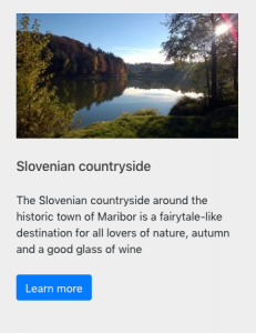
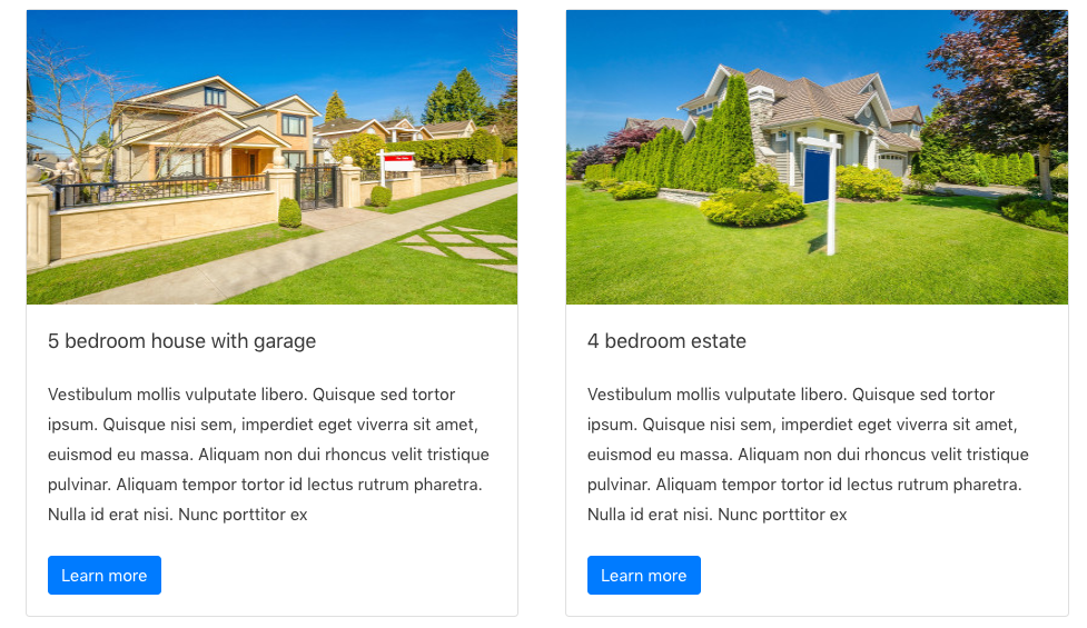
The following images display an example of the same content with and without the card classes applied.
| Content without card classes | Content with some card classes applied |
 |
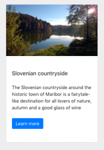 |
In our example, we add a container div with a card class and some classes to elements in our content, as displayed in the following image.
Here are the classes we use:
- card – acts as a container for elements inside it, built with flexbox
- card-img-top – makes the top corners rounded
- card-body – adds paddings
You can add an optional header and footer within a card.
This is how our code looks like in this example (click to expand).
 Bootstrap 4 Card Component Example
<div class="card">
	<img class="card-img-top" src="https://myexamplesite.com/wp-content/uploads/2019/07/image.png">
	<div class="card-body">
		<h5 class="card-title">Slovenian countryside</h5>
		<p class="card-text">The Slovenian countryside around the historic town of Maribor</p>
		<a href="#" class="btn btn-primary">Learn more</a>
	</div>
</div>
Cards support a wide variety of content, including images, text, list groups, links, and more.
Visit Bootstrap 4 documentation to see other applications of using cards.
Jump to the How to use Bootstrap classes in Toolset section to see how to apply the classes in Toolset Views.
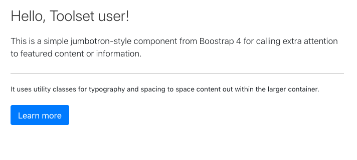
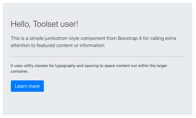
Example #2 – jumbotron
Jumbotron is a lightweight and flexible component to make your content stand out. It adds paddings to your container, grey background and makes the corners a bit rounded. Note that the paddings will adjust nicely on mobile devices as well.
The following images display an example of the same content with and without the jumbotron classes applied.
| Content without the “jumbotron” class | Content with the “jumbotron” class applied |
 |
 |
To use the jumbotron component you just need to add one container div with the jumbotron class. Jumbotron also mixes well with other Bootstrap classes.
This is how our code looks like in this example (click to expand).
Bootstrap 4 Jumbotron Component Example
<div class="jumbotron">
	<h1 class="display-4">Hello, Toolset user!</h1>
	<p class="lead">This is a simple jumbotron-style component from Bootstrap 4 for calling extra attention to featured content or information.</p>
	<hr class="my-4">
	<p>It uses utility classes for typography and spacing to space content out within the larger container</p>
	<p class="lead">
		<a class="btn btn-primary btn-lg" href="#" role="button">Learn more</a>
	</p>
</div>
How to use Bootstrap classes in Toolset
In Views created with shortcodes
Simply add Bootstrap classes and relevant HTML to your markup.
The following image displays how we added the necessary HTML markup and Bootstrap classes to our View’s template.
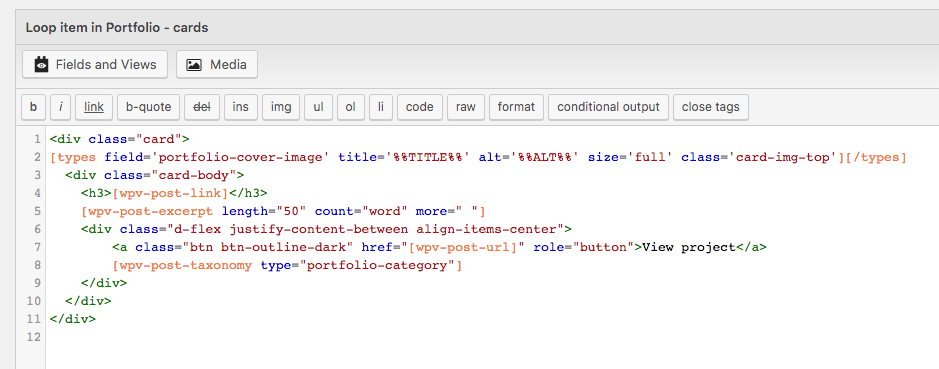
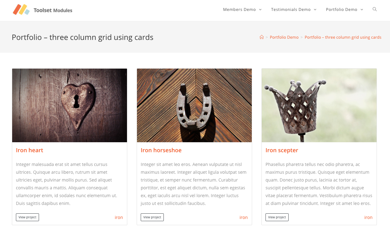
And here is how our View outputs posts using the Bootstrap card component.
Views and Templates using blocks
To add Bootstrap classes, use the HTML mode of the TB Fields and Views block. Switch to the HTML mode to alter the HTML markup and apply Bootstrap Classes as displayed in the following image.

The following image displays the front-end results for Toolset Fields and Text blocks with Bootstrap card classes applied.
Learn about growing your WordPress business
BTW, we recently launched a new podcast on WordPress marketing.
In the latest episode, we discuss how to make become one of the most popular blogs on WordPress.
Feedback?
Are you using Bootstrap components on your Toolset-powered sites?
Let us know how it goes! Please leave your comments below and we’ll get back to you.
I am actually just now trying to rebuild a website using Bootstrap 4 and Toolset, while following the new recommended future proof direction of not using Layouts anymore.
I am miserably failing to wrap my blocks into a .row container, not to speak I have to think how I would further wrap them into a .container-fluid wrapper.
Please explain me how I can use Bootstrap 4’s simple layout grid system using Toolset Blocks and Gutenberg?
Here you can see the code being generated by Gutenberg. How can I insert wrappers around the blocks on the shown level? I tried inserting an opening div and closing div in a separate block, but these get wrapped by yet another block wrappers that break the hierarchy tree.
The next iteration of the Toolset Blocks beta (remember, this is still in beta and so subject to possibly breaking changes, and so is not recommended for production sites yet) includes a container block where you can nest containers which you should be able to use for this. In the current version you are right, it’s not practicable. I’m not sure when the next update will be ready, it’s being actively worked on and should be available before too long.
In the meantime you could experiment with something like the Bootstrap Blocks plugin that provides a visual UI for creating layouts with the Bootstrap grid.
Nigel,
Are we likely to get another Beta to test in august ?
So far so good, no problems at all, a few styling limitations perhaps compared to say beaver builder, but I can now see situations where I won’t need BB at all.
Well done to the TS team.
cheers
The next version is a fairly major update that includes a new Views editor to create Views using blocks directly on the page and we are still ironing out some kinks before it is ready to make its first appearance on the catwalk. I don’t have a date, but I’d say given where we are we would certainly like to have it out before the end of the month, yes.
Nigel,
thanks for the estimate it’s very helpful to have an idea of what might happen.
btw it’s not clear to me how to send feedback on the beta versions.
BB for example has an ‘alpha feedback button’ when I launch it.
If I missed something please let me know….
thanks
Hi, Bryan! You can leave a comment on one of the two major post announcements for these betas:
– For Views: https://toolset.com/2019/06/visually-create-and-design-views-using-block-editor/
– For Toolset Blocks and templates: https://toolset.com/2019/04/toolset-blocks-visual-design-dynamic-content/
Other than that, you can always use our standard feature-suggest contact form and send us your thoughts:
– https://toolset.com/home/contact-us/suggest-a-new-feature-for-toolset/
We will read it carefully and consider all suggestions and feature requests!
Thank you!
Dario
The comments have closed on the older posts – but anyway I will wait for the next release of Views and Blocks before doing much more testing or commenting.
cheers