CRED 1.9, Views 2.4, Layouts 2.0, and Access 2.4 Released
This update for all major Toolset plugins brings great looking form elements on the front-end, including CRED forms, custom search controls, and pagination. It also includes an easy-to-use grid generator, a better workflow for using CRED editing forms, way to control the Bootstrap grid size in Layouts, and other useful improvements.
Great looking front-end elements out-of-the-box
Forms play a big role in your site’s look and feel. Toolset lets you build editing forms, as well as custom search forms.
In this release, we’re making sure that every form that you build with Toolset looks good “out of the box”. This means that building Toolset-based sites just became a lot faster. There’s no more need to spend time styling forms to make them look good. Just create the form and display it. Of course, you can style and tweak, but the default way forms look is already good.
To achieve this, we use the same HTML that Bootstrap uses in its forms. As we reviewed different options for form markup, we discovered that:
- Forms built with the Bootstrap HTML look perfect when Bootstrap CSS is also loaded
- Forms built with the Bootstrap HTML look great even when Bootstrap CSS is NOT loaded
This change in form markup only applies to new forms. Your sites will look the same after this update. All forms have your design and output the same HTML. New forms that you create will benefit from the improved HTML structure.
Nice output for CRED form elements
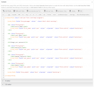
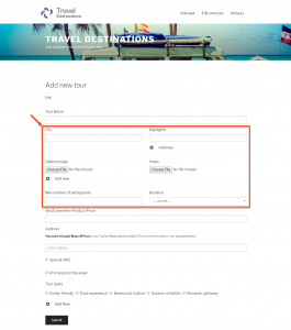
CRED 1.9 brings a new way of auto-generating the front-end forms. When auto-generated, all fields now include a new output attribute with the value “bootstrap”. This makes the fields render with Bootstrap-compatible HTML markup and CSS classes on the front-end.
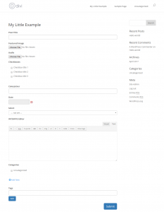
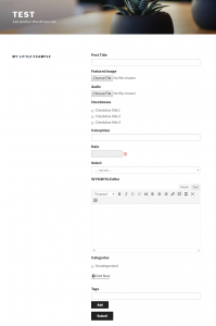
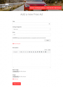
The following table displays several examples of CRED forms inside popular themes. We just created the forms, without needing to touch up any styling.
| Divi | Twenty Seventeen | Toolset Bootstrap |
 |
 |
 |
New settings for loading the CRED style sheets
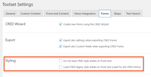
As mentioned above, the new way of rendering the forms is completely backward compatible. This includes changes to the Styling section of the CRED Settings.
As you can see from the image above, you have two options regarding styling:
- You can prevent CRED to load any of its styling for the front-end. This includes the new and the old stylesheets. This is why in this case, you must provide all the necessary styling for the forms.
- CRED can load the legacy styling for the forms so that all forms created with the CRED version prior to 1.9 keep looking good. This option is automatically selected for existing sites being updated to the version 1.9.
Nice output for Views front-end form elements
With the Views version 2.4 all front-end form elements, like custom search controls and pagination, default to using the Bootstrap markup and styling. This makes them look good from the go.
New output for custom search
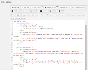
When you insert the custom search controls into the View, you can notice the nicer and cleaner markup.
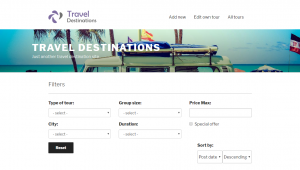
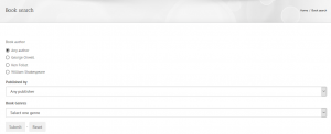
Of course, this is also reflected on the front-end. The following table displays few example of the new output for custom searches with different themes – without additional styling used.
| Twenty Seventeen | Avada | Toolset Starter |
 |
 |
 |
As we already mentioned the change to the output is completely backward compatible. All existing filter and other elements (Submit, Reset buttons) default to the Raw output mode. This mode outputs the elements just like before version 2.4.
On the other hand, all newly inserted elements default to Fully styled output, which is the improved output that comes with this new version of Views. If preferred, you can still select the Raw output mode manually, for any element you are inserting.
New output for Views pagination
Views pagination output is also improved with this release and is based on the Bootstrap markup as well.
When inserting the pagination controls, you can now choose from two modes of the output style:
- Fully styled output, which produces HTML markup that is fully compatible with Bootstrap, giving a nice looking style for the majority of the Bootstrap compatible themes.
- Raw output, which produces the output that Views used to have until now, by retaining full backward compatibility.
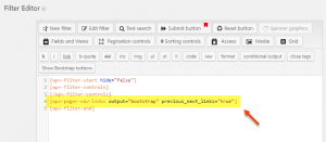
When the Fully styled output is used, pagination controls feature nice and clear markup around the fields.
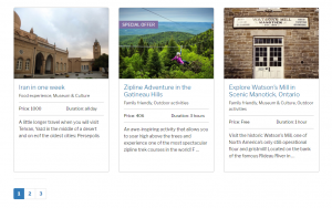
Naturally, this makes pagination look great on the front-end. The following table shows examples of pagination without any additional styling, used in different themes.
| Twenty Seventeen | Toolset Starter |
 |
 |
There are two ways of how Views makes the new pagination output compatible with the Bootstrap markup:
- By adding specific arguments to the shortcodes that produce the Bootstrap ready output using code.
- By directly injecting the proper HTML markup and CSS classes around the shortcodes.
In some cases, both of the above approaches are applied.
GUI changes for the Views custom search
In an effort to improve usability and user experience, as well as unify the control interface further, we added some changes to the controls for creating the custom searches.
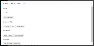
New GUI for adding and editing search filters
There is a new dialog for inserting the filters into custom searches. It has the same look, feel, and structure of the Fields and Views dialog,
After selecting the filter, a new dialog is shown where you can select all the relevant options for that filter.
Please note that this new interface is also now used when editing existing filters.
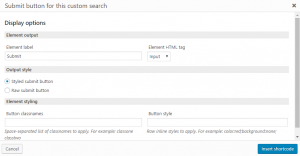
Submit, Reset, and Spinner buttons
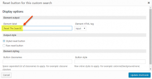
The dialogs for inserting the Submit, Reset, and Spinner controls into the form are also improved and use the same “look and feel” as all the other Views shortcodes.
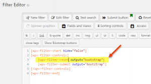
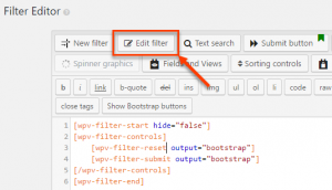
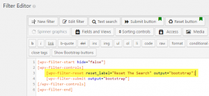
To improve your experience, you can now place the cursor over one of the resulting shortcodes and click the Edit filter button to edit those elements directly, using the interface instead of manual editing.
New grid generator in Toolset editors
When designing sites, there is almost always a need to display content in a grid, putting different parts into columns. Now, most of the editors found in Toolset plugins feature the Grid button that helps you to easily select the type of grid you need and produce the basic structure for you.
This is especially useful when designing lists of posts, front-end forms, and custom searches.
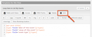
To insert a grid, click the Grid button and select one of the predesigned configurations.
| The Grid button in the Views editor | Bootstrap Grid dialog box |
 |
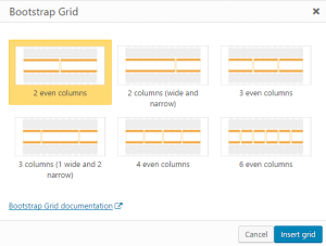 |
After clicking the Insert grid button, a basic HTML structure is inserted.
Example of a generated grid
<div class="row">

<div class="col-sm-6">Cell 1</div>

<div class="col-sm-6">Cell 2</div>

</div>
All you need to do is replace the default content (“Cell 1”, “Cell 2”, etc.) with your own.
Here is a short clip that shows how to add columns to a CRED form, with the new Grid tool.
Grids work with any theme
This feature is based on Bootstrap grids but it works with any theme, even those that do not use Bootstrap. If this is the case with your theme, the only thing you need to do is make sure that Toolset loads the necessary stylesheets on the site.
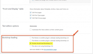
You can do this on the Toolset -> Settings page, in the Bootstrap loading section. There, you should select the Toolset should load Bootstrap 3.0 option.
New workflow for displaying CRED editing forms
During this development cycle, we found some glitches and usability issues with how CRED editing forms worked. This is why we made some important changes and improvements to how you display CRED editing forms on your site.
The biggest change is in how editing forms work. Previously, CRED would attempt to automatically replace the “post content” with a form. Now, we allow you to create separate templates for display and editing modes.
The new workflow for displaying CRED editing forms is:
- Create a separate template (either a Layout or a Content Template) that you want to use when editing the content (editing-mode template)
- The new “editing-mode” template will include the CRED editing form. If you want, you can include other things in it, but usually the CRED edit form is all you need.
- Insert links to editing mode where you need them. This can be in a single-item template to “edit this”, or in Views to edit items in the list.
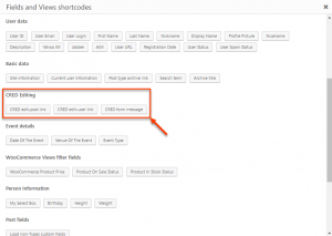
For this purpose, you will now find three new shortcodes in the Fields and Views dialogs. Two for inserting the links to CRED editing forms and one for displaying a CRED success message. The message shortcode needs to be added to the templates for displaying single posts.
| Editing links on a page listing contents | Edit links on a single post rendered with a template |
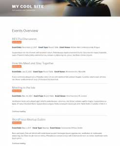 |
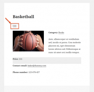 |
Visit our documentation page about displaying CRED editing forms for complete instructions.
New control over Bootstrap column size in Layouts
Until now, Layouts used the Bootstrap column size designed for small devices, by default. While it was possible to use certain workarounds when you preferred to use other column sizes, we realized this needs improvement.
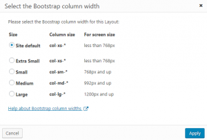
Now, you can easily select the default column size for the site, as well as for individual layouts. This makes it easy to optimize your designs for a specific screen size.
To change the site’s default column width, go to the Toolset -> Settings page and click the Layouts tab. There, scroll to the Default Bootstrap Column Width section and select the preferred column width for your site.
You can also set the column width for individual layouts using the new Column width button in the layout editor.
New way for indicating that Layouts cells have styling
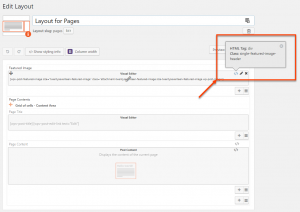
The easiest way to style layouts is to add classes and IDs to rows and cells and set the styling in the site’s CSS. Now, this is easier, as Layouts shows you which rows and cells have custom styling.
When you edit a layout, you will see new “<>” icons on elements that have custom classes, IDs or use an HTML tag other than DIV.
Custom error preview in Access
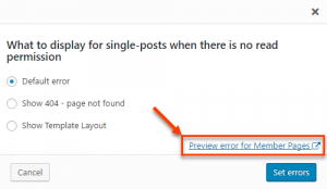
When a user role controlled by Access does not have the permissions to view certain content on the front-end, you can specify what is displayed: default error, a 404 page, or a layout (or Content Template if you are not using Layouts).
Until now, the only way to preview what is being displayed in this case, was to log into the site with an account with that user role and checking out the pages in question manually.
We found this to be a big user experience issue, so we added the link to preview errors right from your admin account. No need to login as another user and check things manually. Simply click the preview link and the error page is loaded in another tab/window.
Use template layouts to display errors for contents without read permission
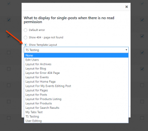
Until now, you only had the option to select a Content Template to display the errors for contents without read permission (for a given user role).
Now that using Toolset to build websites is based on Layouts (at least as the recommended workflow), it was only logical to allow you to select a template layout to display errors.
Fixes for the Divi and Avada theme integrations
This release also includes multiple fixes and improvements for Toolset integration with the Divi and Avada themes.
We fixed the following issues related to Divi:
- When a layout was used to render a page, Divi Page Builder was not working.
- Template layout was not being applied in non-integrated themes
- A wrong HTML markup was produced when Row had a custom CSS ID specified.
We fixed the following issues related to Avada:
- Added the Fields and Views button to Avada Fusion Builder.
- There were jQuery errors when trying to insert elements into CRED form contents using the Avada’s Fusion Builder button.
- There was a strange box being shown on the layout editing page when using Toolset Avada integration.
Additionally, we fixed an important compatibility issue for Divi and Avada theme integrations with Access. It was related to custom error pages, for assets that were using templates different than page.php one.
We are already working on a major update to the Divi and Avada integrations. These will allow you to conveniently use the theme for the header and footer and design with Toolset only pages that you want to display Toolset elements. We explained it in a recent blog post.
Bugfixes
Width of fields in CRED forms
There was a bug in the previous versions of CRED stylesheets, which prevented certain form fields from extending to full width of the container, by default. The fields in question were select, standard text field, and textarea.
We fixed this bug and now, by default, all form fields extend to the full width of their respective container.
| Bug – select field does not extend to full width | Fixed – select field extends to full width |
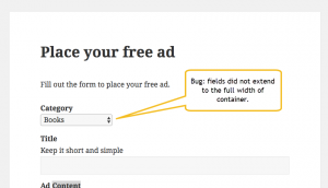 |
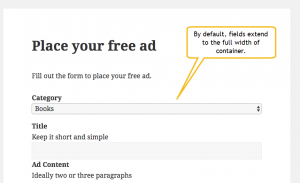 |
How to update
As always, the easiest way to update Toolset plugins is to have them registered and then get automatic updates inside the WordPress admin. You can always download and install manually.
Please remember that this is a major update, modifying almost every feature in Toolset. We took great care to ensure that existing sites don’t change. Still, we strongly recommend backing-up your site before updates.
Question? Ideas? Suggestions?
This release is a result of months of work from the entire Toolset team, including development, testing, design and documentation. We’re looking forward to your feedback. Leave your comments and we’ll get back to you.
Now you are talking. The improved, much improved GUI is what will make toolset components competitive in the age of elementor & divi like builders which are working hard to offer everything from forms to custom layouts/grids/etc. Great job, need to put in a lot more effort though to keep up with the competition!
Thanks a lot, great work! 2 questions:
1) When will those updates be visible in the WordPress plugin administration page?
2) There is a feature request to be able to use the media library in custom image fields in CRED forms. This feature request is mentioned repeatedly in your forums since 2014 (see here, here and here for some examples). Is this implemented in this release? If not is there an estimated delivery date?
The update will appear in the admin in a few hours. WordPress caches plugin update notifications twice a day.
I’ll read you forum threads and reply.
It is nice to hear that you have improved so many things but, there is something essential that you have not worked at all. Many of us have requested so many times, but nothing is done … the possibility of creating an image gallery easily. Also the possibility of adding several images into a post type at once without having to press the button “Add a new image” every time we want to upload an image. There are many support tickets, but nothing is done relating this.
It’s actually on our planning. Problem is, there so many important features, it’s hard to do all of them together.
Great work guys! We appreciate all of the improvements! Using ToolSet has revolutionized the way we build websites.
Keep it up!
P.S. We upgraded our ToolSet account because of your continued improvements and support.
Great to hear this! Thanks for the feedback.
Did this update change or break some things in the layouts API maybe? I’m trying to implement the Foundation framework as per the example setup. Yet I receive some errors in the backend. And the Bootstrap and Foundation grid classes end up getting mixed together (for example: col-lg-8columns col-lg-offset-4). Also on the settings page I don’t see an option to change to the Foundation framework.
We haven’t made any changes to Layouts API. In fact, Layouts, Views and CRED all use that API to register our own cells.
We created a small plugin that adjusts Layouts HTML to Foundation. We’ll push it on Github and paste a link for you to download. We’re using this to test Layouts with WP Forge theme.
Perhaps I should have said whether the update break some things in the Foundation example code, instead of the API. Though I’m not sure, could be something I’m doing wrong here.
Anyway looking forward to the plugin!
We put that glue plugin on Github:
https://github.com/OnTheGoSystems/layouts-foundation
Want to download from there and try?
Thanks, although the plugin doesn’t seem to work on my theme (Sage from roots.io). Is this specifically developed for WP Forge?
Dear Taiko,
I am Riccardo, Layouts developer, we developed the integration to provide a basic integration with any Foundation based theme, but initially for our experiments we bind it to WP-Forge.
I removed the lock and give it a spin with a Sage child theme build for Foundation which seems to render nicely.
Also more complex/advanced components like Tabs, Drop-downs and image responsiveness seem to work with Foundation in Sage.
For what I see there are still some specific adjustments to do for Sage, but since I don’t know too much recent versions of the framework I would like to get some of your feedback first, then I will gladly put my hands on it.
Thanks a lot for the collaboration, please download the updated Integration from GitHub and let me know how it goes.
Best regards,
Riccardo Strobbia
Thanks Riccardo, for the updated plugin.
However Layouts still outputs BS code in my case, along with the Foundation columns class, eg. .
I’m not sure which version of Sage you’ve tested on, but I’m using Sage 9 beta 3. In the Toolset settings > General > Bootstrap loading I have selected ‘This site is not using Bootstrap CSS’. Can you confirm this should work?
By the way I’m not the developer of Sage.
Cheers,
Richard
My code was filtered out, the example of the BS classes along with Foundation:
Sigh, let’s try again:
class="col-lg-8 columns"Can you bulk upload images yet?
Sorry, not yet. We know that it’s a popular feature, but we didn’t manage to implement it yet.
I read the whole article above, my styling for ‘custom search’ is in bad shape now. what is the suggestion for me since i only have 5 types to adjust the css?
1. recreate again to update new “bootstrap” style
2. leave as it is and re-adjust the css on child theme again ?
This update changed the way NEW Views are generated, but it didn’t change any existing View on your site. Are you sure that you didn’t make other changes to these sites?
i did not change a thing and i double plugin conflict , it was live staging site updated to latest version from wp-admin, the content was exported from localhost. before update the custom search was good in shape after update the input boxes sizes esp become larger, i guess its the update on starter theme ?
It’s hard to tell without seeing your site. Can you open a question in our technical support? If you can show us the site and explain what’s wrong, we’ll be able to help.