Skip Navigation

[Resolved] View output grid uneven

This thread is resolved. Here is a description of the problem and solution.

Problem: I have a View that displays results in a Bootstrap grid. When the text in one column on one row is very long, it can cause the column width to change. I want the column widths to be consistent from row to row.

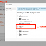
Solution: Re-run the Loop Wizard and choose a table design. This option provides a more consistent column width and vertical alignment.

Relevant Documentation:
https://toolset.com/documentation/user-guides/view-layouts-101/

This support ticket is created 6 years, 2 months ago. There's a good chance that you are reading advice that it now obsolete.

This is the technical support forum for Toolset - a suite of plugins for developing WordPress sites without writing PHP.

Everyone can read this forum, but only Toolset clients can post in it. Toolset support works 6 days per week, 19 hours per day.

Sun Mon Tue Wed Thu Fri Sat
8:00 – 12:00 8:00 – 12:00 8:00 – 12:00 8:00 – 12:00 8:00 – 12:00 - -
13:00 – 17:00 13:00 – 17:00 13:00 – 17:00 13:00 – 17:00 13:00 – 17:00 - -

Supporter timezone: America/New_York (GMT-04:00)

This topic contains 16 replies, has 3 voices.

Last updated by Ben 6 years, 2 months ago.

Assisted by: Christian Cox.

Author
Posts
#1091855

Ben
Screen Shot 2018-08-25 at 07.12.31.png
Screen Shot 2018-08-25 at 07.11.15.png

Can anyone see why this View is outputting the columns unevenly?

I can't figure out why this behaviour is occurring. As far as I can see, 1. should be level with Apples, and 2. Level with Cake.

Can anyone see why?

Thank you kindly in advance!

#1091904

Do you see the red highlighted "li" HTML element?
It indicates that previous HTML is broken, and in fact there (not) is a Missing "div" (closing) HTML tag (of the row class)

I think that should be the issue

#1091908

Ben

Nice spot Beda! Thank you for your help.

I have corrected that but the problem still persists.

Any more ideas?

#1091915

Yes, probably the HTML itself is not so compliant to use.

Rows in Lists are somewhat the opposite of what's thought for, which is to have rows containing many things (also lists).

A list is "self-ordering" so it needs no rows added.

In fact the HTML as you use not will break a List, you can try that in a native WordPress Editor and using Bootstrap CSS enqueued with a Theme instead of Toolset:

<ol>


          <li>
          <div class="row">
            <div class="col-sm-3">[wpv-post-title]</div>
            <div class="col.sm-3">[wpv-post-title]</div>
          </div>
          </li>
          <li>
          <div class="row">
            <div class="col-sm-3">[wpv-post-title]</div>
            <div class="col.sm-3">[wpv-post-title]</div>
          </div>
          </li>
          <li>
          <div class="row">
            <div class="col-sm-3">[wpv-post-title]</div>
            <div class="col.sm-3">[wpv-post-title]</div>
          </div>
          </li>

</ol>

It will break, as it is wrong, it cannot be that a list needs rows + columns.

I suggest to use Lists as proposed by the HTML and if you need to put elements inline (if the unexpectedly break line) you would have to address that with CSS and for example some spans:

<ol>


          <li>
            <span class="any">[wpv-post-title]</span><span class="any">[wpv-post-title]</span>
          </li>
          <li>
            <span class="any">[wpv-post-title]</span><span class="any">[wpv-post-title]</span>
          </li>
          <li>
            <span class="any">[wpv-post-title]</span><span class="any">[wpv-post-title]</span>

          </li>

</ol>

For list groups, where you use div inside a li, you would go with something like this:

<div class="col-md-3">
<ul class="list-group ticketView">
    <li class="list-group-item ticketView">
        <span class="badge pull-left">[wpv-post-title]</span>
        skd ef wef ejflksdf
    </li>
  	<li class="list-group-item ticketView">
        <span class="badge pull-left">[wpv-post-title]</span>
        skdjflk wefsdf
    </li>  
  	<li class="list-group-item ticketView">
        <span class="badge pull-left">[wpv-post-title]kf</span>
        skdjfl wefwq efksdf
    </li>
</ul>
</div>
<div class="col-md-3">
  <ul class="list-group">
      <li class="list-group-item row">
          <div class="col-md-3">[wpv-post-title] </div>
          <div class="col-md-9">[wpv-post-title] </div>
      </li>
      <li class="list-group-item row">
          <div class="col-md-3">[wpv-post-title] </div>
          <div class="col-md-9">[wpv-post-title] </div>
      </li>
      <li class="list-group-item row">
          <div class="col-md-3">[wpv-post-title] </div>
          <div class="col-md-9">[wpv-post-title] </div>
      </li>
      <li class="list-group-item row">
          <div class="col-md-3">[wpv-post-title] </div>
          <div class="col-md-9">[wpv-post-title] </div>
      </li>
  </ul>
</div>

Of course the above code samples are all assuming no toolset.
In Toolset, you would insert only one in the Loop, which then does the rest for you.

However the nested HTML as you use it right now will not work.

Reference:
hidden link
#1091919

Ben

Thank you again Beda!

The default output given by Lists is almost exactly what I need. But it shows the data like this;

1. Title, Custom Field
2. A Title That Is Definitely A Lot Longer, Custom Field

I need the output to display so each outputted field is justified together. Like this:

1. Title, Custom Field
2. A Title That Is Definitely A Lot Longer Custom Field

What is the best way to achieve this?

#1092350

Hi, is it possible for me to see this in a browser so I can understand the problem a bit better? Please provide a URL and login credentials if necessary in the private reply fields here.

#1092360

Ben
wish.png
current.png

I'm just playing about with the view at the moment.

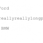
Consider the attached screenshot "Current".

It is of the output of a View for a CPT of 3 items. Each item has a Custom Field and attached data of Colour, City, Car Make.

When you look at the view, the "reallyreallyreallylongplacename" is longer than the other city names, therefore pushing the Car Makes out of alignment. What I am trying to achieve would mean that each Custom Field would be displayed in line with each other, such as something similar to the screenshot "Wish".

I hope all that make sense?

#1092373

Yes, this makes sense. I can't determine the current markup in your Loop by looking at the results, but it looks like you have separated the custom field shortcodes into separate HTML elements, as though you would display them in separate columns. You should combine them in one single HTML element if you do not want them to appear in columns:

<li class="list-group-item row">
  [types field="color"][/types] [types field="city"][/types] [types field="model"][/types]
</li>

Not like this, with column classes applied to multiple elements:

<li class="list-group-item row">
  <div class="col-sm-9">[types field="color"][/types] [types field="city"][/types]</div>
  <div class="col-sm-3"> [types field="model"][/types]</div>
</li>
#1092379

Ben

Thanks for that Christian, however that gives the problem I had discussed above with Beda.

The Loop I am using is just the default "Ordered List", that was the loop that provided the output in the screenshot. It's perfect apart from the lack of alignments to each field.

#1092406
Screen Shot 2018-08-26 at 3.56.49 PM.png

I don't see any reason why it would be behaving this way, but that's because I'm only able to see a picture of the results with no context. If the site is not online somewhere, you can show me the browser inspector with the different elements in each result highlighted so I can see the different styles that are applied to each element. That may help. Otherwise, I can't see the context of the problem. Here is an example showing the results of a View in the browser, with one element highlighted in the browser inspector. The CSS styles that are applied to this element are summarized in the right column of the inspector. This is the type of information I need to know to be able to diagnose the problem. I need to see this information for each element in a single result of the View, and if you're not proficient in CSS and HTML it's probably not going to be practical to ask you for this information. It's best for me to see it online somewhere so I can troubleshoot.

#1093631

Ben
2.png
1.png

Hello Christian. I really appreciate your ongoing help.

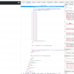
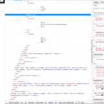
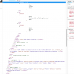
I've uploaded a couple of screenshots. Do they shed light on it in any way?

If not, I will try and replicate the problem online for you to have a look at.

#1093905

The numbers seem to be aligned with the text in these screenshots. Is that because the screen width is narrower with the browser inspector open? If you resize the browser inspector, at what point does the numbering become misaligned, can you show me that?

#1094950

Ben

The numbers aren't misaligned even when the browser is at 100%. It was the alignment of the columns being the issue as in the screenshots in reply 1092360.

#1094976
Screen Shot 2018-08-29 at 9.53.55 AM.png

Oh I misunderstood your request. I thought you did not want columns. I think your best option is to re-run the Loop Wizard, and create the loop using the "table" format. Columns will be sized independently per row in a "list" format, and the alignments will not work as you have requested. Tables, however, are meant for this type of vertical column alignment, which can be dynamic based on the length of text in each cell.

#1095091

Ben

Thank you Christian! That has worked perfectly.

Is there a way to edit the style of the table at all? Make the lines darker or lighter?