Skip Navigation

[Resolved] View on mobile is small. Conflict with Avada ?

This thread is resolved. Here is a description of the problem and solution.

Problem: The columns in my Avada theme Layouts grid are not responsive. I would like them to be full-width at low resolutions.

Solution: Apply any desired Bootstrap grid classes to each cell using the Layouts CSS / JS input area.

Relevant Documentation: http://getbootstrap.com/css/#grid

This support ticket is created 7 years, 6 months ago. There's a good chance that you are reading advice that it now obsolete.

This is the technical support forum for Toolset - a suite of plugins for developing WordPress sites without writing PHP.

Everyone can read this forum, but only Toolset clients can post in it. Toolset support works 6 days per week, 19 hours per day.

Sun Mon Tue Wed Thu Fri Sat
8:00 – 12:00 8:00 – 12:00 8:00 – 12:00 8:00 – 12:00 8:00 – 12:00 - -
13:00 – 17:00 13:00 – 17:00 13:00 – 17:00 13:00 – 17:00 13:00 – 17:00 - -

Supporter timezone: America/New_York (GMT-04:00)

This topic contains 4 replies, has 2 voices.

Last updated by Mojo 7 years, 6 months ago.

Assisted by: Christian Cox.
Author
Posts
#504044
bootstrap-conflict.JPG

Hi,

I'm using Avada 5 together with Layouts and content templates.

Everything works great on desktop. The only problem is on mobile, the rows are STILL at bootstrap sepcified widths instead of full width (12cols). So everything on mobile is compressed smaller instead of spanning mobile's fullwidth.

Please see screenshot for example.

It doesn't matter if the the rows on the layout are set to "Row same as container width" or "Avada Content Row". The ROW will be fullwidth, but anything with bootstrap markups will be small on mobile.

Please advise.

Regards

#504304
Screen Shot 2017-03-22 at 10.22.25 AM.png

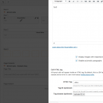
Hi, Layouts isn't smart enough to automatically know how you would like your cells to behave at different screen sizes. Instead, we give you the ability to override the widths of each cell by using additional Bootstrap CSS classes. For example, you can apply the 'col-sm-12' class to any .col-sm-9 cell, forcing it to expand to full-row width on small devices.

Please find a screenshot attached. Let me know if I can help clarify this further.

#505292

Thank you for your response and assistance.

Is it also possible to adjust how the columns are for views ?
Eg.

Through the loop wizard I have created a bootstrap grid with 3 columns. (col-sm-4)
I'd like it to resize to 2 columns on the ipad and then to 1 on mobile.

How should I go about tagging the classes on the loop ? Do I just add more classes alongside col-sm-4 ?

Thank you again

#505432

Yes, exactly - you can completely customize the classes applied to each element in a Bootstrap grid by modifying the markup in the Loop Output Editor. You can add or remove classes however you would like, to make your design work in each resolution class.

The class definitions are explained in detail over in the Bootstrap documentation:
hidden link

#505536

Got it. Thank you for your assistance !

This ticket is now closed. If you're a Toolset client and need related help, please open a new support ticket.