Hi there,...
I created a CPT for terms. And I also created 4 views to show the results in 4 different tabs of an Elementor Tab widget. All is working fine. on tablet and desktop.
But for the mobile Version I decided to create a different Tab Widget to serve the mobile design needs. Only visible on mobiles.
My idea was showing a different Design on mobiles without using media Queries. Just using two different Elementor Tabs widgets on Desktop and mobiles.
Strangly the tab widget is working fine on mobile, but the different shortcodes of its views is not showing the output css of my different views.
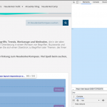
please have a closer look on the "U-Z" Tab on Mobil Version (hidden link) ... There is no output of my css of the different views. It should have classes with "mo-" in the beginning, but it only shows the classes of the first desktop Tab with its views.
Can you help?
Jörg
Strangly the tab widget is working fine on mobile, but the different shortcodes of its views is not showing the output css of my different views.
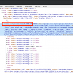
Hi, if you inspect the page source you can see that the same Views are displayed for each section, regardless of screen resolution. For instance, the A-F group is View ID 5569 in both mobile and desktop screen sizes. Is that expected, or did you create separate Views to display the A-F group, one for mobile and another for desktop? See the attachment here for more information.
Hi Chris,...
Thx for xyour reply
I only changed the "U-Z" Tab on the mobile version for testing first... but not having any effect... I stopped moving on...
In this tab I use classes only beginning with mo-.... for mobil classes. in example: Class "h2begriff" is now "mo-h2begriff",
but if I check the quell code all the mo- versions do not appear
I don't have any idea why? Do you?
Jörg
I only changed the "U-Z" Tab on the mobile version for testing first... but not having any effect... I stopped moving on...
How did you change this? Show me a screenshot please. The same View appears in both desktop and mobile versions.
In this tab I use classes only beginning with mo-.... for mobil classes. in example: Class "h2begriff" is now "mo-h2begriff",
Where do you use CSS classes? Is there a text input area, or are you applying CSS classes to Elementor elements in the design? Please show me more information in a screenshot.
Hi Chris,
I did in in a seperate View called "schleifen-objekt-in-fachbegriffe-view-mobil-liste-u-z" in the loop editor,... here in the "template for this view". I use different css classes with "mo-" at the beginning...
Jörg
All the tabs in mobile version only have a grey in the background which comes from Elementor... that works... but not the outputt of the css classes of the toolset view in "U-Z".
Jörg
Is it possible for me to log in to your wp-admin area and see how these tabs are set up? I don't think the mobile View is shown anywhere on the front-end of the site, no matter if the resolution is mobile or desktop. The desktop View tab is shown on all resolutions. The grey background may just be the desktop tab resized down to a smaller size, but it's difficult for me to say without checking the Elementor builder design. Please share login credentials in the private reply fields here.
I edited the mobile tab U-Z and changed the View shortcode to display the View "fachbegriffe-view-mobil-liste-u-z". It was previously set to display the View "fachbegriffe-view-kurz-liste-u-z". You can see the new shortcode here if you scroll down and click the U-Z tab, then click the results: hidden link
It seems to be working for me now at mobile resolutions, I can see the mobile View displaying in the U-Z tab. Can you confirm?
!!!
totally speachless, sorry.
As we say in Germany: "tomatoes on my eyes".
Thank you very much Chris,... your are the best, because you are a very seldom supporter, who really wants to solve problems.
I am still your biggest fan!!!
All the best from Germany
Jörg
Ps: You can close this ticket
I'm glad it's working now!


