Hi,
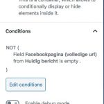
I have two conditional displayed images of social media icons that i want to display side-by-side. I have solved this with a grid but the downside is that on mobile te grid columns are not displayed next to each other, but underneath each other. Can ik positions two conditional images side-by-side with a different method.
Same goes for two buttons side-by-side.
Hans
Shane Supporter
Languages:
English (English )
Timezone:
America/Jamaica (GMT-05:00)
Hi Hans,
Thank you for getting in touch.
The reason why they reflow beneath each other is because of the responsive css that is being applied on Mobile for the grid.
Is it that you don't want this to happen on mobile and keep the images side by side ?
Please clarify for me.
Thanks,
Hi Shane,
Yes correct, but only in 1 location not on the entire website.
A solutions without grid is also fine along as i get the conditional images side-by-side.
Hans
Shane Supporter
Languages:
English (English )
Timezone:
America/Jamaica (GMT-05:00)
Hi Hans,
Can you sent me a screenshot of how you are adding the images to the page. In order to do this you will need to add the elements manually with their shortcodes.
Once I get a screenshot of how you've set this up on the backend we can take it from there.
Thanks,
Shane Supporter
Languages:
English (English )
Timezone:
America/Jamaica (GMT-05:00)
Hi Hans,
Thank you for the screenshots.
Ok so since you are wrapping the conditionals around each element this will make things a little more tricky how it should still be possible.
Would you mind allowing me to have admin access to the website so that I can help with this better.
The private fields will be enabled for your next response. Also please let me know the template that I should be looking at.
Thanks,
Shane Supporter
Languages:
English (English )
Timezone:
America/Jamaica (GMT-05:00)
Hi Hans,
Thank you for the credentials.
I was able to successfully log in however i'm not seeing any link to the page that you want me to make the changes.
Can you send me a link to this page?
Thanks,
Sure Shane,
For example, this page: hidden link
The used template is highlighted in the attached screenshot.
Hans
Shane Supporter
Languages:
English (English )
Timezone:
America/Jamaica (GMT-05:00)
Hi Hans,
Sorry for the delay on this but this issue should now be resolved.
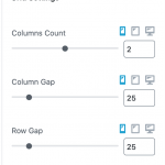
All I did was to set the columns to be a 2 column grid for mobile using the grid settings for the block. See Screenshot.
Please let me know if this helps.
Hi Shane,
No not what i had in mind, there is a big gap between the two logo's.
Hans
Shane Supporter
Languages:
English (English )
Timezone:
America/Jamaica (GMT-05:00)
Hi Hans,
If you have a look at my screenshot you will see that there is a setting for the column gap.
You can use this setting to adjust the gap between the columns for mobile.
Thanks,
My issue is resolved now. Thank you Shane,
I did not fully onderstand the solution, my bad.
Hans


