Skip Navigation

[Resolved] How to display images with text by the side

This thread is resolved. Here is a description of the problem and solution.

Problem:
Client is outputting images with related text and wants the image on the left, and the text on the right.

Solution:
This is commonly known as the media object layout and can be achieved in a number of ways.

In this example this is the markup format used in the template linked to the Loop Output:

<div class="media-block">
  <div class="media-block-left">
    [wpv-post-featured-image]
  </div>
  <div class="media-block-right">
    <h3>[wpv-post-link]</h3>
    [wpv-post-excerpt]
  </div>
</div>

And this is the custom CSS to achieve the layout:

.media-block {
  display: flex;
  align-items: flex-start;
}
 
.media-block-left {
  margin: 10px 10px 0 0;
}
 
.media-block-right {
  flex: 1;
}

Relevant Documentation:
@https://css-tricks.com/media-object-bunch-ways/

This support ticket is created 6 years, 3 months ago. There's a good chance that you are reading advice that it now obsolete.

This is the technical support forum for Toolset - a suite of plugins for developing WordPress sites without writing PHP.

Everyone can read this forum, but only Toolset clients can post in it. Toolset support works 6 days per week, 19 hours per day.

Sun Mon Tue Wed Thu Fri Sat
- 7:00 – 14:00 7:00 – 14:00 7:00 – 14:00 7:00 – 14:00 7:00 – 14:00 -
- 15:00 – 16:00 15:00 – 16:00 15:00 – 16:00 15:00 – 16:00 15:00 – 16:00 -

Supporter timezone: Europe/London (GMT+00:00)

This topic contains 2 replies, has 2 voices.

Last updated by dmfzw 6 years, 3 months ago.

Assisted by: Nigel.
Author
Posts
#1077678

I am trying to:

Float post title text to the right of their respective featured post images.

Link to a page where the issue can be seen:

Site is development mode (please see screenshot)

I expected to see:

The titles wrapped nicely to the right of each image.

Instead, I got:

The first post title text sits at the top of the cell with the first post image beneath it (instead of next to it). Wrapped around the first post image is the second (and not first) title image. This weird alignment repeats down the page with the 3rd, 4th, 5th, etc images and post titles. Please see visual attachment.

Here's the css used:

===
<h3>[wpv-post-link]</h3>
[wpv-post-body view_template="None"]
<div class="image">[wpv-post-featured-image size="custom" width="150" height="90"]</div>
===

Any ideas how to fix this?

Thanks

#1078342

Nigel
Supporter

Languages: English (English ) Spanish (Español )

Timezone: Europe/London (GMT+00:00)

Screen Shot 2018-08-09 at 08.20.17.png

Hi there

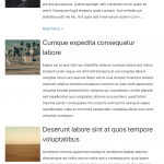
You didn't include the screenshot, and there isn't any CSS either, but I understand that you want to display a list of posts in a media-object style, as shown in my screenshot.

For that this is the markup format I used in the template linked to the Loop Output:

<div class="media-block">
  <div class="media-block-left">
	[wpv-post-featured-image]
  </div>
  <div class="media-block-right">
    <h3>[wpv-post-link]</h3>
    [wpv-post-excerpt]
  </div>
</div>

And I added the following custom CSS to achieve the layout:

.media-block {
  display: flex;
  align-items: flex-start;
}

.media-block-left {
  margin: 10px 10px 0 0;
}

.media-block-right {
  flex: 1;
}

There are quite a few ways you can achieve such a layout, as described here: hidden link

#1078809

Perfect, thanks Nigel.