I am trying to: Create a custom taxonomy archive template but the pages are not rendering properly.
Link to a page where the issue can be seen:
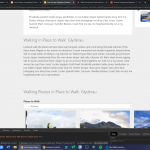
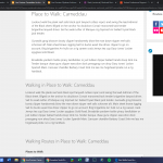
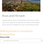
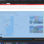
hidden link - This is totally not rendering properly - you can see Walking Routes in Carneddau rendering with the archive rendering to the right. Featured image not appearing at all.
The header not rendering properly on this one: hidden link - but as there is some archive content - it appears ok - though the H2 heading is cenrtred when it should be left justfied.
hidden link - this seems to be rendering better than the others - but the taxonomy description doesn't show the paragraphs as it should and the H2 heading is centred rather than left justfied as it should be.
I've found that if i swap themes to GeneratePress from Astra (both meant to be compatible with Toolset) then i find that the content seems to be rendering outside the regular page area for some reason - this might be what's causing the issue with Astra Theme.
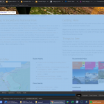
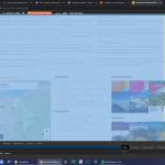
See Screenshot 63 - standard archive - showing a white background on the items, while Screenshot 62 shows the toolset content rendering without the proper background formatting.
You can also see on Screenshot 64 that one of the views spills over to the right (though this could well be custom CSS that I've used - but I don't think I've done anything that should do this)
The taxonomy we're looking at specifically is the place-to-walk - but I've had issues in the past when trying to create a table based archive for one of my CPTs - with the content totally not rendering properly (i had to embed a custom view inside the taxonomy description multiple times to get it to work)
Can you please take a look at this for us?
Thanks.
Hello and thank you for contacting the Toolset support.
To better understand these issues, I'll need to take a closer look at the archive template. Your next reply will be private to let you share credentials safely. ** Make a database backup before sharing credentials. **
From what I gathered so far, the featured image is rendered within an Astra Custom Layout(where to walk #97528), it pulls the featured image from a Toolset field. For "snowdonia-national-park" the image is 1800 pixel wide and fits the whole with of the page. For "glyderau" the image is only 1200px wide.
The alignment for the H2 title is to the left. But it appears in the center for "carneddau" and "glyderau" because they do not have children, which makes the view to display children empty and broke the styles for the layout(#97481) bootstrap columns. This can be fixed by adding the following CSS code to your website(Customizer).
.container-fluid {
    width: 100%;
}
I added the code to the archive cell view in the layout and it fixed it.
I do not see why the featured image is not rendered for "carneddau". Can you purge cache, remove the featured image and save, then add it back and save?
About the title background, I am not sure what do you mean. Your screenshots are from the WordPress customizer can you take a screenshot from the frontend?
Hi Jamal,
Thanks for that - The title is now centred.
I've worked out what's causing the lack of featured image as well as the non-centred images.
The logic is as follows:
Non-centred featured image seems to be related to the 'child taxonomy' being empty? Where there are items in the Child Taxonomy, the featured image appears and is centred.. When there are no Child Taxonomies, the featured image is no longer centred. When there are no Child Taxonomies or Child Posts - the featured image doesn't appear at all.
I've added posts to the Carneddau Taxonomy and you can see the image now appears.
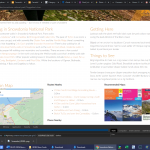
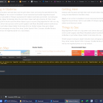
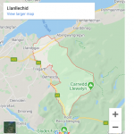
I've added a few more screenshots below that show some of the elements on mobile are rendering to the edge of the screen, and the desktop screenshot appears to show these elements rendering outside what i think is the proper page area? There's also a javascript error on these taxonomy archives which I can't seem to find on any other archive, post or page on the site.
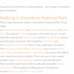
Another clue to the rendering not being quite right is the Snowdonia screenshot - you can see the category description to the left is rendering the text as a single block - this is 3 paragraphs.. The Visual Cell to the right is OK.. I've added these extra sections so the taxonomy looks near to what the final product will be and it's better to spot any issues now than later.
RE - About the title background, I am not sure what do you mean. Your screenshots are from the WordPress customizer can you take a screenshot from the frontend?
These screenshots were from an alternative theme that i tried out in order to troubleshoot the issue and not something i can recreate on the front end as it's an active site.
I think they suggested that some of the toolset content was rendering outside where it should be rendering, something that the new screenshot below also suggest?
If you need any clarification on the above - please let me know.
Thanks again
Dave.
Hi Dave, thank you for your feedback.
I compared two archives to understand why the image is not full width when the taxonomy term has no children. It seems that the style that makes the full image width is part of the Content Template: "loop-item-in-sub-taxa". When there are no children, this content template is never rendered and its styles are never added. Check this screenshot hidden link
I added the following code to the WordPress archive view cell and it seems working.
The description seems to not contain any paragraph tags, check this screenshot hidden link it only contains one empty paragraph at the end. It seems that the description did not go through the default filters to wrap its paragraphs inside <p> tags. This will probably need more analysis. I created another ticket to continue on it.
For the other issues, I could not understand from the screenshots. Can you comment on it a bit? And specify each time which screenshot?
HI Jamal,
The main issue is that the page isn't rendering as it should. On the mobile screenshots you can see that elements reach the edge of the screen and have no padding as they should. Some elements on the archive do render properly in this regard.
I've taken a screenshot with view elements - you can see the text and some graphic elements render outside the site-main class.
I've created a similar layout that's been inserted into another archive via a hook in Astra Theme and the second screenshot shows that - with all the content rendering within the site-main class.
Example using the layouts for the Archive - hidden link
example using a layout inserted via a hook in Astra Theme - hidden link
And finally - just so I'm clear on this - on the last link I've got a paginated view showing child categories - but while it shows correct post counts, page 2 doesn't bring the proper results and brings all results back? I'm sure you mentioned in a previous ticket that I'm not able to have a paginated view like this on an archive page?
In fact, we have a known issue when we can't use AJAX on an archive page. Pagination and sliders are both built around AJAX, so they can't be used on an archive page yet.
https://toolset.com/errata/ajax-pagination-broken-on-taxonomy-view-added-to-taxonomy-archive/
My apologies, but I still don't understand what are the issues of design on desktop or mobile from your screenshots. Can you elaborate more?
In light of some of the difficulties in using the archive page to do what I needed to do, I decided that I needed to use a custom post type instead.
This has worked perfectly to get the design I needed, with two paginated views on the same page.
Here's the link FYI - hidden link
The workaround meant that the CPT needs to share the same slug after the /custom-post-name/ slug meaning I could simply redirect all the regular archive links (breadcrumbs, etc) to the new custom post type. I also have to ensure the CPT is included in the corresponding taxonomy in order that I can display that taxonomies posts on the CPT.
While there's some more work involved, I've found a couple of very specific advantages to my particular setup where I can now share custom fields between the new CPT and the posts within that taxonomy by adding a one-to-many relationship (not possible to do with a taxonomy to post as the relationship is many-many ) so that i can then pull this information through in a view without ambiguity, meaning that it might actually be a more powerful and efficient solution long term!
