Hi there,
I have, on a few pages, filters.
See this page: fabulouslakedistrict.flywheelsites.com/lake-district-cottages/
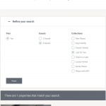
On desktop it has a filter to the left. On iPad it has the same filter replicated using columns in a accordion.
This works great on desktop however in iPad, when you select a different category, the filter is working because the properties change and the number shown changes, however the 'indicator' never changes from it's original setting.
Is there something that can be done to remedy this please?
Many thanks, Pete
After running a few more tests, I'm seeing similar issues on desktop as well as tablet view whenever multiple sets of filters are included and the View is set to "Only show available options for each input" with AJAX updates. Let me ask my 2nd tier support team for a bit more information on this. I'm not sure if this configuration with multiple sets of search filters is fully supported or not, since it's a fairly non-standard implementation. In the meantime, I suppose turning off the "Only show available options for each input" setting and limiting AJAX updates may be a temporary workaround. I'll let you know what I find out and we can go from there.
Hi Christian,
I'm looking at a work around too. The whole point of these pages was the filter was visible and more interactive than a search bar.
On desktop it looks just as we hoped however on iPad we need two columns or properties so there's no room for a side bar and visible filter, this why we hide it as an option.
I can see why there may be a conflict and issues now the issue has been highlighted.
If you come up with something please let me know.
Many thanks.
On desktop it looks just as we hoped however on iPad we need two columns or properties so there's no room for a side bar and visible filter, this why we hide it as an option.
The ideal solution here is to only use one set of filters, and to use responsive design features to display them differently based on the screen resolution. At larger resolutions, you could display them in a 1/3 width column. At smaller resolutions, they could be a full-width column. That would work around any issues caused by 2 sets of filters. I'm not an Elementor expert so I'm not sure how that would be set up, but with Bootstrap you would use responsive grid classes.
https://elementor.com/blog/introducing-mobile-editing/
