I am trying to: Turn checkboxes into buttons
I expected to see: checkbox label to turn red when checked
Instead, I got: no effect when checked
Hello,
I would like to hide the default browser checkboxes and style the Views checkboxes to look like buttons. I used the following ticket as reference https://toolset.com/forums/topic/checkboxes-as-separate-buttons/. Unfortunately the pseudo class :checked is not working. Can you take a look at the following css and tell me if I'm doing something wrong?
.checkbox {
background: #999 none repeat scroll 0 0;
display: inline-block !important;
padding: 10px 20px;
}
.checkbox:hover {
background: #fff none repeat scroll 0 0;
display: inline-block !important;
padding: 10px 20px;
}
.checkbox:active {
background: red none repeat scroll 0 0;
display: inline-block !important;
padding: 10px 20px;
}
.checkbox:checked {
background: red none repeat scroll 0 0;
display: inline-block !important;
padding: 10px 20px;
}
.checkbox input {
display:none !important;
}
.checkbox label {
padding-left:0 !important;
}
Thanks,
Brent
Hi, can you be more specific than "not working"? I cannot see your site so I have no idea what is happening. Try this:
.checkbox:checked {
margin-left: 100px !important;
display: block !important;
}
Is the checkbox displayed with a large left margin now? If so, then you know the selector is working, and the problem is either your styles being overridden or your styles being invalid. For example, I do not think background color on a checkbox input will accomplish anything.
Hi Christian,
My goal is to removed/hide the checkbox element and have the checkbox's label act like a button. I do not want to see a checkbox. The label would act like a button with hover, active and checked states.
What I mean by "not working" is the pseudo-class :checked does not have any effect no matter how I configure the selectors. What's odd to me is all of the css I included in my original message works well (including pseudo-casses :active, :hover), with the exception of :checked.
Also, the css you provided did not work. Again, it's just the :checked portion that does not have any effect.
It seems that other toolset users have had this issue with :checked, but the tickets do not have a solution even through they're marked as "resolved."
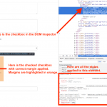
I can help troubleshoot this if I can see the site in my browser, where I can look at the inspector and see what styles are overriding the ones we discussed. Can you provide a URL and login credentials, if necessary? If not, then open your browser's inspector and inspect the checked checkbox in the DOM. Take a screenshot showing all the styles applied to the checkbox element. I am attaching an example inspector in Chrome. As you can see, the checked pseudo selector is utilized and respected. If that is not happening on your site, there is something else interfering. Please let me know what you find.
I don't understand what you're trying to accomplish. Are you trying to style the div wrapper, or the checkbox input? The CSS class "checkbox" is applied to the div wrapper, not the checkbox input. The pseudo-selector :checked will never apply to the div wrapper, so your selector .checked:checked is never going to work.
Here's how you can modify the left margin of the checkbox input:
.checkbox input[type="checkbox"]:checked {
margin-left: 100px !important;
display: block !important;
}
However, this other code you have put in place already hides the checkbox inputs. Your importants are conflicting...so I'm confused.
.checkbox input {
display:none !important;
}
I want to remove/hide the checkbox input. I don't want to see a checkbox.
Is it possible style the checkbox's label to look/act like a button with hover, active and checked states?
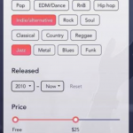
As reference, see Genres buttons in attached image.
I want to remove/hide the checkbox input. I don't want to see a checkbox.
Remove all the pseudo selectors, since those only apply to checkboxes. In your example, this code will hide the browser checkbox completely, provided you do not override it elsewhere:
.checkbox input {
 display:none !important;
}
Is it possible style the checkbox's label to look/act like a button with hover, active and checked states?
Toolset does not offer such a form control, only standard browser checkboxes, radio buttons, text inputs, and select fields. It may be possible with a significant amount of custom JavaScript and CSS, but this level of customization is ultimately beyond the scope of what we provide here in the forums, per our support policy: https://toolset.com/toolset-support-policy/
With that being said, I'm happy to help troubleshoot existing code.

