This is the technical support forum for Toolset - a suite of plugins for developing WordPress sites without writing PHP.
Everyone can read this forum, but only Toolset clients can post in it. Toolset support works 6 days per week, 19 hours per day.
| Sun | Mon | Tue | Wed | Thu | Fri | Sat |
|---|---|---|---|---|---|---|
| - | 12:00 – 17:00 | 12:00 – 17:00 | 12:00 – 17:00 | 12:00 – 17:00 | 12:00 – 17:00 | - |
| - | 18:00 – 21:00 | 18:00 – 21:00 | 18:00 – 21:00 | 18:00 – 21:00 | 18:00 – 21:00 | - |
Supporter timezone: Asia/Karachi (GMT+05:00)
Tagged: Backend editing, Front-end display, Layouts plugin
This topic contains 24 replies, has 2 voices.
Last updated by Noman 6 years, 10 months ago.
Assisted by: Noman.
Hello,
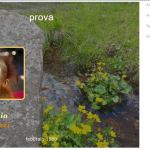
as you can see here: hidden link
it is not responsive, How do I solve?
here is the Layout code:
<div id="blocco-creatura" style="background-image:url('[wpv-post-field name='wpcf-layout-ricordo']');">
<div class="trasparenza"></div>
<div class="titolo-creatura">[wpv-post-title]</div>
<div class="prima-foto">[wpv-post-featured-image size="medium"]</div>
<div class="dedica">[types field='dedica'][/types]</div>
<div class="dedica-seconda">[types field='dedica-seconda'][/types]</div>
<div class="data-decesso">[types field='data-decesso'][/types]</div>
</div>
here is a part of CSS code:
CSS detail
#blocco-creatura=background-images
.titolo-creatura=post title
.prima-foto=featured image
#blocco-creatura {
    width: 800px;
    height: 600px;
    position: relative;
    background-repeat: no-repeat;
    background-size: contain;


}

.trasparenza {
  position: absolute;
  bottom: 0px;
  left: 0px;
  height:300px;
  width: 100%;
  background: rgb(0, 0, 0);
  background: rgba(0, 0, 0, 0.6);
}


.titolo-creatura {

  position: absolute;
  left: 80px;
  top: 100px;
  font-size:40px;
  color:#d67f03;

}

.prima-foto {
  margin:auto;
  position: absolute;
  padding-left: 45px;
  padding-top: 185px;

}
Hi Massimo,
Thank you for contacting Toolset support. You can fix this issue by replacing your CSS with following CSS:
#blocco-creatura {
	max-width: 800px;
    width: 100%;
    height: 600px;
    position: relative;
    background-repeat: no-repeat;
    background-size: cover;
}

.trasparenza {
  position: absolute;
  bottom: 0px;
  left: 0px;
  height:300px;
  width: 100%;
  background: rgb(0, 0, 0);
  background: rgba(0, 0, 0, 0.6);
}


.titolo-creatura {

  position: absolute;
  left: 80px;
  top: 100px;
  font-size:40px;
  color:#d67f03;

}

.prima-foto {
    margin: auto;
    padding-left: 45px;
    padding-right: 45px;
    padding-top: 185px;
    position: absolute;
}
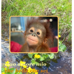
And it will look as in attached screenshot.
Thank you
I put a background image instead of the color, so you understand better.
as you can see, cut the background image: hidden link
I tried to add a radius border to the photo
with this code:
   border: 4px solid #f1c36a;
    border-radius: 15px;
why is the border not attached to the photo?
I followed this guide, but the picture does not round the edges, because ?
hidden link
I also have problems with: text-align
I think there is a problem with Layout !!!
it does not take the CSS
Hi Massimo,
We need to use relative position inside background image content, so that, we don’t need to define background image height. Please try with following CSS:
#blocco-creatura {
    background-repeat: no-repeat;
    background-size: 100% auto;
    height: auto;
    max-width: 800px;
    position: relative;
    width: 100%;
}

.dedica {
    color: #d67f03;
    font: italic bold 30px Georgia,serif;
    left: 20px;
    margin-top: 200px;
    position: relative;
}

.dedica-seconda {
    color: #d67f03;
    font: italic bold 30px Georgia,serif;
    left: 35px;
    margin-top: 5px;
    position: relative;
}

.data-decesso {
    color: #834f05;
    font-size: 20px;
    left: 230px;
    margin-top: 60px;
    position: relative;
}
And it will look as in attached screenshot.
Thank you
puzzle!
?
#blocco-creatura {

    background-repeat: no-repeat;
    background-size: 100% auto;
    height: auto;
    max-width: 800px;
    position: relative;
    width: 100%;

}

.trasparenza {
  position: absolute;
  bottom: 0px;
  left: 0px;
  height:100%;
  width: 100%;
  background: rgb(0, 0, 0);
  background: rgba(0, 0, 0, 0.4);
  color: #f3dcb4; /* Grey text */
  padding: 20px; /* Some padding */
}


.titolo-creatura {

  position: relative;
  text-align:center;
  top: 10px;
  font-size:40px;
  color:#ffffff;

}

.prima-foto {
   position: absolute;
   margin: auto;
   border: 6px solid #f1c36a;
   border-radius: 15px;
   top:100px;
   left:50px;


}

.dedica {
  font: italic bold 30px Georgia, serif;
  position: absolute;
   top:430px;
   left: 20px;
   color:#ffffa9;

}

.dedica-seconda {
  font: italic bold 30px Georgia, serif;
  position: absolute;
   top:480px;
   left: 35px;
   color:#ffffa9;

}


.data-decesso {
   position: absolute;
   top:550px;
   left: 230px;
  font-size:20px;
  color:#f0f0e1;
}
Hello Massimo,
Now, I can not access your pages because coming soon mode is activated. Can you please disable that mode for some time or give me wp-admin access to fix the CSS issue.
hidden link
hidden link
I have enabled private message box.
Thank you
Hello Massimo,
>> why is the border not attached to the photo? I followed this guide, but the picture does not round the edges, because ?
You were applying border and border radius to the container div that’s why it’s not applying to photo. I have applied your css to photo and it looks fine now.
I have updated Layout CSS and now it looks as in attached screenshot.
Please kindly open a new ticket if you found any issue and we would be happy to help. This will help other users with similar problems to find solutions when searching the forum, We do not handle multiple issues in the same ticket as per support policy. https://toolset.com/toolset-support-policy/
Thank you
Hello and thanks
I wanted to understand where I was wrong.
I noticed that the background is responsive, while all the rest: title, photo, etc., does not remain attached.
I was able to show the problem to a professional. tells me that you have to see the html of the page and then assign the class to the Html element. There is no Html in the Creature Layout.
Hello Massimo,
I noticed that the background is responsive, while all the rest: title, photo, etc., does not remain attached.
>> The problem is that, you want to display the complete picture in mobile version that’s why image height shrinks according to screen width, if we will display full height and width according to screen width then image will become stretched and it will not looks good, We can display image left/right/center section on mobile as in attached screenshot right part is showing, In this way it will cover all content.
Thank you
I want to understand if I have to use the media command to solve the problem
@media screen and (max-width:500px){
Hello Massimo,
Yes, you can use media screen CSS, layout will not arise any issue.
Thank you
Ciao Noman,
posso scrivere nella mia lingua madre , Italiano ?
ho delle novità da aggiungere
