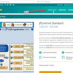
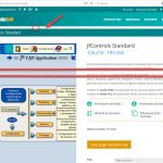
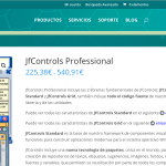
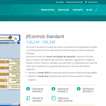
There is a serious problem in displaying the DIVI main menu.
If, for example, I have Toolset Views active, the hover of the menu options is shown as a square with background and the text of the selected option is not visible. If I disable all the Toolset plugins then everything works fine again.
Look at the screenshots.
Thanks for your help.
Best regards,
Francisco R.
I changed the Toolset configuration from 'Toolset should load Bootstrap 3.0' to 'This site is not using Bootstrap CSS', now the menu works correctly, however, on the page of any woocommerce product there is a blank margin between the header and the title of the page. Nor does it solve the problem that the page takes up the full width of the browser.
I thought these problems were only shown when using the EXTRA theme, but the DIVI theme does not work much better either.
I can not use DIVI or EXTRA with Toolset.
This is a real disaster. I can not work this way.
Either you solve these problems or it is impossible to work in this way. ????
Look at the screenshots.
These problems should be immediately communicated to the developers of Toolset to resolve them, I can not wait for the new version to appear to see if the problems are fixed or not, and have to wait for another version after the next to finish fixing the problems. In this way it is not possible to work.
In Elegant Themes every week is released a new version of DIVI and EXTRA with fixes and great improvements. The least the Toolset team could do is to put a new version with fixes every week.
Hi, I'm looking at the whitespace added into the header on your Product page, and when I look at the page source I can see a paragraph tag that seems to be causing this issue. In order to see why this extra paragraph tag is being added, I'll need to access your wp-admin area and check out your templates. If you agree, please provide login credentials to this site in the private reply fields here.
There is a style in Divi's style.dev.css file that adds padding-bottom to all p tags. If I disable this style, the whitespace goes away. So I'm confused about why enabling Toolset would have anything to do with the whitespace here. It seems that it would be shown regardless, but I do not fully understand how your styles are set up so I'm probably overlooking something. I'm attaching padding-bottom.png that shows the p style in the inspector, and the effects of disabling it. Here's the file that includes the padding-bottom for all p tags:
hidden link
If you'd like a CSS override that resolves this whitespace, you may try adding this:
.product-template-default #et-main-area p:first-child {
display: none;
}
I noticed that the paragraph tag does not appear in the header for the Servicios page, so the extra code is not needed here, but it does not cause any negative effects as far as I can tell.
I've done more research and it seems that the margin problem between the header and the title is a problem of the latest version of DIVI (3.0.84).
I have reinstalled the previous version and with this version this problem does not occur. I have communicated it to the DIVI support team. I'll tell you something.
Okay thanks, I'll stand by for your update.
The problem of the white margin between the header and the title has been solved by the support team of Elegant Themes, however the hover problem in the DIVI menu is a Toolset problem. If you enable 'Toolset should load Bootstrap 3.0' then the problem occurs, if you enable 'This site is not using CSS Bootstrap' then the problem does not appear.
The doubt I have is that if CRED uses bootstrap to improve the appearance of the form fields, if I have it disconnected they will look pretty bad. So, the logical thing is that bootstrap should be enabled.
What can I do with this problem in the DIVI menu?
Thanks for your help.
Hi, our support team is actively investigating this compatibility issue with Divi and the latest releases. Please stand by and I will have an update for you soon. In the meantime, I can recommend the following CSS override that should prevent the hover effect in your global navigation and allow you to keep Bootstrap active if needed:
#top-menu-nav>ul>li>a:hover {
background: none;
}
Yes Christian. The CSS override works correctly.
In your expert opinion, what is your advice?
Is it convenient to use Bootstrap along with DIVI for CRED forms and multicolumn layouts rendering with Views or is it better not to use Bootstrap because of CSS overhead on the site?
Thanks for your help.
Christian,
Although it seemed that your CSS code solved the hover problem in the menu, it does not work correctly, often the hover background returns, which is very bad for the appearance.
Hi, I have an update that should remove the background on the focused state of the menu links:
#top-menu-nav>ul>li>a:hover, #top-menu-nav>ul>li>a:focus {
    background: none;
}
I tested this update on several pages and it seems to be functioning okay in my local instance, so please let me know if you find any additional menu background exceptions I can help resolve.
Is it convenient to use Bootstrap along with DIVI for CRED forms and multicolumn layouts rendering with Views or is it better not to use Bootstrap because of CSS overhead on the site?
I think that Bootstrap is well-optimized and works well in most modern browsers. If you use several of the features it provides, Bootstrap is most likely better than building those features yourself. The library's CSS and JS files are smaller than most images on your site. However, if you don't really need most of the built-in features, the full Bootstrap build may be unnecessary. For example, if you just want to use the Bootstrap grid and form elements, you could build a custom Bootstrap package and enqueue it yourself in a child theme:
hidden link
FYI - the difference between the default Bootstrap build and a custom build is negligible compared to the performance of other components of your site:
hidden link
Divi is much more of a performance problem than Bootstrap.
Yes. The hover now seems to work well. 🙂
Thank you very much for your help, information and advice Christian.
Thank you very much for your help, information and advice Christian.


