Hi
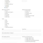
I have post form included in a page, user creates post from this page. you can see all the radio and checkbox doesn't align with the label. And on the top right textbox "Other", the textbox is small not reaching to the end.
below is my form.
[credform]
<div class="container-fluid">
<div class="row">
<div class="form-group col-md-6">
<label>Shop:</label>
[cred_field field='cf-shop' force_type='field' class='form-check-input' output='bootstrap']
</div>
[cred_show_group if="( $(cf-shop) eq 'Others' )" mode="fade-slide"]
<div class="form-group col-md-6">
<label>Shop Other:</label>
[cred_field field='cf-shop-other' force_type='field' class='form-control' output='bootstrap']
</div>
[/cred_show_group]
</div>
<div class="row">
<div class="form-group col-md-6">
<label>Red Grape Varieties:</label>
[cred_field field='cf-red-grape-varieties' force_type='field' class='form-check-input' output='bootstrap']
</div>
<div class="form-group col-md-6">
<label>White Grape Varieties:</label>
[cred_field field='cf-white-grape-varieties' force_type='field' class='form-check-input' output='bootstrap']
</div>
</div>
<div class="row">
<div class="form-group col-md-12">
<label>Type:</label>
[cred_field field='cf-types' force_type='field' class='form-check-input' output='bootstrap']
</div>
</div>
<div class="row">
<div class="form-group col-md-6">
<label>RRP:</label>
[cred_field field='cf-recommended-retail-price' force_type='field' class='form-control' output='bootstrap']
</div>
<div class="form-group col-md-6">
<label>Sale Price:</label>
[cred_field field='cf-on-sale-price' force_type='field' class='form-control' output='bootstrap']
</div>
</div>
<div class="row">
<div class="form-group col-md-12">
<label> URL includes http:// or hidden link;
[cred_field field='cf-url' force_type='field' class='form-control' output='bootstrap']
</div>
</div>
<div class="row">
<div class="form-group col-md-6">
<label>This mystery wine is:</label>
[cred_field field='cf-revealed-bottle' force_type='field' class='form-control' output='bootstrap']
</div>
<div class="form-group col-md-6">
<label>How do you find this wine:</label>
[cred_field field='cf-way-search' force_type='field' class='form-check-input' output='bootstrap']
</div>
</div>
<div class="row">
<div class="col-md-12">
[cred_field field='recaptcha' class='form-control' output='bootstrap']
</div>
</div>
<div class="row">
<div class="col-md-12">
[cred_field field='form_submit' output='bootstrap' value='Submit' class='btn btn-primary btn-lg']
</div>
</div>
<div class="row">
<div class="col-md-12">
[cred_field field='form_messages' class='alert alert-warning']
</div>
</div>
</div>
[/credform]
Hello and thank you for contacting the Toolset support.
To better assist with this issue I need to take a look at the form in the frontend, can you share a URL where we can see it? If it needs to be connected, I activated the private reply to let you share credentials safely. ** Make a database backup before sharing credentials. **
I am not the one who fixed the first issue. Maybe, one of my colleagues who worked with you on other issues. Or maybe fixing another issue has fixed it.
Regarding the last issue for the price filter, the first input has a label, and the other does not, that's why the second input is a bit higher. I fixed it with the following Javascript code:
jQuery('.price-between-filter label').each(function(){
  var label = jQuery(this);
  if ( !label.text().trim().length ) label.html(' ')
})
But first, I had to add the class "price-between-filter" in the filter.
Where did you place your code?
your solution works for some scenario. If I enter both number in both textbox, click submit then click clear filter, then it shows misalignment. Or I browse with my mobile phone, it will shows the same.
How do I set both placeholders (like my screenshot))respectively?
How do I set the maximum width of the textbox?
The style does not apply for mobile, because the first label takes two lines and our previous custom code only handles the case of one line. Check this hidden link
The following code is better, it will stick the inputs to the bottom of their parent element.
jQuery('.price-between-filter label').each(function(){
  var label = jQuery(this);
  if ( !label.text().trim().length ) {
    var formgroup = label.parent();
    var span = formgroup.find('span');
    formgroup.css('position', 'relative');
    span.css('position', 'absolute').css('bottom', '0px');
  }
})
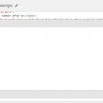
Check this screenshot of where the code is being added hidden link
Regarding your last questions:
How do I set both placeholders (like my screenshot))respectively?
Currently, you can add only one placeholder and it will be used for both inputs. Check this screenshot hidden link
You can work around it with a custom Javascript code if you need to have two different placeholders.
How do I set the maximum width of the textbox?
Currently, there is no way to set the maximum width on the filter block. But you can add custom CSS code or use custom Javascript code to set it. Let me know if you need help with it.
Thanks for the improved code. Yes, I need set both placeholders with"Min" and "Max" respectively. I need to set the price textbox so that it can show around 3 digits only.
Actually the first issue of this ticket isn't solved. I looked at the wrong page, the button still doesn't align with the label.
Additional, I introduce a collapsible button, it works, but when it expands the Toolset Grid will become from 2 column to 1 column. How do I fix this?
a button
<button type="button" class="collapsible">More filter</button>
A css
.content {
padding: 0 18px;
background-color: white;
max-height: 0;
overflow: hidden;
transition: max-height 0.2s ease-out;
}
A JS
var content = document.getElementById("filter-grid");
var coll = document.getElementsByClassName("collapsible");
var i;
for (i = 0; i < coll.length; i++) {
coll[i].addEventListener("click", function() {
this.classList.toggle("active");
console.log(this.innerText);
this.innerText = "Less filter";
if (content.style.display === "block") {
content.style.display = "none";
} else {
content.style.display = "block";
}
});
}
I have an archive, some element of the first post is overlapped to other element. In order to make 3 grid closer enough, I set a negative margin in 3 grids. I am not sure whether it is the best practice. can you have a look?
Actually the first issue of this ticket isn't solved. I looked at the wrong page, the button still doesn't align with the label.
It appears that the Javascript code was not saved on the template, maybe a previous version was loaded or saved from your browser. I saved it again and it is working. hidden link
Regarding the other requests, I created separate tickets and I'll be posting my reply there.
Please let me know where do you save the code.
Of course! Please check this screenshot and let me know if it helps hidden link
Otherwise, I can record a short video to show how. Let me know if it is needed.
Ok, we misunderstand each other, the code you show me is to fix the 2 textboxes misalignment.
What I want you to fix is the issue in the very beginning of this thread. The radio button and checkbox doesn't align with the label. It locates in the post form.
I believe, you are talking about the form on the following page, right? hidden link
Check this screenshot hidden link this left margin is coming from a theme style. To override it you can add the following to the Form custom CSS section:
ul {
    margin-left: none;
}
yes, it is this page. I add your code in post form CSS section, it doesn't work.
My apologies for the late reply, but I do not work on Sundays and Mondays.
I wanted to check this closely, but the credentials provided for your website are not working anymore. The form is not present anymore on the page too.
Can you provide the credentials again and let me know which page to check?
Your next reply will be private to let you share credentials safely. ** Make a database backup before sharing credentials. **
The following code worked correctly:
form ul {
    margin: 0 0 1.5em 0;
}


