Tell us what you are trying to do?
Have my content fit to screen in the mobile view of a toolset template. It is currently wider than the screen in the mobile version.
What is the link to your site?
Example: hidden link
Hello and thank you for contacting Toolset support.
I tested this page in the chrome mobile simulator and on my mobile(in Samsung Internet(browser)) and all the contents are within the screen. Can you share a screenshot that shows this issue? Can you also tell us what mobile screens have you tested with?
Hi Jamal,
Thanks for checking. I have tested on mobile on an iphone12 safari browser and an android google chrome browser and I have a scroll bar on the bottom of both of those browsers on the town pages, as well as on my desktop when I reduce the browser width. Screenshot attached.
Thank you!
Thank you for your feedback, I understand the issue better now. And it also happens for desktops. Check this screenshot hidden link
From what I could gather so far, this happens because of a conflict between the theme's styles(especially the alignfull class) and some block-defined styles(especially padding). I could find two blocks, and one of them is most probably a reusable block.
The first block to cause the issue is the one that contains the "QUICK FACTS". Check this screenshot hidden link
The second block, which I suspect to be reusable, is the one that contains "THE FULL STORY OF SOMERVILLE" and "NEIGHBORHOODS". Check this screenshot hidden link
I believe that this can be fixed by adjusting the styles on these two blocks.
I hope this helps. Let me know if you have any questions.
I do still have questions because I am not quite sure what to adjust. I want the section to be full width so that the background color stretches from edge to edge of the screen, but I do want there to be padding for the block so the text does go to the edge of the screen.
Hi again,
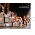
I think I actually narrowed it down to the image carousel as the main problem. The arrows to move to the next image move off the edge of the screen on mobile browsers. However, nothing I do to add padding or adjust the width of that block is changing the size of the carousel.
Well, I am not sure if it is the carousel. To confirm it, hide it temporarily and check if the issue disappears. To further assist you efficiently, allow me temporary access to your website. Your next reply will be private to let you share credentials safely. ** Make a database backup before sharing credentials. **
Someone in the toolset forums helped figure out the carousel/slider part and gave me some CSS to fix it. You are also correct that this is still happening elsewhere, but now on a much much much smaller scale since the slider spillover is no longer a problem.
My apologies if I did not spot the issue with the Slider. Can you share the solution that you get so other users of the forum can benefit from it?
Hi Jamal,
Absolutely, and I do still need some assistance figuring out the other areas where content is still slightly offscreen. What I did was add this custom CSS to the site:
.tb-image-slider { max-width: 100%; margin: auto}
Thank you for sharing this CSS code.
The block that is still causing this issue has a custom style, defined at the block level. It is the one that contains "THE FULL STORY OF SOMERVILLE" and "NEIGHBORHOODS". Check this screenshot hidden link
Just adapt its padding and it should fix the issue.
If you need me to check it further, allow me temporary access to your website and I'll see what I can do. Your next reply will be private to let you share credentials safely. ** Make a database backup before sharing credentials. **

