Skip Navigation

[Resolved] Mobile Items to Display using Blocks

This support ticket is created 3 years, 4 months ago. There's a good chance that you are reading advice that it now obsolete.

This is the technical support forum for Toolset - a suite of plugins for developing WordPress sites without writing PHP.

Everyone can read this forum, but only Toolset clients can post in it. Toolset support works 6 days per week, 19 hours per day.

This topic contains 1 reply, has 1 voice.

Last updated by Pete 3 years, 4 months ago.

Author
Posts
#2181863
aa blocks.png

Hi there,

At the bottom of this page: hidden link
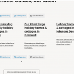
You'll find a section called Tour Travel Guides, our latest.

4 columns is great for a big screen.
However is there a way of setting it so only 3 show for smaller desktops, 2 for tablets?
I really only want 1 row on everything other than phone. I don't wish to have two rows for smaller desktops and iPads.

We use the Kadence Theme and their blog layout has this option, where we can limit the amount of items displayed on mobile.
Blocks, while has a ton of stuff we'd rather use, it lacks this option.

Any thoughts would be great.

#2181933

My issue is resolved now. Thank you!