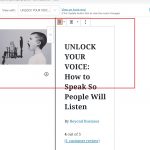
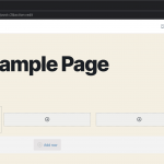
Tell us what you are trying to do?
I am editing a Content Template for products. On the Desktop View, I have a container block with 2 columns because there is a wide screen. On the mobile view and other screens, I want to do a different format with One column and the info on top of each other.
The problem is that when I click on Mobile and start rearranging the layout, this Mobile layout affects the Front end on the other types of layouts as well. How do I do it so that I have different layouts for different screens?
Is there any documentation that you are following? Toolset Blocks but there are no tutorials about how to format templates on different views.
Is there a similar example that we can see? See attached.
What is the link to your site? hidden link
The thing is, the screen-related design is merely for the Inspector (that sidebar on the right of the screen when editing with Gutenberg, which allows controlling blocks settings)
So, if the block settings do not feature the screen size switchers you can't change the look depending on screen size, and the actual "design", can not be changed (in the post editor itself) depending on screen size.
Only the single blocks settings can
If you'd like that what you edit in the actual Post Editor is as well screen size dependant, you'd have to submit this as a feature, to https://toolset.com/home/contact-us/suggest-a-new-feature-for-toolset/
Basically, this would then allow adding completely different blocks on different screen sizes as well, something that is not possible right now
Ok so this is a replica of another content template. See attached screenshot of the Product Page using the existing Template, desktop and Mobile. What I tried to do is click on the Mobile Icon to see how it looks on Mobile and make edits, like with Elementor.
When I click on Front End View on Mobile on the Editor it looks really bad.
However, I just did an actual test of my new template on my Mobile and it works in that it looks ok. See attached last screenshot where the photo is on top.
What I realise is that I cannot see how the Mobile Views looks like using the Toolset Content Template editor..not like Elementor where you can edit Mobile, Desktop separately..but it works..
Thanks!
I don't understand what you mean.
As mentioned you cannot alter the layout of the post (built with blocks) using the screen size switchers.
You can, however, look at, and design single block settings in different screen sizes, always when the block setting has a screen size switch icon.
You can't design the whole "template" depending on screen sizes, but only the single block settings.
Can you elaborate on the precise steps if you think this is broken?
I can see this working, both in the back and front end, but it might depend on specific blocks or content used.
My issue is resolved now. Thank you!


