This thread is resolved. Here is a description of the problem and solution.
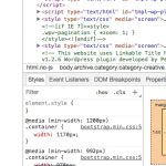
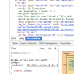
Problem: Media queries in CSS do not appear to work in certain Layouts. I would like to override the maximum container width on certain pages at certain screen sizes.
Solution: There is currently a bug causing the Layouts CSS file to be loaded in different sequence on some pages. This can result in unexpected CSS changes if you target the same classes as Bootstrap. As a temporary solution, you may use more specific CSS selectors to override Bootstrap's selectors.
@media screen and (min-width: 1200px) {
  .archive .container, .post-template .container, .page-template .container  {
    width: 1230px;
  }
}

@media screen and (min-width: 1920px) {
  .archive .container, .post-template .container, .page-template .container  {
    width: 1600px;
  }
}
This is the technical support forum for Toolset - a suite of plugins for developing WordPress sites without writing PHP.
Everyone can read this forum, but only Toolset clients can post in it. Toolset support works 6 days per week, 19 hours per day.
| Sun | Mon | Tue | Wed | Thu | Fri | Sat |
|---|---|---|---|---|---|---|
| 8:00 – 12:00 | 8:00 – 12:00 | 8:00 – 12:00 | 8:00 – 12:00 | 8:00 – 12:00 | - | - |
| 13:00 – 17:00 | 13:00 – 17:00 | 13:00 – 17:00 | 13:00 – 17:00 | 13:00 – 17:00 | - | - |
Supporter timezone: America/New_York (GMT-04:00)
This topic contains 3 replies, has 2 voices.
Last updated by 7 years, 1 month ago.
Assisted by: Christian Cox.

