Hey there,
I am using layouts to integrate bootstrap menus on a site:
hidden link
On my left menu, I chose a bootstrap menu, and aligned it left.
I wanted to align the left edge of the menu with the left edge of the header banner. Usually this would just entail a bit of shifting things around, removing padding and margins, then perhaps a bit of a positional change.
But on the front end the menu displays with a huge amount of extraneous space on its left side. I can't find anything in the CSS that accounts for all that space.
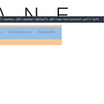
Please see image 1 and 2
Image 1 shows the left aligned menu displaying on front end with all padding and margins removed.
Image 2 shows the space it is taking via the inspector
To make my menu align properly, I've had to set it's left position by quite a lot. As you can see in Image 3.
Am I being foolish, is there a class I am missing in the css to align things more directly?
Thanks again for your help
Jeff
Apologies for the string of posts to welcome you back to work on Monday, but I had a further thought and question.
Is that space to the left of the menu, the area typically allocated to the div.navbar-header for the a.navbar-brand in a typical boostrap menu?
like so:
<nav class="navbar navbar-default">
  <div class="container-fluid">
    <div class="navbar-header"> // This space for this div
      <a class="navbar-brand" href="#">WebSiteName</a>
    </div>
    <ul class="nav navbar-nav">
      <li class="active"><a href="#">Home</a></li>
      <li><a href="#">Page 1</a></li>
      <li><a href="#">Page 2</a></li>
      <li><a href="#">Page 3</a></li>
    </ul>
  </div>
</nav>
If it is, is there any way to either remove it's space allocation with css, or to use the space?
On the bootstrap menu, I can choose not to display this div, and remove padding of the container and navbar etc:
hidden link
In the inspector, I can see that Toolsets implementation of the bootstrap navbar doesn't include this navbar-header div.
I managed to get it to align how I wanted using:
position: relative
left: -68px
Which is okay, but I am having to use different menus for different viewport sizes and as such the positional changes vary. It also affects the responsive menu breakpoints, leading to menu items dropping to a second level when they shouldn't.
Thanks again ?
Jeff
Have you tried to play with the row types?
Cell extends to full width should do the trick here.
Please let me know if that solves the issue.
Otherwise, you can try to access the "collapse ddl-navbar-collapse" HTML class of the collapse DIV with less than the default 15px padding-left.
(This is LAYOUTS default and not BOOTSTRAP default as you will see in the CSS selector tool)
Hey Beda,
I had tried the full width cells, but that made no difference.
But the .ddl-navbar-collapse solved it.
Remove the left padding and margin.
Cheers for pointing that out, silly to have missed it. I might be able to maintain the my split menus all the way down to 768px with that space removed.
Brilliant, thanks
Jeff


