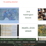
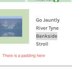
Tell us what you are trying to do? I have a site, haddington.info, and am trying to use the archive to display directory listings. I have managed to get the look I want for the sports and societies section with the image set to fill the grid cell. This means the issue I have is not with the kadence theme I presume. I have tried to create the same look and feel for things to see and do, but the image is not taking the width of the cell. I have checked the grid settings and altered the resolution for the images to be the same as those in the working section and have tried using the same image that looks fine in the working section and displays with a big border in the see and do section. What am I missing?
Is there any documentation that you are following? I have looked at all the documentation I can for archives and grids and containers and other peoples issues.
Is there a similar example that we can see? Yes. The section sports and societies works on the site whereas the section for see and do does not.
What is the link to your site? hidden link. for the working example, hidden link for the one with large spacing
Hi there,
Would you please go to the archive in question and at the top left section click the Hamburger menu to show the stacked list of the blocks that are available on the page.
Compare it with the page that you mentioned work ok, and see if there is any additional block there?
Also click on each block and on the right sidebar check the options and see if there is a padding or not.
From what I see there is a DIV with a padding, which on the page that works ok is set to 0.
If the issue persists, I'd appreciate it if you could give me the URL/User/Pass of your WordPress dashboard after you make sure that you have a backup of your website.
It is absolutely important that you give us a guarantee that you have a backup so if something happens you will have a point of restore.
Make sure you set the next reply as private.
Also give me the Dashboard URL of the archive that I need to check
The issue was in one of the containers - the mobile and tablet view did not show padding but the computer screen option did. This impacted on mobile and tablet views too so all is looking as it should now. Thank you.

