This thread is resolved. Here is a description of the problem and solution.
Problem:
Build a classified site that allows Vendors to offer several types of services to prospective Consumers.
Solution:
Consumers. In this scenario, we only needed one custom post type for the Vendors but created taxonomies for the different types of services that they may elect or not elect to offer.
Our interface design called for offered services (category/taxonomies) to be represented by icons, not text. As Vendors have the ability to turn a service on or off, we needed these icons to be dynamic, not static, which meant our solution must work within the Toolset software.
Note:
There are several WordPress plugins that will assign an icon or image to taxonomies/categories. However, these add-ons have significant limitations when using a Toolset view.
Our Solution:
1
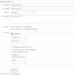
In the Custom Fields for the Vendors we created a Checkboxes, (not checkbox), custom field with one option for one type of service offering. Under "Title" we gave it the name of the service. Under "Value to store" we left it as "1". We then selected the option "Show one of these two values:" We left the "Not selected:" field blank and put an "X" in the "Selected:" field.
Note:
The "X" could have been any placeholder. Ultimately it will be invisible so just keep it simple.
Understanding:
At this point, if a Vendor had checked the box for a given service, it would appear on the front-end as an "X." This is because Toolset allows you to customize the text that reports the status of the checkbox and in our case, we put an "X" in the "Selected" field.
We repeated the above making a separate Checkboxes custom field for each service.
NOTE:
Checkbox is meant for a different function than CheckboxeS. We only put only one service option in each Checkboxes field because later we'll need the ability to target each service/each custom field individually. If we'd put all the service options in one Checkboxes custom field, (which would be the normal approach), we would not have been able to target each service option/custom field on its own. The ability to target each service/custom field becomes very important later.)
2
We created a Test Vendor Form and selected the checkmark for each service, so we'd have a way to test what we're building. So, the Vendor form on the back-end might look like this. (We didn't bother creating a front-end form yet.)
3
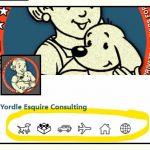
We created a Page with a View for an archive of posts. Our rough goal was to wind up with something like the dummy post example below. Specifically, we wanted the row of icons circled at the bottom of the image. Note: These icons needed to appear/disappear on the post based on whether the Vendor had checked the checkbox for the related service in their profile. They also needed to be changeable at any time in response to a change in services offered by a Vendor.
4
Within the View, we created a Container block. (This will be helpful for formatting the icons as a group.)
5
Within the Container block, we created a Conditional block.
6
Within the Conditional block, we created a Fields and Texts block.
7
Within the Fields and Texts block we created added some HTML. Our example:
[types field='taxonomy-service-one' separator=', '][/types]
Note:
The shortcode section that begins with “[types” and ends with “/types]” may be added by using the context bar option from within the Fields and Text block. Choose “Add Field or View” from the bar and select one of the custom fields you created earlier
8
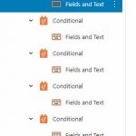
We repeated Steps 5-7 for each service custom field that we created in Step 1. The result should look something like the following image.
Notes:
We used span instead of a paragraph tag because we ultimately wanted all the icons on one line.
We used two class tags. The first class tag will allow us to add CSS specific to the icon that represents, i.e., ServiceOne. The second class tag will allow us to add CSS that affects all of the service icons. Make sure that the first of each Class tag is unique to each Fields and Texts block. This is what will allow you to show and style the related icon. So, in our example, the opening wrappers might look like this….
And so on, depending upon the number of icons needed. Remember, that we’re using the second class, “allServices” to style all of the icons, so it may remain the same in each case.
Understanding:
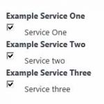
At this point, if you view the page from the front-end, you should see a list of “X”s that will be present for each service that was selected on our Test Vendor Form in step 2.
9
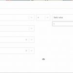
We edited each Conditional block to correspond with the service called for by the Fields and Text block within the Conditional. Please see the image below for the conditions we called for.
Understanding:
This Conditional checks the related post’s custom field for a value of “1.” (Remember, when we set up the custom fields in step 1, if an item was checked by the Vendor, then the database will store a value of “1”.) So, what the Conditional will do is this: If the service was checked by the Vendor than the result from “Selected”, in our case the “X” should be shown on the page. If the service was not checked by the Vendor, then the result from the "Not selected:" field would show. We left that field blank so if the item is not selected, then nothing will show up on the page. At this point, if we look on the front-end, we should have “X”s that properly represent each service that’s been checked on our Test Vendor Form. This can be tested by checking and unchecking service items on our Test Vendor Form.
10
Now we want to turn the “X”s into icons. We’ll primarily do this with CSS using the two classes we created in step 7, within our Fields and Text block. My preference is to use an on-page CSS box that applies only to that page or post whenever possible, so unnecessary CSS isn’t being loaded when using other areas of the site. In absence of another option, you may want to consider the WordPress plugin: “Post/Page specific custom CSS”.
10.1) First we need to make the “X”s invisible. Select each Fields and Text block > Typography > Text Color > Custom Color and enter: 00000000
That's 8 zeros.
Understanding:
000000 is the hex code for black. The additional two, 00s, set opacity to 0 or invisible. So, now our “X” can no longer be seen and we’re ready to place an image into the space that our “X” had occupied.
We also need to add the ability to style the Fields and Text blocks. So, after adjusting the Typography, click on Advanced > CSS Classes > and add a class name, i.e. fntAllServices.
10.2) Next click on the Container > Advanced > and select your preferred alignment for the group of icons. In our case, we chose “Center”.
10.3) Now we can begin to style the Fields and Text blocks. Go to your CSS editor, add the line…
#fntAllServices {display: inline; }
Understanding:
This will cause the icons to be in a row instead of stacked.
10.4) Continuing in your CSS editor, add the class that will affect the styling of all of your icons.
Here’s our example:
.allServices {
min-height: 35px;
background-repeat: no-repeat;
background-position: center center;
display: inline-block;
width: 35px;
margin-bottom: 2px;
margin-right: 6px;
vertical-align: top; }
10.5) Now we can add the icons that we want to appear in place of our invisible “X”s. To do so we must add the classes that we created that will affect the styling of your individual icons.
Here’s our example:
.serviceOne {
background-image: url(https://travelnannies.net/wp-content/uploads/2022/07/icon-house.png); /* This is your preferred image or icon to represent service one. */
background-size: 25px 25px; } /* This helps to set the size of the image.*/
10.6) Repeat this step for each of your icon areas specifying the unique class you created and the icon that will represent that service.
Understanding:
We used the background-image attribute to have an icon appear in the space occupied by our "X". Since our "X" is invisible, only the icon is seen. Additionally, since we've set up a condition that will only display the content if the service has been checked on the Test Vendor Form, the icons will appear/disappear based upon their selection.
So, on the front-end, you should now be able to see a row of icons instead of “X”s. You should also be able to have the icons appear/disappear based upon your selection of checkboxes on your Test Vendor Form. Go ahead and test it.
I hope the above is helpful to some. 🙂
A Better Solution
I wrote the above because I was otherwise unable to find a way to achieve dynamic taxonomy images compatible with Toolset Views. However, if anyone has a more elegant solution or simplifications to the above, I’d be most grateful to know them.
I believe there have been many requests to both WordPress and Toolset to provide a Category/Taxonomy Images option. Perhaps the good folks at Toolset are waiting for WordPress to answer this request so they don’t have to reinvent the wheel. In the interim, an interesting option that would have utility beyond what WordPress is likely to offer would be to have the Checkboxes, field “Selected” allow basic HTML or an image URL instead of just raw text.
This is the technical support forum for Toolset - a suite of plugins for developing WordPress sites without writing PHP.
Everyone can read this forum, but only Toolset clients can post in it. Toolset support works 6 days per week, 19 hours per day.
| Sun | Mon | Tue | Wed | Thu | Fri | Sat |
|---|---|---|---|---|---|---|
| - | 9:00 – 12:00 | 9:00 – 12:00 | 9:00 – 12:00 | 9:00 – 12:00 | 9:00 – 12:00 | - |
| - | 13:00 – 18:00 | 13:00 – 18:00 | 13:00 – 18:00 | 14:00 – 18:00 | 13:00 – 18:00 | - |
Supporter timezone: America/Jamaica (GMT-05:00)
This topic contains 3 replies, has 2 voices.
Last updated by 3 years, 7 months ago.
Assisted by: Shane.
