I followed this guide:
https://toolset.com/documentation/user-guides/creating-responsive-designs/#responsive-utilities
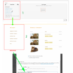
I do these steps (see image attached)
not to see the section in the phone.
unfortunately nothing happens, the section is always seen.
--> (hidden-sx) <--
what am I doing wrong ?
The class name is "hidden-xs" but you have "hidden-sx". If you change the classname, is the problem resolved?
I have no words, I inverted the letters XS
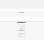
I have a layout that contains a View cell, to change the display on mobile devices what should I do?
I tried with this code, but I always see the results on a column
@media screen and (max-width:500px){
a {font-size: 3vw;}

img {

  display:grid;
  column-count: 2;
}

}
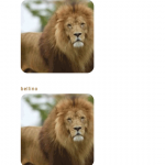
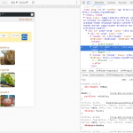
as you can see in the smartphone I see a list of images.
I need to have at least two 2 columns of images
Why not use the Bootstrap responsive grid utilities in the Loop Output editor of this View? I don't think you need any custom CSS to handle the columns. Can you share the code in this View's Loop Output editor? If any Content Templates are used in the Loop, please include the code for those as well. I recommend you check out the responsive grid reference here:
https://getbootstrap.com/docs/3.3/css/#grid-example-mixed
note: the 2-column view of the images I want is ONLY for smartphones.
for the Desktop must be 12 columns
code
[wpv-layout-start]
	[wpv-items-found]
	<!-- wpv-loop-start -->
	<div class="container wpv-loop js-wpv-loop">
	<wpv-loop wrap="6" pad="true">
		[wpv-item index=1]
		<div class="row ">
			<div class="col-sm-2">[wpv-post-body view_template="Loop item in creature cerca"]</div>
		[wpv-item index=other]
			<div class="col-sm-2">[wpv-post-body view_template="Loop item in creature cerca"]</div>
		[wpv-item index=6]
			<div class="col-sm-2">[wpv-post-body view_template="Loop item in creature cerca"]</div>
		</div>
		[wpv-item index=pad]
			<div class="col-sm-2"></div>
		[wpv-item index=pad-last]
			<div class="col-sm-2"></div>
		</div>
	</wpv-loop>
	</div>
	<!-- wpv-loop-end -->
	[/wpv-items-found]
	[wpv-no-items-found]
		<strong>[wpml-string context="wpv-views"]No items found[/wpml-string]</strong>
	[/wpv-no-items-found]<BR>
<div class="nav-search">[wpv-pagination]<ul class="pagination">
	<li class="page-item">[wpv-pager-prev-page][wpml-string context="wpv-views"]Previous[/wpml-string][/wpv-pager-prev-page]</li>
	<li class="page-item">[wpv-pager-next-page][wpml-string context="wpv-views"]Next[/wpml-string][/wpv-pager-next-page]</li>
</ul>[wpv-pager-nav-links output="bootstrap"][/wpv-pagination]</div>

[wpv-layout-end]
Can you provide the code in this Content Template as well?
[wpv-post-body view_template="Loop item in creature cerca"]
do I always find it in Vista?
sorry but I'm a bit on tilt!
you mean this ?
(in the third large View window?)
[wpv-post-link]
[wpv-post-featured-image size="custom" width="160" height="160" crop="true"]
Okay thanks, the main thing I see is that you have set each item in the grid to be 2 columns wide at small resolutions. I think you should set each item in the grid to be 6 columns wide at small resolutions, because the total number of columns is 12. You want to show 2 items in a row, so 12 divided by 2 is 6. I think you should use "col-sm-6" instead of "col-sm-2". Please try that and let me know the results. If it's not working as expected, please share a URL where I can see it on your site.
URL: hidden link
so it's very good for Desktop!
I have to change for tablets and smartphones, the files or columns of images must be:
- tablet: 3 rows or columns of images
- smartphone: 2 rows or columns of images
As I said before, you should use the class "col-sm-6" for each item, not "col-sm-2". When I check your site now, it still shows "col-sm-2". I'm attaching a screenshot for you.
In your site, each item should probably use the classes "col-lg-2", "col-md-4", and "col-sm-6".
col-lg-2: (12 / 2) = 6 items in a row at large sizes
col-md-4: (12 / 4) = 3 items in a row at medium sizes
col-sm-6: (12 / 6) = 2 items in a row at small sizes
I do not understand where to make these changes, I'm sorry
here is my view code:
[wpv-layout-start]
	[wpv-items-found]
	<!-- wpv-loop-start -->
	<div class="container wpv-loop js-wpv-loop">
	<wpv-loop wrap="6" pad="true">
		[wpv-item index=1]
		<div class="row ">
			<div class="col-sm-2">[wpv-post-body view_template="Loop item in creature cerca"]</div>
		[wpv-item index=2]
			<div class="col-sm-2">[wpv-post-body view_template="Loop item in creature cerca"]</div>
		[wpv-item index=3]
			<div class="col-sm-2">[wpv-post-body view_template="Loop item in creature cerca"]</div>
		[wpv-item index=4]
			<div class="col-sm-2">[wpv-post-body view_template="Loop item in creature cerca"]</div>
		[wpv-item index=5]
			<div class="col-sm-2">[wpv-post-body view_template="Loop item in creature cerca"]</div>
		[wpv-item index=6]
			<div class="col-sm-2">[wpv-post-body view_template="Loop item in creature cerca"]</div>
		</div>
		[wpv-item index=pad]
			<div class="col-sm-2"></div>
		[wpv-item index=pad-last]
			<div class="col-sm-2"></div>
		</div>
	</wpv-loop>
	</div>
	<!-- wpv-loop-end -->
	[/wpv-items-found]
	[wpv-no-items-found]
		<strong>[wpml-string context="wpv-views"]No items found[/wpml-string]</strong>
	[/wpv-no-items-found]<BR>
<div class="nav-search">[wpv-pagination]<ul class="pagination">
	<li class="page-item">[wpv-pager-prev-page][wpml-string context="wpv-views"]Previous[/wpml-string][/wpv-pager-prev-page]</li>
	<li class="page-item">[wpv-pager-next-page][wpml-string context="wpv-views"]Next[/wpml-string][/wpv-pager-next-page]</li>
</ul>[wpv-pager-nav-links output="bootstrap"][/wpv-pagination]</div>

[wpv-layout-end]
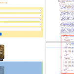
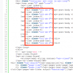
Everywhere you see this code highlighted in red in the screenshot:
Replace it with this code:
<div class="col-sm-6 col-md-4 col-lg-2">
I made the changes,
in the tablet Samsung with a 10 "display the image columns have gone from 6 to 2.
in the smartphone with a 4 "display the image columns remained 1
