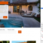
Hi
I'm trying to style a couple of pages, basically so the get the same base colours as your real estate reference site
https://toolset.com/reference-site/toolset-real-estate/
The page in question is our search page for "Opplevelser" (translates to "trips")
hidden link - post type: "Opplevelser" - slug: opplevelse
Please also see
hidden link - Post type: Houses - slug: house - looks as it should
- the only pages in our site built with Toolset Layouts, by the way
I’d like to have light blue as the base color on hidden link
to differ it and its corresponding posts from the orange house page/posts - hidden link
I've tried inspecting the css in Firefox, but can't figure out wht styles to adjust (in my Astra child theme's styles.css file)
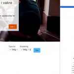
1 – I managed to make to give the slider header/title a blue background with a similar chunk of css as in point 2 below
…BUT failed regarding the read more (Les) button.
Can you help?
2 - Also the Search header (where it says "Søk Opplevelser/Feriebolig, filtrer etter ønsker") should be blue
I also tried to switch style in the “Search Opplevelser”s Filter editor
hidden link
from search-header to search-header-opplevelser in the second line here
<header class="col-sm-3" style="vertical-align: top">
<div class="search-header">
<h3>[wpml-string context="refsite"]Søk opplevelser[/wpml-string]</h3>
<p>[wpml-string context="refsite"]Filtrér etter ønsker[/wpml-string]</p>
</div>
</header>
...and define that new class in the Astra child theme’s style.css file, like this:
.search-header-opplevelser {
    color: white;
    padding: 10px 20px;
    background-color: #62c0fa;
}
but it doesn’t come through. (Instead the styling of the search header just disappears.)
3 – Finally: On tiny screens, the Featured Houses section (Utvalgte boliger) fall slightly outside the screen to the left.
In the two Layouts I've set that row's width to the same as the map (bootstrap width - also tried with the recommended content width) but without luck.
I have also tried to add some (10-15px) padding-left to the .container or .row. classes, but that only has effect on bigger screens.
This issue also applies to the Houses' search page:
hidden link
Any hint, please?
Thanks you
Kjetil
#1 The native Bootstrap class rules are overwritten as you can see in the console.
You overwrote it in the Layouts CSS tab, its the rule:
background-color: var(--primary-color) !important;
border-color: var(--primary-color) !important;
#2 Exact same issue as above.
That colour is defined with:
background-color: var(--primary-color);
#3 I see several margin styles applied.
I suggest removing the JS error first that appears on those pages.
Then, checking if this happens when you remove your Custom CSS (use a native Bootstrap Layout)
If it does not (I could not replicate this locally) then the issue is within the Custom CSS you applied to the Layout.
Eventually, you can play with the settings of the rows (Apply or not apply the default bootstrap margins of 15 px)
Hi Beda
Thanks for coming back to me
A bit late back here - been off for a week
I have not touched the Layouts css, it is just as it comes with the real estate ref site.
After looking through things, I believe the styling doesn't come through "correctly" because I have defined a new post type - opplevelser. The layout etc are copied from the "Land" post type and its corresponding Views etc.
The Toolset starter child theme (which the real estate site is built with originally) contained quite a lot of css. While using it I copy/adjusted chunks making "Opplevelser" display with the Land colours.
After I switched to Astra (because Toolset starter is no longer developed and several issues arised) I tried to transfer the styling to the Astra child theme but it didn't seem to have any effect. Just to give you the story 🙂
Now, I've tried to find the rules you enclosed, - should be connected to .btn-primary - but can't find it.
Maybe, after reading the paragraph above, there is a better way to style "opplevelser"?
Please find the Layout css as text file here:
hidden link
Please also note:
The sie's URL is changed as it is now launched - the base address is
hidden link
Thank you,
Kjetil
Now, I've tried to find the rules you enclosed, - should be connected to .btn-primary - but can't find it.
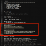
See the attached screenshot styles.png, line 204 of the Layouts CSS text file is where this code starts.
Maybe, after reading the paragraph above, there is a better way to style "opplevelser"?
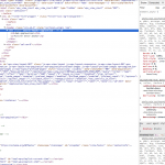
Your method described in #2 should work. When I go to this page, I do not see the class "search-header-oppelvelser" applied to the search header in the page markup (see markup.png)
hidden link
I also do not see the CSS styles for this section in any of the CSS files. I added the CSS class manually in the inspector, and you can see no styles associated with this classname in the styles panel (see header-styles.png)
OK... Thanks for pointing me in the right direction!
Now most of it is in place: hidden link
- just a couple of details are missing
To keep things tidy and following the "standard" I figured I could copy the styling for Land (from line 316), and paste it into the sheet replacing "land" with "opplevelse". (After all it worked while I was on the Toolset starter theme.) I also removed the styling I had added to the Astra child theme.
Since I don't know how to define colors via eg "var(--opplevelse-color)" I instead inserted the color hex code directly. You can see the css I've added from line 367 here:
hidden link
The only parts I can't make display as I like are
- The search submit button: The text color should be white - I believe line 409 should make that happen
...and preferably the button shouldn't go black on hover
- The "arrowish" border on the right side on the search header disappears. (You'll see it on the search header here: hidden link ) I haven't found what controls this.
Thanks,
Kjetil
- The search submit button: The text color should be white - I believe line 409 should make that happen
I think you would have to add the btn-primary class to the submit button for this code to work.
- The "arrowish" border on the right side on the search header disappears.
This little triangle is added with the :after pseudo-selector and a media query, as you can see in the attached screenshot. If you want to override the color, you must override the CSS for this selector with a different border-color.
Great - really closing in now
The only detail missing now is the text color and background hover color og the Opplevelse's search header submit button.
I tried to add a btn-primary class to this part of css (lines 399-411 - below) - I believe it should be added like this:
.post-type-archive-opplevelse .btn-primary
The text should be white while the background should stay blue on hover, as in the slider.
I must be on the wrong place...
(When I inspect the button the only visible class is .btn - but changes here will apply to so many other buttons too:
hidden link )
Thanks for your patience - I'm looking for an online css course to handle this with less stumbling .o)
Kjetil
/* blue background and border on SUBMIT BUTTON on opplevelse slider - replaced var(--opplevelse-color) with #6dc1f8 */
.post-type-archive-opplevelse input[type="submit"],
.post-type-archive-opplevelse .btn-primary,
.single-opplevelse input[type="submit"],
.single-opplevelse .btn-primary,
.post-type-archive-opplevelse .pagination-dots > li > a:hover,
.post-type-archive-opplevelse .pagination-dots > .active-dot > a,
.post-type-archive-opplevelse .pagination span
.post-type-archive-opplevelse .btn-primary {
    background-color: #6dc1f8 !important;
    border-color: #6dc1f8 !important;
    color: #fff;
}
So it looks like you need to add the btn-primary class to the submit button. You can use the "class" attribute on the wpv-filter-submit shortcode to add any CSS classes you want. You can find the shortcode in the Filter Editor panel of the View editor screen:
[wpv-filter-submit output="bootstrap" class="btn-primary other-css-class-1 other-css-class-2"]
Thanks - now we're talking :o)
That worked just as it should, altering the submit code to
[wpv-filter-submit name="Søk" type="button" output="bootstrap" class="btn-primary"]
Thanks a lot for your help
Kj
