This is the technical support forum for Toolset - a suite of plugins for developing WordPress sites without writing PHP.
Everyone can read this forum, but only Toolset clients can post in it. Toolset support works 6 days per week, 19 hours per day.
| Sun | Mon | Tue | Wed | Thu | Fri | Sat |
|---|---|---|---|---|---|---|
| - | 7:00 – 14:00 | 7:00 – 14:00 | 7:00 – 14:00 | 7:00 – 14:00 | 7:00 – 14:00 | - |
| - | 15:00 – 16:00 | 15:00 – 16:00 | 15:00 – 16:00 | 15:00 – 16:00 | 15:00 – 16:00 | - |
Supporter timezone: Europe/London (GMT+00:00)
Tagged: Front-end display, Layouts plugin
This topic contains 12 replies, has 2 voices.
Last updated by kjetilF 6 years, 3 months ago.
Assisted by: Nigel.
Hi
On labellavita.no we'd like to use this
hidden link
as the site's home page - and to do that we'd need to change it. The simplest and best way would be to
- remove the top slider
- add a background image (or video) to the search view or row
(+ adding some padding above the search form)
This would give a layout similar to these:
hidden link
hidden link
hidden link
Do you have a tutorial or something to show me the way?
Thanks,
Kjetil
(PS Most of this site is built with BeaverBuilder + Beaver themer, but the search pages are made with Toolset. I am well aware that the two builders should be defined used well apart from each other.)
Nigel
Languages: English (English ) Spanish (Español )
Timezone: Europe/London (GMT+00:00)
You want the search form itself to have a background image?
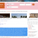
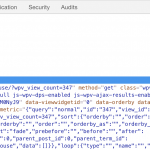
Using the browser tools I see that the search form is a form with name="wpv-filter-347", so you can add custom CSS to add a background image to that element, and change padding etc. as required.
See the screenshot.
See this page for more details about styling the row container etc. in Layouts: https://toolset.com/documentation/user-guides/adding-custom-styling-to-a-layout/
This might come in useful, although I don't think it is relevant here because this is a static page not a post, but if you wanted the src of the background to be dynamic, i.e. to come from an image custom field for the post being displayed, you can create "dynamic CSS" by including style tags in one of the editor sections to add your CSS instead of in the custom CSS sections.
By which I mean you could add something like this:
<style type="text/css">
.selector {
  background: no-repeat url( "[types field='picture' output='raw'][/types]"  );
}
Sorry - had some more urgent matters here
It is more about giving the whole row a background image - as shown in the examples
Possibly I can figure it out with the help you’ve already given. Have to look at it tonight
I’ll be back
Thanks
Kj
Nigel
Languages: English (English ) Spanish (Español )
Timezone: Europe/London (GMT+00:00)
OK, I'll set this as awaiting feedback from you for now.
Hi, Nigel
Finally had time to get back to this 🙂
I think what would look best is if I
1 - add a background image to the search form itself
2 - Make the results when clicking search instead of them appearing underneath instantly (via Ajax)
3 - adjust the padding around the form so it appears in the middle of a bigger image
That should make something like the examples above.
So - it would be helpful if you could help me here:
1 - In View > Search - House I added a background image to the top container:
style="background-image: url(hidden link);"
See screenshot: hidden link
This made the bg image appear like this - screenshot:
hidden link
2 - To make the search results not appear underneath the form, I switched to the upper setting here:
hidden link
...but it didn't make any difference. What's wrong?
3 - Finally, to add the padding, I added it to the same container as in 1 - 200px is just a quick example:
style="background-image: url(hidden link); padding:200px;"
which made the form appear like this:
hidden link
I can make the padding work fine, but:
How should I make the background image go full-width?
Thanks,
Kjetil
Nigel
Languages: English (English ) Spanish (Español )
Timezone: Europe/London (GMT+00:00)
I had a look at the current markup of your page at hidden link.
Check the screenshot, where the search form is full-width with a pink background.
For that I did two things.
First I updated the class of the row container to "container-fluid" to make it full width. I did that directly in the browser tools, you can do it by changing the row settings in the Layout to full-width (I linked to the documentation above).
Second, to target just the form part of the View I edited the View itself. In the Output Editor (at the end) there are two shortcodes, the first of which inserts the search form, the second the View results. So I added a wrapper div around the first shortcode. I added an inline style to set the background, but it would make sense to add a custom class and set the styles for that class to include padding etc. as required.
OK...
Thanks for taking me through this.
(Please see screenshots below)
First:
I tried to find the correct layout to adjust. It should be Layouts > Templates for archives > House - I selected the row with "View: Search - House" and altered the setting inside to "Row as wide as Bootstrap container".
No visible change at the front end so far
- I believe it should show unless I'm in the wrong place here?
Second:
I opened View > "Search - House" and went all the way down to the Output editor and added a class for the background image:
<div class="housesearchbackgroundimage">[wpv-filter-meta-html]</div>
and saved it. Still no visible change, naturally.
- Finally
I added som css to the Astra child themes style.css file:
.housesearchbackgroundimage {
	background-image: url("<em><u>hidden link</u></em>");
	background: red;
	padding-top: 100px;
	padding-right: 50px;
	padding-bottom: 200px;
	padding-left: 50px;
}
Still no visible change - somehow it is not picked up.
(((Side effect: a title has appeared at the top of the house search page: Since I couldn't find any way to remove it I restored the site from a db backup. (Repeated the Layout and View edits - it turns out that the row width edit made the title appear. Reversing it didn't help, had to repeat the restore.)))
I managed
to get the background image through by adding it directly to the view's Output editor:
<div style="background-image: url(hidden link);">[wpv-filter-meta-html]</div>
but the full-width not working remains.
FYI:
I've left the Layout with the original width - but have also left the Output editor's <div class="housesearchbackgroundimage">[wpv-filter-meta-html]</div> + the corresponding css
Thanks for your patience and effort,
Kjetil
Screenshots:
1-Layouts>TempArchives>Houses
hidden link
2-Houses>EditRow
hidden link
3-RowFullWidth
hidden link
4-ViewSearchHouse>Output>divclass
hidden link
5-SearchPageTitle
hidden link
Nigel
Languages: English (English ) Spanish (Español )
Timezone: Europe/London (GMT+00:00)
Could I take a look at the back-end of your site myself?
Looking at the front end, the container div still has the class container and not container-fluid, and although I can see you added the class "housesearchbackgroundimage" the browser console shows that there are no style rules associated with that class.
Let me mark your next reply as private so that I can get log-in credentials from you—you may want to create a temporary admin user for me to use that you can later delete. And be sure to have a current backup of your site, even though I don't intend to make any changes beyond those specifically described above.
Nigel
Languages: English (English ) Spanish (Español )
Timezone: Europe/London (GMT+00:00)
I edited the Layout used for the house archive, and for the row containing the View cell I changed the row settings to full width, and now the full width is available to the form search, so that any background applied to the search form will span the full width.
I don't know why your image isn't displaying. You say you have added a style rule for your custom class to your theme's stylesheet, but it seems not, because if you use your browser dev tools you can see that the div as the class but there are not styles associated with that class.
I added a style attribute directly to the container div in the Output Editor of the View and now the full-width background image is being displayed (you'll need to update the styles accordingly for how you want it to crop, repeat etc.).
Hi
As once before my reply wasn't posted. Problably you have a one hour timeout/ logout or something? Please display a warning.
Luckily this time I had a copy)
Thanks a lot, Nigel - getting closer!
It must have been a cache issue. Not just deactivating caching but also the cache plugin seems to have done the trick.
I agree it is weird that the css declaration didn't go through anyway, but now the image etc works:
hidden link
(On the way I reinserted everything in the style sheet with an other class name: hsearchbgimg)
I have also removed the row with the slider from the Layout > Templates for archives > Houses (after making a duplicate...:-)
The main thing missing now is to get rid of the "Archives: Houses" page title.
Also, there's a huge open space on mobiles
PAGE TITLE
I can't find any setting for that, and the most logical (to me) would be to add a "display: none;" to the title or the section that encloses it. That wouldn't work (details below).
Getting the header section away would also make it possible to get a nice transparent header (using the Astra theme settings), but it ends here:
hidden link
To "remove" the page title I found a kind of solution, though: I added a negative top margin to the hsearchbgimg class declaration:
.hsearchbgimg {
	background-image: url("<em><u>hidden link</u></em>");
    background-repeat: no-repeat;
    background-size: 100%;
	padding-top: 200px;
	padding-right: 50px;
	padding-bottom: 200px;
	padding-left: 50px;
	margin-bottom: 20px;
	margin-top: -170px;
}
On a computer screen the image now just covers the page title
hidden link
and with transparent header active it would also come out quite well.
...BUT - OPEN SPACE:
On a mobile it won't work well:
hidden link
That is: WITH OR WITHOUT the "margin-top: -170px;" there is now a huge empty space below the search form, above the search results.
(That the search drops halfway outside the image is ok I guess)
My guess is that the white space is related to my layout edit.
What do you think?
REGARDING display:none TO REMOVE TITLE
Before that I have tried to remove the title via css - by adding a "display: none;" property to either just the title or rather the section enclosing it:
Before:
hidden link
After:
hidden link
but that css won't work when I add it to the style sheet:
.ast-archive-description {
    margin-bottom: 2.5em;
    padding-bottom: 1.3333em;
    border-bottom: 1px solid #eee;
    display: none;
}
That's why I did the negative margin trick. Not exactly by the book, I guess...
OBS:
I have left the "margin-top: -170px;" out for now.
This will be great once we have these things in place.
Thanks,
Kjetil
Interesting:
The page title is gone - solved
Now only the huge white space remains.
And:
How can I set hidden link as home page? Since it's not a "page" it's not available in the WP Reading settings. Wold it be correct to which the General settings > WordPress address from hidden link to hidden link ?
Thanks
PS I wanted to edit my last post, but clicking Edit just gave this (in FF):
hidden link
Nigel
Languages: English (English ) Spanish (Español )
Timezone: Europe/London (GMT+00:00)
Hi there.
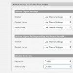
If you are using the Astra theme you should be able to disable the archive title in the theme option settings.
Edit the custom archive and expand the theme options section and disable the archive title (screenshot).
The whitespace problem on mobile is because you are adding large amounts of padding (e.g. padding-top and padding-bottom of 200px) to the div that wraps the search form.
I recommend you use media queries to modify the styles you are adding according to the screen size (hidden link)
My issue is resolved now. Thank you!


