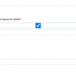
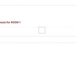
In a post form, I am using a check box to control whether a number of fields in the form are displayed or not.
I attach two images showing the conditional display.
I am struggling to identify how to control the appearance of the check box field.
I want to:-
1. Hide the check box field name and display only the check box.
2. Remove the thin line which appears across the top of the check box field when it is unchecked.
3. Remove the blue highlight box which appears when the check box is ticked.
4. Left align the check box.
Here is the form code showing the check box code:-
	<div class="form-group">
		<label>[cred_i18n name='room1check-label']Tick the box to add up to three room layouts for ROOM 1[/cred_i18n]</label>
		[cred_field field='room1check' force_type='field' class='form-control' output='bootstrap']
	</div>
Could you help me identify how to address these formatting issues.
Regards
Robert
Hi, these checkbox customizations must be accomplished with some custom code, either using CSS or a combination of CSS and JavaScript. See below.
1. Hide the check box field name and display only the check box.
This isn't easily accomplished with CSS alone because the text name is not wrapped in a targetable element. Instead, you can add a custom CSS class tssupp-hide-checkbox-text to all the checkbox field shortcodes like so:
[cred_field field='room1check' force_type='field' class='form-control tssupp-hide-checkbox-text' output='bootstrap']
Then add the following JavaScript to the Form's JS editor panel to hide the text for all the checkboxes with that CSS class:
jQuery(document).ready(function(e){
  jQuery(".tssupp-hide-checkbox-text").closest('label').contents().filter(function () {
     return this.nodeType === 3;
  }).remove();
});
This code may need to be adjusted based on how your theme and other plugins effect checkbox display. I would have to see the Form in the browser to make a more accurate recommendation.
2. Remove the thin line which appears across the top of the check box field when it is unchecked.
3. Remove the blue highlight box which appears when the check box is ticked.
4. Left align the check box.
These styles appear to be added by your site's theme or another 3rd-party plugin. I would need to see it in the browser (not a screenshot) to evaluate those styles and recommend a solution. Can you provide a URL where I can see the Form on the front-end?
Hi Christian
Thanks for the JavaScript which works just fine.
The rest of the styling appears to be done via the bootstrap class .form-control. If I get stuck sorting this out, what the easiest way to let you see the form? It's an edit form. Will you be able to see that if I just pop it on a page?
Regards
Robert
Normally you would place an Edit Post Form in an unassigned Content Template. Then you would include that Content Template's numeric ID as a URL parameter attached to the URL of one of the custom posts, like this:
<em><u>hidden link</u></em>
If you place the Edit Form directly on some custom Page, that might be sufficient. Try it and see if the checkboxes show up as expected, and if so, I can take a look.
Hi Christian
I popped two checkboxes on a create form which you can see at hidden link
'ROOM 1' is the standard CRED code. So you can see the field name and box shadow.
'ROOM 2' has the 'tssupp-hide-checkbox-text' class added together with your JavaScript and also a CSS line to remove the box-shadow.
The remaining issue I'm struggling with is how to position the checkbox. It uses absolute positioning and I don't understand why it has to use that method of positioning. Is it possible to move it either to the RHS of the label or to move it immediately below the label to the LHS of the screen?
Regards
Robert
The remaining issue I'm struggling with is how to position the checkbox. It uses absolute positioning and I don't understand why it has to use that method of positioning. Is it possible to move it either to the RHS of the label or to move it immediately below the label to the LHS of the screen?
The absolute positioning is applied by Bootstrap, and I can't really explain their decision either, but there are workarounds. Another part of the problem is that Bootstrap sets the checkbox input element width at 100% of its closest positioned container element. In this case, the closest positioned element is a full-width list item element. The browser renders the checkbox outline right in the middle of that full width element. That's why the outline of the checkbox appears in the center of the screen. So one option here is to add a div wrapped around the checkbox shortcode in the Form. Apply CSS styles to the wrapping div element to set a specific width, like 70px or something, which would contain the child elements and move the outline of the checkbox over closer to the left hand side. You could experiment with the width of that container some to see what works best. This reduces the clickable area though, so it might be slightly more difficult to check that checkbox on the front-end of the site.
Hi Christian
Thanks for the further advice and suggestions. I will try what you have suggested.
As a short term fix, I centred the checkbox field labels to line them up with the checkboxes. This looks okay for now.
Best regards
Robert

