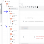
I have an archive, some element of the first post is overlapped to other element. In order to make 3 grid closer enough, I set a negative margin in 3 grids. I am not sure whether it is the best practice. can you have a look?
Hello and thank you for contacting the Toolset support.
Can you provide more details about this issue? What URL? What template?
url is hidden link, template is hidden link
I have set the margins in these 3 objects. In the archive you can see the second post shows differently. the first one is overlap.
another question is, in order to make 3 objects closer, is it the best practice to set margin?
First, I would suggest using "Single Field" blocks instead of "Fields and Text" blocks. Blocks should be aligned correctly.
Please, also, test in a default theme such as TwentyTwenty, just to be sure if it is related to the theme or not. If the issue appears only on the theme, we'll see how to fix it or we'll escalate the issue to our compatibility team.
1. I What is the difference between "Single Field" blocks instead of "Fields and Text"? Does "field and text" have more control on how it displays?
2. I set up the Grid margin to adjust the gaps among objects, is this a good practice?
3. I use generatePress theme, is this compatible with Toolset?
4. I change most of "Fields and Text" to "Single Field" except 1 field which I need to display content conditionally. I change the theme to twenty twenty. It still overlaps.
That "Field and Text" block is "[wpv-conditional if="( $(wpcf-cf-deal-brand) eq 'Others' )"]$(wpcf- cf-deal-brand-other)[/wpv-conditional]"
1. I What is the difference between "Single Field" blocks instead of "Fields and Text"? Does "field and text" have more control on how it displays?
The "Single Field" can pull the value of a custom or default field or a taxonomy term from the current post or a related post. The "Fields & Text" allows us to use legacy shortcodes and other strings. It is useful for cases like "By :{author field}" for example.
2. I set up the Grid margin to adjust the gaps among objects, is this a good practice?
Can you elaborate on this a bit more or add a screenshot that demonstrates this?
3. I use generatePress theme, is this compatible with Toolset?
Yes, GeneratePress is one of our recommended themes https://toolset.com/documentation/recommended-themes/
4. I change most of "Fields and Text" to "Single Field" except 1 field which I need to display content conditionally. I change the theme to twenty twenty.
You can use a conditional block instead of using the "Fields & Text" block.
Regarding the overlapping, can you try to put that element inside a "Container block" and check if it resolves the issue?
1. The "Single Field" can pull the value of a custom or default field or a taxonomy term from the current post or a related post. The "Fields & Text" allows us to use legacy shortcodes and other strings. It is useful for cases like "By :{author field}" for example.
Due to the main purpose is to use legacy shortcode, does it mean in most of the scenario I should use "Single Field"?
2. Can you elaborate on this a bit more or add a screenshot that demonstrates this?
Look at my snapshot, I want to reduce the gap where green arrow pointing to. The blue area is a container, there is a grid inside it. In order to reduce the gap, should I set in blue container 1.negative margin in container, 2. negative padding in container, 3 negative margin in grid, or 4. negative padding in grid? Or set something else?
4. You can use a conditional block instead of using the "Fields & Text" block.
Regarding the overlapping, can you try to put that element inside a "Container block" and check if it resolves the issue?
Yes, I place those 3 grids into a container respectively. now it works.
1. Yes, In most scenarios, you should use the "Single Field" block. We can consider that the "Fields & Text" block is primarily for using legacy shortcodes. Because, currently, Blocks do not offer the full spectrum of features legacy Views do.
2. The gab under the title is caused by a <p> tag. This is because the Title is displayed as a link inside the Fields & Text block. And is wrapped by a <p> tag. I would suggest using a "Toolset Heading" block or a "Single Field" block. Then you will customize it better.
I would say that negative margin or padding is a bad practice and should be avoided unless there is no other solution.
I hope this answers your questions. Let me know if you have any doubts.
My issue is resolved now. Thank you!

