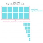
Tell us what you are trying to do? create truly responsive grid loop w/equal height cells
Is there any documentation that you are following? no - it would be great if you could give me a simple example of code rather than point me to documentation - unless it's truly relevant documentation. requirements are:
6 cell grid loop;
equal height cells;
responsive cells;
and also when the screen size changes 6 columns turns into 5, then 4, then 3, then 2, then 1.
seems like bootstrap cards is the answer but don't know how to make that work. but whatever method you guys recommend is fine. thank you.
Is there a similar example that we can see? no
What is the link to your site? n/a
Hi, what you're trying to accomplish is fairly complex, and will require some custom CSS using media queries. Can you show me in a browser where you would like to add the grid?
thanks - is it possible to use cards or no? is there one part of this that is complex, or all of it?
in my requirements list is 'responsive cells' i can live without that. i can keep my data standardized so that the content in each cell is always the same. i can also live with media query breakpoints. but would like to use cards - seems like a more elegant solution and the current situation is giving me grief trying to deal with margins between cells. i tried editing the loop container code - <div class="row" ><div class="col-sm-3", etc., to create bootstrap cards output but it didn't work. is there a way to do that?
is it possible to use cards or no?
Are you talking about hidden link ?
Bootstrap cards are available in Bootstrap 4, but Toolset uses Bootstrap 3. So the simple answer is no out of the box. Instead, you could try to load Bootstrap 4 yourself and tell Toolset to not load Bootstrap in Toolset > Settings > General, but I'm not sure how that would work with other Bootstrap components. Toolset is designed to work with Bootstrap 3. You could try it out. Another solution is to use CSS to style each element to look like a card.
is there one part of this that is complex
Responsive cells coupled with complex, specific row/column reflows. Here's the Bootstrap grid documentation:
hidden link
A simpler solution doesn't have quite as many column breakpoints, but accomplishes something similar:
[wpv-layout-start]
	[wpv-items-found]
	<!-- wpv-loop-start -->
	<div class="container wpv-loop js-wpv-loop">
	<wpv-loop wrap="6" pad="true">
		[wpv-item index=1]
		<div class="row ">
			<div class="col-xs-12 col-sm-6 col-md-4 col-lg-2 card">[wpv-post-body view_template="Loop item in Posts in grid"]</div>
		[wpv-item index=2]
			<div class="col-xs-12 col-sm-6 col-md-4 col-lg-2 card">[wpv-post-body view_template="Loop item in Posts in grid"]</div>
		[wpv-item index=3]
			<div class="col-xs-12 col-sm-6 col-md-4 col-lg-2 card">[wpv-post-body view_template="Loop item in Posts in grid"]</div>
		[wpv-item index=4]
			<div class="col-xs-12 col-sm-6 col-md-4 col-lg-2 card">[wpv-post-body view_template="Loop item in Posts in grid"]</div>
		[wpv-item index=5]
			<div class="col-xs-12 col-sm-6 col-md-4 col-lg-2 card">[wpv-post-body view_template="Loop item in Posts in grid"]</div>
		[wpv-item index=6]
			<div class="col-xs-12 col-sm-6 col-md-4 col-lg-2 card">[wpv-post-body view_template="Loop item in Posts in grid"]</div>
		</div>
		[wpv-item index=pad]
			<div class="col-xs-12 col-sm-6 col-md-4 col-lg-2"></div>
		[wpv-item index=pad-last]
			<div class="col-xs-12 col-sm-6 col-md-4 col-lg-2"></div>
		</div>
	</wpv-loop>
	</div>
	<!-- wpv-loop-end -->
	[/wpv-items-found]
	[wpv-no-items-found]
		<strong>[wpml-string context="wpv-views"]No items found[/wpml-string]</strong>
	[/wpv-no-items-found]
[wpv-layout-end]
In this example the key to the responsive columns is in the classnames:
col-xs-12 col-sm-6 col-md-4 col-lg-2
This means at large sizes you will have 6 columns, at medium you will have 3 columns, at small 2 columns, and at extra small one column. It's not exactly like what you had originally specified but it's pretty close, and doesn't require much additional code. I also added a "card" class to each card item, which you could use in CSS to target each "cell" in the grid, like adding a background or border.
the current situation is giving me grief trying to deal with margins between cells.
Again, if I could see this in a browser I could provide more specific advice here. If you want to use Bootstrap grids, you're a bit locked in to their margin systems, but sometimes it's possible to add margins to the contents of each cell to expand the apparent margin between cells.
thanks - i'll try this out. on the last question - all i'm doing is using the loop wizard for bootstrap, 4 columns - all the default settings. but i'm trying to decrease the margins between columns, not increase. do you have any suggestions?
ps, and my page and content are both full width. (on the last issue - grid margins)
Decreasing the gutter width will require overriding Bootstrap's margin and padding system for columns and rows using custom CSS. This isn't something I can provide a complete answer for here in the forums, but a quick search led me to these articles:
https://stackoverflow.com/questions/19041733/bootstrap-3-gutter-size/19044326
hidden link
