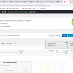
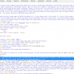
This thread is resolved. Here is a description of the problem and solution.
Problem: I am using a Bootstrap Grid to display some information. I have applied col-sm-9 and col-xs-12 classes to one grid item, but at mobile sizes it's not expanding to fill the width of the container. It's still at 9 columns width.
Solution: Check the CSS applied by the theme and other plugins. In this case, a media query is used to set the width of col-sm-9, but not col-xs-12. The means the col-sm-9 class is more specific than col-xs-12, breaking the grid code. Override that or remove the media query from col-sm-9.
Relevant Documentation:
https://css-tricks.com/specifics-on-css-specificity/
https://www.smashingmagazine.com/2007/07/css-specificity-things-you-should-know/
This is the technical support forum for Toolset - a suite of plugins for developing WordPress sites without writing PHP.
Everyone can read this forum, but only Toolset clients can post in it. Toolset support works 6 days per week, 19 hours per day.
| Sun | Mon | Tue | Wed | Thu | Fri | Sat |
|---|---|---|---|---|---|---|
| 8:00 – 12:00 | 8:00 – 12:00 | 8:00 – 12:00 | 8:00 – 12:00 | 8:00 – 12:00 | - | - |
| 13:00 – 17:00 | 13:00 – 17:00 | 13:00 – 17:00 | 13:00 – 17:00 | 13:00 – 17:00 | - | - |
Supporter timezone: America/New_York (GMT-04:00)
This topic contains 2 replies, has 2 voices.
Last updated by 6 years ago.
Assisted by: Christian Cox.

