Tell us what you are trying to do?
I would like to set up a carousel slider that shows two posts in two columns, but I can't seem to get the layout right. I either get a messed up overlapped layout or a layout in two rows instead of two columns. I would also like to center the pagination dots. See attached for the messed up layout and how I would like it to look.
Is there any documentation that you are following?
Looked on the forums and tutorials, and it seems like I am doing the correct thing, but not getting the proper results.
Is there a similar example that we can see?
What is the link to your site?
Page with the messed up slider using Toolset views: hidden link
Page with what I'd like the slider to ultimately look like (set up with a page builder for demo purposes): hidden link
Thank you.
I figured out the overlap issue, but how do I set it up so that only one post shows up on smaller displays? Also, I would still like to know how to center the navigation dots. Thanks!
Hello and thank you for contacting the Toolset support.
You can register WordPress function wp_is_mobile to conditionally display a one-column or two-column sliders for mobile or desktops.
https://developer.wordpress.org/reference/functions/wp_is_mobile/
https://toolset.com/documentation/user-guides/views/conditional-html-output-in-views/
For the dots, you will have to tweak it with CSS and test it on different browsers and devices to be sure. The following code worked for chrome on desktop and worked for the mobile simulator
ul.wpv-pagination-nav-links-container.js-wpv-pagination-nav-links-container.slider-nav {
    width: 1%;
    margin: auto;
}
Thank you Jamal. I think I'm going to need you to walk me through the process on how to register the wp_is_mobile function. Do I put that code in the functions.php file of my child theme? And then do I add the conditional statement in the offspring view or the page template where the view is output? Sorry, but I'm a bit of a neophyte some of this.
No need to add anything to functions.php file because the function wp_is_mobile is provided by WordPress. If we want to create our own function, we can add it to the theme's functions.php file.
Then we need to register the function in Toolset->Setting->Front-end Content). Check this screenshot hidden link
Then we can use it on our views (or conditional blocks if you are using Gutenberg/Blocks editor). Check this example with shortcodes:
[wpv-conditional if="( wp_is_mobile() eq '1' )"]
<h3>Mobile content</h3>
[/wpv-conditional]

[wpv-conditional if="( wp_is_mobile() eq '0' )"]
<h3>Desktop content</h3>
[/wpv-conditional]
Check the result on this screenshot with the browser mobile simulator hidden link
Ah, okay. I've registered the wp_is_mobile. But which view or template would I add the conditional for only one post to show in the carousel on mobile? What is the coding I would use?
When creating a slider with Toolset, you can define how many columns you want. Define two slider views, one for desktop with two columns, one for mobile with one column. Then you can put the views inside the conditional shortcodes accordingly.
Ahhhh. Got it. Thank you!
Would you be so kind as to help me with one other thing regarding this carousel layout?
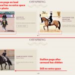
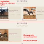
I am using the exact same template to display the offspring on both the stallion and mare pages, but for some reason, when the carousel slides on the mare page, the navigation buttons shift about 10 pixels down and then there is about a 10 pixel space underneath the photo. It does not happen on the stallion pages. I've attached screenshots to illustrate what I'm talking about and you can see the carousel on these pages (it's down at the bottom):
Stallion: hidden link
Mare: hidden link
I have looked and looked and looked at all my coding deleted things and added them back in and nothing do seems to make a difference. Maybe a fresh pair of eyes can detect the issue.
That space issue was really hard to find, it seems that it is caused by a line-height, probably because below the image, there is an empty <p> tag. I am not really sure, I have modest CSS knowledge.
But the following code seems to work for that page:
.q_elements_holder_custom_936850 .wpb_wrapper {
    line-height: 6px;
}
I only tested it on the chrome developer tools. Give it a try and let me know what you will get.
Good catch on the <p> tags. It looks like there were a bunch of them. I deleted all the returns in the code and that cleared things up. It looks like the stallion offspring view did not have all those <p> tags automatically inserted. Weird, because I just copy/pasted the code from the stallion view to the mare view, but the copy/paste somehow inserted the <p> tags on the front end.
Thank you for all your help in getting this all resolved.
My issue is resolved now. Thank you!


