I refer back to this thread: https://toolset.com/forums/topic/archive-layout-display-bug-with-astra-on-xs-view/
There have been some updates to Astra and Layouts and now this bug is back in a different context. For example, please see this page: hidden link
In xs view the row padding is doing something odd again - padding is disappearing on the top row.
I'm not exactly sure what you're describing. Are you talking about the left edge of the blue boxes? I believe the problem is partially because of the borders applied inside the grid, and partially because of the next issue (see below). You may be able to clean this up by removing the border-left from .grid-unit elements in XS dimensions using media queries.
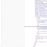
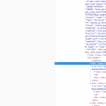
If you're referring to the main image at the top of the screen, I think the problem is actually that the content of this area is spilling out past the horizontal boundaries. You can scroll left and right, even on a large desktop device, and that shouldn't be possible. I'm seeing some nesting in the markup for the header image that doesn't make sense (nesting.png):
- container-fluid
--ddl-full-width-row
---col-sm-12
----ddl-full-width-row
I think this nested structure around the top image could use some adjustments. The col-sm-12 and following ddl-full-width-row seem to be redundant, since they are children of a ddl-full-width-row. This redundancy is breaking the grid and causing horizontal overflow. If I remove the col-sm-12 and ddl-full-width-row classes from those two nested elements, the horizontal scrolling is fixed on desktop and XS. I'm not clear how that nested structure would be created in a Layout. May I log into this site's wp-admin area to take a look and the Layouts? I may be able to offer a suggestion for improving the Layout structure.


