Skip Navigation

[Resolved] Align Layout / CSS with ddl-full-width-row for mobile resolution

This thread is resolved. Here is a description of the problem and solution.

Problem:
The issue here was that the customer had alignment issues with his divs when they are being rendered on a mobile device.

Solution:

We actually have a way to do this and the instructions can be seen below.
https://toolset.com/documentation/user-guides/creating-responsive-designs/#how-to-set-up-larger-margins-for-extra-small-devices

This support ticket is created 6 years, 11 months ago. There's a good chance that you are reading advice that it now obsolete.

This is the technical support forum for Toolset - a suite of plugins for developing WordPress sites without writing PHP.

Everyone can read this forum, but only Toolset clients can post in it. Toolset support works 6 days per week, 19 hours per day.

Sun Mon Tue Wed Thu Fri Sat
- 9:00 – 12:00 9:00 – 12:00 9:00 – 12:00 9:00 – 12:00 9:00 – 12:00 -
- 13:00 – 18:00 13:00 – 18:00 13:00 – 18:00 14:00 – 18:00 13:00 – 18:00 -

Supporter timezone: America/Jamaica (GMT-05:00)

This topic contains 6 replies, has 2 voices.

Last updated by Mario 6 years, 11 months ago.

Assisted by: Shane.
Author
Posts
#609506
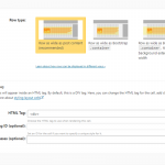
2018-01-24_18h59_27.png
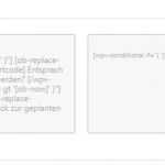
2018-01-24_19h08_55.png
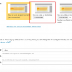
2018-01-24_19h21_38.png

I created two div boxes with Toolset-Layout. See Screen.
In mobile resolution view, i have padding left or right, coming from class 'ddl-full-width-row row'.

So how could i align this boxes (with green buttons) perfect to right an left border?

Page:
hidden link
I read for example
https://toolset.com/documentation/user-guides/creating-responsive-designs/

Thank you for pointing me in the right direction.

#609528

Shane
Supporter

Languages: English (English )

Timezone: America/Jamaica (GMT-05:00)

Hi Mario,

Thank you for contacting our support forum.

From your screenshot I see that you want to align to 2 boxes beside in other on what seems to be a mobile screen.

This wouldn't be possible because the screensize is too small to allow for 2 boxes to be placed beside each other.

They should reflow like that for a larger screen like an Ipad but not so for smaller screens.

Thanks,
Shane

#609579
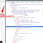
2018-01-24_23h32_46.png
2018-01-24_18h59_27.png

Shane, thanks for answering quickly.

No not besides, just in one column.
My problem ist that "ddl-with-class" inserts this padding:0 and i couldn´t disable this ddl class.
Could choose 'Row as wide Bootstrap', but this produces unfortunately other problems.

#609805

Shane
Supporter

Languages: English (English )

Timezone: America/Jamaica (GMT-05:00)

Hi Mario,

I see the issue with the alignment now.

Try using this css

.ddl-full-width-row>[class*="col-"]:first-child
{
    padding-left: 14px;
}
.ddl-full-width-row>[class*="col-"]:last-child {
    padding-right: 13px;
}

Please let me know if this helps.
Thanks,
Shane

#609816

Thank you Shane, that works perfect. Great.
But a little bit confused. Why is this necessary? Do i do something wrong?

#609863

Shane
Supporter

Languages: English (English )

Timezone: America/Jamaica (GMT-05:00)

Hi Mario,

Actually I fixed it using CSS but the correct method was here:
https://toolset.com/documentation/user-guides/creating-responsive-designs/#how-to-set-up-larger-margins-for-extra-small-devices

I didn't think you did anything wrong but the offset was needed to be set.

Thanks,
Shane

#609887

thumbs up.