This thread is resolved. Here is a description of the problem and solution.
Problem:
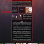
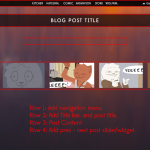
Okay, so the idea is that I begin with [Support Example - Post Template.png]
I create a template that includes my navigation bar, a title, post body, and a widget for previous and next posts.
This is my default post layout.
Then I go into my post and write out an article which includes sections, columns of information, supporting images and other media. All as part of this particular article topic. All using the wordpress dashboard text editor.
I then load that article on the site and it uses my default post layout as it should and displays like [Support Example - Post Body with unique formatting.png]
If you're on mobile and your screen is constrained, then the columns rearrange as toolset does and everything stays organized and well presented. Otherwise everything displays like the image because it's formatted to be that way.
Am I able to do this with toolset? Or would I need to create tables or custom shortcode myself to have such a feature?
Solution:
1) Then I go into my post and write out an article which includes sections, columns of information, supporting images and other media. All as part of this particular article topic. All using the wordpress dashboard text editor.
Yes, it is possible with the Layouts plugin, please check the document I mentioned above:
https://toolset.com/documentation/user-guides/front-end-editing/#editing-layouts-on-the-backend
section "Editing layouts on the backend", you can edit the post content with Layouts plugin in wordpress admin side.
And when you edit/create a post/page in the WordPress admin side, there is a button "Content Layout Editor" just above post content editor, click it, you will be able to design the post content with the Layouts plugin, see screenshot Content-Layout-Editor.JPG
2) I then load that article on the site and it uses my default post layout as it should and displays like [Support Example - Post Body with unique formatting.png]
You will need to design the post body within Layouts plugin to what you want in step1), see the document I mentioned above:
https://toolset.com/documentation/user-guides/learn-how-rows-can-displayed-different-ways/
Add different layout cells to design the layout from scratch:
https://toolset.com/documentation/user-guides/#layouts-cells
3) If you're on mobile and your screen is constrained, then the columns rearrange as toolset does and everything stays organized and well presented. Otherwise everything displays like the image because it's formatted to be that way.
Yes, Layouts plugin is based on Bootstrap framework, on mobile device, you can fully responsive designs with Layouts plugin:
https://toolset.com/home/layouts/
Create fully responsive designs without effort
And here is the document of bootstrap
https://getbootstrap.com/docs/4.0/layout/grid/
For your reference,
Relevant Documentation:
Everyone can read this forum, but only Toolset clients and people who registered for Types community support can post in it.
| Sun | Mon | Tue | Wed | Thu | Fri | Sat |
|---|---|---|---|---|---|---|
| - | 9:00 – 13:00 | 9:00 – 13:00 | 9:00 – 13:00 | 9:00 – 13:00 | 9:00 – 13:00 | - |
| - | 14:00 – 18:00 | 14:00 – 18:00 | 14:00 – 18:00 | 14:00 – 18:00 | 14:00 – 18:00 | - |
Supporter timezone: Asia/Hong_Kong (GMT+08:00)
This topic contains 6 replies, has 2 voices.
Last updated by 6 years, 10 months ago.
Assisted by: Luo Yang.
The forum ‘Types Community Support’ is closed to new topics and replies.


