New Homepage for Toolset, Projects and Free Trials
If you visited Toolset website today, you may have noticed a few changes. Let’s look at them together and see what they mean for you.
New homepage(s) – one for visitors and for logged-in clients
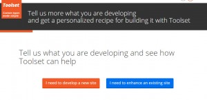
When you visit our homepage, if you’re not logged-in, you will see this:
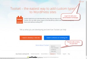
Don’t worry. It’s not all gone. The menu just moved to the bottom (on the homepage). And, if you login (top-right), you’ll go to your personalized homepage:
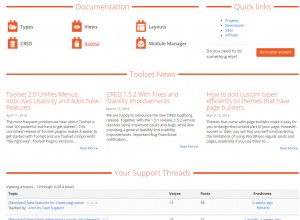
Your personalized homepage shows links to documentation, links to important account resources, news and your support threads.
“Projects” to help you use Toolset the right way
You probably know that you can do many different things with Toolset. Toolset is like a huge box of Legos, which you can put together in different ways, to build different things.
Do all Lego sets come with the same generic instructions? Of course not. Each set comes with its own book, explaining to you how to build that specific thing with the Lego cubes.
This is the purpose of the new “Projects” system.
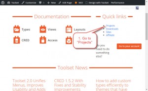
1. Go to the projects section
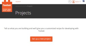
2. Create a project
3. Choose if you are creating a new site or updating an existing one
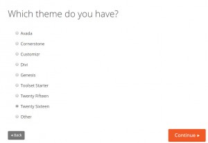
4. Choose which theme you are using (for new sites)
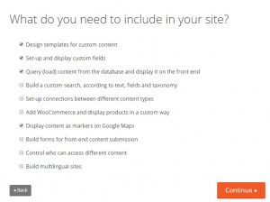
5. Choose what you want to build with Toolset
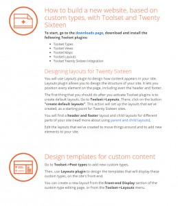
6. Get your personalized recipe for how to build it with Toolset
The instructions that you get depend on what you want to build, if it’s a new site or an existing site and your theme. You will see which Toolset plugins you need to install and how to use them. Instructions give an overview and links to relevant documentation.
Free trials
Toolset is a major change from how developers build WordPress sites. Some are willing to jump head-first and try. For others, it looks too scary. We’re making trial easier, by offering it completely free for the first 30 days.
When developers want to try Toolset, we ask for a PayPal pre-approval. This is not actual payment and no money leaves the account. We do this, to verify that we’re talking with a real person, who can eventually pay if deciding to stay with Toolset.
During the trial period we offer unlimited downloads, installs and support. This costs a lot and we want to know that we’re offering it to folks who are real Web professionals.
We hope that you like these changes. Let us know what you think by leaving your comments.
Personally I’m not a fan of the new workflow for guest visitors – navigating to the homepage reveals only two main buttons, which lead to a questionnaire. In my humble opinion a good percentage of the readers would require additional details and browsing around, and those could be “exported” as “Site Configurator” or “Project Builder”, or “Recipes” workflow buttons that are not as prominent as they are now.
I would assume (possibly wrongfully) that this would also affect SEO and general searchability for people looking for solutions that are now behind a “paywall” in the form of those questionnaires, which may limit the number of people visiting the site while looking for certain queries (i.e. people in the Attract or Convert phases as HubSpot would define these in their Inbound flow).
The logged-in dashboard looks neat and certainly helpful for existing users, although I have my doubts regarding the added complication and additional layers/steps for first-time visitors as a main action hiding the standard layout (not a helper button or wizard).
I’m really curious how would this go in the short and long run – conversion rates, traffic changes and the like, so hopefully you can also blog about the redesign success in a few months from now 🙂
Well, it’s new for us too, so we’ll see. The homepage for visitors includes all the links that we had before. The navigation menu is at the bottom of the page and opens upwards.
Sure thing, I’m confident that this is an informed decision based on customer feedback, stats, and experience from previous redesigns. I’d honestly love to read more about how it goes, since it’s a bold experiment that may very well be groundbreaking in terms of innovation and usability.
I think the new logged in homepage is great — frankly i was always lost when coming here and couldn’t find what i need. This is a step in the right direction!
The new website looks good – I like the concept. For a total toolset geek, so I’m not your typical audience. But I also do a lot of marketing and I think that your wording is bit wonky, a bit inaccessible to the new comer. There’s a lot of assumptions that people will get the whole concept of custom post types and that they get that an archive page is an aggregation of custom post types. I would start out with a really strong WHY, why Toolset, and then gently work through the landscape of what you offer, so that people will get the benefits. If the market is people that already geek around with WordPress, then I think its fine. If you’re trying to attract a broader audience, I would try to make it more accessible. That’s my two cents worth
Hi Steve, you intrigued me with these words:
“I would start out with a really strong WHY, why Toolset, and then gently work through the landscape of what you offer, so that people will get the benefits. ”
So “why Toolset?” in your option? Even if your view is very subjective, I’m eager to learn more why you find Toolset valuable.
I totally agree with Steve. The new site looks great, and the idea behind it is solid, but for people new to WordPress, or those who don’t really understand what CPT’s are, or those who do but don’t understand how Toolset can help them tackle this issue – the new homepage doesn’t seem to help a lot.
Perhaps another pair of big buttons saying something like “New to WordPress or Custom Post Types?” and “Don’t know how Toolset can help with CPT’s?” would alleviate this.
Keep on the good work, you guys rock!
yuda
Hi Yuda, thanks for your feedback.
What makes you think that this new new homepage doesn’t seem to help a lot for new users? Can you share an example? It would help me to understand your point of view.
Of course if we learn that this new approach doesn’t help much, we will tune it.
I like the idea of the wizard, especially as over time you can really focus in to give people targeted information. It seems like an excellent way to collect info on what users want to do. Here are things that came to mind as I explored the new landing pages / wizard:
1) Links for documentation, support, and the blog are pretty hard to find. The convention is to put those frequent targets in a nav bar at the top, though I’ve seem people use a hamburger / mobile icon menu when they wanted to minimize distraction.
2) Suppose I want to see a list of features? The summaries are pretty general.
3) If I am not a WordPress developer, will I understand the options in the wizard?
4) Everything but Layouts works with any theme, but the first question in the wizard is about themes … the question and the answer referring to themes might make people think that only particular themes work.
5) At the end of the wizard you summarized my answers and pushed me to a free 30 day trial. What happened to the awesome reference site option? A nice thing about the reference sites is the support team could see what you’ve done and answer questions. While I know that I can dig around, the end of the wizard, the 30 day trial option, seems like the end of the road.
6) I expected instead of the summary of my answers, that you would have a pointed summary of how specific toolset components could address each requirement, with links to tutorials on how to. You have lots of great documentation and tutorials. When I am making buying decisions I look for that kind of resource.
7) I get the feeling that there is a pretty big push for layouts. Is it that big of a draw / reason people are buying? I came for Views, and am enjoying the rest.
As always, you are pushing to be better and move things forward. Keep up the good work and please let us know how it goes and what you find.
Hi,
Just wanted to mention that the result loading for the homepage questions is reeeeeally slow – I hope that’s not because of Toolset plugins 😉
I love Toolset solutions, as new user the new homepage design would definitely scare me off though…
Cheers,
Thomas
Hi Thomas, thanks for your comment. You mean you would be scared off because of the graphic design or the content? I would appreciate more details to learn something constructive from your comment. Thanks and best regards.
Dear Agnes,
For more details and to learn something constructive please visit or download the pdf file from the following urls.
https://gtmetrix.com/reports/wp-types.com/LZ4QaL8w
https://gtmetrix.com/reports/wp-types.com/LZ4QaL8w/pdf?full=1
Thank you. It helps. We are working on optimizing our site.
Hi,
Well, the loading of the results takes a really long time. I think this is a nice advanced feature or option for interested visitors, it shouldn’t be the main way to discover Toolset though.
In my opinion, you should create clean one-page homepage with all relevant basic facts and links to in-depth sections. You can still provide to directions for new and existing site tasks, forcing visitors to use the questionnaire will most likely annoy most of them.
If you really need/want to provide a custom experience, why not just use Ajax filter selects with a grid below that only shows the relevant information/page teasers with links
Cheers,
Thomas
Sorry, don´t have enough time to more details, but I don´t really like the new homepage. And I really like you guys to have a growing and successful business.
Hi Iroko, thanks for your opinion. I would appreciate more details once you have more time. It would help us to improve.
Hello there.
I didn’t actually see your previous homepage, as I am brand-new to the Toolset. However I don’t think the goal of your exercise was a comparison, but more of an inquiry to learn about the benefits and shortcomings of your current website. That being the case, please consider this:
The first thing I look for is an overview; ideally a visual overview. The overview helps me understand what a product can do – and how it does it – in a very short period of time. When I didn’t find one on your website, I initially left and continued my search for solutions.
There are many partial solutions out there and periodically while searching (originally for “Gravity Forms & Post Types”) I would see another mention of your product and come back to your website again to see what I had missed. Ultimately, I purchased your complete toolset based only on my belief that your components could be combined in a manner that provided a solution that was superior to the many I had reviewed. Obviously, the 30 day refund policy was a determinant factor in this decision, since I still didn’t understand how to use the Toolset.
Once I was invested, I turned my entire focus to learning about the product. Again, I wanted to start with an overview. Since there wasn’t any obvious link to an overview I thought I would search for one. Of course, there is no search available on your site, so I had to turn to Google. Still I had no luck finding an overview.
For clarity, when I say overview, I’m referring to a visual representation of the process one would implement in order to best utilize your components.
Imagine you had never heard of a bank. Now if you went to a bank website and found the various components for banking: account, checks, deposit slips, debit card, statement, etc., that would be helpful. But without a thorough explanation, it may be easy to understand what each component’s function is, but not so clear how it actually works. I mean, without an overview you may not realize you need to use the deposit slip first to make a deposit in your account before you can use the checks or debit card. You may imagine that you can use the checks and debit cards first and then make a deposit after you get a statement.
That is to say, that while you seem to do an excellent job in describing each component, the absence of an overview may leave the new customer/potential customer without the context needed to fully absorb the potential of your products capabilities. Essentially, I find myself with a list of ingredients, but no instructions for the recipe. You can explain to me what food group each ingredient is a member of, describe the taste of the ingredient, give me a visual picture of the ingredient, and describe how the ingredient taste. And while I’m sure I could use all the ingredients and I may be lucky enough to guess how to cook (or not cook) each of them, being able to add the appropriate ingredients in the appropriate quantity, in the correct order is highly unlikely and will I will probably ruin the dish.
A quick example is that of Genesis integration. Having used Genesis for more than a decade, “Genesis Integration” was a factor in my buying decision. Of course, I was unable to find anything about it on your website and had to go back to Google to find the URL where I had originally noticed it while searching for other solutions. And now that I read it, I still a little unclear on whether I will be including Toolset with Genesis or including Genesis with Toolset.
Similarly, I appreciate your effort in creating users individual training websites. Unfortunately, the advantage of them escapes me at this early stage of my involvement. I had Imagined they would work similar to the concept that is used by cloud–press.net, which is somewhat of a SAAS staging server where I one has the ability to export directly to their hosted site. If the main advantage is a free website to dork around in, then I would suggest that this is something that your target user can already do. Even the cheapest of web hosting services these day allow you to have sub and or addon domains and provide a script-based WordPress installation.
Anyway, as I said, I did buy the product, so my effort here is based on the hope that my input will be useful in improving the product and its documentation. I have been working with software long enough to know that – in addition to the purchase price – a useful product that provides comprehensive solutions will generally require an investment of time to become proficient in its use. That’s expected. I’m already impressed with the comprehensive nature of your documentation presentation, but if you’ve ever read any legal code in your life, you know something can be very comprehensive and still lack clarity. This is the gist of my message to you today.
Basically, I would suggest you do the thing that is counter intuitive from your standpoint and imagine that no one really cares about your product; they only care about how to get their project done in a fast and professional manner. In doing this you can better understand the usability shortcomings of your website, and perhaps your product workflow.
Kindest regards –
Dear Anthony,
thank you very much for your time and your valuable feedback. That’s the longest comment we have ever received. Thank you. I appreciate the time you spent to post it even if you used voice recognition software.
So you are saying that the “How you will build sites with Toolset” section on our homepage doesn’t help to understand our product workflow? Or maybe you were referring to our wizard (removed now)? How would you change it to make it more helpful? I mean for you, personally.
Yet another example of the single biggest problem in communication – the illusion that it has actually taken place.
First, while I now see a search icon in the site’s header, I don’t think the indexing is working properly. For example, searching for “How you will build sites with Toolset” returns “No search results”. I finally found it after I logged out.
Anyway, to answer your question, no, the five-step “How you will build sites with Toolset” isn’t very helpful to me. While it could be considered an overview, it is certainly one of the most simplistic.
As for how I would make it more helpful, maybe I used the wrong terminology before; instead of saying visual overview, maybe I should have said “flowchart” or an “if-then” breakdown of how to make decisions within Toolset.
Is already something like that? Basically, I think that if I understood Toolset’s approach I might be able to get it a lot faster.
For instance, the “access” capabilities that Toolset offers seem to be very superficial. Or maybe it’s just a problem with the way things were done. At this point it’s difficult for me to define the limitations of the Toolset software. This makes application planning difficult as you don’t want to just start building only to later learn that an important part of your plan isn’t feasible (or even practical) in toolset.
To explain, I gather you are using your own software on this website. So now I am wondering why – when I’m already logged into the website – does constantly try to sell me the Toolset software (which I have already purchased)?
Isn’t there a way for Toolset to get this user-related information? Why don’t the pages in your website know my purchaser status when I am logged in?
This is similar to the behavior of your Classifieds “reference site” wherein it continues to ask for billing information, even if you are logged in. Also in that reference site, I added several locations but none of them showed up in the search location drop box on the front end – only the four locations that were originally included in the reference site are viewable.
I guess I’ll just start posting questions in the forum.
Thanks anyway
Thank you. You are making good points here. It’s not easy to explain what Toolset is and what it does. Such a flowchart would help for sure but I find it difficult to picture it covering all Toolset aspects. There are so many applications of Toolset plugins.
And of course you are right that we can do better with showing diffrent contents for logged and not logged in users.
You are also right about the classifieds site. I’m not sure if we will fix this on our current site since we have plans to build a simplified version of this site combined with CRED/Access tutorials.
Thank you for your feedback again.
Well if you can’t clearly explain what it is, what it does, or how it does it, then you have a real problem. And to your point about a flow chart or diagram, while you may not be able to show every facet of what it can do, surely you could show a component’s most central functions and and how it interacts with the most central functions of the the other components.
Such an overview of the context and relationship of the components – however basic – would be a massive improvement over simply imagining how it works. Ideally, you would also have a step-by-step documentation as to how to create one of your reference sites.
To be clear, I’m not speaking of instructions on how to LOAD a pre-constructed reference site, but to instead actually create it – just as you had to originally do before you packaged it.
When one simply loads the pre-constructed site with the installer, all they can do is try to reverse engineer it. Of course, reverse engineering it can provide some limited insight, but going through the steps to actually create the site would be exponentially more informative and educational.
Actually the basics are simple:
Everything revolves around Post Types (Posts, Pages, Custom Post Types) and custom fields.
1. You use the Types plugin to manage them (add new, edit, delete, connect in relationship).
2. You use Views to display them on the front-end in diffrent variations.
3. You use CRED to build forms to add/edit them through the front-end. In addition CRED allows you to build front-end form to add new WordPress users and edit their profiles.
4. You use Access to control access to them.
This site
http://views-tutorial-demo.discover-wp.com/
has a series of step-by-step tutorials attached showing how you can build it yourself.
https://toolset.com/documentation/user-guides/getting-started-views/
We only did the first step for you, I mean we created relevant Post Types and example posts to save your time.
Currently we are woking on a similar site and tutorials but in the membership area, so you could learn how to use CRED to create front-end forms for content submitting, including user registration and account management form the front-end.
I must go back to the need for an overview.
For instance, you didn’t even mention Content Templates. Can they be used in regular WordPress pages or should they only be used in Views? Can you even have a View without a Content Template? And what about binding content to Content Templates?
I’m just saying, this stuff isn’t as simple as you pretend, and without a decent overview of the RELATIONSHIP between your various components, it’s like using a crossword puzzle to play chess.
I have seen similar notes going back for years and whomever is in charge of documentation needs a fresh look at a different approach.
You are right about Content Templates.
A Content Template can be used:
1. As a template for single post pages
2. As a container to group elements in a View loop
3. As a block of “code” that can be used in many places all over the site
We will add the missing page with more details to our Toolset documentation. Thank you.
One other note: contrary to what you state above, I noticed that my paypal account was billed immediately instead of waiting 30 days as you described above. Assuming I can just get a refund within the 30 days, this isn’t a big deal for me, but I can see how it could have been a big deal for others if they weren’t expecting the payment to come out immediately, so you probably want to look at why the payment ran immediately instead of waiting.
Hello,
if your account was billed immediately you must have used the “Buy Toolset” button instead of the “Try Toolset”.