Major Betas for Types and Views, CRED Update
We are very happy to release a beta of Types 1.4 and Views 1.3, together with a maintenance release of CRED. These new versions bring Types and Views aim to greatly improve usability and let you get more work done with Toolset.
Views 1.3 – New Interface and Workflow
Views 1.3 comes with a completely new GUI and improved workflow for many of the more demanding tasks.
In case you haven’t seen it yet, the video clip that I’ve prepared for the Views 1.3 preview post is still very relevant for this update:
New Names
First, some naming changes:
- Views -> Views (no change)
- Content Templates -> Content Templates
- View Archives -> WordPress Archives
We hope that name change helps and not bothers you. Our fingers are crossed 🙂
New Listing Screens
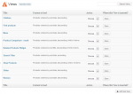
Cosmetics aside, the first evidence of change comes when you visit the listing pages.
Convenient Views Editing
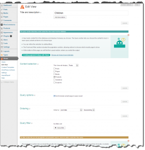
The new Views editor is in the heart of Views 1.3. It exposes everything that you need and lets you see what’s available and needed to complete your work.
We figured that it’s better to create a long admin screen, which shows you everything you need, rather than make it compact and play hide and seek with numerous show/hide controls.
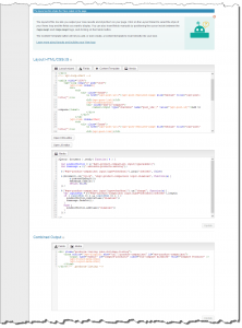
This screenshot is a bit long, so let’s look at it one piece at a time.
Here’s the new Query section, which determines what the View loads:
In this section, you choose the content type, query options and content filtering. It’s the same as before, just that we hope that it’s more intuitive now and easier to grasp.
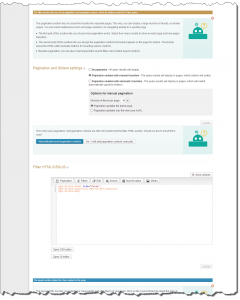
The filter section is where you enable pagination (for paginated lists or sliders) and set up custom searches.
Instead of hiding the ‘complicates’ options, Views 1.3 shows them all, but tries to make every control clear and simple. More on this in just a bit.
And finally, we have the output section, where you design and style the output coming from the View:
The output section exposes the HTML editors always. Instead of repeatedly opening and closing them, you just get the right editors open and ready to use always. When you update the HTML, you don’t need to scroll up and ‘update’. You get local update buttons next to each section, making edit / test / refine easier and quicker.
Streamlined Views Setup
Did you notice how the Views setup page became a little long? Don’t worry, most of the time it’s going to be a lot shorter for you. How? By showing just the sections that you need to achieve your goals.
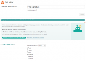
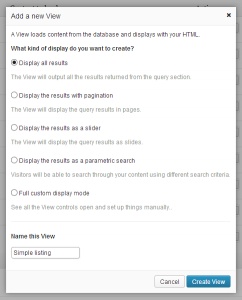
When you create a new View, first, you’re asked what the View is for.
Once Views knows what you want to achieve, it’s easy to show you just the controls that are needed for it. For instance, if you want to list all ‘products’, there’s not much point in showing you controls for building a paginated list, or a slider. Right?
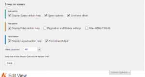
Armed with this knowledge about what you’re building, the Views admin screen adapts to your need. Only relevant sections will display, along with specific help messages that explain about them. Once you get the hang of it, you can always dismiss these soon-to-be-nagging help messages. However, we hope that they might help first time Views users.
And, don’t worry if you created a View for one thing and later what to add more to it. You can always show and hide sections in the familiar WordPress ‘screen options’ tab.
Easy Custom Searches
Now that we have a modern GUI, we can put it to good use and make working with Views easier. The first thing that we wanted to fix was that powerful but super-difficult-to-use custom search feature.
Custom search is actually a complex feature by definition. Here is how it works:
- You need to have a filter for each search criteria.
- That filter needs to have a value coming from a URL argument.
- You need to add the filter element to the HTML and display it as part of the filter section.
Then, when visitors click on the ‘search’, they generate a URL that includes all the filter arguments, Views parses it and filters by that criteria.
So, we figured that it can remain complex on the inside, but it needs to appear simple and intuitive on the outside.
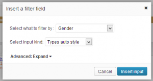
In Views 1.3, to create a custom search, all you need to do is throw-in fields to the HTML.
See? That wasn’t too painful, was it?
The idea here is that you just need to tell Views what you want to have in the filter and Views sets up everything for you.
When you insert a field, Views already knows what kind of input it should be, from the Types field setup. You can always override this and choose other HTML input kinds, but that’s optional. Then, Views automatically adds that field to the Query Filter section, with the correct setup to work as a custom search.
Combined Content Templates with Views
We recommend to use Content Templates inside Views, when you need complex styling for your output. This way, you can edit conveniently and reuse the same template in several places in the View layout.
Until now, using Content Templates with Views was a multi-step process. You had to navigate away, create your template, save it, refresh the View and insert. Works, but not to conveniently.
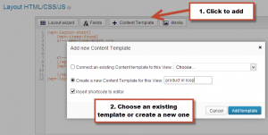
Views 1.3 integrates between Views and Content Templates. When you want to use a Content Template in your View layout, just add it there. See what happens:
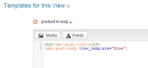
Once you’ve added the Content Template, you can edit it in the same Views edit page. Scroll down below the Layout HTML section and you’ll discover your Content Templates there.
Easy HTML Editing and Field Insertion
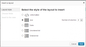
On one hand, we wanted to make it easy for you to edit the View HTML. On the other hand, we realize you need a tool to create the first looks. Views 1.3 displays the HTML editing box always and it also creates a convenient wizard, which lets you create your first layouts.
There’s much more in this release, but I’m leaving a bit for you to discover 🙂
Types 1.4 – Dialogs for All Field Options
Types 1.4 lets you insert fields, with their full features, without having to memorize shortcode attributes or read our documentation. It took about two months to build and we think that you’ll be happy with the results.
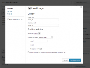
For example, when you insert an image field, you see this dialog:
Whenever you insert a field, you get such a popup, with all the options for that kind of field. You’ll find the basic options on the main tab, styling options and ‘post ID’ options on their tabs.
Besides adding dialogs for all Types fields, this release also improves on stability, consistency and performance. Types 1.4 feels much lighter, opens admin screens faster and smoother and makes your admin work nicer. The idea is that you should just not feel Types, but flow with your work, uninterrupted.
CRED 1.2.2 with Better Design and Many Fixes
This release also includes a big maintenance update for CRED. This version includes:
- New admin screen styling, to be more consistent with the Types and Views
- A number of bug fixes
- Improvements to the notifications system
- Streamlined form wizard
- Better compatibility with other plugins
By itself, this update doesn’t include anything amazing, but it doesn’t end there. Many of the bugs we fixed were exposed as we built a fully-functional classifieds site with CRED, CRED Commerce and WooCommerce. With this new version of CRED, we’ll be able to launch our classifieds reference site very soon.
Trying Types 1.4 and Views 1.3
The new betas for Types 1.4 and Views 1.3 are ready in your account right now. To download them, log in to your account and click on Downloads. Scroll to the bottom, to the betas section.
Please note that you must update everything, as Toolset plugins have some shared code. You should definitely use both betas for Types and Views and if you’re using CRED, make sure to update it too.
And, you are very welcome to experiment with the new versions in our Discover WP site. We’ve just installed Types 1.4, Views 1.3 and CRED 1.2.2 there. If you have exiting sites, they’re still running great, just with the new version. Otherwise, head over to Discover WP and create your new sites. This is probably the easiest way to play with the new versions and report issues.
What do You Think?
Views 1.3 has been in intensive development in the last 4 months. We had a team of 5 developers, 2 front-end designers and a GUI designer. We’re happy with the results, but we’re more interested in hearing what you think.
Leave your comments and I’ll get back to you.


Will it ever be possible to do a text search across fields in posts? I could really use that 🙂
You mean search any custom field in a post? Have you tried to do that with the parametric search feature? It’s a lot easier to use now.
For me, Types and Views are a ‘Must Use’ plugin for most of my wordpress implementations. These changes just crank that up to 11. I am incredibly excited about using the new views, specifically. I don’t think WordPress has anything comparable, in the whole giant community, like the Views functionality. This release just makes it that much more powerful. Seriously, thank you so much.
Very True
Good work! The gui seems easy to work with.
With the new bootstrap theme I have started using views more and in situations that might not be the intended use case where no cpt is presented by the view. Like creating custom headers, layout (loading other views) and even as an enhanced textwidget. At the screen where we select what we want to do can there be an option that only loads the gui for editing html, css, js and content templates?
In the “Custom Post Types and Taxonomies” screen, the links under the “User fields” and one link under “Access control” don’t go anywhere? Perhaps these are just unfinished areas?
Regardless – Great work guys!
Good catch. We’ll fix those links. Thanks for the feedback.
Just watched the demo video for Views 1.3b and have been blown away. This update will make working with Views so much easier, and will allow for creation of more complex WordPress sites much more easily. Thank you team Toolset, it looks like you have come up with a much improved solution that I am looking forward to using on websites we create.
Views already was before the one plugin that enabled me to create online applications instead of “just sites”. And it now got even better. Really amazing and I really love the new interface.
One question though: Are the updated tutorials (I think I need to go through them again 🙂 already online? If so, where to find them?
Thanks for creating this epic addon to WP
We’re almost done with a brand new set of tutorials for Views. This time around, we’re taking a different approach and building the documentation as an online course. It will have training material with sample content and explanations. When you’re done with that course, you’ll be able to build virtually anything with Views. Should be live next week, as we release Views 1.3.
You really rock!!!! 🙂
That definitely is my preferred way of (re-)learning stuff: doing instead of “only” reading 🙂
The best thing is, I’m on vacation at home for 1 week next week so I hope the tuts don’t get released on Sunday night next week *lol*
You guys simply ROCK.
hmmm…. already way more than a week gone and I cannot see the promised tutorials. Will they be delivered anytime soon?
Full Views tutorials, covering everything:
https://toolset.com/documentation/user-guides/getting-started-with-views/
Is there still going to be a Types v.1.3.2 or is it just v.1.4 now?
There will only be a 1.4 release. We decided to change the version number of Types from 1.3.2 to 1.4 because it was more than a minor release with the new Types insert fields dialog.
BTW, what about Access?
I noticed it silently received an update to v1.1.7 a few days ago. Why there is no mention of what it contained?
The Access 1.1.7 release was to fix 2 problems:
1) The delete role button was not working
2) Fix compatibility with iThemes Builder
I had purchased the package few months back but could never use it.
I wanted to know with this new release would it be easier to setup an advanced search with custom fields and custom taxonomies already created without this toolset.
Like I have a premium theme for posting ads – it has custom post type ads, taxonomy – category and few custom fields like city, price etc.
I want to have an advanced search box on home page to search a particular category with sub-category drop down, city and price. Can this be done using this toolset ?
I think that this version of Types will make it a lot easier for you. We’ve specifically improved the parametric search feature, making it a lot more intuitive.
Thanks Amir. Will have a look. Can you kindly point me to the tutorial to start with this search feature.
Actually, we’re just polishing the tutorials right now. They should all be online, including video and text format on Monday. I’ll write again about it when all that is online.
OK, this is going to be viral! I do hope so! You guys just rock. Seriously you’ve just transformed wordpress in one of the most accessible though powerful tool ever available on the net.
I know you can’t list all the new features, but for TYPES, in the Fields Table are we going to see and edit the taxonomies of the child? For right now, we have to create the child and then open it to fill the taxonomies…
From what I have seen here you know how to streamline a process, so I am hoping some good news 🙂
Tell me, know that you’ve significantly improved the UX, can we expect some improvements on posts relationships management?
I do think it is a weakness of WP (except if you can code, but still) and to a certain degree of Toolset.
One-to-many relations and the way you allow the user to deal with it is really cool.
But aren’t enough to unleash the true potential of what could be compared, to a certain extend, to a relational DBB.
We (at least I) would like to dig into the realm of true (or faked but look true-weaknesses of WP oblige) many-to-many relations: post-2-posts of course and posts-2-users also.
Keep on the great work, get inspired, and inspire us 😉
Thanks
Thanks for the compliments. We did put a bit of work into the new Views GUI and I’m very happy it’s working well for you.
We have a ton of new features in the planning. They can’t come all together, but we’re getting there.
Yes. A nicer way to manage related data is top on that list. We want to have many-to-many relationships with transparent intermediary objects, which you don’t see, feel or smell. This sounds like a small thing, but it actually a pretty big project.
Another thing that we’re very interested in is data-dependent inputs for parametric searches. This means that if you’re building a form to filter addresses, you’ll select ‘country’ and the ‘states’ will update for you to choose from.
There are other major features that we’re planning to add on both Types, Views and CRED. We’ll release Types 1.4 and Views 1.3 next week and get right to that list.
HERE! HERE!
Hello? Yes, please! 😀
Another use-case would be like with a site I recently developed for a car search. In the parametric search inputs I had two select dropdowns. One is Make and the other is Model. When the user selects a Make (e.g. Toyota), the Model dropdown (initially blank) will populate dynamically and list all Models of Toyota (e.g. Land Cruiser, Corolla, etc.). The list of car makes was a custom taxonomy. I thought about adding the Models as child terms for each Make, so that the second dropdown will populate with child terms of the parent term selected in the first taxonomy dropdown. This could work for custom fields as well, but for things such as countries, car manufacturers and the like, I think managing them through taxonomies is better and easier– especially for clients.
Makes sense?
OK, I’ve been playing with those betas for the past couple of days. Here’s what I have for you:
General feedback: overall, I’m excited about the direction Toolset is going. Streamlining the workflow and interface of complex software isn’t an easy task. WordPress itself is currently working on this probably for the 3.8 release, so it’s good to see Views taking this route. I hope you’re also planning a UX/UI streamline process for your other plugins (especially WPML). Also, the new names are definitely a much-needed improvement.
I have some detailed feedback, some I think need quick addressing, and some are fairly trivial such as typos and finishing design touches/cosmetics. So, without any particular order:
TYPES:
1. There is no insert field popup for default WordPress post fields (e.g. featured image)? When I click to insert a featured image shortcode inside the editor, the shortcode will be inserted immediately without a popup to configure it. I understand that you implemented this for Types fields only, but some standard fields like the featured image shortcode still have some attributes that I’ll have to visit your online docs again to remember them.
2. If I have a Types image, file, or Skype field, pressing the Upload image/file, Edit Skype button still ignites the old, ugly, pre-3.5 media uploader. You’ve already incorporated the new media manager in Views, make use of it for Types image/file upload fields as well.
3. I believe you should do away with the inline docs/help links found under the Custom Types and Custom Field Groups pages. These just clutter the UI, IMHO. Don’t remove them, but rather put them in a better place. There is already a Help panel next to Screen Options, plus you already have a designated Help page in Types menu. So, why not make use of one (or both) of these? Screenshot (http://i.imgur.com/aaoVeIQ.png)
4. Consider streamlining the Types admin menu, just like you did for Views. Currently, it has too many entries that can be avoided and I personally hate when menu entries have long names and start to break into two lines (it irks!) and makes it harder to spot the menu item you want from the first glance. I think you should consolidate the Custom Fields and Custom Fields Control into one menu (same thing for User Fields). It is cumbersome to add fields in one page, and then navigate to another one to “control” the fields you just created. Doesn’t feel natural. Do away with those as you did with the Views “settings” page. I mocked up a screenshot (http://i.imgur.com/RmCcrXU.jpg)
5. I believe you’re set to “re-imagine” Types admin as you did with Views admin. I’m not talking about fields insertion dialogs; these already received a wonderful rework with v1.4. I’m more specifically referring to the way Types admin screen look and function, and the way the fields are inserted in the post edit page. Maybe more specifically, the repeating fields controls and the post relationships meta-box. The repeating fields controls is of personal interest to me, since it is already cluttering up my edit screens if I have a couple of repeating fields for a post. Consider this use-case (http://i.imgur.com/7UTbvwM.jpg). That is just too much space taken. Every instance of the repeating field is taking up THREE whole rows on the page. You can easily streamline this UI with a bit of work. Other custom fields plugins have nicer UIs here. You can also do away with the text buttons “Add Another fields-name” and “Delete field-name” in favor of simple + and – icons in the *same* row. Those text buttons also don’t read properly for some field names (see “Delete Additional Images” in my above screenshot where it should’ve read “Delete Additional Image”)
6. There is *tiny* grammatical error in the Post ID side tab of the new Types field insertion popup. Screenshot (http://i.imgur.com/Zhvj2xX.png)
————————
VIEWS:
1. Is there a way in this new version to build non-field shortcodes using the new popup? For example, [wpv-if] and [wpv-for-each] shortcodes each has attributes and extra configurations that one usually doesn’t memorize and need to constantly check the online docs/examples. If not, can you consider adding a UI for this?
2. The Grid layout option in Views still uses tables to mimic a grid layout. Can we have a real CSS grid as in your Bootstrap theme?
3. The green success messages that appear after clicking those Update buttons in the View builder page disappear way too fast. It probably won’t hurt if I missed reading them, but would be better if you made them stay a couple more seconds.
4. The old media manager is still secretly hiding under the insert parametric search form popup when clicked from the “V” icon. Screenshot (http://i.imgur.com/RokpVAY.png)
5. Don’t use the meta-box styling for the Settings page; this type of visual look (table) is meant for listing pages. You should just display the settings on a blank background with section headings (take hint from the WordPress settings pages). This is also the case for Types settings page. Screenshot (http://i.imgur.com/cKSokXC.png)
6. There’s a nasty little “WordPress” typo in Views Help page in the button “Create a new WordPress Archive”. Screenshot (http://i.imgur.com/u0L2hfj.png)
7. To perfect the streamlining of Views, you can be consistent with the name “Views” and update all other instances of “WP Views” which didn’t make much sense anyway. I’ve found one that is the plugin’s name on the plugins table, and another on the Views widget titles.
8. The View Te… err Content Template editor page is a bit inconsistent with the View editor page in two areas: A) clicking the Edit CSS and Edit JS buttons for Content Templates will open up the code box with the old blue/teal background. I thought this was removed since it doesn’t happen anymore when clicking Edit CSS/JS buttons in View editors. B) the new help box close button in the Content Template editor page is colored black (instead of red) and the mouse cursor does not change to a pointer when hovering over it.
9. In the Content Template editor page, I see two checkboxes in the Screen Options panel: Slug and Author. These are redundant I believe and should be removed.
10. When I select to sort results of a View using a random order, the dropdown to select asc or desc order still appears. I believe there is no use for asc and desc when I’m sorting randomly, correct? If so, you can hide this dropdown conditionally when random order is selected. If I’m wrong though, don’t mind this.
11. There is a *tiny* bit of inconsistency with the label that appears on the add filter button and the reference to this button in the help message associated with it. Screenshot (http://i.imgur.com/NhFCtcQ.png)
12. I love the idea you implemented of assigning different colors to each section of the View builder (i.e. teal for Query Section, brown for Filter Section, blue for Layout Section). This small touch has significantly improved my understanding of the overall picture of how a View functions and broke it up into sections in my mind. I just have a minor complaint that the text in title of each section is a bit small and looks kinda “stuffed” in the rectangle with the background color. I’m talking about the with class “wpv-section-title”. I have modified its font size from 11px to 12px and its padding from “padding:1px 4px;” to “padding: 5px” and I believe it is much easier on the eye now. Also changing the padding of the .btn class from “padding: 0 10px” to “padding: 3px 10px” gave the button a bit more space to breathe. Screenshot (http://i.imgur.com/WhMQURX.jpg). Consider adding those little CSS enhancements.
13. One of those new help boxes that appear when building a slider View is missing a close button. Screenshot (http://i.imgur.com/MmbAmkk.png). BTW, love that robotic figure in the help box 😀
14. There is a “float: right” CSS in the Views widget in the widgets page applied inline to a tag. I think you should remove it. My guess it was a “leftover” code that didn’t get cleaned up. Screenshot (http://i.imgur.com/Rn3wel3.jpg)
15. I’ve encountered a reference to the abandoned “View Templates” terminology in the “Display Custom Content” meta-box that appears in post edit pages. You should update that. Screenshot (http://i.imgur.com/Wg3pOTE.png)
16. Another small typo (when Types is installed but not Views) is in the “marketing” meta-box in post edit screen. Screenshot (http://i.imgur.com/sFGPrOj.png)
————————
Pheww, that took some time to hunt AND write. I hope someone actually reads through it 😀
Excellent feedback, thanks a million for taking the time to explain all these points and even include screenshots.
I’m happy to see that you didn’t stumble into show-stopper bugs. We’ve included several fixes for bugs that we found and a few display glitches and we’ll be releasing Types 1.4 and Views 1.3 early next week. I’m adding all your notes to our issue tracking. For Views, they will go into 1.3.1. For Types, most of the GUI that you’re seeing now will be completely replaced by a new (and hopefully better) GUI.
One of the major challenges for Views 1.4 will be to add GUI to all these fields that currently rely on remembering shortcode attributes. The wpv-if is a major star there. There are a few others. It will be a long and painful process, but I’m sure that this is what we need to do next.
Other things on our todo list for Views will be dependent values for parametric searches and proper support for many-to-many relationships. I’m not sure about the schedule of these two, as we first want to complete the GUI for everything you can do with Views.
So, again, thanks for the feedback. You can be sure that it will be put to good use.