Skip Navigation

[Resolved] Tabs are not appearing when in mobile version

The Toolset Community Forum is closed, for technical support questions, please head on to our Toolset Professional Support (for paid clients), with any pre-sale or admin question please contact us here.

This thread is resolved. Here is a description of the problem and solution.

Problem: Tabs are not appearing on my mobile site. The tabs work fine on desktop resolutions.

Solution: It appears that Fusion Builder is adding some conflicting CSS. Please add the following CSS in Layouts CSS & JS:

.show-mobile-nav .fusion-tabs .nav {
 display: block;
}

Relevant Documentation: https://toolset.com/documentation/user-guides/layouts-css-and-js-editor/

This support ticket is created 7 years, 4 months ago. There's a good chance that you are reading advice that it now obsolete.
This is the community support forum for Types plugin, which is part of Toolset. Toolset is a suite of plugins for developing WordPress sites without writing PHP.

Everyone can read this forum, but only Toolset clients and people who registered for Types community support can post in it.

Sun Mon Tue Wed Thu Fri Sat
8:00 – 12:00 8:00 – 12:00 8:00 – 12:00 8:00 – 12:00 8:00 – 12:00 - -
13:00 – 17:00 13:00 – 17:00 13:00 – 17:00 13:00 – 17:00 13:00 – 17:00 - -

Supporter timezone: America/New_York (GMT-04:00)

This topic contains 2 replies, has 2 voices.

Last updated by pierreV-2 7 years, 4 months ago.

Assisted by: Christian Cox.

Author
Posts
#539300

I have used tabs in Layouts, which on the desktop version of my website works fine, but when I switch to a smaller screen, the tabs and the content of all but the left tab do not appear.

Here's an example: hidden link
When I switch Tabs Navigation style from tabs to buttons, it kind of works.
Is this normal?

Thanks

#539314
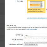
show-mobile-nav.png

It's not normal, no. When I inspect your page, I see that the Fusion builder has applied the following CSS to this page:

.fusion-tabs .nav {
 display: none;
}
...
@media only screen and (min-width: 800px) {
    .fusion-tabs .nav {
        display:block;
    }
}

This means that the Fusion builder has added code that will hide these navigation elements on screen sizes less than 800px wide. I can provide you with some CSS to override this. Please add the following CSS in Toolset > Layouts CSS & JS:

.show-mobile-nav .fusion-tabs .nav {
 display: block;
}

Then in your Layout editor, click the pencil icon to edit the row that contains this tab component. Add an optional CSS class "show-mobile-nav" to this element. Please see the attached screenshot. When added correctly, the "show-mobile-nav" class will look like a pill. Save your Layout, clear your browser cache and reload the Adventure Camp page. Let me know the results.

#541954

Thanks, that worked!

The forum ‘Types Community Support’ is closed to new topics and replies.