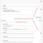
I have 2 repeatable field groups in my "Charts" post type. One for song parts, one for song references—each with a different set of fields within. The problem I've encountered is that when I set the view for one of these repeating field groups in my edit screen, it sets that view for all repeating field groups.
This is not ideal because for the song parts group, I want the fields displayed in columns. In the song references group I want the fields displayed in rows. That leaves me editing one group, saving the post, choosing the alternate layout for the other group which reloads the page with the selected layout, and then editing that group as needed.
For me, this is not an ideal user experience—is this something you guys can change with a future release so that each group can maintain an independent layout selection? I want to be able to quickly view the song part details in column view because these get edited more often and having to expand so many accordions is inconvenient when a song has 7-8 parts, and at the same time I want to leave the song references in rows because I like to have this one hidden away as they don't ever need to be edited once added (not to mention there are too many fields for it to work nicely in column view).
I'm gonna have a lot of clients using this and I just want it to to be intuitive.
Side note: in the screenshot you'll see that the input fields are all the same width but the select field is much wider—perhaps you could fix that UI issue while you're in there? It just looks off.
Thanks for your time—I've attached screenshots to show what I've described.
Hi, I see the problems you're describing and I can replicate them on my own local test site. Let me escalate this to my 2nd tier support team for further investigation. It seems like something our developers need to address in an upcoming release. I'll let you know what I find out. I'll split off a separate ticket for the select field issue so we can track these individually.
My 2nd tier support teams agrees this usability issue should be addressed. We have escalated it to our developers and they will include a fix for this problem in a future release of the software. For now, there is no known workaround, but if that changes I will let you know here.

