With the Toolset Grid block, you can easily organize your content into responsive columns and grids. You can create a website that will look great on desktops, tablets, and phones.
LnRiLWhlYWRpbmcuaGFzLWJhY2tncm91bmR7cGFkZGluZzowfQ==
LnRiLWZpZWxke21hcmdpbi1ib3R0b206MC43NmVtfS50Yi1maWVsZC0tbGVmdHt0ZXh0LWFsaWduOmxlZnR9LnRiLWZpZWxkLS1jZW50ZXJ7dGV4dC1hbGlnbjpjZW50ZXJ9LnRiLWZpZWxkLS1yaWdodHt0ZXh0LWFsaWduOnJpZ2h0fS50Yi1maWVsZF9fc2t5cGVfcHJldmlld3twYWRkaW5nOjEwcHggMjBweDtib3JkZXItcmFkaXVzOjNweDtjb2xvcjojZmZmO2JhY2tncm91bmQ6IzAwYWZlZTtkaXNwbGF5OmlubGluZS1ibG9ja311bC5nbGlkZV9fc2xpZGVze21hcmdpbjowfQ==
LnRiLWNvbnRhaW5lciAudGItY29udGFpbmVyLWlubmVye3dpZHRoOjEwMCU7bWFyZ2luOjAgYXV0b30gLndwLWJsb2NrLXRvb2xzZXQtYmxvY2tzLWNvbnRhaW5lci50Yi1jb250YWluZXJbZGF0YS10b29sc2V0LWJsb2Nrcy1jb250YWluZXI9IjFmNjA1YTkwYjNlOWQ4MDExYmRmOTQ3ZTQ4OWQ5NjNkIl0geyBib3JkZXItcmFkaXVzOiA1cHg7YmFja2dyb3VuZDogcmdiYSggMjQ1LCAyNDUsIDI0NSwgMSApO3BhZGRpbmc6IDIwcHggMzBweCAxNXB4IDMwcHg7bWFyZ2luLXRvcDogMjBweDttYXJnaW4tYm90dG9tOiA1MHB4O2Rpc3BsYXk6bXMtZmxleGJveCAhaW1wb3J0YW50O2Rpc3BsYXk6ZmxleCAhaW1wb3J0YW50Oy1tcy1mbGV4LWRpcmVjdGlvbjpjb2x1bW47ZmxleC1kaXJlY3Rpb246Y29sdW1uOy1tcy1mbGV4LXBhY2s6Y2VudGVyO2p1c3RpZnktY29udGVudDpjZW50ZXI7IH0gLnRiLWdyaWQsLnRiLWdyaWQ+LmJsb2NrLWVkaXRvci1pbm5lci1ibG9ja3M+LmJsb2NrLWVkaXRvci1ibG9jay1saXN0X19sYXlvdXR7ZGlzcGxheTpncmlkO2dyaWQtcm93LWdhcDoyNXB4O2dyaWQtY29sdW1uLWdhcDoyNXB4fS50Yi1ncmlkLWl0ZW17YmFja2dyb3VuZDojZDM4YTAzO3BhZGRpbmc6MzBweH0udGItZ3JpZC1jb2x1bW57ZmxleC13cmFwOndyYXB9LnRiLWdyaWQtY29sdW1uPip7d2lkdGg6MTAwJX0udGItZ3JpZC1jb2x1bW4udGItZ3JpZC1hbGlnbi10b3B7d2lkdGg6MTAwJTtkaXNwbGF5OmZsZXg7YWxpZ24tY29udGVudDpmbGV4LXN0YXJ0fS50Yi1ncmlkLWNvbHVtbi50Yi1ncmlkLWFsaWduLWNlbnRlcnt3aWR0aDoxMDAlO2Rpc3BsYXk6ZmxleDthbGlnbi1jb250ZW50OmNlbnRlcn0udGItZ3JpZC1jb2x1bW4udGItZ3JpZC1hbGlnbi1ib3R0b217d2lkdGg6MTAwJTtkaXNwbGF5OmZsZXg7YWxpZ24tY29udGVudDpmbGV4LWVuZH0gLndwLWJsb2NrLXRvb2xzZXQtYmxvY2tzLWdyaWQudGItZ3JpZFtkYXRhLXRvb2xzZXQtYmxvY2tzLWdyaWQ9IjlmMGQyZjdlNjg1NzE5MTBiZGMyMjUwMTMwOTVjNGM0Il0geyBncmlkLXRlbXBsYXRlLWNvbHVtbnM6IG1pbm1heCgwLCAwLjMzNWZyKSBtaW5tYXgoMCwgMC42NjVmcik7Z3JpZC1jb2x1bW4tZ2FwOiA1MHB4O2dyaWQtYXV0by1mbG93OiByb3cgfSAud3AtYmxvY2stdG9vbHNldC1ibG9ja3MtZ3JpZC50Yi1ncmlkW2RhdGEtdG9vbHNldC1ibG9ja3MtZ3JpZD0iOWYwZDJmN2U2ODU3MTkxMGJkYzIyNTAxMzA5NWM0YzQiXSA+IC50Yi1ncmlkLWNvbHVtbjpudGgtb2YtdHlwZSgybiArIDEpIHsgZ3JpZC1jb2x1bW46IDEgfSAud3AtYmxvY2stdG9vbHNldC1ibG9ja3MtZ3JpZC50Yi1ncmlkW2RhdGEtdG9vbHNldC1ibG9ja3MtZ3JpZD0iOWYwZDJmN2U2ODU3MTkxMGJkYzIyNTAxMzA5NWM0YzQiXSA+IC50Yi1ncmlkLWNvbHVtbjpudGgtb2YtdHlwZSgybiArIDIpIHsgZ3JpZC1jb2x1bW46IDIgfSAudGItZmllbGRbZGF0YS10b29sc2V0LWJsb2Nrcy1maWVsZD0iM2ExNzAzYzhmM2U0ZTZhN2NjZWMzZDY0YTQ1MGQ0NjEiXSBhIHsgdGV4dC1kZWNvcmF0aW9uOiBub25lOyB9ICAudGItZ3JpZCwudGItZ3JpZD4uYmxvY2stZWRpdG9yLWlubmVyLWJsb2Nrcz4uYmxvY2stZWRpdG9yLWJsb2NrLWxpc3RfX2xheW91dHtkaXNwbGF5OmdyaWQ7Z3JpZC1yb3ctZ2FwOjI1cHg7Z3JpZC1jb2x1bW4tZ2FwOjI1cHh9LnRiLWdyaWQtaXRlbXtiYWNrZ3JvdW5kOiNkMzhhMDM7cGFkZGluZzozMHB4fS50Yi1ncmlkLWNvbHVtbntmbGV4LXdyYXA6d3JhcH0udGItZ3JpZC1jb2x1bW4+Knt3aWR0aDoxMDAlfS50Yi1ncmlkLWNvbHVtbi50Yi1ncmlkLWFsaWduLXRvcHt3aWR0aDoxMDAlO2Rpc3BsYXk6ZmxleDthbGlnbi1jb250ZW50OmZsZXgtc3RhcnR9LnRiLWdyaWQtY29sdW1uLnRiLWdyaWQtYWxpZ24tY2VudGVye3dpZHRoOjEwMCU7ZGlzcGxheTpmbGV4O2FsaWduLWNvbnRlbnQ6Y2VudGVyfS50Yi1ncmlkLWNvbHVtbi50Yi1ncmlkLWFsaWduLWJvdHRvbXt3aWR0aDoxMDAlO2Rpc3BsYXk6ZmxleDthbGlnbi1jb250ZW50OmZsZXgtZW5kfSAud3AtYmxvY2stdG9vbHNldC1ibG9ja3MtZ3JpZC50Yi1ncmlkW2RhdGEtdG9vbHNldC1ibG9ja3MtZ3JpZD0iY2VmNWFlYWNkY2EwMWUxZGFlMTMxMDJhYTI3ODdhNWYiXSB7IGdyaWQtdGVtcGxhdGUtY29sdW1uczogbWlubWF4KDAsIDAuMDg1ZnIpIG1pbm1heCgwLCAwLjkxNWZyKTtncmlkLWNvbHVtbi1nYXA6IDVweDtncmlkLWF1dG8tZmxvdzogcm93IH0gLndwLWJsb2NrLXRvb2xzZXQtYmxvY2tzLWdyaWQudGItZ3JpZFtkYXRhLXRvb2xzZXQtYmxvY2tzLWdyaWQ9ImNlZjVhZWFjZGNhMDFlMWRhZTEzMTAyYWEyNzg3YTVmIl0gPiAudGItZ3JpZC1jb2x1bW46bnRoLW9mLXR5cGUoMm4gKyAxKSB7IGdyaWQtY29sdW1uOiAxIH0gLndwLWJsb2NrLXRvb2xzZXQtYmxvY2tzLWdyaWQudGItZ3JpZFtkYXRhLXRvb2xzZXQtYmxvY2tzLWdyaWQ9ImNlZjVhZWFjZGNhMDFlMWRhZTEzMTAyYWEyNzg3YTVmIl0gPiAudGItZ3JpZC1jb2x1bW46bnRoLW9mLXR5cGUoMm4gKyAyKSB7IGdyaWQtY29sdW1uOiAyIH0gaDQudGItaGVhZGluZ1tkYXRhLXRvb2xzZXQtYmxvY2tzLWhlYWRpbmc9IjNlN2Y1ZmE3MmJlODVmNGY2MTIwYTc5NDM4ZDBhYjZjIl0gIHsgZm9udC13ZWlnaHQ6IGJvbGQ7Y29sb3I6IHJnYmEoIDUyLCA1MiwgNTIsIDEgKTsgfSBoNC50Yi1oZWFkaW5nW2RhdGEtdG9vbHNldC1ibG9ja3MtaGVhZGluZz0iM2U3ZjVmYTcyYmU4NWY0ZjYxMjBhNzk0MzhkMGFiNmMiXSBhICB7IGNvbG9yOiByZ2JhKCA1MiwgNTIsIDUyLCAxICk7dGV4dC1kZWNvcmF0aW9uOiBub25lOyB9ICAud3AtYmxvY2stdG9vbHNldC1ibG9ja3MtZ3JpZC1jb2x1bW4udGItZ3JpZC1jb2x1bW5bZGF0YS10b29sc2V0LWJsb2Nrcy1ncmlkLWNvbHVtbj0iZTg2M2Q2NmVhYzk0OTkwOGE1YzZjOGQyZmQzMTMyMGMiXSB7IGRpc3BsYXk6IGZsZXg7IH0gLnRiLWltYWdle3Bvc2l0aW9uOnJlbGF0aXZlO3RyYW5zaXRpb246dHJhbnNmb3JtIDAuMjVzIGVhc2V9LndwLWJsb2NrLWltYWdlIC50Yi1pbWFnZS5hbGlnbmNlbnRlcnttYXJnaW4tbGVmdDphdXRvO21hcmdpbi1yaWdodDphdXRvfS50Yi1pbWFnZSBpbWd7bWF4LXdpZHRoOjEwMCU7aGVpZ2h0OmF1dG87d2lkdGg6YXV0bzt0cmFuc2l0aW9uOnRyYW5zZm9ybSAwLjI1cyBlYXNlfS50Yi1pbWFnZSAudGItaW1hZ2UtY2FwdGlvbi1maXQtdG8taW1hZ2V7ZGlzcGxheTp0YWJsZX0udGItaW1hZ2UgLnRiLWltYWdlLWNhcHRpb24tZml0LXRvLWltYWdlIC50Yi1pbWFnZS1jYXB0aW9ue2Rpc3BsYXk6dGFibGUtY2FwdGlvbjtjYXB0aW9uLXNpZGU6Ym90dG9tfSAud3AtYmxvY2staW1hZ2UudGItaW1hZ2VbZGF0YS10b29sc2V0LWJsb2Nrcy1pbWFnZT0iMmFmNzU2YWNmYTI2MDI1OGY5YzNiYTFlMDE2NjQ0M2YiXSB7IG1heC13aWR0aDogMTAwJTsgfSAud3AtYmxvY2staW1hZ2UudGItaW1hZ2VbZGF0YS10b29sc2V0LWJsb2Nrcy1pbWFnZT0iMmFmNzU2YWNmYTI2MDI1OGY5YzNiYTFlMDE2NjQ0M2YiXSBpbWcgeyBwYWRkaW5nLXRvcDogMTJweDsgfSAud3AtYmxvY2stdG9vbHNldC1ibG9ja3MtZ3JpZC1jb2x1bW4udGItZ3JpZC1jb2x1bW5bZGF0YS10b29sc2V0LWJsb2Nrcy1ncmlkLWNvbHVtbj0iMGVhYTk3MTE5MDIyZTZmMWIxZWI5M2IyMzA0NWEzNzciXSB7IHBhZGRpbmctcmlnaHQ6IDQwcHg7Ym9yZGVyLXJpZ2h0OiAxcHggc29saWQgcmdiYSggMjIxLCAyMjEsIDIyMSwgMSApO2Rpc3BsYXk6IGZsZXg7IH0gaDQudGItaGVhZGluZ1tkYXRhLXRvb2xzZXQtYmxvY2tzLWhlYWRpbmc9ImJlNjIxZjdlZDBkMjAzNmRmYTFhMjQ4M2E4MWNlMTdjIl0gIHsgZm9udC13ZWlnaHQ6IGJvbGQ7dGV4dC1hbGlnbjogbGVmdDsgfSBoNC50Yi1oZWFkaW5nW2RhdGEtdG9vbHNldC1ibG9ja3MtaGVhZGluZz0iYmU2MjFmN2VkMGQyMDM2ZGZhMWEyNDgzYTgxY2UxN2MiXSBhICB7IHRleHQtZGVjb3JhdGlvbjogbm9uZTsgfSAgLnRiLWNvbnRhaW5lciAudGItY29udGFpbmVyLWlubmVye3dpZHRoOjEwMCU7bWFyZ2luOjAgYXV0b30gLndwLWJsb2NrLXRvb2xzZXQtYmxvY2tzLWNvbnRhaW5lci50Yi1jb250YWluZXJbZGF0YS10b29sc2V0LWJsb2Nrcy1jb250YWluZXI9ImQyYzRlYjkyZGIxZTM5ODQ5NmZiYWE0MjRkNmViNzAxIl0geyBwYWRkaW5nOiAwcHggMHB4IDQwcHggMHB4OyB9IC50Yi1jb250YWluZXIgLnRiLWNvbnRhaW5lci1pbm5lcnt3aWR0aDoxMDAlO21hcmdpbjowIGF1dG99IC53cC1ibG9jay10b29sc2V0LWJsb2Nrcy1jb250YWluZXIudGItY29udGFpbmVyW2RhdGEtdG9vbHNldC1ibG9ja3MtY29udGFpbmVyPSI5NmRkNDkzYzE4MzkzYjY2YWQ3N2UzZmEyMjdhNzIyNyJdIHsgcGFkZGluZzogNDBweCAwcHggMHB4IDBweDsgfSAudGItZmllbGRbZGF0YS10b29sc2V0LWJsb2Nrcy1maWVsZD0iN2Q5MzVhZGE3ODIxM2MwOWQ1NDczZjM3YjI5M2I0ZDciXSB7IHRleHQtYWxpZ246IGxlZnQ7IH0gLnRiLWZpZWxkW2RhdGEtdG9vbHNldC1ibG9ja3MtZmllbGQ9IjdkOTM1YWRhNzgyMTNjMDlkNTQ3M2YzN2IyOTNiNGQ3Il0gYSB7IHRleHQtZGVjb3JhdGlvbjogbm9uZTsgfSAgaDMudGItaGVhZGluZ1tkYXRhLXRvb2xzZXQtYmxvY2tzLWhlYWRpbmc9ImM4YzY0YzIzMDgzY2Y1NTUyYzQxNWY2MTU0OThiMmFhIl0gYSAgeyB0ZXh0LWRlY29yYXRpb246IG5vbmU7IH0gIC50Yi1pbWFnZXtwb3NpdGlvbjpyZWxhdGl2ZTt0cmFuc2l0aW9uOnRyYW5zZm9ybSAwLjI1cyBlYXNlfS53cC1ibG9jay1pbWFnZSAudGItaW1hZ2UuYWxpZ25jZW50ZXJ7bWFyZ2luLWxlZnQ6YXV0bzttYXJnaW4tcmlnaHQ6YXV0b30udGItaW1hZ2UgaW1ne21heC13aWR0aDoxMDAlO2hlaWdodDphdXRvO3dpZHRoOmF1dG87dHJhbnNpdGlvbjp0cmFuc2Zvcm0gMC4yNXMgZWFzZX0udGItaW1hZ2UgLnRiLWltYWdlLWNhcHRpb24tZml0LXRvLWltYWdle2Rpc3BsYXk6dGFibGV9LnRiLWltYWdlIC50Yi1pbWFnZS1jYXB0aW9uLWZpdC10by1pbWFnZSAudGItaW1hZ2UtY2FwdGlvbntkaXNwbGF5OnRhYmxlLWNhcHRpb247Y2FwdGlvbi1zaWRlOmJvdHRvbX0gLnRiLWltYWdlW2RhdGEtdG9vbHNldC1ibG9ja3MtaW1hZ2U9IjUwOWIxMWU1OGZhM2RlN2RiZTcwNGM2MWI1ODE3MzY5Il0geyBtYXgtd2lkdGg6IDEwMCU7IH0gLnRiLWltYWdlW2RhdGEtdG9vbHNldC1ibG9ja3MtaW1hZ2U9IjUwOWIxMWU1OGZhM2RlN2RiZTcwNGM2MWI1ODE3MzY5Il0gaW1nIHsgYm9yZGVyOiAxcHggc29saWQgcmdiYSggMjIyLCAyMjIsIDIyMiwgMSApOyB9IC50Yi1pbWFnZXtwb3NpdGlvbjpyZWxhdGl2ZTt0cmFuc2l0aW9uOnRyYW5zZm9ybSAwLjI1cyBlYXNlfS53cC1ibG9jay1pbWFnZSAudGItaW1hZ2UuYWxpZ25jZW50ZXJ7bWFyZ2luLWxlZnQ6YXV0bzttYXJnaW4tcmlnaHQ6YXV0b30udGItaW1hZ2UgaW1ne21heC13aWR0aDoxMDAlO2hlaWdodDphdXRvO3dpZHRoOmF1dG87dHJhbnNpdGlvbjp0cmFuc2Zvcm0gMC4yNXMgZWFzZX0udGItaW1hZ2UgLnRiLWltYWdlLWNhcHRpb24tZml0LXRvLWltYWdle2Rpc3BsYXk6dGFibGV9LnRiLWltYWdlIC50Yi1pbWFnZS1jYXB0aW9uLWZpdC10by1pbWFnZSAudGItaW1hZ2UtY2FwdGlvbntkaXNwbGF5OnRhYmxlLWNhcHRpb247Y2FwdGlvbi1zaWRlOmJvdHRvbX0gLnRiLWltYWdlW2RhdGEtdG9vbHNldC1ibG9ja3MtaW1hZ2U9Ijc2NDFlYjQ5YmJmNTVlMzRhZmRjZjQzMTc0NjBjZmY0Il0geyBtYXgtd2lkdGg6IDEwMCU7IH0gLnRiLWltYWdlW2RhdGEtdG9vbHNldC1ibG9ja3MtaW1hZ2U9Ijc2NDFlYjQ5YmJmNTVlMzRhZmRjZjQzMTc0NjBjZmY0Il0gaW1nIHsgYm9yZGVyOiAxcHggc29saWQgcmdiYSggMjIyLCAyMjIsIDIyMiwgMSApOyB9IC50Yi1pbWFnZXtwb3NpdGlvbjpyZWxhdGl2ZTt0cmFuc2l0aW9uOnRyYW5zZm9ybSAwLjI1cyBlYXNlfS53cC1ibG9jay1pbWFnZSAudGItaW1hZ2UuYWxpZ25jZW50ZXJ7bWFyZ2luLWxlZnQ6YXV0bzttYXJnaW4tcmlnaHQ6YXV0b30udGItaW1hZ2UgaW1ne21heC13aWR0aDoxMDAlO2hlaWdodDphdXRvO3dpZHRoOmF1dG87dHJhbnNpdGlvbjp0cmFuc2Zvcm0gMC4yNXMgZWFzZX0udGItaW1hZ2UgLnRiLWltYWdlLWNhcHRpb24tZml0LXRvLWltYWdle2Rpc3BsYXk6dGFibGV9LnRiLWltYWdlIC50Yi1pbWFnZS1jYXB0aW9uLWZpdC10by1pbWFnZSAudGItaW1hZ2UtY2FwdGlvbntkaXNwbGF5OnRhYmxlLWNhcHRpb247Y2FwdGlvbi1zaWRlOmJvdHRvbX0gLnRiLWltYWdlW2RhdGEtdG9vbHNldC1ibG9ja3MtaW1hZ2U9IjU4Mjc0YmEwMWEyYWIzZjRlYzQyYTJhOTFjZTBjODk4Il0geyBtYXgtd2lkdGg6IDEwMCU7IH0gLnRiLWltYWdlW2RhdGEtdG9vbHNldC1ibG9ja3MtaW1hZ2U9IjU4Mjc0YmEwMWEyYWIzZjRlYzQyYTJhOTFjZTBjODk4Il0gaW1nIHsgYm9yZGVyOiAxcHggc29saWQgcmdiYSggMjIyLCAyMjIsIDIyMiwgMSApOyB9IEBtZWRpYSBvbmx5IHNjcmVlbiBhbmQgKG1heC13aWR0aDogOTkxcHgpIHsgLnRiLWNvbnRhaW5lciAudGItY29udGFpbmVyLWlubmVye3dpZHRoOjEwMCU7bWFyZ2luOjAgYXV0b30udGItZ3JpZCwudGItZ3JpZD4uYmxvY2stZWRpdG9yLWlubmVyLWJsb2Nrcz4uYmxvY2stZWRpdG9yLWJsb2NrLWxpc3RfX2xheW91dHtkaXNwbGF5OmdyaWQ7Z3JpZC1yb3ctZ2FwOjI1cHg7Z3JpZC1jb2x1bW4tZ2FwOjI1cHh9LnRiLWdyaWQtaXRlbXtiYWNrZ3JvdW5kOiNkMzhhMDM7cGFkZGluZzozMHB4fS50Yi1ncmlkLWNvbHVtbntmbGV4LXdyYXA6d3JhcH0udGItZ3JpZC1jb2x1bW4+Knt3aWR0aDoxMDAlfS50Yi1ncmlkLWNvbHVtbi50Yi1ncmlkLWFsaWduLXRvcHt3aWR0aDoxMDAlO2Rpc3BsYXk6ZmxleDthbGlnbi1jb250ZW50OmZsZXgtc3RhcnR9LnRiLWdyaWQtY29sdW1uLnRiLWdyaWQtYWxpZ24tY2VudGVye3dpZHRoOjEwMCU7ZGlzcGxheTpmbGV4O2FsaWduLWNvbnRlbnQ6Y2VudGVyfS50Yi1ncmlkLWNvbHVtbi50Yi1ncmlkLWFsaWduLWJvdHRvbXt3aWR0aDoxMDAlO2Rpc3BsYXk6ZmxleDthbGlnbi1jb250ZW50OmZsZXgtZW5kfSAud3AtYmxvY2stdG9vbHNldC1ibG9ja3MtZ3JpZC50Yi1ncmlkW2RhdGEtdG9vbHNldC1ibG9ja3MtZ3JpZD0iOWYwZDJmN2U2ODU3MTkxMGJkYzIyNTAxMzA5NWM0YzQiXSB7IGdyaWQtdGVtcGxhdGUtY29sdW1uczogbWlubWF4KDAsIDAuNWZyKSBtaW5tYXgoMCwgMC41ZnIpO2dyaWQtYXV0by1mbG93OiByb3cgfSAud3AtYmxvY2stdG9vbHNldC1ibG9ja3MtZ3JpZC50Yi1ncmlkW2RhdGEtdG9vbHNldC1ibG9ja3MtZ3JpZD0iOWYwZDJmN2U2ODU3MTkxMGJkYzIyNTAxMzA5NWM0YzQiXSA+IC50Yi1ncmlkLWNvbHVtbjpudGgtb2YtdHlwZSgybiArIDEpIHsgZ3JpZC1jb2x1bW46IDEgfSAud3AtYmxvY2stdG9vbHNldC1ibG9ja3MtZ3JpZC50Yi1ncmlkW2RhdGEtdG9vbHNldC1ibG9ja3MtZ3JpZD0iOWYwZDJmN2U2ODU3MTkxMGJkYzIyNTAxMzA5NWM0YzQiXSA+IC50Yi1ncmlkLWNvbHVtbjpudGgtb2YtdHlwZSgybiArIDIpIHsgZ3JpZC1jb2x1bW46IDIgfSAudGItZmllbGRbZGF0YS10b29sc2V0LWJsb2Nrcy1maWVsZD0iM2ExNzAzYzhmM2U0ZTZhN2NjZWMzZDY0YTQ1MGQ0NjEiXSBhIHsgdGV4dC1kZWNvcmF0aW9uOiBub25lOyB9ICAudGItZ3JpZCwudGItZ3JpZD4uYmxvY2stZWRpdG9yLWlubmVyLWJsb2Nrcz4uYmxvY2stZWRpdG9yLWJsb2NrLWxpc3RfX2xheW91dHtkaXNwbGF5OmdyaWQ7Z3JpZC1yb3ctZ2FwOjI1cHg7Z3JpZC1jb2x1bW4tZ2FwOjI1cHh9LnRiLWdyaWQtaXRlbXtiYWNrZ3JvdW5kOiNkMzhhMDM7cGFkZGluZzozMHB4fS50Yi1ncmlkLWNvbHVtbntmbGV4LXdyYXA6d3JhcH0udGItZ3JpZC1jb2x1bW4+Knt3aWR0aDoxMDAlfS50Yi1ncmlkLWNvbHVtbi50Yi1ncmlkLWFsaWduLXRvcHt3aWR0aDoxMDAlO2Rpc3BsYXk6ZmxleDthbGlnbi1jb250ZW50OmZsZXgtc3RhcnR9LnRiLWdyaWQtY29sdW1uLnRiLWdyaWQtYWxpZ24tY2VudGVye3dpZHRoOjEwMCU7ZGlzcGxheTpmbGV4O2FsaWduLWNvbnRlbnQ6Y2VudGVyfS50Yi1ncmlkLWNvbHVtbi50Yi1ncmlkLWFsaWduLWJvdHRvbXt3aWR0aDoxMDAlO2Rpc3BsYXk6ZmxleDthbGlnbi1jb250ZW50OmZsZXgtZW5kfSAud3AtYmxvY2stdG9vbHNldC1ibG9ja3MtZ3JpZC50Yi1ncmlkW2RhdGEtdG9vbHNldC1ibG9ja3MtZ3JpZD0iY2VmNWFlYWNkY2EwMWUxZGFlMTMxMDJhYTI3ODdhNWYiXSB7IGdyaWQtdGVtcGxhdGUtY29sdW1uczogbWlubWF4KDAsIDAuNWZyKSBtaW5tYXgoMCwgMC41ZnIpO2dyaWQtYXV0by1mbG93OiByb3cgfSAud3AtYmxvY2stdG9vbHNldC1ibG9ja3MtZ3JpZC50Yi1ncmlkW2RhdGEtdG9vbHNldC1ibG9ja3MtZ3JpZD0iY2VmNWFlYWNkY2EwMWUxZGFlMTMxMDJhYTI3ODdhNWYiXSA+IC50Yi1ncmlkLWNvbHVtbjpudGgtb2YtdHlwZSgybiArIDEpIHsgZ3JpZC1jb2x1bW46IDEgfSAud3AtYmxvY2stdG9vbHNldC1ibG9ja3MtZ3JpZC50Yi1ncmlkW2RhdGEtdG9vbHNldC1ibG9ja3MtZ3JpZD0iY2VmNWFlYWNkY2EwMWUxZGFlMTMxMDJhYTI3ODdhNWYiXSA+IC50Yi1ncmlkLWNvbHVtbjpudGgtb2YtdHlwZSgybiArIDIpIHsgZ3JpZC1jb2x1bW46IDIgfSBoNC50Yi1oZWFkaW5nW2RhdGEtdG9vbHNldC1ibG9ja3MtaGVhZGluZz0iM2U3ZjVmYTcyYmU4NWY0ZjYxMjBhNzk0MzhkMGFiNmMiXSBhICB7IHRleHQtZGVjb3JhdGlvbjogbm9uZTsgfSAgLndwLWJsb2NrLXRvb2xzZXQtYmxvY2tzLWdyaWQtY29sdW1uLnRiLWdyaWQtY29sdW1uW2RhdGEtdG9vbHNldC1ibG9ja3MtZ3JpZC1jb2x1bW49ImU4NjNkNjZlYWM5NDk5MDhhNWM2YzhkMmZkMzEzMjBjIl0geyBkaXNwbGF5OiBmbGV4OyB9IC50Yi1pbWFnZXtwb3NpdGlvbjpyZWxhdGl2ZTt0cmFuc2l0aW9uOnRyYW5zZm9ybSAwLjI1cyBlYXNlfS53cC1ibG9jay1pbWFnZSAudGItaW1hZ2UuYWxpZ25jZW50ZXJ7bWFyZ2luLWxlZnQ6YXV0bzttYXJnaW4tcmlnaHQ6YXV0b30udGItaW1hZ2UgaW1ne21heC13aWR0aDoxMDAlO2hlaWdodDphdXRvO3dpZHRoOmF1dG87dHJhbnNpdGlvbjp0cmFuc2Zvcm0gMC4yNXMgZWFzZX0udGItaW1hZ2UgLnRiLWltYWdlLWNhcHRpb24tZml0LXRvLWltYWdle2Rpc3BsYXk6dGFibGV9LnRiLWltYWdlIC50Yi1pbWFnZS1jYXB0aW9uLWZpdC10by1pbWFnZSAudGItaW1hZ2UtY2FwdGlvbntkaXNwbGF5OnRhYmxlLWNhcHRpb247Y2FwdGlvbi1zaWRlOmJvdHRvbX0ud3AtYmxvY2stdG9vbHNldC1ibG9ja3MtZ3JpZC1jb2x1bW4udGItZ3JpZC1jb2x1bW5bZGF0YS10b29sc2V0LWJsb2Nrcy1ncmlkLWNvbHVtbj0iMGVhYTk3MTE5MDIyZTZmMWIxZWI5M2IyMzA0NWEzNzciXSB7IGRpc3BsYXk6IGZsZXg7IH0gaDQudGItaGVhZGluZ1tkYXRhLXRvb2xzZXQtYmxvY2tzLWhlYWRpbmc9ImJlNjIxZjdlZDBkMjAzNmRmYTFhMjQ4M2E4MWNlMTdjIl0gYSAgeyB0ZXh0LWRlY29yYXRpb246IG5vbmU7IH0gIC50Yi1jb250YWluZXIgLnRiLWNvbnRhaW5lci1pbm5lcnt3aWR0aDoxMDAlO21hcmdpbjowIGF1dG99LnRiLWNvbnRhaW5lciAudGItY29udGFpbmVyLWlubmVye3dpZHRoOjEwMCU7bWFyZ2luOjAgYXV0b30udGItZmllbGRbZGF0YS10b29sc2V0LWJsb2Nrcy1maWVsZD0iN2Q5MzVhZGE3ODIxM2MwOWQ1NDczZjM3YjI5M2I0ZDciXSBhIHsgdGV4dC1kZWNvcmF0aW9uOiBub25lOyB9ICBoMy50Yi1oZWFkaW5nW2RhdGEtdG9vbHNldC1ibG9ja3MtaGVhZGluZz0iYzhjNjRjMjMwODNjZjU1NTJjNDE1ZjYxNTQ5OGIyYWEiXSBhICB7IHRleHQtZGVjb3JhdGlvbjogbm9uZTsgfSAgLnRiLWltYWdle3Bvc2l0aW9uOnJlbGF0aXZlO3RyYW5zaXRpb246dHJhbnNmb3JtIDAuMjVzIGVhc2V9LndwLWJsb2NrLWltYWdlIC50Yi1pbWFnZS5hbGlnbmNlbnRlcnttYXJnaW4tbGVmdDphdXRvO21hcmdpbi1yaWdodDphdXRvfS50Yi1pbWFnZSBpbWd7bWF4LXdpZHRoOjEwMCU7aGVpZ2h0OmF1dG87d2lkdGg6YXV0bzt0cmFuc2l0aW9uOnRyYW5zZm9ybSAwLjI1cyBlYXNlfS50Yi1pbWFnZSAudGItaW1hZ2UtY2FwdGlvbi1maXQtdG8taW1hZ2V7ZGlzcGxheTp0YWJsZX0udGItaW1hZ2UgLnRiLWltYWdlLWNhcHRpb24tZml0LXRvLWltYWdlIC50Yi1pbWFnZS1jYXB0aW9ue2Rpc3BsYXk6dGFibGUtY2FwdGlvbjtjYXB0aW9uLXNpZGU6Ym90dG9tfS50Yi1pbWFnZXtwb3NpdGlvbjpyZWxhdGl2ZTt0cmFuc2l0aW9uOnRyYW5zZm9ybSAwLjI1cyBlYXNlfS53cC1ibG9jay1pbWFnZSAudGItaW1hZ2UuYWxpZ25jZW50ZXJ7bWFyZ2luLWxlZnQ6YXV0bzttYXJnaW4tcmlnaHQ6YXV0b30udGItaW1hZ2UgaW1ne21heC13aWR0aDoxMDAlO2hlaWdodDphdXRvO3dpZHRoOmF1dG87dHJhbnNpdGlvbjp0cmFuc2Zvcm0gMC4yNXMgZWFzZX0udGItaW1hZ2UgLnRiLWltYWdlLWNhcHRpb24tZml0LXRvLWltYWdle2Rpc3BsYXk6dGFibGV9LnRiLWltYWdlIC50Yi1pbWFnZS1jYXB0aW9uLWZpdC10by1pbWFnZSAudGItaW1hZ2UtY2FwdGlvbntkaXNwbGF5OnRhYmxlLWNhcHRpb247Y2FwdGlvbi1zaWRlOmJvdHRvbX0udGItaW1hZ2V7cG9zaXRpb246cmVsYXRpdmU7dHJhbnNpdGlvbjp0cmFuc2Zvcm0gMC4yNXMgZWFzZX0ud3AtYmxvY2staW1hZ2UgLnRiLWltYWdlLmFsaWduY2VudGVye21hcmdpbi1sZWZ0OmF1dG87bWFyZ2luLXJpZ2h0OmF1dG99LnRiLWltYWdlIGltZ3ttYXgtd2lkdGg6MTAwJTtoZWlnaHQ6YXV0bzt3aWR0aDphdXRvO3RyYW5zaXRpb246dHJhbnNmb3JtIDAuMjVzIGVhc2V9LnRiLWltYWdlIC50Yi1pbWFnZS1jYXB0aW9uLWZpdC10by1pbWFnZXtkaXNwbGF5OnRhYmxlfS50Yi1pbWFnZSAudGItaW1hZ2UtY2FwdGlvbi1maXQtdG8taW1hZ2UgLnRiLWltYWdlLWNhcHRpb257ZGlzcGxheTp0YWJsZS1jYXB0aW9uO2NhcHRpb24tc2lkZTpib3R0b219IH0gQG1lZGlhIG9ubHkgc2NyZWVuIGFuZCAobWF4LXdpZHRoOiA1OTlweCkgeyAudGItY29udGFpbmVyIC50Yi1jb250YWluZXItaW5uZXJ7d2lkdGg6MTAwJTttYXJnaW46MCBhdXRvfS50Yi1ncmlkLC50Yi1ncmlkPi5ibG9jay1lZGl0b3ItaW5uZXItYmxvY2tzPi5ibG9jay1lZGl0b3ItYmxvY2stbGlzdF9fbGF5b3V0e2Rpc3BsYXk6Z3JpZDtncmlkLXJvdy1nYXA6MjVweDtncmlkLWNvbHVtbi1nYXA6MjVweH0udGItZ3JpZC1pdGVte2JhY2tncm91bmQ6I2QzOGEwMztwYWRkaW5nOjMwcHh9LnRiLWdyaWQtY29sdW1ue2ZsZXgtd3JhcDp3cmFwfS50Yi1ncmlkLWNvbHVtbj4qe3dpZHRoOjEwMCV9LnRiLWdyaWQtY29sdW1uLnRiLWdyaWQtYWxpZ24tdG9we3dpZHRoOjEwMCU7ZGlzcGxheTpmbGV4O2FsaWduLWNvbnRlbnQ6ZmxleC1zdGFydH0udGItZ3JpZC1jb2x1bW4udGItZ3JpZC1hbGlnbi1jZW50ZXJ7d2lkdGg6MTAwJTtkaXNwbGF5OmZsZXg7YWxpZ24tY29udGVudDpjZW50ZXJ9LnRiLWdyaWQtY29sdW1uLnRiLWdyaWQtYWxpZ24tYm90dG9te3dpZHRoOjEwMCU7ZGlzcGxheTpmbGV4O2FsaWduLWNvbnRlbnQ6ZmxleC1lbmR9IC53cC1ibG9jay10b29sc2V0LWJsb2Nrcy1ncmlkLnRiLWdyaWRbZGF0YS10b29sc2V0LWJsb2Nrcy1ncmlkPSI5ZjBkMmY3ZTY4NTcxOTEwYmRjMjI1MDEzMDk1YzRjNCJdIHsgZ3JpZC10ZW1wbGF0ZS1jb2x1bW5zOiBtaW5tYXgoMCwgMWZyKTtncmlkLWF1dG8tZmxvdzogcm93IH0gLndwLWJsb2NrLXRvb2xzZXQtYmxvY2tzLWdyaWQudGItZ3JpZFtkYXRhLXRvb2xzZXQtYmxvY2tzLWdyaWQ9IjlmMGQyZjdlNjg1NzE5MTBiZGMyMjUwMTMwOTVjNGM0Il0gID4gLnRiLWdyaWQtY29sdW1uOm50aC1vZi10eXBlKDFuKzEpIHsgZ3JpZC1jb2x1bW46IDEgfSAudGItZmllbGRbZGF0YS10b29sc2V0LWJsb2Nrcy1maWVsZD0iM2ExNzAzYzhmM2U0ZTZhN2NjZWMzZDY0YTQ1MGQ0NjEiXSBhIHsgdGV4dC1kZWNvcmF0aW9uOiBub25lOyB9ICAudGItZ3JpZCwudGItZ3JpZD4uYmxvY2stZWRpdG9yLWlubmVyLWJsb2Nrcz4uYmxvY2stZWRpdG9yLWJsb2NrLWxpc3RfX2xheW91dHtkaXNwbGF5OmdyaWQ7Z3JpZC1yb3ctZ2FwOjI1cHg7Z3JpZC1jb2x1bW4tZ2FwOjI1cHh9LnRiLWdyaWQtaXRlbXtiYWNrZ3JvdW5kOiNkMzhhMDM7cGFkZGluZzozMHB4fS50Yi1ncmlkLWNvbHVtbntmbGV4LXdyYXA6d3JhcH0udGItZ3JpZC1jb2x1bW4+Knt3aWR0aDoxMDAlfS50Yi1ncmlkLWNvbHVtbi50Yi1ncmlkLWFsaWduLXRvcHt3aWR0aDoxMDAlO2Rpc3BsYXk6ZmxleDthbGlnbi1jb250ZW50OmZsZXgtc3RhcnR9LnRiLWdyaWQtY29sdW1uLnRiLWdyaWQtYWxpZ24tY2VudGVye3dpZHRoOjEwMCU7ZGlzcGxheTpmbGV4O2FsaWduLWNvbnRlbnQ6Y2VudGVyfS50Yi1ncmlkLWNvbHVtbi50Yi1ncmlkLWFsaWduLWJvdHRvbXt3aWR0aDoxMDAlO2Rpc3BsYXk6ZmxleDthbGlnbi1jb250ZW50OmZsZXgtZW5kfSAud3AtYmxvY2stdG9vbHNldC1ibG9ja3MtZ3JpZC50Yi1ncmlkW2RhdGEtdG9vbHNldC1ibG9ja3MtZ3JpZD0iY2VmNWFlYWNkY2EwMWUxZGFlMTMxMDJhYTI3ODdhNWYiXSB7IGdyaWQtdGVtcGxhdGUtY29sdW1uczogbWlubWF4KDAsIDFmcik7Z3JpZC1hdXRvLWZsb3c6IHJvdyB9IC53cC1ibG9jay10b29sc2V0LWJsb2Nrcy1ncmlkLnRiLWdyaWRbZGF0YS10b29sc2V0LWJsb2Nrcy1ncmlkPSJjZWY1YWVhY2RjYTAxZTFkYWUxMzEwMmFhMjc4N2E1ZiJdICA+IC50Yi1ncmlkLWNvbHVtbjpudGgtb2YtdHlwZSgxbisxKSB7IGdyaWQtY29sdW1uOiAxIH0gaDQudGItaGVhZGluZ1tkYXRhLXRvb2xzZXQtYmxvY2tzLWhlYWRpbmc9IjNlN2Y1ZmE3MmJlODVmNGY2MTIwYTc5NDM4ZDBhYjZjIl0gYSAgeyB0ZXh0LWRlY29yYXRpb246IG5vbmU7IH0gIC53cC1ibG9jay10b29sc2V0LWJsb2Nrcy1ncmlkLWNvbHVtbi50Yi1ncmlkLWNvbHVtbltkYXRhLXRvb2xzZXQtYmxvY2tzLWdyaWQtY29sdW1uPSJlODYzZDY2ZWFjOTQ5OTA4YTVjNmM4ZDJmZDMxMzIwYyJdIHsgZGlzcGxheTogZmxleDsgfSAudGItaW1hZ2V7cG9zaXRpb246cmVsYXRpdmU7dHJhbnNpdGlvbjp0cmFuc2Zvcm0gMC4yNXMgZWFzZX0ud3AtYmxvY2staW1hZ2UgLnRiLWltYWdlLmFsaWduY2VudGVye21hcmdpbi1sZWZ0OmF1dG87bWFyZ2luLXJpZ2h0OmF1dG99LnRiLWltYWdlIGltZ3ttYXgtd2lkdGg6MTAwJTtoZWlnaHQ6YXV0bzt3aWR0aDphdXRvO3RyYW5zaXRpb246dHJhbnNmb3JtIDAuMjVzIGVhc2V9LnRiLWltYWdlIC50Yi1pbWFnZS1jYXB0aW9uLWZpdC10by1pbWFnZXtkaXNwbGF5OnRhYmxlfS50Yi1pbWFnZSAudGItaW1hZ2UtY2FwdGlvbi1maXQtdG8taW1hZ2UgLnRiLWltYWdlLWNhcHRpb257ZGlzcGxheTp0YWJsZS1jYXB0aW9uO2NhcHRpb24tc2lkZTpib3R0b219LndwLWJsb2NrLXRvb2xzZXQtYmxvY2tzLWdyaWQtY29sdW1uLnRiLWdyaWQtY29sdW1uW2RhdGEtdG9vbHNldC1ibG9ja3MtZ3JpZC1jb2x1bW49IjBlYWE5NzExOTAyMmU2ZjFiMWViOTNiMjMwNDVhMzc3Il0geyBkaXNwbGF5OiBmbGV4OyB9IGg0LnRiLWhlYWRpbmdbZGF0YS10b29sc2V0LWJsb2Nrcy1oZWFkaW5nPSJiZTYyMWY3ZWQwZDIwMzZkZmExYTI0ODNhODFjZTE3YyJdIGEgIHsgdGV4dC1kZWNvcmF0aW9uOiBub25lOyB9ICAudGItY29udGFpbmVyIC50Yi1jb250YWluZXItaW5uZXJ7d2lkdGg6MTAwJTttYXJnaW46MCBhdXRvfS50Yi1jb250YWluZXIgLnRiLWNvbnRhaW5lci1pbm5lcnt3aWR0aDoxMDAlO21hcmdpbjowIGF1dG99LnRiLWZpZWxkW2RhdGEtdG9vbHNldC1ibG9ja3MtZmllbGQ9IjdkOTM1YWRhNzgyMTNjMDlkNTQ3M2YzN2IyOTNiNGQ3Il0gYSB7IHRleHQtZGVjb3JhdGlvbjogbm9uZTsgfSAgaDMudGItaGVhZGluZ1tkYXRhLXRvb2xzZXQtYmxvY2tzLWhlYWRpbmc9ImM4YzY0YzIzMDgzY2Y1NTUyYzQxNWY2MTU0OThiMmFhIl0gYSAgeyB0ZXh0LWRlY29yYXRpb246IG5vbmU7IH0gIC50Yi1pbWFnZXtwb3NpdGlvbjpyZWxhdGl2ZTt0cmFuc2l0aW9uOnRyYW5zZm9ybSAwLjI1cyBlYXNlfS53cC1ibG9jay1pbWFnZSAudGItaW1hZ2UuYWxpZ25jZW50ZXJ7bWFyZ2luLWxlZnQ6YXV0bzttYXJnaW4tcmlnaHQ6YXV0b30udGItaW1hZ2UgaW1ne21heC13aWR0aDoxMDAlO2hlaWdodDphdXRvO3dpZHRoOmF1dG87dHJhbnNpdGlvbjp0cmFuc2Zvcm0gMC4yNXMgZWFzZX0udGItaW1hZ2UgLnRiLWltYWdlLWNhcHRpb24tZml0LXRvLWltYWdle2Rpc3BsYXk6dGFibGV9LnRiLWltYWdlIC50Yi1pbWFnZS1jYXB0aW9uLWZpdC10by1pbWFnZSAudGItaW1hZ2UtY2FwdGlvbntkaXNwbGF5OnRhYmxlLWNhcHRpb247Y2FwdGlvbi1zaWRlOmJvdHRvbX0udGItaW1hZ2V7cG9zaXRpb246cmVsYXRpdmU7dHJhbnNpdGlvbjp0cmFuc2Zvcm0gMC4yNXMgZWFzZX0ud3AtYmxvY2staW1hZ2UgLnRiLWltYWdlLmFsaWduY2VudGVye21hcmdpbi1sZWZ0OmF1dG87bWFyZ2luLXJpZ2h0OmF1dG99LnRiLWltYWdlIGltZ3ttYXgtd2lkdGg6MTAwJTtoZWlnaHQ6YXV0bzt3aWR0aDphdXRvO3RyYW5zaXRpb246dHJhbnNmb3JtIDAuMjVzIGVhc2V9LnRiLWltYWdlIC50Yi1pbWFnZS1jYXB0aW9uLWZpdC10by1pbWFnZXtkaXNwbGF5OnRhYmxlfS50Yi1pbWFnZSAudGItaW1hZ2UtY2FwdGlvbi1maXQtdG8taW1hZ2UgLnRiLWltYWdlLWNhcHRpb257ZGlzcGxheTp0YWJsZS1jYXB0aW9uO2NhcHRpb24tc2lkZTpib3R0b219LnRiLWltYWdle3Bvc2l0aW9uOnJlbGF0aXZlO3RyYW5zaXRpb246dHJhbnNmb3JtIDAuMjVzIGVhc2V9LndwLWJsb2NrLWltYWdlIC50Yi1pbWFnZS5hbGlnbmNlbnRlcnttYXJnaW4tbGVmdDphdXRvO21hcmdpbi1yaWdodDphdXRvfS50Yi1pbWFnZSBpbWd7bWF4LXdpZHRoOjEwMCU7aGVpZ2h0OmF1dG87d2lkdGg6YXV0bzt0cmFuc2l0aW9uOnRyYW5zZm9ybSAwLjI1cyBlYXNlfS50Yi1pbWFnZSAudGItaW1hZ2UtY2FwdGlvbi1maXQtdG8taW1hZ2V7ZGlzcGxheTp0YWJsZX0udGItaW1hZ2UgLnRiLWltYWdlLWNhcHRpb24tZml0LXRvLWltYWdlIC50Yi1pbWFnZS1jYXB0aW9ue2Rpc3BsYXk6dGFibGUtY2FwdGlvbjtjYXB0aW9uLXNpZGU6Ym90dG9tfSB9IA==
aDMudGItaGVhZGluZ1tkYXRhLXRvb2xzZXQtYmxvY2tzLWhlYWRpbmc9ImM4YzY0YzIzMDgzY2Y1NTUyYzQxNWY2MTU0OThiMmFhIl0gYSAgeyB0ZXh0LWRlY29yYXRpb246IG5vbmU7IH0gIC50Yi1pbWFnZXtwb3NpdGlvbjpyZWxhdGl2ZTt0cmFuc2l0aW9uOnRyYW5zZm9ybSAwLjI1cyBlYXNlfS53cC1ibG9jay1pbWFnZSAudGItaW1hZ2UuYWxpZ25jZW50ZXJ7bWFyZ2luLWxlZnQ6YXV0bzttYXJnaW4tcmlnaHQ6YXV0b30udGItaW1hZ2UgaW1ne21heC13aWR0aDoxMDAlO2hlaWdodDphdXRvO3dpZHRoOmF1dG87dHJhbnNpdGlvbjp0cmFuc2Zvcm0gMC4yNXMgZWFzZX0udGItaW1hZ2UgLnRiLWltYWdlLWNhcHRpb24tZml0LXRvLWltYWdle2Rpc3BsYXk6dGFibGV9LnRiLWltYWdlIC50Yi1pbWFnZS1jYXB0aW9uLWZpdC10by1pbWFnZSAudGItaW1hZ2UtY2FwdGlvbntkaXNwbGF5OnRhYmxlLWNhcHRpb247Y2FwdGlvbi1zaWRlOmJvdHRvbX0gLnRiLWltYWdlW2RhdGEtdG9vbHNldC1ibG9ja3MtaW1hZ2U9IjUwOWIxMWU1OGZhM2RlN2RiZTcwNGM2MWI1ODE3MzY5Il0geyBtYXgtd2lkdGg6IDEwMCU7IH0gLnRiLWltYWdlW2RhdGEtdG9vbHNldC1ibG9ja3MtaW1hZ2U9IjUwOWIxMWU1OGZhM2RlN2RiZTcwNGM2MWI1ODE3MzY5Il0gaW1nIHsgYm9yZGVyOiAxcHggc29saWQgcmdiYSggMjIyLCAyMjIsIDIyMiwgMSApOyB9IC50Yi1pbWFnZXtwb3NpdGlvbjpyZWxhdGl2ZTt0cmFuc2l0aW9uOnRyYW5zZm9ybSAwLjI1cyBlYXNlfS53cC1ibG9jay1pbWFnZSAudGItaW1hZ2UuYWxpZ25jZW50ZXJ7bWFyZ2luLWxlZnQ6YXV0bzttYXJnaW4tcmlnaHQ6YXV0b30udGItaW1hZ2UgaW1ne21heC13aWR0aDoxMDAlO2hlaWdodDphdXRvO3dpZHRoOmF1dG87dHJhbnNpdGlvbjp0cmFuc2Zvcm0gMC4yNXMgZWFzZX0udGItaW1hZ2UgLnRiLWltYWdlLWNhcHRpb24tZml0LXRvLWltYWdle2Rpc3BsYXk6dGFibGV9LnRiLWltYWdlIC50Yi1pbWFnZS1jYXB0aW9uLWZpdC10by1pbWFnZSAudGItaW1hZ2UtY2FwdGlvbntkaXNwbGF5OnRhYmxlLWNhcHRpb247Y2FwdGlvbi1zaWRlOmJvdHRvbX0gLnRiLWltYWdlW2RhdGEtdG9vbHNldC1ibG9ja3MtaW1hZ2U9Ijc2NDFlYjQ5YmJmNTVlMzRhZmRjZjQzMTc0NjBjZmY0Il0geyBtYXgtd2lkdGg6IDEwMCU7IH0gLnRiLWltYWdlW2RhdGEtdG9vbHNldC1ibG9ja3MtaW1hZ2U9Ijc2NDFlYjQ5YmJmNTVlMzRhZmRjZjQzMTc0NjBjZmY0Il0gaW1nIHsgYm9yZGVyOiAxcHggc29saWQgcmdiYSggMjIyLCAyMjIsIDIyMiwgMSApOyB9IC50Yi1pbWFnZXtwb3NpdGlvbjpyZWxhdGl2ZTt0cmFuc2l0aW9uOnRyYW5zZm9ybSAwLjI1cyBlYXNlfS53cC1ibG9jay1pbWFnZSAudGItaW1hZ2UuYWxpZ25jZW50ZXJ7bWFyZ2luLWxlZnQ6YXV0bzttYXJnaW4tcmlnaHQ6YXV0b30udGItaW1hZ2UgaW1ne21heC13aWR0aDoxMDAlO2hlaWdodDphdXRvO3dpZHRoOmF1dG87dHJhbnNpdGlvbjp0cmFuc2Zvcm0gMC4yNXMgZWFzZX0udGItaW1hZ2UgLnRiLWltYWdlLWNhcHRpb24tZml0LXRvLWltYWdle2Rpc3BsYXk6dGFibGV9LnRiLWltYWdlIC50Yi1pbWFnZS1jYXB0aW9uLWZpdC10by1pbWFnZSAudGItaW1hZ2UtY2FwdGlvbntkaXNwbGF5OnRhYmxlLWNhcHRpb247Y2FwdGlvbi1zaWRlOmJvdHRvbX0gLnRiLWltYWdlW2RhdGEtdG9vbHNldC1ibG9ja3MtaW1hZ2U9IjU4Mjc0YmEwMWEyYWIzZjRlYzQyYTJhOTFjZTBjODk4Il0geyBtYXgtd2lkdGg6IDEwMCU7IH0gLnRiLWltYWdlW2RhdGEtdG9vbHNldC1ibG9ja3MtaW1hZ2U9IjU4Mjc0YmEwMWEyYWIzZjRlYzQyYTJhOTFjZTBjODk4Il0gaW1nIHsgYm9yZGVyOiAxcHggc29saWQgcmdiYSggMjIyLCAyMjIsIDIyMiwgMSApOyB9IEBtZWRpYSBvbmx5IHNjcmVlbiBhbmQgKG1heC13aWR0aDogOTkxcHgpIHsgaDMudGItaGVhZGluZ1tkYXRhLXRvb2xzZXQtYmxvY2tzLWhlYWRpbmc9ImM4YzY0YzIzMDgzY2Y1NTUyYzQxNWY2MTU0OThiMmFhIl0gYSAgeyB0ZXh0LWRlY29yYXRpb246IG5vbmU7IH0gIC50Yi1pbWFnZXtwb3NpdGlvbjpyZWxhdGl2ZTt0cmFuc2l0aW9uOnRyYW5zZm9ybSAwLjI1cyBlYXNlfS53cC1ibG9jay1pbWFnZSAudGItaW1hZ2UuYWxpZ25jZW50ZXJ7bWFyZ2luLWxlZnQ6YXV0bzttYXJnaW4tcmlnaHQ6YXV0b30udGItaW1hZ2UgaW1ne21heC13aWR0aDoxMDAlO2hlaWdodDphdXRvO3dpZHRoOmF1dG87dHJhbnNpdGlvbjp0cmFuc2Zvcm0gMC4yNXMgZWFzZX0udGItaW1hZ2UgLnRiLWltYWdlLWNhcHRpb24tZml0LXRvLWltYWdle2Rpc3BsYXk6dGFibGV9LnRiLWltYWdlIC50Yi1pbWFnZS1jYXB0aW9uLWZpdC10by1pbWFnZSAudGItaW1hZ2UtY2FwdGlvbntkaXNwbGF5OnRhYmxlLWNhcHRpb247Y2FwdGlvbi1zaWRlOmJvdHRvbX0udGItaW1hZ2V7cG9zaXRpb246cmVsYXRpdmU7dHJhbnNpdGlvbjp0cmFuc2Zvcm0gMC4yNXMgZWFzZX0ud3AtYmxvY2staW1hZ2UgLnRiLWltYWdlLmFsaWduY2VudGVye21hcmdpbi1sZWZ0OmF1dG87bWFyZ2luLXJpZ2h0OmF1dG99LnRiLWltYWdlIGltZ3ttYXgtd2lkdGg6MTAwJTtoZWlnaHQ6YXV0bzt3aWR0aDphdXRvO3RyYW5zaXRpb246dHJhbnNmb3JtIDAuMjVzIGVhc2V9LnRiLWltYWdlIC50Yi1pbWFnZS1jYXB0aW9uLWZpdC10by1pbWFnZXtkaXNwbGF5OnRhYmxlfS50Yi1pbWFnZSAudGItaW1hZ2UtY2FwdGlvbi1maXQtdG8taW1hZ2UgLnRiLWltYWdlLWNhcHRpb257ZGlzcGxheTp0YWJsZS1jYXB0aW9uO2NhcHRpb24tc2lkZTpib3R0b219LnRiLWltYWdle3Bvc2l0aW9uOnJlbGF0aXZlO3RyYW5zaXRpb246dHJhbnNmb3JtIDAuMjVzIGVhc2V9LndwLWJsb2NrLWltYWdlIC50Yi1pbWFnZS5hbGlnbmNlbnRlcnttYXJnaW4tbGVmdDphdXRvO21hcmdpbi1yaWdodDphdXRvfS50Yi1pbWFnZSBpbWd7bWF4LXdpZHRoOjEwMCU7aGVpZ2h0OmF1dG87d2lkdGg6YXV0bzt0cmFuc2l0aW9uOnRyYW5zZm9ybSAwLjI1cyBlYXNlfS50Yi1pbWFnZSAudGItaW1hZ2UtY2FwdGlvbi1maXQtdG8taW1hZ2V7ZGlzcGxheTp0YWJsZX0udGItaW1hZ2UgLnRiLWltYWdlLWNhcHRpb24tZml0LXRvLWltYWdlIC50Yi1pbWFnZS1jYXB0aW9ue2Rpc3BsYXk6dGFibGUtY2FwdGlvbjtjYXB0aW9uLXNpZGU6Ym90dG9tfSB9IEBtZWRpYSBvbmx5IHNjcmVlbiBhbmQgKG1heC13aWR0aDogNTk5cHgpIHsgaDMudGItaGVhZGluZ1tkYXRhLXRvb2xzZXQtYmxvY2tzLWhlYWRpbmc9ImM4YzY0YzIzMDgzY2Y1NTUyYzQxNWY2MTU0OThiMmFhIl0gYSAgeyB0ZXh0LWRlY29yYXRpb246IG5vbmU7IH0gIC50Yi1pbWFnZXtwb3NpdGlvbjpyZWxhdGl2ZTt0cmFuc2l0aW9uOnRyYW5zZm9ybSAwLjI1cyBlYXNlfS53cC1ibG9jay1pbWFnZSAudGItaW1hZ2UuYWxpZ25jZW50ZXJ7bWFyZ2luLWxlZnQ6YXV0bzttYXJnaW4tcmlnaHQ6YXV0b30udGItaW1hZ2UgaW1ne21heC13aWR0aDoxMDAlO2hlaWdodDphdXRvO3dpZHRoOmF1dG87dHJhbnNpdGlvbjp0cmFuc2Zvcm0gMC4yNXMgZWFzZX0udGItaW1hZ2UgLnRiLWltYWdlLWNhcHRpb24tZml0LXRvLWltYWdle2Rpc3BsYXk6dGFibGV9LnRiLWltYWdlIC50Yi1pbWFnZS1jYXB0aW9uLWZpdC10by1pbWFnZSAudGItaW1hZ2UtY2FwdGlvbntkaXNwbGF5OnRhYmxlLWNhcHRpb247Y2FwdGlvbi1zaWRlOmJvdHRvbX0udGItaW1hZ2V7cG9zaXRpb246cmVsYXRpdmU7dHJhbnNpdGlvbjp0cmFuc2Zvcm0gMC4yNXMgZWFzZX0ud3AtYmxvY2staW1hZ2UgLnRiLWltYWdlLmFsaWduY2VudGVye21hcmdpbi1sZWZ0OmF1dG87bWFyZ2luLXJpZ2h0OmF1dG99LnRiLWltYWdlIGltZ3ttYXgtd2lkdGg6MTAwJTtoZWlnaHQ6YXV0bzt3aWR0aDphdXRvO3RyYW5zaXRpb246dHJhbnNmb3JtIDAuMjVzIGVhc2V9LnRiLWltYWdlIC50Yi1pbWFnZS1jYXB0aW9uLWZpdC10by1pbWFnZXtkaXNwbGF5OnRhYmxlfS50Yi1pbWFnZSAudGItaW1hZ2UtY2FwdGlvbi1maXQtdG8taW1hZ2UgLnRiLWltYWdlLWNhcHRpb257ZGlzcGxheTp0YWJsZS1jYXB0aW9uO2NhcHRpb24tc2lkZTpib3R0b219LnRiLWltYWdle3Bvc2l0aW9uOnJlbGF0aXZlO3RyYW5zaXRpb246dHJhbnNmb3JtIDAuMjVzIGVhc2V9LndwLWJsb2NrLWltYWdlIC50Yi1pbWFnZS5hbGlnbmNlbnRlcnttYXJnaW4tbGVmdDphdXRvO21hcmdpbi1yaWdodDphdXRvfS50Yi1pbWFnZSBpbWd7bWF4LXdpZHRoOjEwMCU7aGVpZ2h0OmF1dG87d2lkdGg6YXV0bzt0cmFuc2l0aW9uOnRyYW5zZm9ybSAwLjI1cyBlYXNlfS50Yi1pbWFnZSAudGItaW1hZ2UtY2FwdGlvbi1maXQtdG8taW1hZ2V7ZGlzcGxheTp0YWJsZX0udGItaW1hZ2UgLnRiLWltYWdlLWNhcHRpb24tZml0LXRvLWltYWdlIC50Yi1pbWFnZS1jYXB0aW9ue2Rpc3BsYXk6dGFibGUtY2FwdGlvbjtjYXB0aW9uLXNpZGU6Ym90dG9tfSB9IA==
You can also set a different layout for each device type. Of course, you can many Grid blocks on your page.
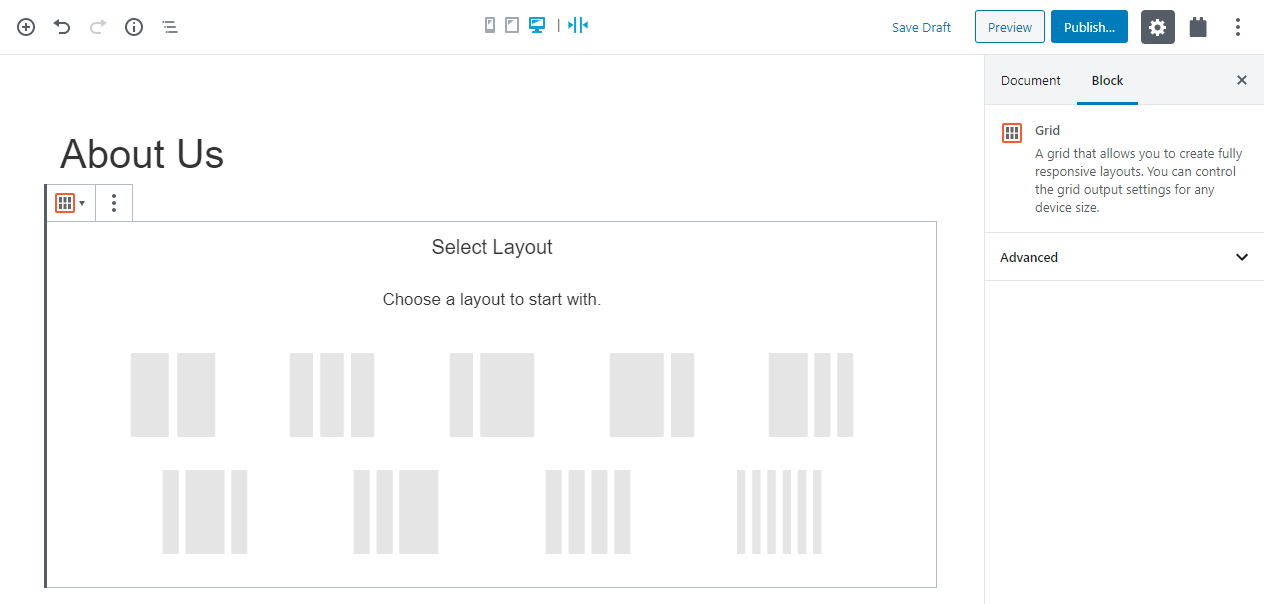
Each grid consists of rows that have cells in it. In each cell, you can place one or more blocks. The first step after inserting a Grid block is to set the number of columns.
Selecting a layout for your Grid block
Once you have your columns in place you can easily adjust the width by dragging the column border.
Resizing the columns in the Grid block
The Grid block settings
The Grid block has multiple useful options:
You can change the number of columns at any time. When you reduce the number of columns, your content automatically shifts. You have full control over the gap (space) between columns and rows. You can have different columns per screen size. On wide screens, place several columns. On tablets fewer and usually, one column is great for phone screens. You can reverse the column order for sensible image positions. This allows you to control when “floating” images appear on phones. Reverse the column order for right-floating images to come before the text on phones.
Setting a Grid block properties
Using grid features in Views and archives
The features of the Toolset Grid block are also available when you create Views and design archives . The grid layout makes your lists of posts look great on narrow screens.
Changing the grid options for a View
To change grid options for your View , select the View Loop block and expand the Grid Settings section. Tweak the options for your View’s grid output.
Changing the grid options for a WordPress Archive
To change grid options for your WordPress Archive , select the WordPress Archive Loop block and expand the Grid Settings section. Tweak the options for your archive’s grid output.


 Enviar comentarios a nuestro equipo de documentación