LnRiLWNvbnRhaW5lciAudGItY29udGFpbmVyLWlubmVye3dpZHRoOjEwMCU7bWFyZ2luOjAgYXV0b30gLndwLWJsb2NrLXRvb2xzZXQtYmxvY2tzLWNvbnRhaW5lci50Yi1jb250YWluZXJbZGF0YS10b29sc2V0LWJsb2Nrcy1jb250YWluZXI9ImQyYzRlYjkyZGIxZTM5ODQ5NmZiYWE0MjRkNmViNzAxIl0geyBwYWRkaW5nOiAwcHggMHB4IDQwcHggMHB4OyB9IC50Yi1jb250YWluZXIgLnRiLWNvbnRhaW5lci1pbm5lcnt3aWR0aDoxMDAlO21hcmdpbjowIGF1dG99IC53cC1ibG9jay10b29sc2V0LWJsb2Nrcy1jb250YWluZXIudGItY29udGFpbmVyW2RhdGEtdG9vbHNldC1ibG9ja3MtY29udGFpbmVyPSI5NmRkNDkzYzE4MzkzYjY2YWQ3N2UzZmEyMjdhNzIyNyJdIHsgcGFkZGluZzogNDBweCAwcHggMHB4IDBweDsgfSAudGItZmllbGRbZGF0YS10b29sc2V0LWJsb2Nrcy1maWVsZD0iN2Q5MzVhZGE3ODIxM2MwOWQ1NDczZjM3YjI5M2I0ZDciXSB7IHRleHQtYWxpZ246IGxlZnQ7IH0gLnRiLWZpZWxkW2RhdGEtdG9vbHNldC1ibG9ja3MtZmllbGQ9IjdkOTM1YWRhNzgyMTNjMDlkNTQ3M2YzN2IyOTNiNGQ3Il0gYSB7IHRleHQtZGVjb3JhdGlvbjogbm9uZTsgfSAgLnRiLWltYWdle3Bvc2l0aW9uOnJlbGF0aXZlO3RyYW5zaXRpb246dHJhbnNmb3JtIDAuMjVzIGVhc2V9LndwLWJsb2NrLWltYWdlIC50Yi1pbWFnZS5hbGlnbmNlbnRlcnttYXJnaW4tbGVmdDphdXRvO21hcmdpbi1yaWdodDphdXRvfS50Yi1pbWFnZSBpbWd7bWF4LXdpZHRoOjEwMCU7aGVpZ2h0OmF1dG87d2lkdGg6YXV0bzt0cmFuc2l0aW9uOnRyYW5zZm9ybSAwLjI1cyBlYXNlfS50Yi1pbWFnZSAudGItaW1hZ2UtY2FwdGlvbi1maXQtdG8taW1hZ2V7ZGlzcGxheTp0YWJsZX0udGItaW1hZ2UgLnRiLWltYWdlLWNhcHRpb24tZml0LXRvLWltYWdlIC50Yi1pbWFnZS1jYXB0aW9ue2Rpc3BsYXk6dGFibGUtY2FwdGlvbjtjYXB0aW9uLXNpZGU6Ym90dG9tfSAudGItaW1hZ2VbZGF0YS10b29sc2V0LWJsb2Nrcy1pbWFnZT0iNTUzNTQ4ZGU0OWJiYzk4MjdlMTI1MzY5ZGYyZjFkZTAiXSB7IG1heC13aWR0aDogMTAwJTsgfSAudGItaW1hZ2VbZGF0YS10b29sc2V0LWJsb2Nrcy1pbWFnZT0iNTUzNTQ4ZGU0OWJiYzk4MjdlMTI1MzY5ZGYyZjFkZTAiXSBpbWcgeyBtYXJnaW4tYm90dG9tOiAzMHB4O2JvcmRlcjogMXB4IHNvbGlkIHJnYmEoIDIyMiwgMjIyLCAyMjIsIDEgKTsgfSAudGItaW1hZ2V7cG9zaXRpb246cmVsYXRpdmU7dHJhbnNpdGlvbjp0cmFuc2Zvcm0gMC4yNXMgZWFzZX0ud3AtYmxvY2staW1hZ2UgLnRiLWltYWdlLmFsaWduY2VudGVye21hcmdpbi1sZWZ0OmF1dG87bWFyZ2luLXJpZ2h0OmF1dG99LnRiLWltYWdlIGltZ3ttYXgtd2lkdGg6MTAwJTtoZWlnaHQ6YXV0bzt3aWR0aDphdXRvO3RyYW5zaXRpb246dHJhbnNmb3JtIDAuMjVzIGVhc2V9LnRiLWltYWdlIC50Yi1pbWFnZS1jYXB0aW9uLWZpdC10by1pbWFnZXtkaXNwbGF5OnRhYmxlfS50Yi1pbWFnZSAudGItaW1hZ2UtY2FwdGlvbi1maXQtdG8taW1hZ2UgLnRiLWltYWdlLWNhcHRpb257ZGlzcGxheTp0YWJsZS1jYXB0aW9uO2NhcHRpb24tc2lkZTpib3R0b219IC50Yi1pbWFnZVtkYXRhLXRvb2xzZXQtYmxvY2tzLWltYWdlPSJiY2M0MDBhMjU1MjM3ODI2MmZhZTBmMDkxNGM0ZTEyMiJdIHsgbWF4LXdpZHRoOiAxMDAlOyB9IC50Yi1pbWFnZVtkYXRhLXRvb2xzZXQtYmxvY2tzLWltYWdlPSJiY2M0MDBhMjU1MjM3ODI2MmZhZTBmMDkxNGM0ZTEyMiJdIGltZyB7IG1hcmdpbi1ib3R0b206IDMwcHg7Ym9yZGVyOiAxcHggc29saWQgcmdiYSggMjIyLCAyMjIsIDIyMiwgMSApOyB9IC50Yi1pbWFnZXtwb3NpdGlvbjpyZWxhdGl2ZTt0cmFuc2l0aW9uOnRyYW5zZm9ybSAwLjI1cyBlYXNlfS53cC1ibG9jay1pbWFnZSAudGItaW1hZ2UuYWxpZ25jZW50ZXJ7bWFyZ2luLWxlZnQ6YXV0bzttYXJnaW4tcmlnaHQ6YXV0b30udGItaW1hZ2UgaW1ne21heC13aWR0aDoxMDAlO2hlaWdodDphdXRvO3dpZHRoOmF1dG87dHJhbnNpdGlvbjp0cmFuc2Zvcm0gMC4yNXMgZWFzZX0udGItaW1hZ2UgLnRiLWltYWdlLWNhcHRpb24tZml0LXRvLWltYWdle2Rpc3BsYXk6dGFibGV9LnRiLWltYWdlIC50Yi1pbWFnZS1jYXB0aW9uLWZpdC10by1pbWFnZSAudGItaW1hZ2UtY2FwdGlvbntkaXNwbGF5OnRhYmxlLWNhcHRpb247Y2FwdGlvbi1zaWRlOmJvdHRvbX0gLnRiLWltYWdlW2RhdGEtdG9vbHNldC1ibG9ja3MtaW1hZ2U9ImE2Y2I4ZmY2ZjQ2NzAzOGY0NTllMzYwNjc0MjllZTJmIl0geyBtYXgtd2lkdGg6IDEwMCU7IH0gLnRiLWltYWdlW2RhdGEtdG9vbHNldC1ibG9ja3MtaW1hZ2U9ImE2Y2I4ZmY2ZjQ2NzAzOGY0NTllMzYwNjc0MjllZTJmIl0gaW1nIHsgbWFyZ2luLWJvdHRvbTogMzBweDtib3JkZXI6IDFweCBzb2xpZCByZ2JhKCAyMjIsIDIyMiwgMjIyLCAxICk7IH0gLnRiLWltYWdle3Bvc2l0aW9uOnJlbGF0aXZlO3RyYW5zaXRpb246dHJhbnNmb3JtIDAuMjVzIGVhc2V9LndwLWJsb2NrLWltYWdlIC50Yi1pbWFnZS5hbGlnbmNlbnRlcnttYXJnaW4tbGVmdDphdXRvO21hcmdpbi1yaWdodDphdXRvfS50Yi1pbWFnZSBpbWd7bWF4LXdpZHRoOjEwMCU7aGVpZ2h0OmF1dG87d2lkdGg6YXV0bzt0cmFuc2l0aW9uOnRyYW5zZm9ybSAwLjI1cyBlYXNlfS50Yi1pbWFnZSAudGItaW1hZ2UtY2FwdGlvbi1maXQtdG8taW1hZ2V7ZGlzcGxheTp0YWJsZX0udGItaW1hZ2UgLnRiLWltYWdlLWNhcHRpb24tZml0LXRvLWltYWdlIC50Yi1pbWFnZS1jYXB0aW9ue2Rpc3BsYXk6dGFibGUtY2FwdGlvbjtjYXB0aW9uLXNpZGU6Ym90dG9tfSAudGItaW1hZ2VbZGF0YS10b29sc2V0LWJsb2Nrcy1pbWFnZT0iYmMwMDE0NzQ3ZGVkNzVmMjhjMTJhNDM5Y2M0ODkxNzMiXSB7IG1heC13aWR0aDogMTAwJTsgfSAudGItaW1hZ2VbZGF0YS10b29sc2V0LWJsb2Nrcy1pbWFnZT0iYmMwMDE0NzQ3ZGVkNzVmMjhjMTJhNDM5Y2M0ODkxNzMiXSBpbWcgeyBib3JkZXI6IDFweCBzb2xpZCByZ2JhKCAyMjIsIDIyMiwgMjIyLCAxICk7IH0gLnRiLWltYWdle3Bvc2l0aW9uOnJlbGF0aXZlO3RyYW5zaXRpb246dHJhbnNmb3JtIDAuMjVzIGVhc2V9LndwLWJsb2NrLWltYWdlIC50Yi1pbWFnZS5hbGlnbmNlbnRlcnttYXJnaW4tbGVmdDphdXRvO21hcmdpbi1yaWdodDphdXRvfS50Yi1pbWFnZSBpbWd7bWF4LXdpZHRoOjEwMCU7aGVpZ2h0OmF1dG87d2lkdGg6YXV0bzt0cmFuc2l0aW9uOnRyYW5zZm9ybSAwLjI1cyBlYXNlfS50Yi1pbWFnZSAudGItaW1hZ2UtY2FwdGlvbi1maXQtdG8taW1hZ2V7ZGlzcGxheTp0YWJsZX0udGItaW1hZ2UgLnRiLWltYWdlLWNhcHRpb24tZml0LXRvLWltYWdlIC50Yi1pbWFnZS1jYXB0aW9ue2Rpc3BsYXk6dGFibGUtY2FwdGlvbjtjYXB0aW9uLXNpZGU6Ym90dG9tfSAudGItaW1hZ2VbZGF0YS10b29sc2V0LWJsb2Nrcy1pbWFnZT0iYTNiNzU2NjNiODU3OGU2YTA3ZDRhNGFhMTI5YzIzNzMiXSB7IG1heC13aWR0aDogMTAwJTsgfSAudGItaW1hZ2VbZGF0YS10b29sc2V0LWJsb2Nrcy1pbWFnZT0iYTNiNzU2NjNiODU3OGU2YTA3ZDRhNGFhMTI5YzIzNzMiXSBpbWcgeyBtYXJnaW4tYm90dG9tOiAzMHB4O2JvcmRlcjogMXB4IHNvbGlkIHJnYmEoIDIyMiwgMjIyLCAyMjIsIDEgKTsgfSAudGItaW1hZ2V7cG9zaXRpb246cmVsYXRpdmU7dHJhbnNpdGlvbjp0cmFuc2Zvcm0gMC4yNXMgZWFzZX0ud3AtYmxvY2staW1hZ2UgLnRiLWltYWdlLmFsaWduY2VudGVye21hcmdpbi1sZWZ0OmF1dG87bWFyZ2luLXJpZ2h0OmF1dG99LnRiLWltYWdlIGltZ3ttYXgtd2lkdGg6MTAwJTtoZWlnaHQ6YXV0bzt3aWR0aDphdXRvO3RyYW5zaXRpb246dHJhbnNmb3JtIDAuMjVzIGVhc2V9LnRiLWltYWdlIC50Yi1pbWFnZS1jYXB0aW9uLWZpdC10by1pbWFnZXtkaXNwbGF5OnRhYmxlfS50Yi1pbWFnZSAudGItaW1hZ2UtY2FwdGlvbi1maXQtdG8taW1hZ2UgLnRiLWltYWdlLWNhcHRpb257ZGlzcGxheTp0YWJsZS1jYXB0aW9uO2NhcHRpb24tc2lkZTpib3R0b219IC50Yi1pbWFnZVtkYXRhLXRvb2xzZXQtYmxvY2tzLWltYWdlPSJiZTUyNWRjN2Q5ZDg1OGVkOWI5NDAzNzAxNjU2ZWFlYiJdIHsgbWF4LXdpZHRoOiAxMDAlOyB9IC50Yi1pbWFnZVtkYXRhLXRvb2xzZXQtYmxvY2tzLWltYWdlPSJiZTUyNWRjN2Q5ZDg1OGVkOWI5NDAzNzAxNjU2ZWFlYiJdIGltZyB7IGJvcmRlcjogMXB4IHNvbGlkIHJnYmEoIDIyMiwgMjIyLCAyMjIsIDEgKTsgfSAudGItaW1hZ2V7cG9zaXRpb246cmVsYXRpdmU7dHJhbnNpdGlvbjp0cmFuc2Zvcm0gMC4yNXMgZWFzZX0ud3AtYmxvY2staW1hZ2UgLnRiLWltYWdlLmFsaWduY2VudGVye21hcmdpbi1sZWZ0OmF1dG87bWFyZ2luLXJpZ2h0OmF1dG99LnRiLWltYWdlIGltZ3ttYXgtd2lkdGg6MTAwJTtoZWlnaHQ6YXV0bzt3aWR0aDphdXRvO3RyYW5zaXRpb246dHJhbnNmb3JtIDAuMjVzIGVhc2V9LnRiLWltYWdlIC50Yi1pbWFnZS1jYXB0aW9uLWZpdC10by1pbWFnZXtkaXNwbGF5OnRhYmxlfS50Yi1pbWFnZSAudGItaW1hZ2UtY2FwdGlvbi1maXQtdG8taW1hZ2UgLnRiLWltYWdlLWNhcHRpb257ZGlzcGxheTp0YWJsZS1jYXB0aW9uO2NhcHRpb24tc2lkZTpib3R0b219IC50Yi1pbWFnZVtkYXRhLXRvb2xzZXQtYmxvY2tzLWltYWdlPSI0YWI3ZWNhZDUxNWU2ZWM2YTgzZjgwOWI1YTJhOGFiNCJdIHsgbWF4LXdpZHRoOiAxMDAlOyB9IC50Yi1pbWFnZVtkYXRhLXRvb2xzZXQtYmxvY2tzLWltYWdlPSI0YWI3ZWNhZDUxNWU2ZWM2YTgzZjgwOWI1YTJhOGFiNCJdIGltZyB7IG1hcmdpbi1ib3R0b206IDMwcHg7Ym9yZGVyOiAxcHggc29saWQgcmdiYSggMjIyLCAyMjIsIDIyMiwgMSApOyB9IEBtZWRpYSBvbmx5IHNjcmVlbiBhbmQgKG1heC13aWR0aDogOTkxcHgpIHsgLnRiLWNvbnRhaW5lciAudGItY29udGFpbmVyLWlubmVye3dpZHRoOjEwMCU7bWFyZ2luOjAgYXV0b30udGItY29udGFpbmVyIC50Yi1jb250YWluZXItaW5uZXJ7d2lkdGg6MTAwJTttYXJnaW46MCBhdXRvfS50Yi1maWVsZFtkYXRhLXRvb2xzZXQtYmxvY2tzLWZpZWxkPSI3ZDkzNWFkYTc4MjEzYzA5ZDU0NzNmMzdiMjkzYjRkNyJdIGEgeyB0ZXh0LWRlY29yYXRpb246IG5vbmU7IH0gIC50Yi1pbWFnZXtwb3NpdGlvbjpyZWxhdGl2ZTt0cmFuc2l0aW9uOnRyYW5zZm9ybSAwLjI1cyBlYXNlfS53cC1ibG9jay1pbWFnZSAudGItaW1hZ2UuYWxpZ25jZW50ZXJ7bWFyZ2luLWxlZnQ6YXV0bzttYXJnaW4tcmlnaHQ6YXV0b30udGItaW1hZ2UgaW1ne21heC13aWR0aDoxMDAlO2hlaWdodDphdXRvO3dpZHRoOmF1dG87dHJhbnNpdGlvbjp0cmFuc2Zvcm0gMC4yNXMgZWFzZX0udGItaW1hZ2UgLnRiLWltYWdlLWNhcHRpb24tZml0LXRvLWltYWdle2Rpc3BsYXk6dGFibGV9LnRiLWltYWdlIC50Yi1pbWFnZS1jYXB0aW9uLWZpdC10by1pbWFnZSAudGItaW1hZ2UtY2FwdGlvbntkaXNwbGF5OnRhYmxlLWNhcHRpb247Y2FwdGlvbi1zaWRlOmJvdHRvbX0udGItaW1hZ2V7cG9zaXRpb246cmVsYXRpdmU7dHJhbnNpdGlvbjp0cmFuc2Zvcm0gMC4yNXMgZWFzZX0ud3AtYmxvY2staW1hZ2UgLnRiLWltYWdlLmFsaWduY2VudGVye21hcmdpbi1sZWZ0OmF1dG87bWFyZ2luLXJpZ2h0OmF1dG99LnRiLWltYWdlIGltZ3ttYXgtd2lkdGg6MTAwJTtoZWlnaHQ6YXV0bzt3aWR0aDphdXRvO3RyYW5zaXRpb246dHJhbnNmb3JtIDAuMjVzIGVhc2V9LnRiLWltYWdlIC50Yi1pbWFnZS1jYXB0aW9uLWZpdC10by1pbWFnZXtkaXNwbGF5OnRhYmxlfS50Yi1pbWFnZSAudGItaW1hZ2UtY2FwdGlvbi1maXQtdG8taW1hZ2UgLnRiLWltYWdlLWNhcHRpb257ZGlzcGxheTp0YWJsZS1jYXB0aW9uO2NhcHRpb24tc2lkZTpib3R0b219LnRiLWltYWdle3Bvc2l0aW9uOnJlbGF0aXZlO3RyYW5zaXRpb246dHJhbnNmb3JtIDAuMjVzIGVhc2V9LndwLWJsb2NrLWltYWdlIC50Yi1pbWFnZS5hbGlnbmNlbnRlcnttYXJnaW4tbGVmdDphdXRvO21hcmdpbi1yaWdodDphdXRvfS50Yi1pbWFnZSBpbWd7bWF4LXdpZHRoOjEwMCU7aGVpZ2h0OmF1dG87d2lkdGg6YXV0bzt0cmFuc2l0aW9uOnRyYW5zZm9ybSAwLjI1cyBlYXNlfS50Yi1pbWFnZSAudGItaW1hZ2UtY2FwdGlvbi1maXQtdG8taW1hZ2V7ZGlzcGxheTp0YWJsZX0udGItaW1hZ2UgLnRiLWltYWdlLWNhcHRpb24tZml0LXRvLWltYWdlIC50Yi1pbWFnZS1jYXB0aW9ue2Rpc3BsYXk6dGFibGUtY2FwdGlvbjtjYXB0aW9uLXNpZGU6Ym90dG9tfS50Yi1pbWFnZXtwb3NpdGlvbjpyZWxhdGl2ZTt0cmFuc2l0aW9uOnRyYW5zZm9ybSAwLjI1cyBlYXNlfS53cC1ibG9jay1pbWFnZSAudGItaW1hZ2UuYWxpZ25jZW50ZXJ7bWFyZ2luLWxlZnQ6YXV0bzttYXJnaW4tcmlnaHQ6YXV0b30udGItaW1hZ2UgaW1ne21heC13aWR0aDoxMDAlO2hlaWdodDphdXRvO3dpZHRoOmF1dG87dHJhbnNpdGlvbjp0cmFuc2Zvcm0gMC4yNXMgZWFzZX0udGItaW1hZ2UgLnRiLWltYWdlLWNhcHRpb24tZml0LXRvLWltYWdle2Rpc3BsYXk6dGFibGV9LnRiLWltYWdlIC50Yi1pbWFnZS1jYXB0aW9uLWZpdC10by1pbWFnZSAudGItaW1hZ2UtY2FwdGlvbntkaXNwbGF5OnRhYmxlLWNhcHRpb247Y2FwdGlvbi1zaWRlOmJvdHRvbX0udGItaW1hZ2V7cG9zaXRpb246cmVsYXRpdmU7dHJhbnNpdGlvbjp0cmFuc2Zvcm0gMC4yNXMgZWFzZX0ud3AtYmxvY2staW1hZ2UgLnRiLWltYWdlLmFsaWduY2VudGVye21hcmdpbi1sZWZ0OmF1dG87bWFyZ2luLXJpZ2h0OmF1dG99LnRiLWltYWdlIGltZ3ttYXgtd2lkdGg6MTAwJTtoZWlnaHQ6YXV0bzt3aWR0aDphdXRvO3RyYW5zaXRpb246dHJhbnNmb3JtIDAuMjVzIGVhc2V9LnRiLWltYWdlIC50Yi1pbWFnZS1jYXB0aW9uLWZpdC10by1pbWFnZXtkaXNwbGF5OnRhYmxlfS50Yi1pbWFnZSAudGItaW1hZ2UtY2FwdGlvbi1maXQtdG8taW1hZ2UgLnRiLWltYWdlLWNhcHRpb257ZGlzcGxheTp0YWJsZS1jYXB0aW9uO2NhcHRpb24tc2lkZTpib3R0b219LnRiLWltYWdle3Bvc2l0aW9uOnJlbGF0aXZlO3RyYW5zaXRpb246dHJhbnNmb3JtIDAuMjVzIGVhc2V9LndwLWJsb2NrLWltYWdlIC50Yi1pbWFnZS5hbGlnbmNlbnRlcnttYXJnaW4tbGVmdDphdXRvO21hcmdpbi1yaWdodDphdXRvfS50Yi1pbWFnZSBpbWd7bWF4LXdpZHRoOjEwMCU7aGVpZ2h0OmF1dG87d2lkdGg6YXV0bzt0cmFuc2l0aW9uOnRyYW5zZm9ybSAwLjI1cyBlYXNlfS50Yi1pbWFnZSAudGItaW1hZ2UtY2FwdGlvbi1maXQtdG8taW1hZ2V7ZGlzcGxheTp0YWJsZX0udGItaW1hZ2UgLnRiLWltYWdlLWNhcHRpb24tZml0LXRvLWltYWdlIC50Yi1pbWFnZS1jYXB0aW9ue2Rpc3BsYXk6dGFibGUtY2FwdGlvbjtjYXB0aW9uLXNpZGU6Ym90dG9tfS50Yi1pbWFnZXtwb3NpdGlvbjpyZWxhdGl2ZTt0cmFuc2l0aW9uOnRyYW5zZm9ybSAwLjI1cyBlYXNlfS53cC1ibG9jay1pbWFnZSAudGItaW1hZ2UuYWxpZ25jZW50ZXJ7bWFyZ2luLWxlZnQ6YXV0bzttYXJnaW4tcmlnaHQ6YXV0b30udGItaW1hZ2UgaW1ne21heC13aWR0aDoxMDAlO2hlaWdodDphdXRvO3dpZHRoOmF1dG87dHJhbnNpdGlvbjp0cmFuc2Zvcm0gMC4yNXMgZWFzZX0udGItaW1hZ2UgLnRiLWltYWdlLWNhcHRpb24tZml0LXRvLWltYWdle2Rpc3BsYXk6dGFibGV9LnRiLWltYWdlIC50Yi1pbWFnZS1jYXB0aW9uLWZpdC10by1pbWFnZSAudGItaW1hZ2UtY2FwdGlvbntkaXNwbGF5OnRhYmxlLWNhcHRpb247Y2FwdGlvbi1zaWRlOmJvdHRvbX0gfSBAbWVkaWEgb25seSBzY3JlZW4gYW5kIChtYXgtd2lkdGg6IDU5OXB4KSB7IC50Yi1jb250YWluZXIgLnRiLWNvbnRhaW5lci1pbm5lcnt3aWR0aDoxMDAlO21hcmdpbjowIGF1dG99LnRiLWNvbnRhaW5lciAudGItY29udGFpbmVyLWlubmVye3dpZHRoOjEwMCU7bWFyZ2luOjAgYXV0b30udGItZmllbGRbZGF0YS10b29sc2V0LWJsb2Nrcy1maWVsZD0iN2Q5MzVhZGE3ODIxM2MwOWQ1NDczZjM3YjI5M2I0ZDciXSBhIHsgdGV4dC1kZWNvcmF0aW9uOiBub25lOyB9ICAudGItaW1hZ2V7cG9zaXRpb246cmVsYXRpdmU7dHJhbnNpdGlvbjp0cmFuc2Zvcm0gMC4yNXMgZWFzZX0ud3AtYmxvY2staW1hZ2UgLnRiLWltYWdlLmFsaWduY2VudGVye21hcmdpbi1sZWZ0OmF1dG87bWFyZ2luLXJpZ2h0OmF1dG99LnRiLWltYWdlIGltZ3ttYXgtd2lkdGg6MTAwJTtoZWlnaHQ6YXV0bzt3aWR0aDphdXRvO3RyYW5zaXRpb246dHJhbnNmb3JtIDAuMjVzIGVhc2V9LnRiLWltYWdlIC50Yi1pbWFnZS1jYXB0aW9uLWZpdC10by1pbWFnZXtkaXNwbGF5OnRhYmxlfS50Yi1pbWFnZSAudGItaW1hZ2UtY2FwdGlvbi1maXQtdG8taW1hZ2UgLnRiLWltYWdlLWNhcHRpb257ZGlzcGxheTp0YWJsZS1jYXB0aW9uO2NhcHRpb24tc2lkZTpib3R0b219LnRiLWltYWdle3Bvc2l0aW9uOnJlbGF0aXZlO3RyYW5zaXRpb246dHJhbnNmb3JtIDAuMjVzIGVhc2V9LndwLWJsb2NrLWltYWdlIC50Yi1pbWFnZS5hbGlnbmNlbnRlcnttYXJnaW4tbGVmdDphdXRvO21hcmdpbi1yaWdodDphdXRvfS50Yi1pbWFnZSBpbWd7bWF4LXdpZHRoOjEwMCU7aGVpZ2h0OmF1dG87d2lkdGg6YXV0bzt0cmFuc2l0aW9uOnRyYW5zZm9ybSAwLjI1cyBlYXNlfS50Yi1pbWFnZSAudGItaW1hZ2UtY2FwdGlvbi1maXQtdG8taW1hZ2V7ZGlzcGxheTp0YWJsZX0udGItaW1hZ2UgLnRiLWltYWdlLWNhcHRpb24tZml0LXRvLWltYWdlIC50Yi1pbWFnZS1jYXB0aW9ue2Rpc3BsYXk6dGFibGUtY2FwdGlvbjtjYXB0aW9uLXNpZGU6Ym90dG9tfS50Yi1pbWFnZXtwb3NpdGlvbjpyZWxhdGl2ZTt0cmFuc2l0aW9uOnRyYW5zZm9ybSAwLjI1cyBlYXNlfS53cC1ibG9jay1pbWFnZSAudGItaW1hZ2UuYWxpZ25jZW50ZXJ7bWFyZ2luLWxlZnQ6YXV0bzttYXJnaW4tcmlnaHQ6YXV0b30udGItaW1hZ2UgaW1ne21heC13aWR0aDoxMDAlO2hlaWdodDphdXRvO3dpZHRoOmF1dG87dHJhbnNpdGlvbjp0cmFuc2Zvcm0gMC4yNXMgZWFzZX0udGItaW1hZ2UgLnRiLWltYWdlLWNhcHRpb24tZml0LXRvLWltYWdle2Rpc3BsYXk6dGFibGV9LnRiLWltYWdlIC50Yi1pbWFnZS1jYXB0aW9uLWZpdC10by1pbWFnZSAudGItaW1hZ2UtY2FwdGlvbntkaXNwbGF5OnRhYmxlLWNhcHRpb247Y2FwdGlvbi1zaWRlOmJvdHRvbX0udGItaW1hZ2V7cG9zaXRpb246cmVsYXRpdmU7dHJhbnNpdGlvbjp0cmFuc2Zvcm0gMC4yNXMgZWFzZX0ud3AtYmxvY2staW1hZ2UgLnRiLWltYWdlLmFsaWduY2VudGVye21hcmdpbi1sZWZ0OmF1dG87bWFyZ2luLXJpZ2h0OmF1dG99LnRiLWltYWdlIGltZ3ttYXgtd2lkdGg6MTAwJTtoZWlnaHQ6YXV0bzt3aWR0aDphdXRvO3RyYW5zaXRpb246dHJhbnNmb3JtIDAuMjVzIGVhc2V9LnRiLWltYWdlIC50Yi1pbWFnZS1jYXB0aW9uLWZpdC10by1pbWFnZXtkaXNwbGF5OnRhYmxlfS50Yi1pbWFnZSAudGItaW1hZ2UtY2FwdGlvbi1maXQtdG8taW1hZ2UgLnRiLWltYWdlLWNhcHRpb257ZGlzcGxheTp0YWJsZS1jYXB0aW9uO2NhcHRpb24tc2lkZTpib3R0b219LnRiLWltYWdle3Bvc2l0aW9uOnJlbGF0aXZlO3RyYW5zaXRpb246dHJhbnNmb3JtIDAuMjVzIGVhc2V9LndwLWJsb2NrLWltYWdlIC50Yi1pbWFnZS5hbGlnbmNlbnRlcnttYXJnaW4tbGVmdDphdXRvO21hcmdpbi1yaWdodDphdXRvfS50Yi1pbWFnZSBpbWd7bWF4LXdpZHRoOjEwMCU7aGVpZ2h0OmF1dG87d2lkdGg6YXV0bzt0cmFuc2l0aW9uOnRyYW5zZm9ybSAwLjI1cyBlYXNlfS50Yi1pbWFnZSAudGItaW1hZ2UtY2FwdGlvbi1maXQtdG8taW1hZ2V7ZGlzcGxheTp0YWJsZX0udGItaW1hZ2UgLnRiLWltYWdlLWNhcHRpb24tZml0LXRvLWltYWdlIC50Yi1pbWFnZS1jYXB0aW9ue2Rpc3BsYXk6dGFibGUtY2FwdGlvbjtjYXB0aW9uLXNpZGU6Ym90dG9tfS50Yi1pbWFnZXtwb3NpdGlvbjpyZWxhdGl2ZTt0cmFuc2l0aW9uOnRyYW5zZm9ybSAwLjI1cyBlYXNlfS53cC1ibG9jay1pbWFnZSAudGItaW1hZ2UuYWxpZ25jZW50ZXJ7bWFyZ2luLWxlZnQ6YXV0bzttYXJnaW4tcmlnaHQ6YXV0b30udGItaW1hZ2UgaW1ne21heC13aWR0aDoxMDAlO2hlaWdodDphdXRvO3dpZHRoOmF1dG87dHJhbnNpdGlvbjp0cmFuc2Zvcm0gMC4yNXMgZWFzZX0udGItaW1hZ2UgLnRiLWltYWdlLWNhcHRpb24tZml0LXRvLWltYWdle2Rpc3BsYXk6dGFibGV9LnRiLWltYWdlIC50Yi1pbWFnZS1jYXB0aW9uLWZpdC10by1pbWFnZSAudGItaW1hZ2UtY2FwdGlvbntkaXNwbGF5OnRhYmxlLWNhcHRpb247Y2FwdGlvbi1zaWRlOmJvdHRvbX0udGItaW1hZ2V7cG9zaXRpb246cmVsYXRpdmU7dHJhbnNpdGlvbjp0cmFuc2Zvcm0gMC4yNXMgZWFzZX0ud3AtYmxvY2staW1hZ2UgLnRiLWltYWdlLmFsaWduY2VudGVye21hcmdpbi1sZWZ0OmF1dG87bWFyZ2luLXJpZ2h0OmF1dG99LnRiLWltYWdlIGltZ3ttYXgtd2lkdGg6MTAwJTtoZWlnaHQ6YXV0bzt3aWR0aDphdXRvO3RyYW5zaXRpb246dHJhbnNmb3JtIDAuMjVzIGVhc2V9LnRiLWltYWdlIC50Yi1pbWFnZS1jYXB0aW9uLWZpdC10by1pbWFnZXtkaXNwbGF5OnRhYmxlfS50Yi1pbWFnZSAudGItaW1hZ2UtY2FwdGlvbi1maXQtdG8taW1hZ2UgLnRiLWltYWdlLWNhcHRpb257ZGlzcGxheTp0YWJsZS1jYXB0aW9uO2NhcHRpb24tc2lkZTpib3R0b219IH0g
LnRiLWZpZWxke21hcmdpbi1ib3R0b206MC43NmVtfS50Yi1maWVsZC0tbGVmdHt0ZXh0LWFsaWduOmxlZnR9LnRiLWZpZWxkLS1jZW50ZXJ7dGV4dC1hbGlnbjpjZW50ZXJ9LnRiLWZpZWxkLS1yaWdodHt0ZXh0LWFsaWduOnJpZ2h0fS50Yi1maWVsZF9fc2t5cGVfcHJldmlld3twYWRkaW5nOjEwcHggMjBweDtib3JkZXItcmFkaXVzOjNweDtjb2xvcjojZmZmO2JhY2tncm91bmQ6IzAwYWZlZTtkaXNwbGF5OmlubGluZS1ibG9ja311bC5nbGlkZV9fc2xpZGVze21hcmdpbjowfQ==
Picking a good color combination can make basic site designs appear professional, but this also means that poor color combinations can make top-quality sites look bad. To create a good color scheme that complements your design, you need to understand what color palettes are, how to create your own, and how to use them without reducing content readability.
Understanding a color palette
Your color palette, also known as a color scheme, is the basis of all the colors present on a website. There are countless combinations out there and they are not all suitable for website design, so pick a palette that suits your brand identity and apply them using the information below:
Pick at least 3 colors: dark, light, and an accent (bright).
Apply the dark or light color to either the background or text. Don’t make the text and background color similar to one another, only one can be light or dark at a time.
Apply the accent to places you want attention, such as buttons or links.
You can add more colors for different reasons, but we recommend a maximum of 5 colors.
The following example has colors that are simple but complement one another well:
A minimalist color palette
To replicate the same color, you need to use hexadecimal codes (e.g. #ffffff for white). These are what you insert in color-pickers to make sure you get the same color every time. To do this, use free services such as Google’s Color Picker .
As you can tell, our example’s palette has three colors that follow the color rules:
White for the main background
Very dark blue for plain text and headings
Dark cyan as an accent color for buttons, links, and special backgrounds
Since these colors complement one another, they won’t clash and distract users from the content of the site.
Here is how this looks on a webpage:
An example of a website that uses colors effectively to enhance its content
Using color contrast for site readability
Color contrast is how well a color stands out from another color, and it controls whether or not people can read the content on your site. To make sure your site has good readability, never let your background color be too similar to your text or image colors.
For example, the WordPress theme Twenty Twenty-One follows these color contrast rules:
Adjusting the color automatically updates the text to a better color
Please note that if you find it difficult to follow contrast rules, you can use a service such as ColourContrast to help you test your color combinations.
Creating your color palette
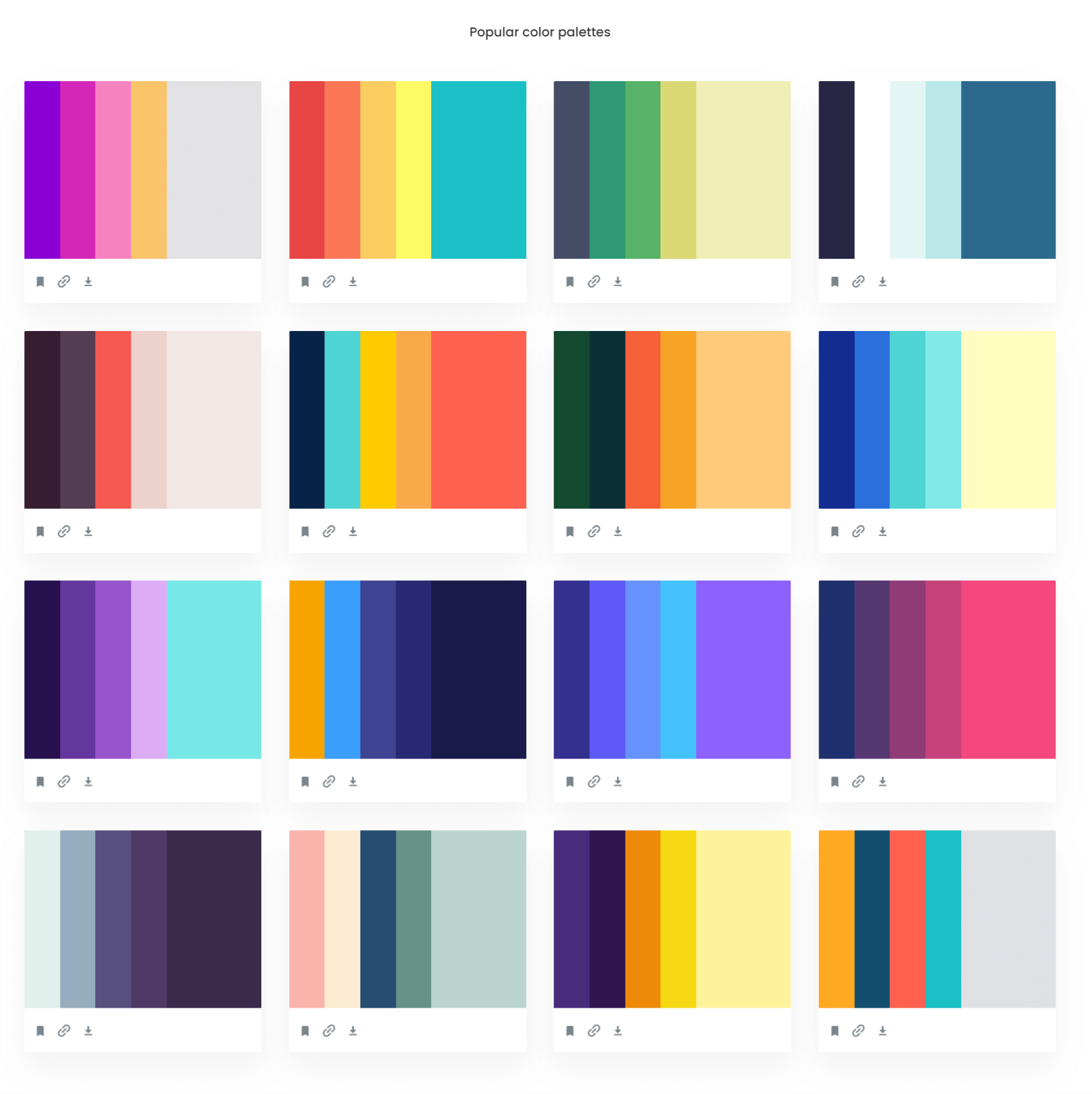
You can easily use online services to help you choose the perfect color combination, such as Colors.Muz , Color Hunt , Coolors , and Colormind . These work by suggesting colors that are complementary to the ones you want to use or save.
Examples of color palettes generated from online services
In case you do not know what to pick for your website palette, we suggest the following combination:
White
Your brand’s main color
Dark grey
A website color palette consisting of White, Coral Pink, and Dark Grey
If you want to base all of the colors on your brand design then you can just take the colors from your logo by selecting:
The lightest shade on the logo, or the lightest shade of your main color
An eye-catching accent that complements the other colors, or simply the main color
The darkest shade on the logo, or the darkest shade of your main color
If you have a business with a purple logo, the site palette might look like this:
A website color palette consisting of variations of Purple
If you are not familiar with design, you can also hire a graphics designer to create color scheme proposals from the logo you want to use.
How to add colors to your site
To add the color palette you want, go to Appearance → Customize and find the Colors or Base Colors panel. Sometimes this has a different name or is located in different panels in the Customizer. Refer to your theme documentation if you aren’t sure where it is.
Setting up the website palette in the Customizer
Some themes only offer basic color customization. If you need to customize all of your site colors, check that the theme you want to use allows this. You can also install plugins that add this functionality to your site.
For more information, visit the official WordPress documentation about colors .