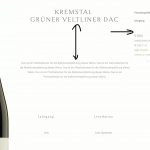
building a woocommerce product single template the vertical alignment of the grid (top) doesn`t work.
next the horizontal alignment (center) of the "add to cart" block doesn`t work either.
Hello,
I have tried it in my localhost with a fresh WordPress installation + the latest version of Toolset plugins, it works fine:
1) the vertical alignment of the grid (top) works as expected
2) "add to cart" block works fine too.
See screenshot vlign.JPG
Please check these in your website:
1) In case it is a compatibility problem, please deactivate all other plugins, and switch to wordpress default theme 2020, and test again
2) Also check if there is any PHP/JS error in your website:
https://toolset.com/documentation/programmer-reference/debugging-sites-built-with-toolset/
3) If the problem still persists, please provide database dump file(ZIP file) of your website, also point out the problem page URL and view URL, I need to test and debug it in my localhost, thanks
https://toolset.com/faq/provide-supporters-copy-site/
i can provide a staging installation for you?
I have tried your database dump file, but can not see the problems you mentioned above, see screenshot wein1.JPG
Then I have tried it in your live website with my Chrome browser, see screenshot wein2.JPG, I don't see the problems too.
1) the vertical alignment of the grid (top) works as expected
2) "add to cart" block works fine too.
Is this problem resolved? and the private message box enabeld, in case you need more assistance for it. Thanks
hi luo,
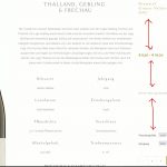
you can replicate the problem exactly, because the alignment is not "top". the elements are using all available space from top to bottom to place the elements. i want it have on top. in the middle and at the bottom it works fine, but not on "top".
you have the site credentials.
I have checked again in your website, for example:
versteckter Link
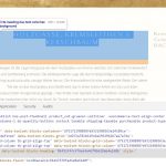
The desciption text does display as valign "Top", you can use Chrome browser to test it, select the title text "HOLZGASSE, KREMSLEITHEN & KERSCHBAUM", inspect the HTML element, you should be able to see it is styles of title make those space, see screenshot space.JPG
So if you want to remove those space between title and description, you will need to try CSS codes, for example:
h3.tb-heading{
margin-bottom: -3rem;
}
See screenshot:space2.JPG
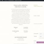
hi luo, to explain, i have added three screenshots:
1. gridcell align bottom: working as expected, the content is at the bottom
2. grid cell align middle: working as expected, the content is in the middle
3. grid cell top: you see the spacing? the content is using all available space, thats not ok, why and how to solve?
Thanks for the details, you are right, the top vertical align of grid block does not work same as admin side, I have escalated it, will update here if there is any news.
Here is the feedback, it is fixed in the next version of Toolset plugins, please let me know if you need a developement version plugin for testing.
how long does it take until the next release is released?
The next version of Toolset Blocks plugin is still under QA status, which will be released soon, maybe few days.
The Toolset Blocks plugin is released, you can download it here:
https://toolset.com/account/downloads/
Please test it and feedback if the problem is fixed, thanks
My issue is resolved now. Thank you!
