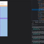
I am trying to: I have a section on my product page with two columns, which I would like to render as one column on mobile.
Link to a page where the issue can be seen: versteckter Link
I expected to see: Columns rendered as I set them
Instead, I got: On a small screen, I see the items stacked, but showing up way skinnier than they should. Inspection shows the two column CSS is overriding the one column @media CSS? I have no idea what's going on.
Hi there,
I will need to check how you set up your Single Content Template for products.
I'd appreciate it if you could give me the URL/User/Pass of your WordPress dashboard after you make sure that you have a backup of your website.
It is absolutely important that you give us a guarantee that you have a backup so that if something happens you will have a point of restore.
Make sure you set the next reply as private.
If it needs more investigation I will need to copy the website to our server or the best way is that you give me the staging version of the website if you have one.
Thank you.
Hi there,
The issue is happening because you added the CSS code below to the Content Template CSS Editor: (wp-admin/post.php?post=335818&action=edit)
.wp-block-toolset-blocks-grid.tb-grid[data-toolset-blocks-grid="b4ba35a082eaf5f3ddf71774e7effd6f"] {
	display: grid;
    grid-template-columns: minmax(0, 0.605fr) minmax(0, 0.395fr);
    grid-auto-flow: row;
}
.navplugify{
    margin-bottom: 10px;}
If you remove the code it will work ok.
I suggest that you wrap the code you added to only show on a minimum width proper to the desktop and for the smaller devices it should not be there.
Ah, I forgot I added that. I added it as a quick patch because on a handful of my product pages, the css styles for the toolset grid are not being loaded. But I have no idea how to deal with that because every time I copy my site to staging it starts working again.
