This is the technical support forum for Toolset - a suite of plugins for developing WordPress sites without writing PHP.
Everyone can read this forum, but only Toolset clients can post in it. Toolset support works 6 days per week, 19 hours per day.
Heute stehen keine Supporter zur Arbeit im Werkzeugsatz-Forum zur Verfügung. Sie können gern Tickets erstellen, die wir bearbeiten werden, sobald wir online sind. Vielen Dank für Ihr Verständnis.
| Sun | Mon | Tue | Wed | Thu | Fri | Sat |
|---|---|---|---|---|---|---|
| - | 7:00 – 14:00 | 7:00 – 14:00 | 7:00 – 14:00 | 7:00 – 14:00 | 7:00 – 14:00 | - |
| - | 15:00 – 16:00 | 15:00 – 16:00 | 15:00 – 16:00 | 15:00 – 16:00 | 15:00 – 16:00 | - |
Supporter timezone: Europe/London (GMT+00:00)
Verwandte Dokumentation:
Dieses Thema enthält 17 Antworten, hat 3 Stimmen.
Zuletzt aktualisiert von Francisco Ramón Molina Busquiel vor 7 Jahren.
Assistiert von: Nigel.
Nigel
Sprachen: Englisch (English ) Spanisch (Español )
Zeitzone: Europe/London (GMT+00:00)
Hi Francisco
It will be easier for me to understand what's happening here if I can see how you have this set up.
Can I get credentials from you to look at the back-end of your site please? (The credentials from an earlier ticket are no longer valid.)
Marking your next reply as private.
Nigel
Sprachen: Englisch (English ) Spanisch (Español )
Zeitzone: Europe/London (GMT+00:00)
Hi Francisco
Sorry for the delay getting back to you.
I think there are just two small CSS fixes required for the styling issues.
In the custom CSS section of the Divi page builder used to design the Content Template "Loop item in View-For-Blog", try adding the following style rules:
.row .et_pb_row {
  width: auto;
}

.row .et_pb_section {
  border-style: solid;
}
Regarding the question of how to link the image or text to the post, you need to wrap the shortcodes where you insert them in links where the URL is that of the current post for which you can insert the shortcode using the Fields and Views button.
For the featured image it would look like this, and you can do something similar for the post excerpt:
<a href="{!{wpv-post-url}!}">{!{wpv-post-featured-image size="large"}!}</a>
(Note that in the Divi page builder the shortcodes have a slightly different format than normal, with the square brackets replaced by a {!{ shortcode }!} syntax.)
The categories are not displaying because for some reason the shortcode to insert them has type="layout_category" instead of the type="category" required for standard post categories.
The final question about the responsiveness, i.e. the number of columns at different widths, Views inserts a basic grid with the number of columns you specify, that collapse to a single column at very small screen sizes. If you want to take more control over this you can add additional classes that will modify this behaviour.
The source documentation for the Bootstrap grid system is here: versteckter Link
And we have a fairly comprehensive guide to customising the grid here: https://toolset.com/documentation/user-guides/creating-responsive-designs/
You may wish to know, the support team are gathering examples of where Divi-Bootstrap conflicts occur so that we can come up with a list of required CSS overrides that we may compile together into a dedicated stylesheet.
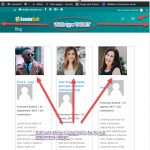
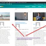
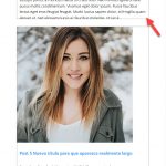
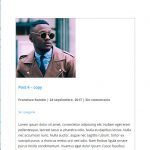
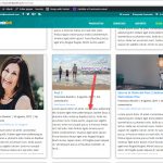
As you will see in the screenshots.
If the images are smaller, they do not fit the width of the column, in the DIVI blog module the images work correctly, the images must fit the width of the column regardless of its size.
As the links of the categories are a shortcut of Toolset, how can the color of the link be changed?
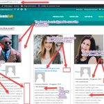
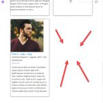
If I put in the columns configuration of the Toolset layout 'col-xs-12 col-sm-6 col-md-4' has the functionality that is expected, but does not work correctly, since, when the browser is narrowed so that 2 columns are shown, areas appear in which a post should be shown ,an empty area is shown.
Another topic that I wanted to comment on, you gave me some workarounds for the products page of woocommerce on this ticket:
https://toolset.com/forums/topic/bad-appearance-of-the-elements-of-the-products-woocommerce/
That workaround had a code to disable bootstrap on that page.
The problem is that if I disable Bootstrap, the header of the page takes the correct appearance of DIVI and this appearance is different from the header of the other pages of my site.
With the style sheet that you are going to use to solve the problems of incompatibility between Bootstrap and CSS, you are going to solve the problems of the header of the pages, so in the page that shows WooCommerce products you should not disable Bootstrap, so that you must give me the CSS workaround for the appearance of the internal elements of that page.
I am glad that you are going to make a style sheet for the problems of incompatibility between Bootstrap and CSS.
Do you know when you will have it?
Thanks for your help Nigel.
Hello Francisco
We have had several Tickets about issues with DIVI, Bootstrap and Toolset.
We are fully aware of these issues.
They are due to how DIVI is adding CSS (it uses the same classes as Bootstrap does).
We work on solutions. They might be presented as Custom CSS snippets in a special DOC; or even as a special Style loaded for DIVI by us.
We are not yet sure about the exact solution that is best.
Nigel will be with you here just as in any other Support Ticket.
But pleas acknowledge that Nigel cannot provide you fully ready to use Custom CSS fixes.
There are several reasons why not:
- first, if you apply them and DIVI changes it's styles all is broken again eventually. Nigel will not re-debug this that time.
- second, if we provide a future proof solution, the CSS might then also be invalid
- third, if we provide custom Snippets in future they will be QA tested. Nigels' solutions might work now, but will not be QA tested.
That is why to use Toolset you need to know CSS, JS and HTML fluently, to adjust such issues and style the website as per your desire.
Yes, we are aware that this is a special case, and that is why we work hard on finding a proper solution where you do not have to guess and invent CSS each time.
Now, you can help us greatly (you already do) by reporting each of these issues to us.
We will acknowledge them and try to provide a CSS solution - but if that is too large of the code, or it requires eventually some tests, it cannot be provided by the Supporter on the fly.
In those case please bare with us, the Supporter will let you know that he escalates or passes on this issue, that then means we will add this to the list of issue and provide solutions.
These will not be provided overnight thou. It requires some time, and eventually some changes in the code.
Thank you for understanding why sometimes we will not be able to provide you the full solution right away in the forum.
Please be assured that we work on this actively.
Thank you ????
Nigel
Sprachen: Englisch (English ) Spanisch (Español )
Zeitzone: Europe/London (GMT+00:00)
Hi Francisco
yes, your images are too small to fill the columns, and stretching images is not normally desirable, but if you want to do that then you can add a min-width: 100% rule to the img tags.
Regarding the issue of the columns, looking at this more closely, if you want to use them for the output of a View you cannot use the Loop Wizard to insert the markup for a specific number of columns.
The reason is that it will add a div with a .row class for every nth set of results, and when you modify the classes so that the number of columns changes, this can mean a row break occurring in the middle of a visual row on the screen.
So what you need to do is remove the markup that is used to create the columns in the Loop Output Editor and replace it with something like this:
[wpv-layout-start]
	[wpv-items-found]
		<div class="row ">
		<!-- wpv-loop-start -->
		<wpv-loop>
			<div class="loop-item col-sm-6 col-md-4">[wpv-post-body view_template="Loop item in View-For-Blog"]</div>
		</wpv-loop>
		<!-- wpv-loop-end -->
		</div>
	[/wpv-items-found]
	[wpv-no-items-found]
		<strong>[wpml-string context="wpv-views"]No items found[/wpml-string]</strong>
	[/wpv-no-items-found]
[wpv-layout-end]
Note that I have moved the div.row outside the loop section so that it is added only once and that *all* of the results appear in the same row. This is not how the Bootstrap grid is intended to be used, but there is little alternative.
And, it will only work if all of the loop items are the same height, so you will have to manually decide on a desired height and then set it.
I added these custom CSS rules to get it to work (including a couple of tweaks for issues I then noticed):
.loop-item {
  height: 600px;
  overflow-y: hidden;
  margin-bottom: 2em;
}

.loop-item > .et_pb_section {
  max-height: 599px;
}

@media (max-width: 980px)
.et_pb_section .et_pb_column .et_pb_module {
  margin-bottom: inherit;
}
Note that there are two hard-coded heights in that CSS rule, the second of which is one px less than the first, which is required so that the bottom border renders.
Ok Beda. Tell me something when you have some solution for all these problems.
Nigel, Your solution is not bad, the problem is that when you change the width of the browser the box of the post does not change in height, so the text is cut.
Can there be any solution for this?
You have not told me anything about putting the color of the category link.
Can you give me some idea to put it?
Regarding the WooCommerce products page, what do you recommend? We wait to see the solutions of the Toolset developers or do you give me some CSS to avoid disabling Bootstrap on that page and style its elements?
Thanks for your help Nigel.
Nigel
Sprachen: Englisch (English ) Spanisch (Español )
Zeitzone: Europe/London (GMT+00:00)
Hi Francisco
The items must have the same height for it to work, so the max-height rule seems like the best solution.
You could use media queries with the style rules to set different max-heights for different screen widths, but the particular details are a question of judgement depending on your content.
The category links are inheriting the colour for links set by the theme.
I don't know where you want the link colours to change.
If you only want to target the category links, where you insert the shortcode to output the category links you should wrap this shortcode in a container element such as a div which has a specific class name that you can then use in your CSS rule to change the colour, e.g.:
.my-class-name a {
  color: red;
}
I will check the other ticket to see if a solution has already been proposed for the style conflicts on the WooCommerce page and report back here.
In the meantime, please note that a sticky thread has been opened where we encourage clients to report new issues with Divi styling conflicting with Bootstrap so that they can be gathered in the same place (no need to re-post existing issues): https://toolset.com/forums/topic/style-conflicts-with-bootstrap-and-3rd-party-plugins-or-themes/
Is it not possible by modifying your css to make the text not next to the bottom line?
That is, put a margin between the text and the bottom line.
Thanks for the ticket information for problems with Bootstrap.
Nigel
Sprachen: Englisch (English ) Spanisch (Español )
Zeitzone: Europe/London (GMT+00:00)
Hi Francisco
Yes, that is possible, but the text may still be cut off at midway through a line.
First, you need to edit the Content Template with Divi page builder and move each of the elements into the same row (currently you have them split between two rows).
The update the CSS in the View CSS editor like so:
.loop-item {
  margin-bottom: 2em;
}

.loop-item > .et_pb_section {
  height: 600px;
}

.loop-item > .et_pb_section > .et_pb_row {
  max-height: 576px;
  overflow-y: hidden;
}
You may have to tweak the CSS to your requirements but that shows the principle involved.
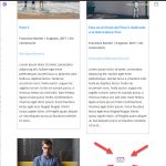
I have done what you have indicated, but 2 very strange phenomena are happening: ????
- In some posts the margins of the description are not being respected.
- The link to go to the previous page is not shown
Another thing, I have specified 9 elements per page, when resizing the browser, when only 2 columns are shown, the last element of the page is empty, although there are more elements.
This may have a solution?
Look at the screenshots.
Thanks for your help Nigel.
Nigel
Sprachen: Englisch (English ) Spanisch (Español )
Zeitzone: Europe/London (GMT+00:00)
Hi Francisco
I'm not seeing the margin issue on my copy of your site but I suspect with the various changes they have drifted apart, so I am taking another copy now so that I have an up-to-date copy where I can try and replicate the issue.
Regarding the empty "slot" at the bottom of a two-column layout when you are showing 9 items there is logically no way to fill that gap with a post.
I suggest you display 12 items at a time, it is a useful number that is divisible by 2, 3, or 4, so will fill the available slots whenever you have 1, 2, 3 or 4 columns.
Very good idea to display 12 items. You have a very intelligent mind. 🙂
I await your suggestions to solve the problem.
Do not forget to also look at the problem of the lack of links to navigate between pages.
Thanks for your help Nigel.
Nigel
Sprachen: Englisch (English ) Spanisch (Español )
Zeitzone: Europe/London (GMT+00:00)
Hi Francisco
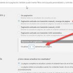
The question of pagination controls is fairly simple: you have specified pagination with manual transition and page reload in the settings, but you haven't inserted any pagination controls, which you can do in the Filter Editor or the Loop Output section using the "Controles de paginación" button (I'd recommend the Filter Editor). See https://toolset.com/documentation/user-guides/views-pagination/
I fixed the margin issue by adding the following to the existing custom CSS in the View:
.et_pb_text {
  margin-top: 10px;
  margin-left: 10px;
  margin-right: 10px;
}
I think the problem arises because of how you have this set up.
You design the individual posts with Divi page builder, and then design the Content Template (of the View) again with the Divi page builder.
Any differences in the Divi settings of the individual posts may affect how they appear in the View output.
I would say that nesting Divi-styled content inside Divi-styled content risks over-complicating things when it comes to styling. It is certainly not something that would be expected by the creators of Divi (because you cannot create templates for posts with Divi alone), and we recommend when using page builders that you use the normal WordPress editor when publishing individual posts, and then use the page builder solely for designing the templates.

