Dieser Thread wurde gelöst. Hier ist eine Beschreibung des Problems und der Lösung.
Problem:
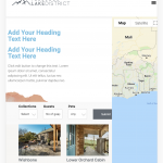
The issue here was that the user's page template wasn't being responsive correctly for mobiles.
Solution:
Unfortunately in this case the user had used Elementor to do their page template so they would have to contact the elementor team in order to get an accurate tutorial on how to adjust the mobile breaking points
This is the technical support forum for Toolset - a suite of plugins for developing WordPress sites without writing PHP.
Everyone can read this forum, but only Toolset clients can post in it. Toolset support works 6 days per week, 19 hours per day.
| Sun | Mon | Tue | Wed | Thu | Fri | Sat |
|---|---|---|---|---|---|---|
| - | 9:00 – 12:00 | 9:00 – 12:00 | 9:00 – 12:00 | 9:00 – 12:00 | 9:00 – 12:00 | - |
| - | 13:00 – 18:00 | 13:00 – 18:00 | 13:00 – 18:00 | 14:00 – 18:00 | 13:00 – 18:00 | - |
Supporter timezone: America/Jamaica (GMT-05:00)
Dieses Thema enthält 2 Antworten, hat 2 Stimmen.
Zuletzt aktualisiert von vor 5 Jahren, 7 Monaten.
Assistiert von: Shane.
