I have this Blog page
versteckter Link
Post 5 and 11 displays from a Toolset View. All the other posts is from the Divi Blog Module. The Toolset View posts integrate nicely on the desktop version, but on mobile phone the image is too small. See first image on screenshot. I have tested with different css approaches, but I'm not able to find a solution that looks nice on a mobile phone. Could you please take a look?
Thanks in advice
Regards
Rune
Hi, can you share the code from your Loop Output editor and any Content Templates used to display this View? I would like to see how you have things set up.
Hi Christian
Thanks for looking into this.
Loop output editor:
[wpv-layout-start]
	[wpv-items-found]
	<!-- wpv-loop-start -->
	<wpv-loop wrap="1" pad="true">
		[wpv-item index=1]
		<div class="row ">
			<div class="col-sm-12">[wpv-post-body view_template="Loop item in Blogginnlegg 2"]</div>
		</div>
		[wpv-item index=other]
			<div class="col-sm-12">[wpv-post-body view_template="Loop item in Blogginnlegg 2"]</div>
		[wpv-item index=pad]
			<div class="col-sm-12"></div>
		[wpv-item index=pad-last]
			<div class="col-sm-12"></div>
		</div>
	</wpv-loop>
	<!-- wpv-loop-end -->
	[/wpv-items-found]
	[wpv-no-items-found]
		<strong>[wpml-string context="wpv-views"]No items found[/wpml-string]</strong>
	[/wpv-no-items-found]
[wpv-layout-end]
Template for this View:
<div align="center"><a target="_blank" href="[wpv-post-url]">[wpv-post-featured-image size='custom' width='303' height='190' crop='true' crop_horizontal='center' crop_vertical='top']</a>
  <a target="_blank" href="[wpv-post-url]"><H2 style="margin-top:20px;font-size:18px;min-height:45px;">[wpv-post-title]</H2></a>
  <a target="_blank" href="[wpv-post-url]"><div class="lesmer">Les mer</div></a>
</div>
Regards
Rune
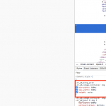
Okay it looks like the images provided by the Divi blog module are all at least 400px wide, but the images in your View are sized at 303. That's the main issue. You should modify your featured image shortcode to match the other images width of 400px. You'll notice that 400px is actually too wide to fit in the space available, so your theme has adapted this by setting the max-width property on each image to be 100%. This forces their wider images to contain themselves within the available horizontal space without overflowing. Take a look at the screenshot that shows the styles added by your theme.
So you can mimic this by adding your own custom classes and matching styles in your Content Template, or you can apply the classes from the Divi blog module to your own design. Note that their code requires two levels of hierarchy surrounding the image tag, so you would be required to add another wrapper div. Let me know if this sounds like something you're comfortable doing, or if you need more assistance and I can take a closer look.
Thanks Christian
You got me on the right track. It looks good on my phone now. All I did was to modify the the featured image shortcode from
width = 303 height = 190 to width = 400 height = 251
It looks like there is no need to add more custom css.
Thanks again.
Regards
Rune

