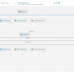
Hello. When I'm in the editor and trying to lay things out, it is adding weird padding to items. The actual front end page looks correct but it makes it incredibly hard to lay things out when it differs from editor to frontend.
In this example I have added the field name and then the field itself. I've used the Toolset felds rather than WordPress but the field description is higher than the field itself in the editor
Hi,
Thank you for waiting.
While testing on my website, I couldn't reproduce this issue, which suggests that something specific to your website is involved.
To troubleshoot this, I'll suggest the following steps:
1. Please make sure that WordPress, active theme, and plugins are all updated to the latest versions.
2. It would be interesting to test this with all non-Toolset plugins disabled and a default theme like Twenty Twenty-One.
If it's fixed, you can start adding the disabled items, one-by-one, to narrow down to a possible conflicting one.
3. In case the issue still persists, I'll need a clone/snapshot of your website, to investigate this on a different server.
( ref: https://toolset.com/faq/provide-supporters-copy-site/ )
Please let me know how it goes and I've set your next reply as private.
regards,
Waqar
Hello
I'm sure I completed the snapshot form but there is no record of it here. Can you confirm if i did or not??!!
Thank you
Hi,
Thank you for sharing the duplicator package and I've successfully deployed it on my server.
I'll be performing some investigation and testing to find the difference between your website and my test website and will share my findings accordingly.
Thank you for your patience.
regards,
Waqar
Hi,
Thank you for waiting.
During some further testing, I noticed that the alignment is off, only if the grid block is nested inside a "Container" block. In this case, some extra top and bottom margin is applied to Toolset blocks, as compared to the WordPress' built-in blocks.
I've shared these findings with the concerned team and will keep you updated through this ticket.
regards,
Waqar
Hi
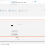
Thanks for looking. I've found another similar issue in Views. When adding a grid to a view the 2 columns in the gird are not aligned in the editor - even before I add a field. Again, it shows fine in the resulting UI but it makes makes life hard when trying to create a view if the editor isn't visually correct. Anyway attached is an example of 2 single toolset fields in a grid in the editor, one where I've clicked into the View, the other where the view is not highlighted.
TBH there are a number of times the editor does not show the correct UI and it never seems to show the correct fonts as per the theme.
Thanks for writing back.
1. As for the original report about the extra top and bottom margins applied to the Toolset blocks, I can confirm that it has been passed on to the development team and they'll review and adjust it accordingly, in future releases.
2. The difference shown in your latest screenshots is by design. The first loop item of the view is shown more prominent and detailed than the rest, as it is the one that is used for the editing.
3. Themes and plugins are designed to load most of their font and styles only on the frontend pages. This is why you'll not see the 100% preview in the admin area and it is more of a WordPress limitation in general and not something specific to Toolset plugins.
I hope this makes it more clear.
Hey,
1. Great thanks
3. Yes understood
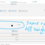
2. I've attached another image as I think you've misunderstood what I meant. The alignment issue us WITHIN the loop. If you see the row the 2 columns are at different heights. Again it is fine in the end site, just the editor that is being weird.
Feel free to close this thread as you like.
Thank you for sharing this.
I can see now what you mean in point 2 and will add a note about that in the original report too.
You're welcome to mark this ticket as resolved and feel free to start a new one for each new question or concern.


