Tell us what you are trying to do?
I've two alternative pages:
The original one is
[Walks & Talks – Westminster Guides](enlace oculto) showing pagination with a 3 x 3 grid, and this resizes for mobile use.
It uses this view
[Edit View ‹Tour Search](enlace oculto)
I'm trying to create a new page
[Walks & Talks – 2 – Westminster Guides](enlace oculto). This looks fine on desktop (2x3 grid), but no resizing for mobile use.
It uses two views
[Edit View ‹ Walks and Talks for Public](enlace oculto)
and
[Edit View ‹ Walks and Talks for Group](enlace oculto)
My main question is what do I need to do to ensure that the new page also resizes - so it becomes readable on a mobile phone?
An additional question with
[Edit View ‹ Walks and Talks for Public](enlace oculto)
I'd like to ensure this only shows events on or after the current date. I've tried adding a query filter
Filter by Custom field - Date/Time of Tour, where this field is a DATETIME field, that is greater or equal to either NOW() or TODAY(), but in both cases this refuses to display any items at all. Any ideas on how I can fix this?
Many thanks for any help you can provide.
Is there any documentation that you are following?
Just the documentation on the toolset site.
What is the link to your site?
Passed over details in an earlier ticket, and the details should still work.
Hi there
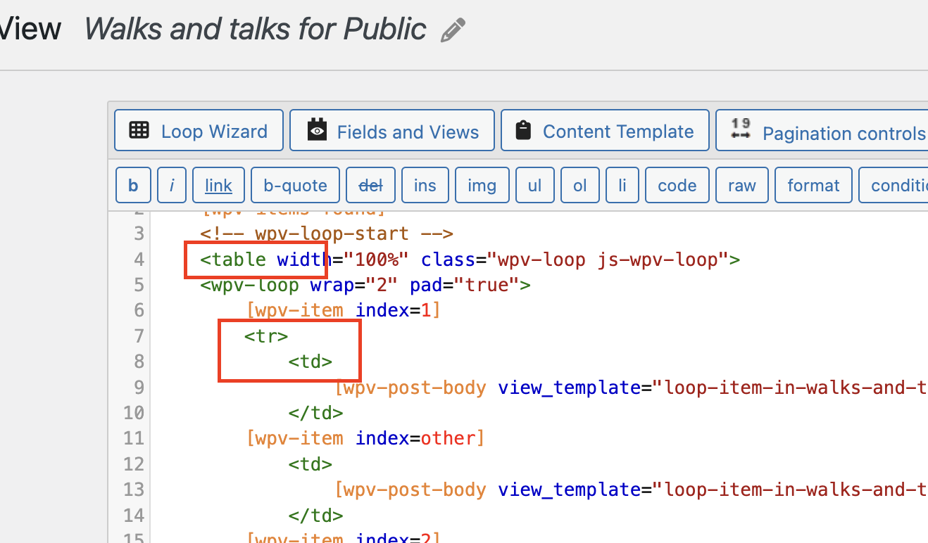
On your problem page the "grid" is not responsive in the same way as the first page because the output format of the View is as a table, with columns and rows. These can't resize and reflow responsively in the way that the first page does, which instead uses a grid layout for the View output.
Regarding the date filter, I can't see from the front end alone what the problem is.
We discard sensitive data when a thread is resolved, so let me set another private reply to get site credentials from you again.
Hi there,
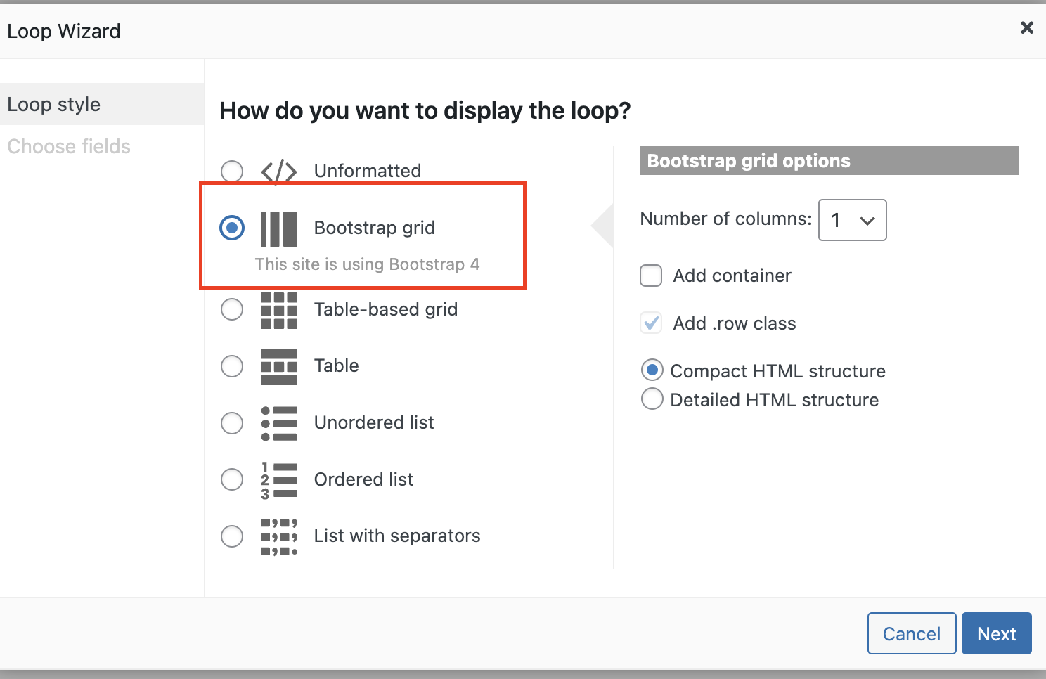
Thank you for the login information. If you check the View that you use you can see that you used the Table method to create the formatting of the view below: (Check the screenshot)
enlace oculto
But if you check this view which you say works ok it uses DIV instead of table:
enlace oculto
You can start over to create a new view and there in the wizard please do not use the Table one and use the Bootstrap grid one.
For the second question, I could not find any filter query . If the date stored in the custom field is created by Toolset, then Toolset stores the date in UNIX format, so for the comparison you should use the Number method and not DATE.
Thanks.
Thanks Christopher. I've changed the two views, and it now works. The page
enlace oculto
shows public and group walks under different tabs. I'm also pleased that the number approach for the date and time appears to be working.
One minor issue remains - if you look at the Group Walks page (which is generated randomly) a long title for a tour spreads over two lines, and hence displaces the image down compared to the entries with shorter titles.
Ideally I'd like to have the same two line margin for each heading. I've seen pages on the web that suggest that the following CSS
h4 {
display: -webkit-box;
-webkit-line-clamp: 2;
-webkit-box-orient: vertical;
overflow: hidden;
}
should do the trick, but I've been unable to make it work.
Do you have any ideas on how I could get the images to align (while maintaining the ability to read the page on a mobile phone screen)
Many thanks, appreciate the help that you are providing.
David Brown
Hi David,
This goes beyond the normal Toolset functionality and it is more of a styling issue.
I will be happy to give a solution here but we will not be able to follow up on that.
I suggest that you add a class to your H4 tags in HTML inside the view such as "tab-title". That will help to target the titles of the view only and not the whole website.
Then you can add a CSS code like this:
h4.tab-title {
    min-height: 50px;
}
You can fine tune the code to your liking.
Thanks.