This is the technical support forum for Toolset - a suite of plugins for developing WordPress sites without writing PHP.
Everyone can read this forum, but only Toolset clients can post in it. Toolset support works 6 days per week, 19 hours per day.
| Sun | Mon | Tue | Wed | Thu | Fri | Sat |
|---|---|---|---|---|---|---|
| - | 7:00 – 14:00 | 7:00 – 14:00 | 7:00 – 14:00 | 7:00 – 14:00 | 7:00 – 14:00 | - |
| - | 15:00 – 16:00 | 15:00 – 16:00 | 15:00 – 16:00 | 15:00 – 16:00 | 15:00 – 16:00 | - |
Supporter timezone: Europe/London (GMT+01:00)
Etiquetado: Sliders, Views plugin
Documentación relacionada:
Este tema contiene 30 respuestas, tiene 4 mensajes.
Última actualización por AlimB3245 hace 4 años, 11 meses.
Asistido por: Nigel.
Tell us what you are trying to do? I first tried to use a VIEW but then I realised that it shows images from other POSTS.. then I found the solution with REPEATABLE FIELDS as it allowed me to show multiple images from the same custom field which is what I wanted.. so that's perfect.. but I don't seem to know how to fix the height of the block that's displayed and I can't control the transition pace or period.. Normally with a VIEW I think we have Pagination settings to do this but with Repeatable Fields I can't seem to find any controls.
Is there any documentation that you are following?
Is there a similar example that we can see?If possible I'd like it to transition like this where I am using a Smart Slider Plugin.. enlace oculto
What is the link to your site?enlace oculto .. this is the problem page
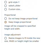
I managed to fix the block issues by changing the image settings as per screenshot below..
I have attached an image of previous issue where the image settings were normal and the block surrounding the image was too much in height... it's just so that you have an idea about the issue I was facing..
Do let me know the setting change I've made.. is that the right way to go or is there something else to fix this issue?
however the transition issue still persists.. the slide doesn't move to the next one.. how do I do that?
Regards,
Alim
Hello Alim and thank you for contacting the Toolset support.
It seems that the slider lazyloads the image, before that, it puts a 1x1 px image as place holder and defines the width of the image container to 1250px. Which translates then to 1260px for the height, coming from 1250px(aspect ratio of the 1x1px image) + 5px top margin + 5px bottom margin.
I might need to investigate this further to spot what is putting this 1x1px image and what is enforcing the aspect ration. But as a workaround, you can add the following CSS code to your view/content template or page to resolve it.
ul.glide__slides {
    max-height: 410px;
}

.glide__slide img.aligncenter {
	display: block;
	margin: 0px;
}
Regarding the movement of the slider, that is not supported yet on the repeating field block for images. Please ask this feature here https://toolset.com/contact-us/suggest-a-new-feature-for-toolset/
In the meantime, you can simulate a click on the right navigation button every 5 seconds with the following Javascript code. Just put it in your view or content template. Please note that if you have multiple similar sliders on the same image, this code will trigger the click on all of them.
jQuery(function($){
  function move(){ $('.glide__arrow.glide__arrow--right').trigger('click'); }
  setInterval(move, 5 * 1000)
})
I hope this helps. Let me know your feedback.
Hi Jamal
Thanks for the prompt response and update...:-)..
your workaround seems to work well.. thanks for the update.. do let me know if your development team figures out a way for me to avoid the CSS if it's a bug..
I need another small favour.. your CSS works for the Desktop but the issue still shows on the mobile view.. I am not that good at CSS but I assume it's some media query .. would appreciate if you could let me know how I could have the CSS work on the mobile view too..
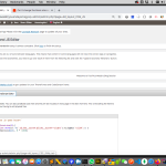
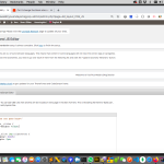
Also could you advise me the best way to store these CSS and JS data.. considering we have so many places to keep the CSS, I am always a bit lost.. I assumed your Layout CSS and JS menu would have been a good way to do this as it would be possible to view all the Toolset CSS and JS in one place but when I tried to put the CSS there it didn't seem to work.. is it supposed to work and I am doing something wrong or it's not meant for this? Please do advise. (screenshot attached).. It worked for me when I put the CSS in the document settings for one of the content templates.. but the problem is as it's universal for all templates I will not remember which template I have actually used the CSS and JS in..;-).. it already happened to me today when I wanted to update for the media query..;-)..
Will use your 'suggest a new feature' link for sure..
Thanks again.. have a nice day..:-)..
Regards,
Alim
Hi
Any update on this?
I am still looking for an update on whether the bug about the resizing of the box has been resolved.
If not, then the workaround is fine but I can't seem to make it work for the mobile view
And finally I need to know if Layouts Menu works or doesn't work for the CSS and JS... I'd like to know the best place to add the CSS and JS provided..
Regards,
Alim
Jamal is on vacation. This is Minesh here and I will take care of this ticket.
Regarding the height of the block, what if you add a container block and for the container, block add the min-height from the Ineer content tab available on right panel when Container block is on focus. See the screenshot: enlace oculto
Once you add the container block and set the height, what if you move your repeating field block to this container. does the fix the issue for the height?
If not, then the workaround is fine but I can't seem to make it work for the mobile view
===>
Have you checked the following article?
- https://toolset.com/documentation/getting-started-with-toolset/creating-responsive-designs/
You can set your block to display with different resolution and set height/width of the block as per the screen resolution (desktop, tablet and mobile)
- enlace oculto
However, if that does not work for you, you need to check with Pro CSS expert who can write the custom media query according to your requirement.
And finally I need to know if Layouts Menu works or doesn't work for the CSS and JS... I'd like to know the best place to add the CSS and JS provided..
===>
I do not know why you are using Layouts as Layout's plugin is only in maintenance mode, we are not going to add any feature to it as our focus to move on Blocks.
You can add your custom CSS to your view. With your view block, you will see the tab "Custom JS and CSS". Please see the screenshot: enlace oculto
Hi Minesh
I will try the container block as suggested by you but I would prefer that instead of a workaround we'd be able to resolve the issue.. as per Jamal's message earlier (pasted below) it was a bug that he would probably need to investifate
I might need to investigate this further to spot what is putting this 1x1px image and what is enforcing the aspect ration. But as a workaround, you can add the following CSS code to your view/content template or page to resolve it.
That's why I was hoping we would need any workarounds.. Unless of course the bug is not easy to resolve.. please do keep me updated.
And yes, I've tried the other options and also media queries but the mobile view doesn't seem to work..
I do not know why you are using Layouts as Layout's plugin is only in maintenance mode, we are not going to add any feature to it as our focus to move on Blocks.
I am not using Layouts because of any preference.. I am using it because I am new to toolset and it happened to be there as one of my menus... How on earth would I know that Layouts is outdated and Blocks is your new focus.. in that way even Views is not something you encourage but you yourself used VIEWS in classic editor to solve one of my earlier tickets.. Anyways thanks for letting me know that Layouts is outdated.. will delete the plugin in that case.. but wouldn't it be easier for you guys to keep those plugins in a section called something like LEGACY or something? It would help newer people like me who have no idea to know that Layout is outdated.. no?
You can add your custom CSS to your view. With your view block, you will see the tab "Custom JS and CSS". Please see the screenshot: enlace oculto;
I am aware of this.. but the issue is that when you add a CSS style that applies to ALL VIEW and not just that particular block it's not such a good idea to keep the CSS and Jquery within a certain block .. as in the future when you have some issue in another block or view and you have to search every block for a possible CSS or JS issue... it can be quire a pain.. hence I was checking with you guys if there's a particular place where CSS and JSS that apply to ALL parts of the site could be saved.
Regards,
Alim
Ok - we are talking about many things at the same time.
So, Can we talk issues/doubts one by one:
1)
I will try the container block as suggested by you but I would prefer that instead of a workaround we'd be able to resolve the issue.. as per Jamal's message earlier (pasted below) it was a bug that he would probably need to investifate
I might need to investigate this further to spot what is putting this 1x1px image and what is enforcing the aspect ration. But as a workaround, you can add the following CSS code to your view/content template or page to resolve it.
That's why I was hoping we would need any workarounds.. Unless of course the bug is not easy to resolve.. please do keep me updated.
And yes, I've tried the other options and also media queries but the mobile view doesn't seem to work..
====>
I do not have idea how Jamal told you that it is a bug as I do not see any internal ticket he filed but have you checked the new "image slider" block. Please check the following announcement:
- https://toolset.com/2020/05/toolset-blocks-1-2-is-live/
2)
I do not know why you are using Layouts as Layout's plugin is only in maintenance mode, we are not going to add any feature to it as our focus to move on Blocks.
I am not using Layouts because of any preference.. I am using it because I am new to toolset and it happened to be there as one of my menus... How on earth would I know that Layouts is outdated and Blocks is your new focus.. in that way even Views is not something you encourage but you yourself used VIEWS in classic editor to solve one of my earlier tickets.. Anyways thanks for letting me know that Layouts is outdated.. will delete the plugin in that case.. but wouldn't it be easier for you guys to keep those plugins in a section called something like LEGACY or something? It would help newer people like me who have no idea to know that Layout is outdated.. no?
=====>
The Layouts and Views plugins are already added to Legacy tab as you can see with the following link:
--- https://toolset.com/account/downloads/#legacy-plugins
To keep updated with latest Toolset news you should keep eye on our Blog:
- https://toolset.com/blog/
3)
You can add your custom CSS to your view. With your view block, you will see the tab "Custom JS and CSS". Please see the screenshot: enlace oculto
I am aware of this.. but the issue is that when you add a CSS style that applies to ALL VIEW and not just that particular block it's not such a good idea to keep the CSS and Jquery within a certain block .. as in the future when you have some issue in another block or view and you have to search every block for a possible CSS or JS issue... it can be quire a pain.. hence I was checking with you guys if there's a particular place where CSS and JSS that apply to ALL parts of the site could be saved.
=====>
We offer "Custom Code" section which you can use to add custom code/hooks/filters but that will not allow you to add custom CSS and JS directly.
So, the best place to add your custom CSS or JS, there are many possibilities like:
- you can use the theme if theme offers any place to add custom JS or CSS
- create a child theme and add yoru custom CSS and JS there
- you can the any third-party plugin using which you can add custom CSS and JS: https://wordpress.org/plugins/custom-css-js/
Can you please help me resolve the main issue? I am still having the odd size in the slide in the mobile view? The CSS code and the JS provided by Jamal worked fine on desktop but it's not working on the mobile..
Nigel
Idiomas: Inglés (English ) Español (Español )
Zona horaria: Europe/London (GMT+01:00)
Hi Alim
Looking over this question it sounds like you started out using the Repeating Field / Gallery block from the previous version of Blocks.
In Blocks 1.2 the gallery and slider output options were split into their own blocks and given more options. After upgrading and editing the template that includes the block you should have been prompted to upgrade the block, but if not I recommend you recreate the slider using the dedicated Image Slider block rather than persisting with the older block.
The new Image Slider block does not have a bug with the sizing as far as I'm aware.
The images added to a slide may not all have the same height (when displayed at the given width).
There are two ways to deal with this. One is to say, no problem, and just let the images display at their natural height.
This leads to a problem (which came up often in the past with different solutions) whereby the overall height of the slider changed with every slide transition, causing all of the content on the page below the slider to move up or down with transitions. So imagine you are reading some text further down the page, and every 5 seconds it moves up or down a few hundred px depending on what was happening in the slider, which may even be off the top of the screen.
So, the slider block checks the height of all of the images that will be included in the slider and then sets the height of the slider to match the height of the tallest image. That does mean whitespace appearing below short images, though.
To avoid that, you have the crop option, which will crop images as required so that the dimensions of the slider remain fixed across transitions.
I don't recall precisely how this was implemented with the older Repeating Field / Gallery block, which may be why you are experiencing problems.
So, please make sure you switch to using the current Image Slider block for the slider, and decide on which of the two output formats I described you prefer and choose one.
You won't need the workaround provided by Jamal, and you should have a consistent experience across screen sizes.
Regarding autoplaying the slider, I'm not sure why that feature wasn't included, but we already have an internal ticket about adding it, and I've added this thread to it to demonstrate the demand.
In the meantime you can continue using the JS snippet Jamal provided.
Please let me know after updating that you get the Image Slider block working as you wish.
Hi Nigel
Thanks for getting back on this..:-)..
Yes the image slider is a welcome addition/update but it hasn't solved my issue..:-(..
with the repeatable field I at least had a working solution but with the slider I am confused.. and also the repeatable field has lost it's slider setting I think.. so I can't even use that option now...
Here's a link to the new result..
enlace oculto
it's a test template.. the first block is the new slider module and the second one below it is the old repeatable field...
Here's a working version of the repeatable field from an earlier template..
enlace oculto
but this one has just one image (not multiple)
Please advise what I should be doing...
Regards,
Alim
Nigel
Idiomas: Inglés (English ) Español (Español )
Zona horaria: Europe/London (GMT+01:00)
Can I get credentials for your site so that I can check this using your images rather than the images I have on my local test site?
I've set up a private reply.
Nigel
Idiomas: Inglés (English ) Español (Español )
Zona horaria: Europe/London (GMT+01:00)
I checked on your site and I can't see what the problem is.
I can see it, but not determine the cause.
I tried recreating a new template with an Image Slider and get the same result.
I downloaded all of the images and added them to my local test site to see if it was some quirk arising from the images used and their dimensions, but it worked fine: enlace oculto
I switched to the twentytwenty theme on your site and then did a side-by-side comparison between the markup and styling of the problematic version on your site and the working version on my site, and I can't spot any significant differences.
I can see some differences in the markup on your version (related to lazy loading) which don't appear to be significant, but I can't spot anything else.
I expect the problem arises from some conflict with another plugin. But you are on a multisite so I can't disable the plugins on that site alone for testing.
I tried to take a copy of just that site with Duplicator Pro to install locally for testing, but it won't work on your network.
So I am somewhat stuck.
I either need a copy of the standalone site, or for you to disable all plugins except for Types and Blocks on the entire network to be able to check what happens when conflicts are ruled out.
Hi Nigel
Thanks for the udpate... I think you are the super admin and should be able to disable all the plugins on the entire network.. do let me know if you still need me to do it and I'll have it done..
Regards,
Alim
Hi Nigel
Just a gentle reminder on this ticket.. If there's something you'd like me to do, please do let me know..
I just assumed that if you were to disable the plugins yourself you would know the results immediately and not have to wait for me to update you..
Also there's one thing that I'd like to point out.. based on this ticket with Shane where I added a Content Template to Opticians Custom Post while adding an EDIT form..
https://toolset.com/forums/topic/user-permission-to-view-and-edit-custom-posts/
Now the old content template ('Optician Profile') had the CSS and JS in its custom view.. it's missing.. I say missing, because I have no clue where it's gone.. I can't find it.. but when I try to create one with the same name it doesn't allow me to so I am assuming it's still there somewhere.. so I am trying to create a new custom template with the name of 'Optician Profile 1'
Just thought the above information could help you hence adding it here.
Also as it'd be the weekend soon, would appreciate if we could try and find some resolution today as I could implement a few things over the weekend.. please do let me know if you need me to be online or anything.. I am reachable on whatsapp on [redacted] ... I am currently in Bali due to the lockdown and can only take whatsapp calls on that number as regular phone calls would incur roaming charges.. but if you want I can be on skype or hangouts or anything you prefer...
Have a nice day..:-)..
Regards,
Alim


